
Table of Contents
Dark, over-the-top and original, for the past 15 years the films of Yorgos Lanthimos have achieved both critical acclaim and popular success. The Greek director, the whose latest film Poor Things garnered a slew of prestigious nominations and awards, has a real knack for capturing an audience’s imagination.
And if Lanthimos’s aesthetic is flamboyant and eccentric, so are his typographical choices. Mismatched fonts, exaggerated spacing, wobbly lettering: Lanthimos and trusted designer Vasilis Marmatakis are daring in title design too.
From The Lobster to Poor Things, from The Killing of a Sacred Deer to The Favourite and Dogtooth, today we’ll be exploring the eerie cinema of Yorgos Lanthimos and his quirky typographical choices. Things are about to get weird…
Dogtooth

Released in 2009, Dogtooth (original Greek title: Kynodontas) is the third feature-length film by Yorgos Lanthimos and the first to receive international acclaim, including an Oscar nomination for Best Foreign Language Film. It gives a first taste of his unsettling style of cinema, taking us inside a strange family where the children are completely cut off from the outside world.
As the film opens, mysterious coloured lines appear on the screen before we get the credits, which use a simple serifed font, probably a Times. The same design details are also used on the film’s official poster. Sharp-eyed viewers will notice that these coloured lines take the form of two teeth, a nod to the film’s title. In terms of title design, Dogtooth is important because it marks the start of a long and fruitful collaboration between Yorgos Lanthimos and Vasilis Marmatakis, the Greek artist and designer who would go on to produce the titles and posters for director’s subsequent feature films.

The Lobster

Lanthimos’s fifth feature, The Lobster, is a black comedy released in 2015. A cult hit, the film established Lanthimos as a rising star in world cinema and brought his work to a wider audience. It tells the story of a surreal dystopian future in which single people are obliged to move into a hotel where they must find a partner within 45 days or be turned into an animal…
Once again, Vasilis Marmatakis was in charge of title design. In an illuminating interview, he explained how Lanthimos paid meticulous attention to every detail of the film’s aesthetic, including font and poster design. It is this that empowered the director’s collaborators to pitch typographical ideas that were every bit as bold and unconventional as his films.
In The Lobster, the film’s title appears after a short opening scene that gives a taster what is to come. A woman is driving through the countryside in the rain. She stops, gets out and shoots an apparently innocent donkey grazing in a field. The font chosen is Avenir Next, an updated version of the Avenir font created in 1988 by Swiss type designer Adrian Frutiger, the man behind typefaces like Univers and the eponymous Frutiger. “Avenir” means “future” in French, and is, in fact, a remake of the famous Futura font.
On the poster for The Lobster, Marmatakis plays with the idea of absence, creatively using empty space to explore “what it feels to be alone, and the need to be with someone”. This minimalism is also reflected in the choice of font.

The Killing of a Sacred Deer

The Killing of a Sacred Deer is a psychological horror directed by Yorgos Lanthimos in 2017. In this, his sixth feature, the Greek director gives us another tour de force in absurdist cinema. It’s the tale of a heart surgeon whose family members come down with a mysterious illness and the relationship he develops with a young patient.
The film’s credits – designed of course by Vasilis Marmatakis – make original use of typography which is “absurd” in its own way. Marmatakis uses two different fonts (one with serifs, the other without). He then throws italics, bold and capitals into the mix. The typefaces chosen are Times, the Linotype version of Times New Roman, and Nexa, a geometric font developed by Bulgarian type designer Svetoslav Simov in 2012.
These typographic choices are reprised in other promotional material for the film, including the official posters, website and social media pages. It’s a masterclass on how to break the rules of design – with aplomb.

The Favourite

The Favourite is another dark and eccentric film by Yorgos Lanthimos. Released in 2018, it follows the misadventures of Queen Anna, a 16th century monarch who is unwell, unhappy and inexpert in affairs of state.
The font chosen for the credits, which is also used to introduce the different chapters in the story, is both balanced and original. And, of course, they were designed by long-term collaborator Vasilis Marmatakis.
The typeface in question is Village, a modern font with a traditional look. Village was created in 1903 by American artist, printer and type designer Frederic Goudy, who was inspired by the Venetian styles of the 15th century. What’s makes the lettering in the film unusual is the way Marmatakis uses exaggerated spacing between characters.

To avoid an overly digital effect, Marmatakis designed the blocks of text on a computer, printed them and then manually smudged the edges using a water brush. The result is perfectly in keeping with the film’s bizarre historical ambiance.
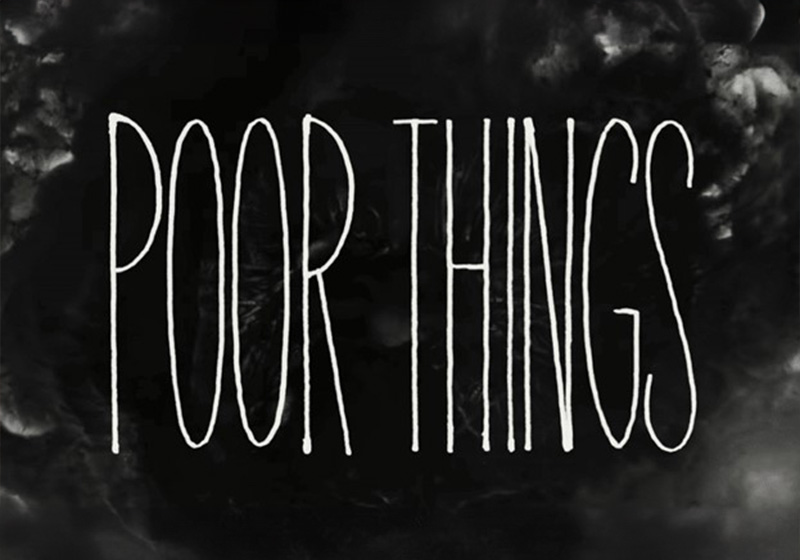
Poor Things

Yorgos Lanthimos’s eighth film, Poor Things, was released to great acclaim in 2023, picking up four Oscars, two Golden Globes and five BAFTAs. It tells the tale of Bella Baxter, a young woman brought back to life by a brilliant and unorthodox scientist.
For the title design, Vasilis Marmatakis opted for thin lettering created by Serbian type designer Vladimir Radibratovic. The font brings to mind the lettering used in another cinematic masterpiece: Stanley Kubrick’s Dr. Strangelove (1964). The typeface for Kubrick’s film was specially created by designer Pablo Ferro (you can learn more in our article “The fonts of Stanley Kubrick”).
In Poor Things, eccentric typography runs through the film from start to finish, reaching peak weirdness in the closing credits, when it actually frames the image. It’s an inspired choice that keeps viewers glued to the screen right to the very end.

That’s a wrap for fonts in the films of Yorgos Lanthimos, where the typography is as bizarre as the cinematography. Thanks in no small part to his long-standing collaboration with designer Vasilis Marmatakis, Lanthimos’s typographical choices disconcert audiences, even when using conventional typefaces: the perfect fit for his off-the-wall film-making!