Table of Contents
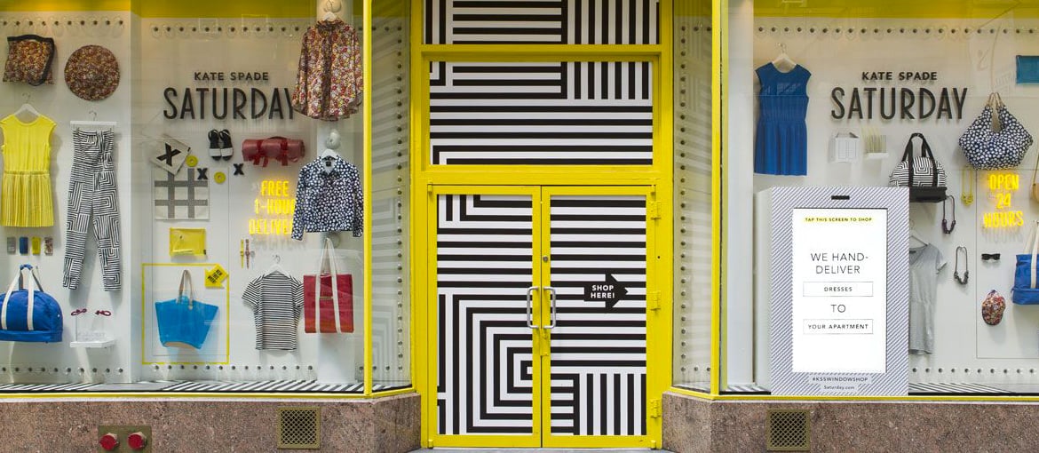
Your shop window is the most powerful tool at your disposal for attracting passers-by and potential customers. It is a business card for your retail space, which can show off new products, highlight promotions and improve your brand’s image.
Creating a shop window is not something you can do off the cuff: on average customers stop for just 5 seconds to look at them and decide whether to enter your premises. In this article we will therefore examine some of the best ideas for creating window displays, as well as giving you some useful advice and a guide to the materials to choose for the best results.
Shop windows: why creating a display is still worthwhile
The purpose of a shop window is not to display as many products as possible; indeed, the exact opposite is true. The window should whet the appetite of passers-by and entice them to go in and discover more.
This concept applies to all categories of goods: shoes, children’s clothes, toys, or indeed virtually any product or service. Of course, the rule is not set in stone, and you can also place a selection of items in the window, but the success of your window will depend on the marketing strategy behind it.
The window is the first stage of the retail funnel: a model used to describe where any one person is on the journey from their first contact with your business to being converted into a customer. The upper part of the funnel is, of course, wider, representing a large number of customers; as you move further down, the funnel – and the number of users – gets narrower, representing those who are closest to making a purchase. Here is a simplified version of the key steps:
- Attract: this is the first stage where the shop window plays a crucial role: it grabs the customer’s attention and piques their interest.
- Purchase: the beautiful window display encourages the potential customer to go in, and, thanks to a good visual merchandising strategy, they make their first purchase.
- Retain: you now need to keep the customer as happy as possible, to ensure they come back to the shop.
This is why a well-designed window display is still valuable: it catches people’s eye and intrigues them so much that they can’t resist entering the shop.
Shop window displays: best practice and useful materials
So how do you produce a shop window that will attract and wow passers-by? To be successful, it’s not enough to simply group together some of the products you sell and put them on display. You need to plan it properly, perhaps using these seven simple rules as a starting point.
1.Always start with your target audience.
Before you start thinking about the layout of the objects in the window, you need to consider the people they are aimed at. Who do you want to attract? Which types of people would benefit most from your products and services? You need to know the answers to these questions before you can take any decisions. The window must have a clear target so it attracts the right customers, but it shouldn’t be so specific that it puts off potential buyers. Once you have chosen the various types of consumer to aim for (in terms of age, sex, habits and lifestyle) you can decide whether to give your window a more classic, modern or vintage feel.
2.Display products wisely.
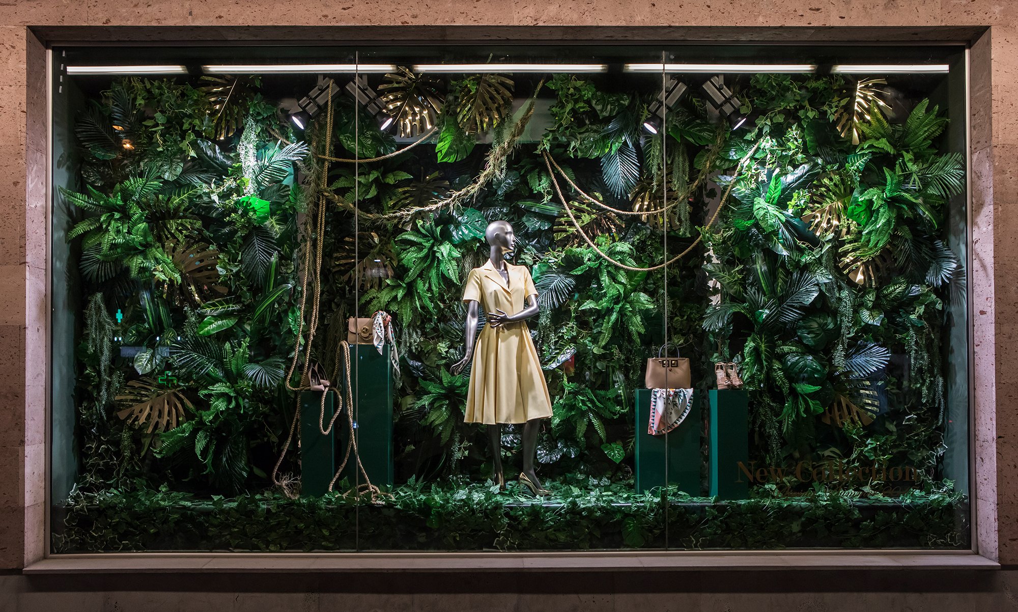
This is the most important rule to bear in mind for an effective window display. Consider the differences between the displays you see in the windows of fashion boutiques and your typical local shop. The former tend to display fewer products, but show them off at their best, and you can apply the same rule to any store, even if you are not selling expensive products or services. It’s best to be selective when choosing which goods to display to avoid a chaotic, overly crowded window. The best approach is to select a product or group of products to be the focus of the window, and then perhaps change it once a month based on the season or upcoming festivals (Christmas, Valentine’s Day, Father’s Day, sales, etc.).
3.Tell a story and follow a theme.
Once you have worked out which products to showcase, you can move on to the display itself. The secret here is to create scenery that tells a story, which is a very powerful tool for attracting people’s attention. Whether your shop window is dedicated to Christmas or another time of year, storytelling means choosing a theme and delving deep into a particular aspect of that season. At Christmas, for example, this could be elves, reindeer or Santa’s village. There are numerous different materials available to help you do this, including panels for creating sumptuous backdrops, a convenient choice because they can be made very large. You can use window stickers to tailor the messages you wish to communicate to the current season, or dedicated display materials for sales and special events. You could also consider using various sizes of poster, with or without frames.
4.Don’t forget the focal point.
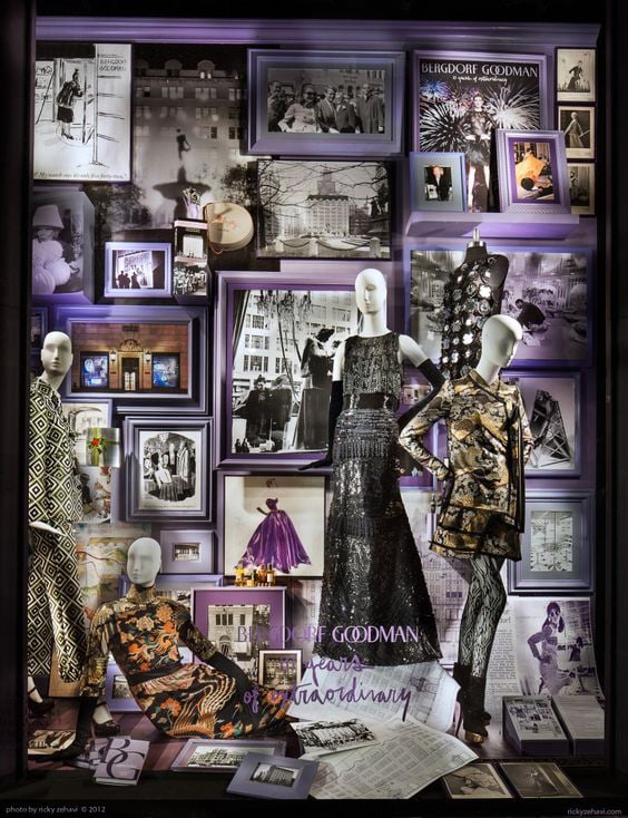
Once you’ve chosen the theme, you need to physically arrange the products in the window. At this point, it is worth creating a focal point, in other words an area that the customer’s eye is drawn to, and place the most important product in the display there. The focal point is usually a circle with a diameter of between 80 cm and 1 m, and is positioned at the centre at a height of roughly 1.5 m.
5.Choose the right colours.
Once you’ve chosen the theme, you need the colours to go with it, which, it goes without saying, must all be coordinated. It is sensible to choose one main colour and a maximum of two secondary colours, depending on the seasons. Red, white, gold, blue and silver are excellent for the Christmas period, pastel colours are ideal for spring, while for a summer window you could opt for strong colours like yellow, gold, orange and light blue. Finally, more subdued colours like plum, beige and burgundy are a great choice for autumn.
6.Include initiatives and discounts.
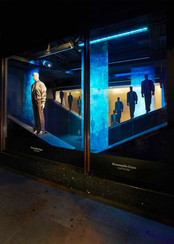
Discounts and special initiatives are always a winner in shop windows. You could, for instance, organise in-store events, games or prize draws, or hold sales during particular periods of the year. These can be communicated in the window using window clings, which avoid you having to make handmade signs (which certainly look less professional).

7.Get the lighting right.
The inside and outside lighting is another crucial part of creating a window display. If your display is based on pale colours, don’t go overboard with the lighting, or you may end up with annoying reflections. Conversely, if you are using darker products or decorations, or matt materials that tend to absorb light, you will need to adjust the lighting accordingly. You can use LED spotlights to light products directly, or use strip LEDs that can change colour depending on the display. The right lighting will ensure the window stands out from the others, and you can leave the lights on in the evening, when the others are ‘asleep’, particularly if you opt for low-consumption LEDs.
Ideas for shop windows that will inspire and attract customers
From the most established brands to small boutiques, there are countless examples of creative designs that could inspire new shop window display ideas: here are three unique designs that caught our eye.
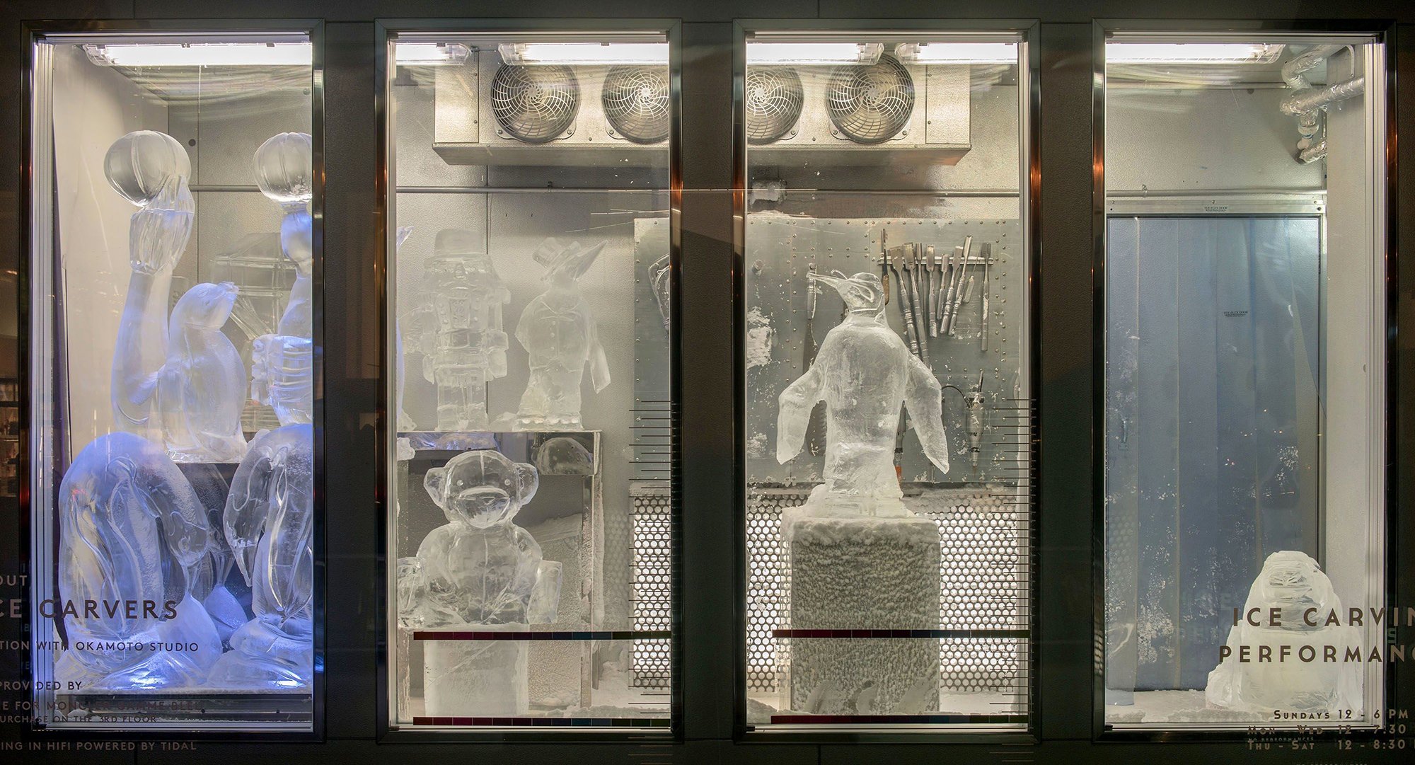
1.Barneys, New York
This window display was created with a live performance. To stand out from the other Christmas-themed windows, Barneys hired sculptors from Okamato Studio to carve blocks of ice in festive shapes while wearing designer jumpsuits, gloves and scarves. The live demonstration highlighted the products (showing them worn by humans, not mannequins) and grabbed the attention of large swathes of people for a significant period of time. This combined window display and performance also meant people created content to share on social media. This initiative could certainly be reproduced ‘in miniature’ by organising live performances within your shop window. You would be doing something completely different from the competition that would attract the attention of passers-by and at the same time extend the online reach of your products, thanks to the content generated spontaneously by spectators.
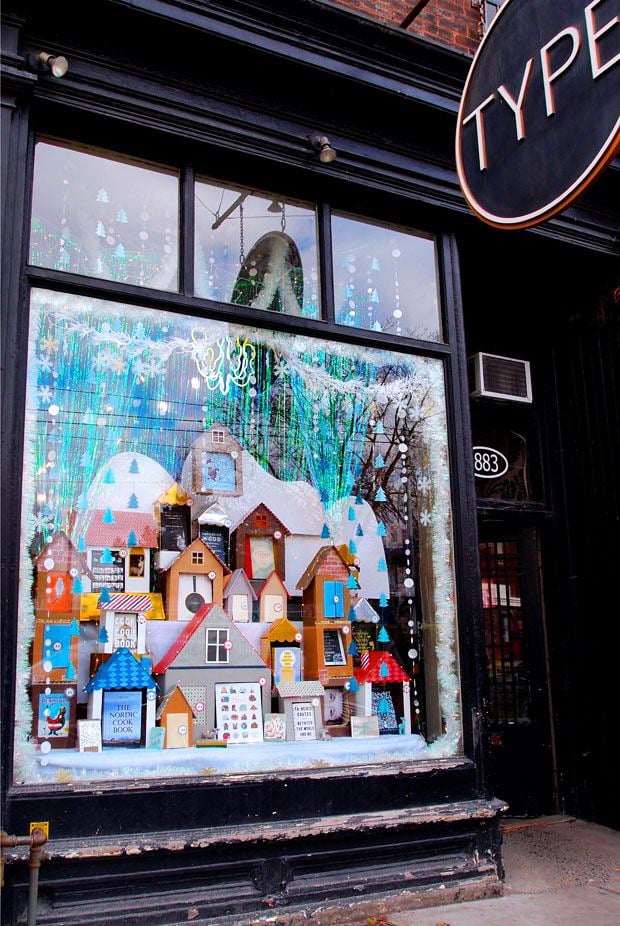
2.Type bookshop
Another creative idea comes courtesy of the independent bookshop Type, which has become renowned in Toronto for its captivating and vibrant window displays. This is all thanks to Kalpna Patel, who creates the majority of his work using nothing but glue and paper. Here he created a perfect winter window display, with each book placed within small Nordic-style ‘houses’. There are no costly features: just a specific theme – home, protection and comfort – that inspires customers and draws them in, helped by a vast array of colours.
3.Harvey Nichols
Finally, for one of its Christmas window displays, Harvey Nichols decided to pull out all the stops to create a glam, almost disco aesthetic, using stars, neon lights and a lot of glitter. This extravagant display in its shop in Knightsbridge, London required 5,370 metres of strip LED lights, thousands of baubles and neon stars and much, much more. Over the top? Undoubtedly. Dazzling? Definitely!


