Table of Contents
In the interests of keeping up to date, and also just out of curiosity, we often browse Awwwards, a portal that awards the most sophisticated websites from a design perspective. The site is a badge of honour coveted by designers and developers from all over the world but above all it is the ideal place to find some great inspiration.
We visited it recently and we want to tell you about the websites that made the biggest impression on us and what conclusions we came to: what are the latest trends in web design?
Our classification of the best websites
We’ll start with some examples of the best websites that combine design, usability and creativity. They are an excellent source of inspiration and range from food to the travel industry.
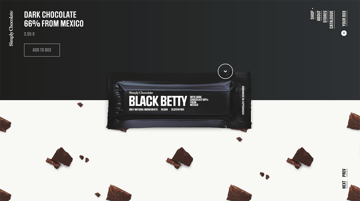
Web design, this is our home turf. One site that has made a big impression on us is Xavier Cussó. It is no coincidence that Xavier Cussó is a visual designer and art director by profession and is also an Awwwards judge. Therefore, he couldn’t leave out his own spectacular site. Colours, animations, fonts and fades: you can’t stop looking through it, it’s absolutely captivating.
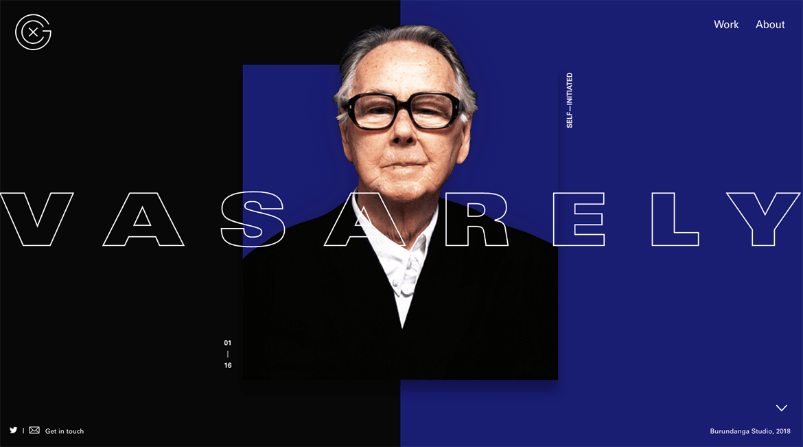
Design, power to the images. We also liked Only Once Shop, a design shop for those who love vintage design. Have a look round. It is simple and minimalist and, in our opinion, very elegant. The product images are meticulous and they really make the site stand out. They are presented in a square format that is reminiscent of Instagram galleries. Have a look at the product profiles: simple, clear, well-organised, with only as much text as is needed. Scroll down and you’ll find an excellent gallery of images that relate to the product.
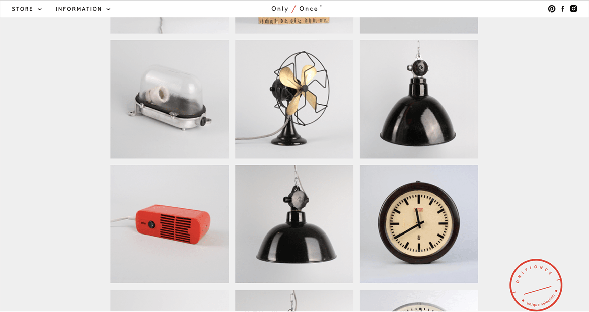
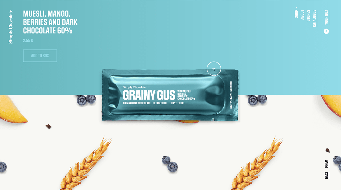
Food: a site that gives chocolate the pop-art treatment Simply Chocolate is an e-commerce site that sells chocolate. We loved its creative design and fun way of presenting the product. The circular layout, animations, vibrant colours and large images turn the humble chocolate bar into an irresistible pop object.
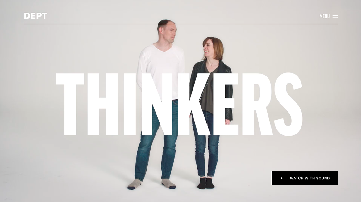
A creative agency with a site… bursting with creativity! Dept is an agency focused on technology and innovation. Its site features videos, animations, bold lettering and 100% original photos. Check out the menus too: simplicity and clarity define them. These are the ingredients that make the site so special.
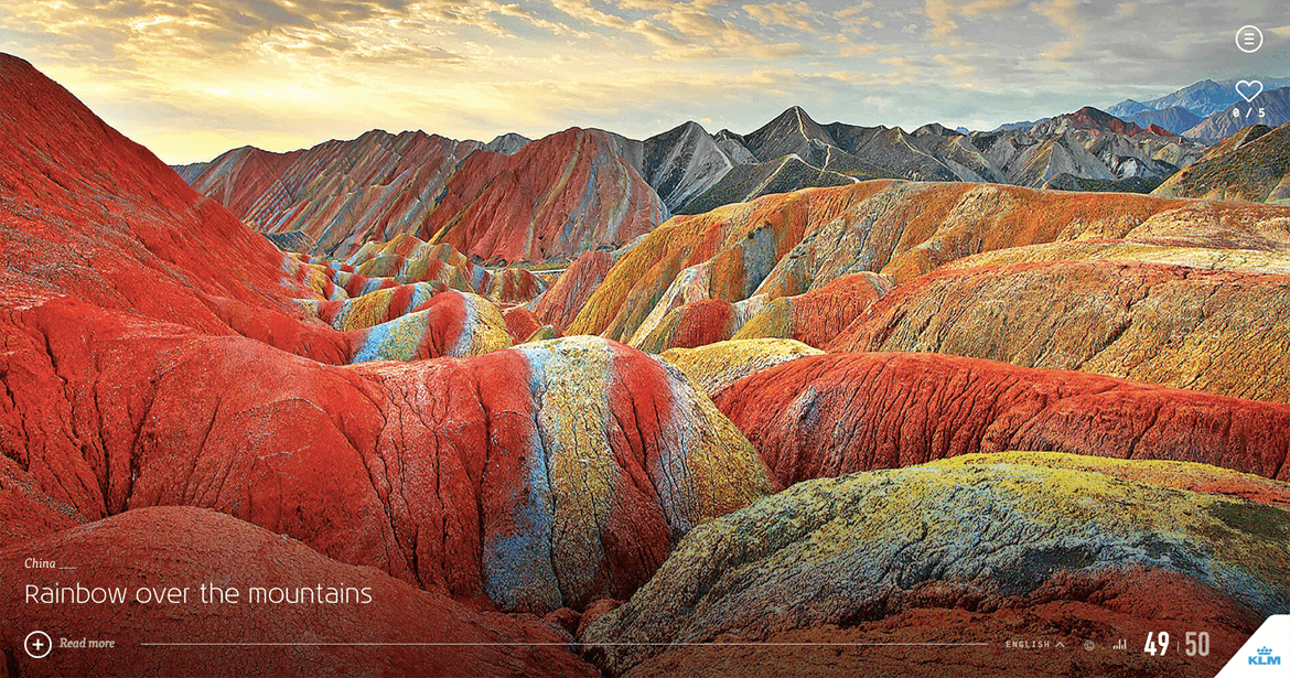
Travel through your screen. Go to iFly 50, turn up the volume on your computer and let this site take you on a journey: it’s one of the most thrilling we’ve seen. Created to mark the 50th anniversary of KLM’s iFly magazine, it lets you explore some of the world’s most stunning sights. Images, music and animations make this virtual journey seem real. Pack your bags! 😉
Web design. New trends
It’s time to take stock and make a note of what makes the sites we’ve explored so special. Here are a few recurring features:
- Circular layouts. Instead of organising content in boxes.
- Lots of colour, where and when its needed. Most of the sites we’ve seen use bold colours.
- Original photographs, illustrations and videos. Lend more personality. Remember that few people like stock photos.
- Animation of layout elements.
- Makes the browsing experience even more compelling.
- Large, bold fonts that are easy to read.
- White space. Widely used, this lets pages breath. Pages with little content – but content that’s clear, essential and meaningful.
We’ve shown you just a few of the websites that we love, but there are many more out there offering inspiration. Our advice is to look at the best, see what makes them so special and then… find a good web designer!

