Table of Contents
Warner Bros: the legendary icon of entertainment is renewed
Warner Bros is one of the world’s most famous, and profitable, film studios, with revenues of 5.57 billion dollars in 2018. Its back catalogue comprises over 100,000 hours of programming, including 8,600 movies and 5,000 TV series. The company owns the rights to some of the biggest film and TV franchises, including the DC Comics universe, Harry Potter, Joker, The Lord of the Rings, the Matrix, It, The Big Bang Theory, Friends and Looney Tunes.
Logo before and after animation. Credit: Warner Bros.
Warner Bros: a new logo to adapt to modernity
As its centenary approaches, this famous Hollywood studio recently unveiled its new identity, which was created by Emily Oberman, the New York-based multidisciplinary designer and partner at the Pentagram design agency. Updating one of the world’s most iconic logos without erasing its history was a real challenge. One that the agency feels it successfully met by working with Warner Bros. to create “a new brand identity and brand strategy that draws on the company’s incredible heritage to position it for the future, looking ahead to the studio’s centennial in 2023.” To great fanfare, the new logo was unveiled on the water tower at its Burbank studios in the presence of Warner Bros. President and CEO Ann Sarnoff, and, of course, Bugs Bunny.

The new look keeps the iconic shield but makes it cleaner and leaner. Created in 1993, the previous version was very detailed, making it difficult to use, particularly in small formats and digital contexts, which are increasingly important in today’s world. The logo was therefore optimised to work on different platforms, in different formats and with a broad range of content. It retains the colour blue, updated to a more contemporary tone, but places the brand name below the shield (rather than across it as before) in a darker shade of blue to create extra contrast.

A simplified logo suitable for every platform
This new design without the sash “streamlines the logo to its key elements”, the design agency explains. The shield is slimmed down and its shape is based on classical proportions of the golden ratio. The designers carefully updated the letters of the “WB” monogram, making them more modern while preserving their originality. The letters in the monogram are aligned as if they were written in one continuous movement, emphasising unity and connection.

The Warner Bros Condensed Bold custom font
Pentagram also created a font inspired by the logo and rather unoriginally baptised Warner Bros. The distinctive monogram was turned into a customised typeface, Warner Bros Condensed Bold, used for the symbols of the company’s different divisions. Conceived by Pentagram and developed by Jeremy Mickel into a complete font family, “Warner Bros” uses condensed letters that are related to the stretched “WB” of the shield.
Typographical animation. Credit: Warner Bros.
The logo is a “frame” : it adapts to the various entertainment franchises
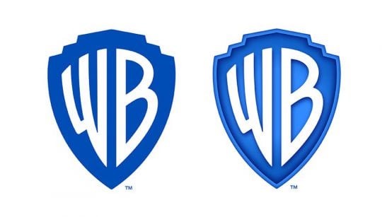
For this graphical makeover, Pentagram New York also created a complete visual identity, which included two logos: one with a flat design and another with a three-dimensional design for use on screen and in special cases. The so-called “dimensional” logo can also be used as a window to showcase images from films by using the shield as a frame. The simplified shield can therefore adopt a range of different styles far more successfully than the old logo. A principle that is by no means new but which works very well in this case.
-

Two logos. Credit: Warner Bros. 
Window logo. Credit: Warner Bros.
The latest iteration of the iconic Warner Bros. logo is the perfect balance of business and entertainment, something that is very difficult to pull off. It should begin appearing on our screens at the start of 2020 and we can, of course, expect to see different guises, depending on the film.


