Table of Contents
Emotions play a crucial role in purchase decisions, as scientific studies show. This means that in the retail world, no matter what the line of business, from clothes shops to supermarkets, from shoe shops to hairdressers, the way that shop windows, products and stores are presented will influence the behaviour of potential customers.
So how can you shape this behaviour and drive sales? The answer is visual merchandising.
In this article, we’re going to take a closer look at what visual merchandising is and its underlying principles, as well as useful tools and helpful advice for achieving good results with a bit of DIY.
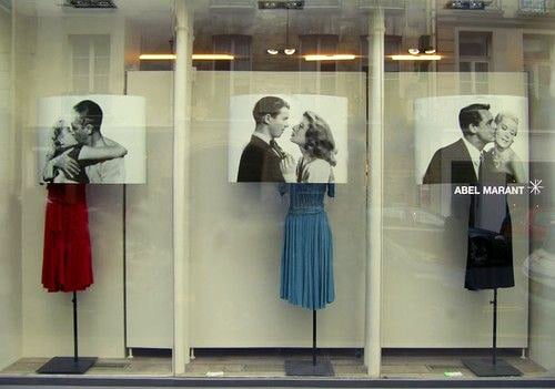
A simple but creative example of visual merchandising in the shop window: French fashion house Isabel Marant covered the top part of dresses with images of lovestruck couples embracing and kissing. The idea is to sell that same feeling of being loved. 
Visual merchandising: meaning and benefits
Visual merchandising is a retail practice that involves strategically planning and laying out a store and the products it sells to create an environment that is emotionally and sensorially attractive.
This means creating an ambience that reflects the identity and values of the brand to catch the eye of customers. It also determines the first impression that customers get when they see the shop window and explore the inside of the store.
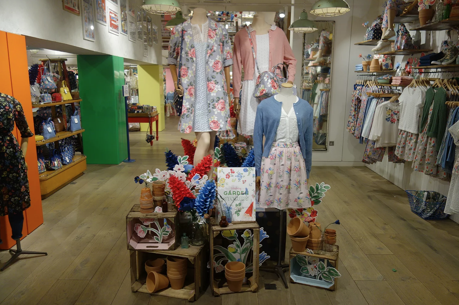
To put together a good visual merchandising strategy, you need to bear in mind a few key points:
- All products must be tidy and well presented
- Display a wide range of items
- But don’t fill every inch of space, otherwise you’ll create a cluttered environment
- Create an exciting feel that will make customers want to come back
To achieve this, we can appeal to all five human senses:
- Sight: this is the first sense the customer uses. A golden rule to remember is “what can’t be seen won’t be bought”. So display products creatively: group them together by colour, or tell a story, like one based on the year’s seasons, for
- Sound: choose music or sounds that stimulate sales, but always make sure these are in line with the brand’s philosophy.
- Smell: certain scents can stimulate customers’ memories, subconsciously leading them to make a purchase.
- Touch: customers should be able to touch and try products so they can get an idea of the characteristics of what they are buying.
- Taste: many businesses selling food and drink offer tastings to seduce customers.
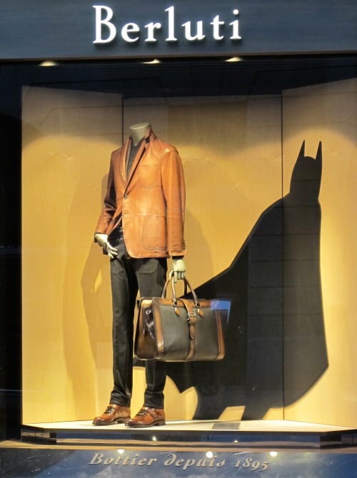
The added value that the right visual merchandising strategy can bring is the ability to engage and inspire customers, pushing them to buy particular products.
Visual merchandising: the basic principles
The purpose of visual merchandising is to drive sales. But successful execution requires knowledge of some basic rules which, if followed, will increase average spend.
Here are five rules to follow:
- Start with the target: when presenting products in a store, there are some basic questions you need to ask yourself. Who is the ideal customer? How old are they and what sort of lifestyle do they lead? And above all: what story do you want to tell? Once you have the answers, you can decide whether to adopt a contemporary, traditional, or vintage look for your shop.
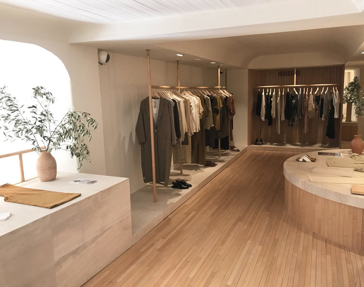
- The importance of colour: good colour coordination is essential. On the shop floor or in the window, consider contrasting colours like black and white, or create some areas with a single colour theme (like yellow, which is the first colour perceived by the retina). And remember that customers follow their gaze. So colours can be used to create “pathways” to subconsciously guide people around the store. What’s more, today it’s crucial that the shop is “instagrammable”, in other words a place with an atmosphere that inspires potential customers to photograph it or themselves inside it and then share the pictures on social media.
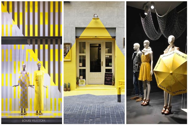
- Create a strong focal point: the goal is to try as hard as possible not to confuse customers who’ve just walked in. So where should you draw their focus? You need to create a focal point in every area of the store. These are often positioned in the middle or at the sides of the store. Or you can create a display based on the season, but remember to draw attention to the products and not their surroundings.
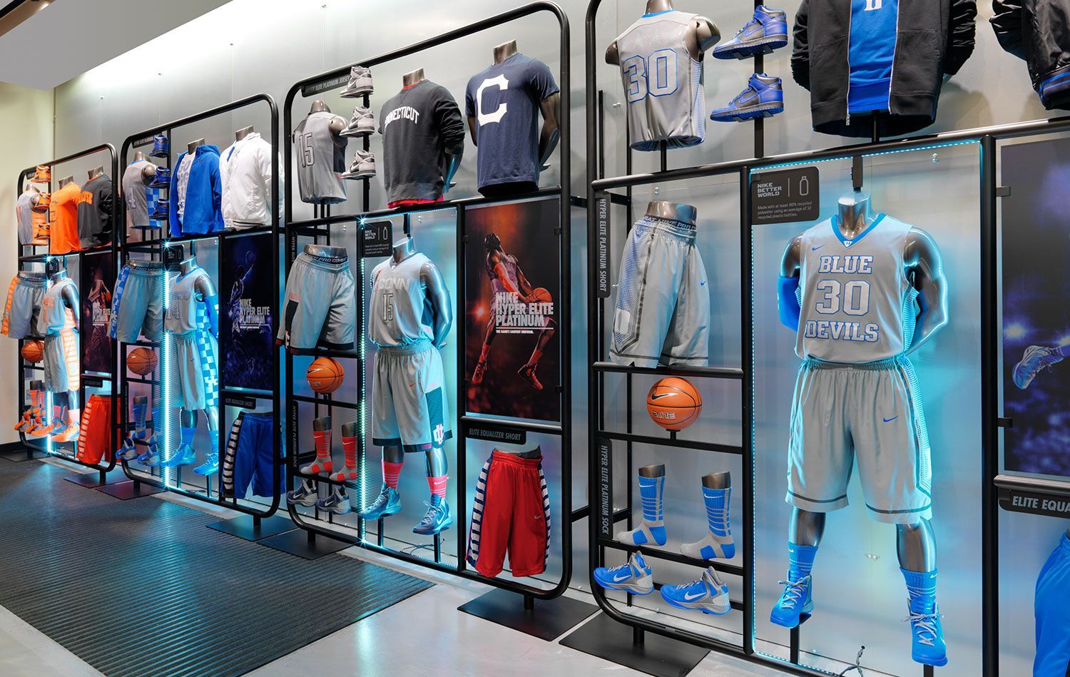
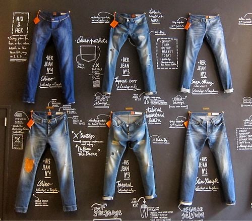
- Tell a story: inside a store it’s vital to always use clear and concise signage. Customers should know in the blink of an eye how to get to the part of the store they’re interested in. Signage can also be used for the products themselves: for example, it can present a bulleted list explaining to customers why they need a product or how their life will be made much easier by such a purchase. It’s about quickly telling a story and helping the customer to better understand the product. As well as words, images and graphics can help with this storytelling too.
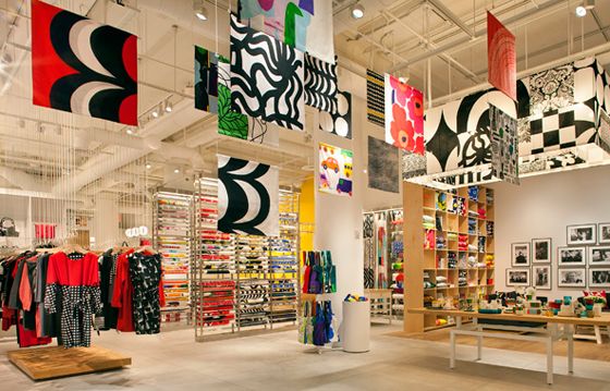
- He or she who sees, buys: a well-designed store shows customers as many products as possible while being tastefully organised and not visually cluttered. Circular layouts are popular because they expose customers to more products. In any case, it’s advisable to have as many displays as possible in the space available, while ensuring everything stays neat and tidy, and perhaps organising items colour or type.
There’s also an area that’s rarely used in shops: the space between the goods and the ceiling. Here you can use signs that are as clear as possible, or art installations that are in keeping with the products on sale.
Creditos: Pinterest
Visual merchandising: useful materials and DIY tips
When applying different visual merchandising techniques, there’s a whole series of useful materials you can use. So here are some tips on what to use to present your shop and its products in the best possible light.
The outside and the shop window
The first contact that customers have with the store is from the outside, so the window display is a fundamental element of any visual merchandising strategy. Everything, from lighting to the type of mannequins (if there are any) and digital devices like displays must catch customers’ attention and make them want to come into the store.
The display in the window can, for example, be customised with cardboard lettering or semi-transparent self-adhesive vinyl, which can be changed from season to season. Outdoor display items can also be used to grab the attention of passers-by: you’re spoilt for choice when it comes to customisation. Lastly, to advertise promotions, window stickers and cardboard cutouts are ideal.
Entrance and floor
Even though most people turn right when they enter a shop, it’s still possible to guide them along the best path to show them as many products as possible. This is where your visual merchandising strategy can definitely benefit from self-adhesive vinyl for floors, which can be used for signage or to highlight special offers. And in these pandemic times, there is also self-adhesive vinyl for floors to encourage social distancing.
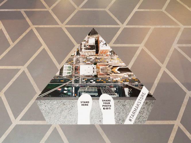
Customised signage
Customers should never feel confused inside the shop. There are various products available to ensure this is the case, such as signs printed in high definition, Foamex signs and plaques for providing useful wayfinding information to people in the shop.
Interior Decoration
The layout of the store’s interior significantly influences purchasing decisions, as well as setting the general tone. The goal is to take the customer on a journey to discover your products. You can, for example, organise the interior space into a grid, like supermarkets do, which maximises the number of products on display.
Then there’s the ideal layout for narrow spaces, with displays on the left and right.
On the other hand, the loop layout takes customers on a journey through various different environments, as seen in IKEA: it’s an experience aimed at inspiring and stimulating the impulse to buy. Lastly, there’s the free-flow layout of displays and products, which encourages customers to roam around the store: this can be the most creative layout because it can be adapted and changed over the course of the year. Useful products include shelf displays, which can create major focal points in the shop, as well as many other types of display in a slew of different formats.
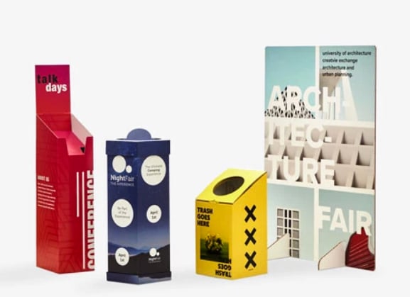
Every corner of the store can be used to communicate something: to do so, you can use high-quality posters and decals, or wallpaper if you need to cover larger areas.
So, visual merchandising has much to offer: it’s about far more than just positioning products better on the shop floor. It requires constantly thinking about how space is used in the store, keeping abreast of the latest trends, a big dose of creativity, and above all lots of passion: all this can make any type of store truly irresistible.

