Table of Contents
UX copywriting: a practical guide to designing texts that convert
UX copywriting is that little extra sprinkling of magic that turns the experience you’re giving the user into one to remember.
For some time now, companies and brands of all sizes and in all sectors have (finally!) cottoned on to the fact that relationships are the key to reaching people.
Effective marketing requires the customer to always be centre stage, and to achieve this businesses must shift their focus towards products and services that are truly tailored to their audience. Moreover, every touchpoint during the purchasing journey must be designed to offer a consistent, memorable and seamless experience.
And this is where (amongst other things) words come in: if enough thought goes into them, they can help to improve the overall experience you offer your customers, with very positive consequences for the relationship as a whole.
How? Read on and I’ll explain!
Spoiler alert: we’ll be discussing UX copywriting… brace yourself!

Preparing for take-off: five principles for a successful user experience
To highlight how important the user experience is to businesses, I’d like to share an example that everyone can learn from: easyJet. In 2010, the company realised that for every 36,000 bookings made, 4,200 people could not complete the transaction for various reasons.
As a result, the company was losing £13,933 a day.
To avoid issues like these, and in general to ensure the people who choose your firm enjoy an excellent experience, there are five drivers I think you should focus on.
- First of all, you need to provide a succinct and convincing overall theme that guides all parts of the experience towards a single, engaging storyline. One example of a brand that does this very well is the Hard Rock Cafe chain of restaurants and shops, which succeeds in giving its customers an experience of rock culture through appropriate naming, the design of the stores and their distinctive decor (full of musical memorabilia).
- The experience must then be consolidated through unforgettable moments. To create the desired impression, you need to signal the nature of the experience to people. Even the smallest cue can help create a unique experience. For example, if the owner of a restaurant says ‘Your table is ready’, they are not giving any particular signal, but when a waiter from Rainforest Cafe declares ‘Your adventure is about to begin’, they have already set the stage for something special and unique.
- The building blocks that make up the overall experience must be integrated and consistent – in other words, anything that diminishes, contradicts or distracts from the main theme should be eliminated. Less is more!
- At the end of the experience, make good use of memorabilia: objects that recall and bring to mind a memory of what has just taken place. Ever wondered why your kitchen cupboards are so full of mugs gifted to you by a wide range of firms and brands?
- Finally, engage the senses to add value to the whole experience: the more stimulating, the better.
Now we’ve completed this overview, we can move on to discussing the specifics of UX copywriting.

How UX copywriting positively influences the online experience
UX copywriting is a branch of user experience (UX) design focused on designing text or microtexts to improve the experience for users. UX copywriting (or UX writing) is therefore devoted to keeping customers’ attention, and involves applying user experience to copywriting.
It is therefore a method – or better, a combination of methods – used to write the contents for interfaces on websites, apps, digital services, and so on.
If you’re wondering what the difference is between this and its ‘sister’ profession of copywriting, drawing on the wonderful book on the subject by Alice Morrone we can say that UX copywriters are copywriters who think like UX designers 🙂
UX copywriting covers the entire decision-making and creative process (from planning through to writing) involved in generating error messages, menu labels, instructions, confirmations of actions, forms, buttons, interactions with chatbots and much more, with the ultimate aim of optimising the experience people receive through digital interfaces.
But how do you define an ‘optimal experience’? Here are three major aspects.
- Easy to use: UX copywriting must make encounters with brands a smooth, seamless and clear experience, so the user does not encounter any issues but on the contrary is pleasantly surprised by how easy the website, app, online shop or other touchpoint is to browse or use.
- In line with its aims: as well as improving the experience, UX copywriting must help the business to achieve its objectives, with text that guides people to discover its products or facilitates the process once customers have decided to purchase something.
- Representative of the brand identity: the words chosen must also follow the business’ corporate and brand identity guidelines. The text must emphasise the brand’s tone of voice, personality and key archetypes, so customers are aware who they are interacting with and the relationship is as natural and unique as possible.
Designing something with all these things in mind is no easy matter. To sort them all out, it’s always best to start with your relationship with customers: getting to know them well is the first step to understanding the best tailored approach to adopt.
However, there is one characteristic shared by all users browsing the web.
When people encounter a digital text, they rarely read it – there are much more likely to scan it instead.
This has not changed since the first websites were built in the 1990s, and it conditions the way online content is designed and created. Although digital experiences have changed significantly over the years, human behaviour has remained almost the same.
It’s true that the way we scan has become increasingly less linear and nowadays follows more of an F shape or zig-zag, but the fact still remains that people don’t want to waste time or struggle while browsing online. Our job is therefore to come up with experiences that help people find what they really need and to do so in the most pleasant way possible.

Details make all the difference: microcontent
Microcontent is a form of UX copywriting dedicated to researching and creating the fragments of text (and sometimes just single words) that add the finishing touches to the content’s meaning. For example:
- webpage titles optimised for search engines;
- newsletter subjects;
- suggestions of actions to take (e.g. ‘click here’);
- slogans or statements on the homepage.
Microcontent’s extremely brief messages are often used to help add clarity or improve usability.
It important to note that microcontent should not be confused with the text itself, such as menu items or call-to-action buttons. Indeed, by its very nature, it is designed to provide a wider context and enhance users’ understanding.
The main advantage of these short texts is their persuasive power. As people increasingly read less and scan more, they often form an opinion based solely on the microcontent, without reading the actual content at all.
Some effective examples of UX copywriting
Now we’ve clarified what UX copywriting (or UX writing) involves, let’s get in to the nitty-gritty with a few excellent examples.
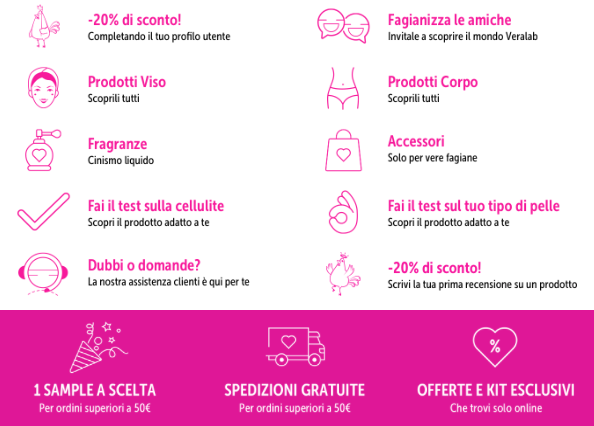
- Estetista Cinica: UX copywriting is one of the most effective ways to make your audience feel part of the community. An excellent example of this is Estetista Cinia, a personal brand that then became a company – VeraLab – and achieved fame with its direct, human and personal language. For example, in its various communication channels it calls its customers fagiane, or ‘pheasants’ and often uses this distinctive name to make its copy stand out, for example in its newsletter.

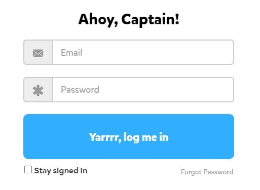
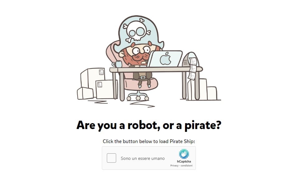
- Pirate Ship: what’s so special about a company that offers a service designed to lower shipping costs? Answer: it’s personality, which is clear across its website. From the anti-bot security page to the buttons on the login form, everything makes you feel…erm…part of the crew 🙂


- Troppotogo: even legal or informative text, which is generally considered boring and complex, can become a way to improve the user experience. This is what Troppotogo has achieved by deciding to invest time and creativity into personalising its cookie banners, surprising its customers by turning something boring into fun and engaging content.

In conclusion, when writing for the digital world you should pay attention to the very smallest details, as they can create a valuable experience that can transform your business. This is vital if you want to build a strong relationship with customers and make them fall in love with your brand.


