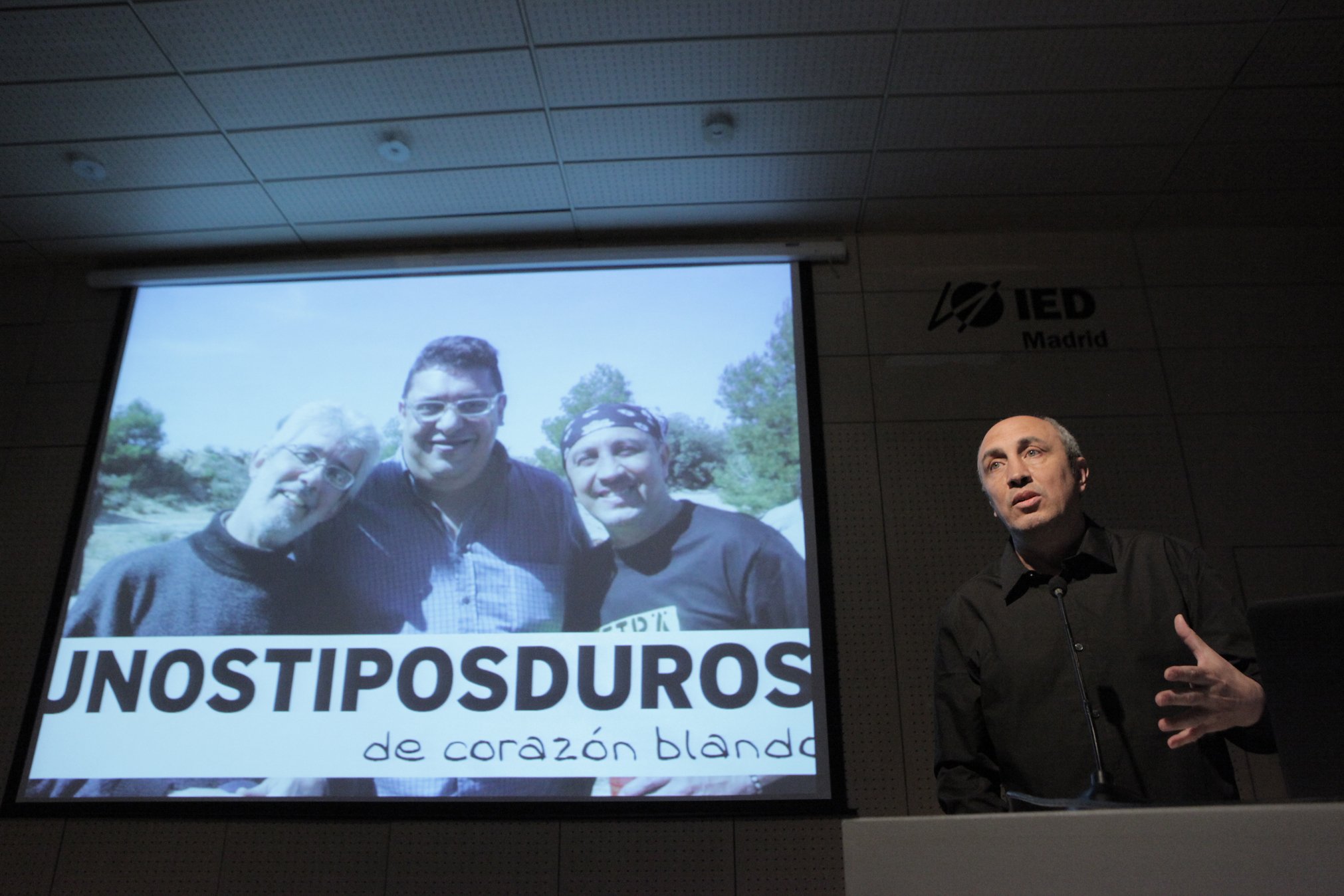
If there’s one person who knows about typography in the Spanish-speaking world, it’s José Ramón Panela. He is a graphic designer, typographer, researcher and co-founder of the Unos Tipos Duros website, a leading source for any designer wanting to keep up to date with the thrilling world of typography. He has also written about typography, its history, and its application in publications like Étapes, Visual, Iconográphic and Gràffica, and collaborates regularly with publishers like Gustavo Gili and Taschen. And if we also consider that he’s a member of the International Typography Congress Scientific Committee in Spain and the Printing Historical Society, then it’s clear that he’s a true expert in his field. Today we talk to José Ramón about letterpress, about the value of typography and the role it currently plays in society, and of course, about his love of characters.
José Ramón Penela is a tough, restless person, the kind who never stops. In fact, as he answers our questions, he’s in Santo Domingo, where he’s speaking at the SantoTipo event. His relationship with typography began years ago when he undertook a Masters in Editorial Design for professional reasons. “I soon found myself with an amazing tool, especially at that time, around the year 2000, when there was very little Spanish-language content online on typography,” he explains. “Passion and interest led me to create Unos Tipos Duros”.

Since then, this small-scale project, which was essentially a means of personal expression with limited content, has evolved into a set of resources placed at the disposal both of the educational community and of anyone interested professionally or personally in typography. And now, Unos Tipos Duros (UTD) is the foremost source of information and training in typography in the Spanish-speaking world. Something which was unimaginable at the outset.
José Ramón Penela works alongside Pep Patau (partner and co-founder of their UTD venture) to publish the website’s main content and to answer readers’ questions (of which there are many).
One of the concerns of many designers is that their work is undervalued. We wonder how typography, as a design discipline, is affected, and we ask our expert the question. Does typography need to prove its worth as a discipline within the design world? His view is clear: “I don’t think so. Typography without design is just shapes.” And he adds: “It’s an essential part of communication.” Another issue relates to what happens with the general public; to what extent are ordinary people aware of how typography permeates the various aspects of their lives. In this sense, for Penela, “people are aware that letters convey concepts and ideas, and in turn they’re part of the everyday landscape. But most probably don’t stop to reflect on how typography is adapted to the message, because it’s everywhere.”

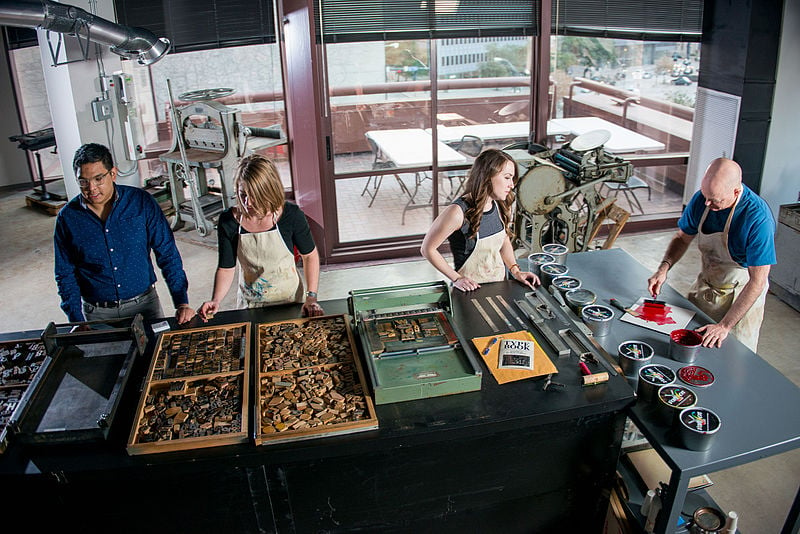
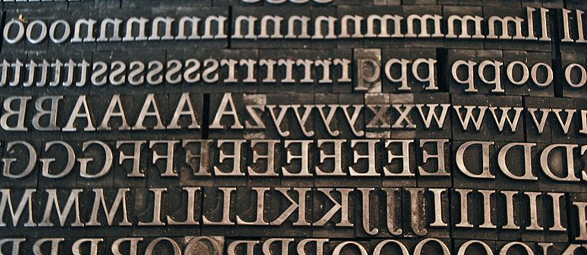
This takes nothing away from the fact that we’re currently experiencing a typographical boom that spans two apparently conflicting worlds. On the one hand, digital typography, which opens up endless possibilities. And on the other, there is a need to revive and reinvigorate artisan techniques, the letterpress and lead typesetting. As J.R. Penela tells us, the coexistence of the two worlds happens naturally, with no conflict, because “they’re two parallel phenomena,” he says. And he goes on to explain: “The revival of the letterpress stems from a widespread tendency to look to the past, to nature, trying to reclaim a different kind of relationship with our environment. When a technology becomes obsolete, it becomes a craft, and that’s what has happened with the letterpress, which has become a means of artistic expression.”
As for digital typography and the new possibilities it creates, a few months ago we learned of the case of IBM, which will save a million dollars a year with the development of its new typeface, IBM Plex. Our question is, do typeface designers normally address aspects such as economy of resources or ethics in the design of a font? Or does the aesthetic aspect usually take precedence? Panela is in no doubt: “A good typeface designer must take into account all the variables of a typeface design project. This means both technical requirements and aesthetic or formal ones. In some cases, one element will be more important than another, of course. I think responsibility and ethics, in any creative and communication project, are something that must be emphasised.”
Equally, there are some big companies (IBM, Samsung…) that have invested in their own typefaces. “A typeface is an important part of a company’s corporate identity. In this sense, having one’s own, exclusive voice is a good investment for a company,” he explains. “Which is why I think it’s a good idea to have one’s own typeface. But if it’s a small business, we should be clear about the expectations that we can have.”
In a few minutes’ time, José Ramón Penela will begin an event at the Santo Domingo Cultural Centre as part of the SantoTipo Typographical Week. We end the interview still wanting to ask more. Anyone interested in experiencing his passion for typography and its history and application should visit the website: Unos Tipos Duros.

