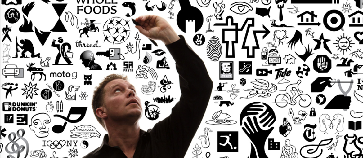
Icons have become such a ubiquitous way of life for most of us, that we don’t often think about them. And the point is, we shouldn’t, unless they misguide us or leave us confused. In Felix Sockwell’s new book, Thinking in Icons, he walks readers through the process of designing icons and the subtle nuances that can make or break the design.
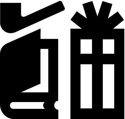
“Icons affect our daily lives, similar to typography. It’s something we don’t take much notice of until it’s wrong,” Sockwell says. “For instance, in Penn Station—a place where millions of commuters pass through—there’s an icon in the main hall that denotes ‘gift shops,’ showing a pipe, a gift (with ribbon), and a book. It makes no sense to most people. And no one sells pipes–you can’t even smoke outside in many New York City public spaces–but that icon has been there forever, and it probably always will be. I find strange pleasure pointing out odd things like this to people. It’s one of the reasons I’m no longer married.”

He’s also fascinated by the evolution of some icons, such as the “share” icon. “It started out clunky, within a box and with rounded edges. Now it’s a 3D arrow, and it’s quite effective,” he notes. “A lot of mistakes turn into good, useable icons. My book is an honest conversation about how icons are used, designed, conceived and understood. Designing icons isn’t a sexy or even known practice within the profession. Most designers take it upon themselves to either use an old system or tweak things to feel new or proprietary. I’m more interested in the bigger steps and mistakes that lead to workable solutions.”
And he shares it all in the book, admitting in the introduction, “Ninety percent of the work shown within these pages is completely fake—drawn up in the sidebars of actual assignments. Some of them are redrafted explorations, staged buffoonery cloaked in optimism.” Even so, you get a front row seat into the thought process, and the many considerations that go into a simple mark.
Here, we look at two projects featured in the book:
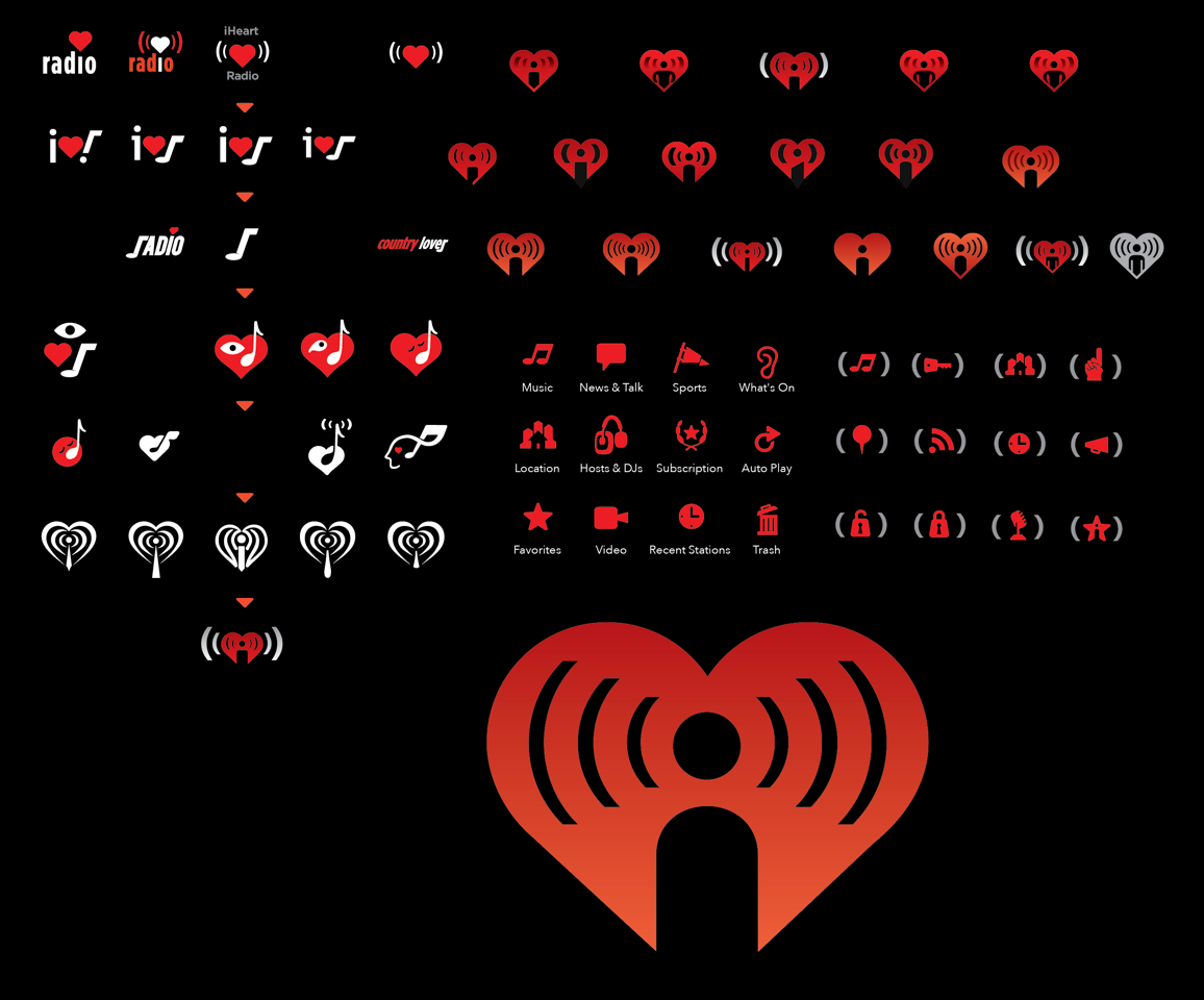
For this assignment, Sockwell was asked to literally interpret the name using a heart, a person, and a radio. Sounds easy, right? Well, not so fast. He sketched out several iterations, using variations of the theme trying to distill it. Words were initially introduced, then dropped and replaced with cryptic visuals. Parts and pieces moved until he hit the right note. Then it was a matter of tweaking the final concept until it hit the sweet spot. “Josh and I work well together—and fast. He knows how illustrators work having spent years in editorial. For the brand to sit firmly, we needed a hook that stood out from Sirius XM Radio—that is, no rounded corners or mono weighted lines. When Josh left, the incoming creative director took what we did and made it like the rest: mono weighted and bubbly trendy. Which is fine had the type been Arial Bold Rounded. But we had a crisp face and wanted the mark to reflect that,” Sockwell explains. “Ce La Vie. It’s still the same, basically, but those little tweaks ripple through the air like imperfect notes. Change one, you have to rethink it holistically.”
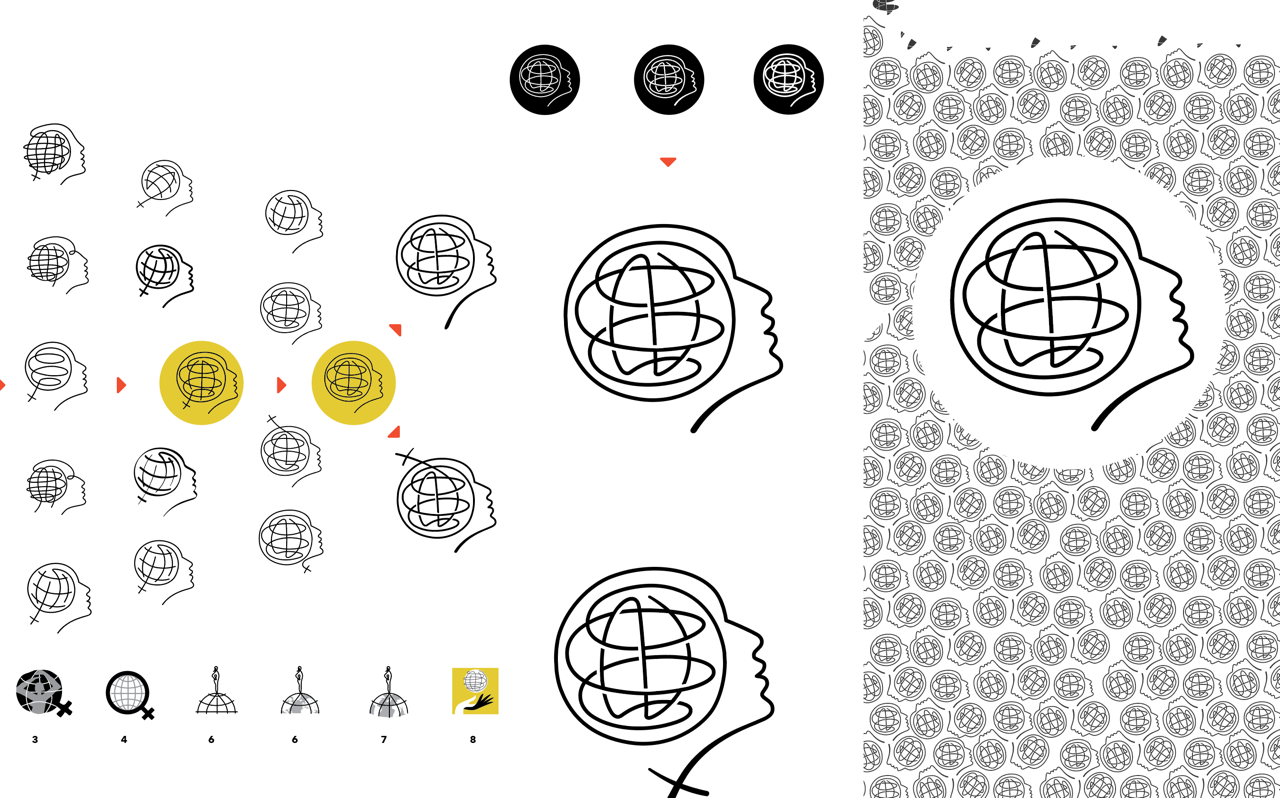
Editorial icons have their own set of challenges, in that they have to quickly communicate a theme or topic to engage readers. Let’s face it, many people don’t actually read any longer—they skim. A good icon will stop them in their tracks. The International Herald Tribune hired Sockwell to create an icon for a year-long series about women in the early 21st century. His initial explorations contained female figures and globes. Through some refinements, he landed on a solution that integrated both ideas, but determining the number of lines and stroke width were more challenging. It’s the little details, like this, that factor into the readability—especially with a small, editorial icon.
To see these and many more icon designs, pick up a copy of Sockwell’s new book. It’s loaded with ideas and inspiration for any design project.

