
Table of Contents
One of the world’s most read daily newspapers, The Guardian is a leading progressive voice and a pioneer in using graphic design to help readers better understand the news.

From its founding over a century ago as “The Manchester Guardian” until the late eighties, The Guardian had taken a conventional approach to graphic design. That all changed in 1988 when the paper was relaunched with a fresh new look by designer David Hillman.
Ever since, The Guardian has steadily built a reputation as an authoritative source of news and trailblazer in newspaper design. Today, it ranks among the top ten English-language new websites in the world.

The evolution from broadsheet to tabloid format
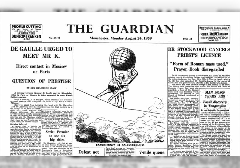
Like most storied newspapers, The Guardian has evolved over the years. In the noughties, as the crisis in print media began to bite, it switched from broadsheet to Berliner, a format slightly larger than a traditional tabloid. The smaller size saved on newsprint, but required the paper to undergo a fundamental redesign to fit the new format.
In 2018, the paper downsized again, this time to tabloid format. It was a brave but necessary choice: over the years, the layout had become cluttered, and The Guardian had lost some of the clarity and readability that were its hallmark.

(Image from editorial-design.com)
The Mark Porter era
The man behind the modern incarnation of The Guardian was Mark Porter, who for ten years served as the title’s creative director. Today, he heads his own editorial design agency, Mark Porter Associates (which counts The New Statesman, Wired UK, Nature, Domus and The Sunday Times among its clients), but the design system he put in place at The Guardian still lives on.
In 2003, Porter launched a radical redesign that brought The Guardian into the 21st century and raised the bar for editorial design. The result was a cleaner, more orderly and more precise look. Pages were easier to read thanks to bespoke fonts; the use of space was optimised without the paper becoming cluttered; and browsing pages was a breeze. The project earned The Guardian the prestigious best-designed newspaper award from the Society for News Design in 2006.*


The Guardian has made outstanding graphic design its hallmark. It has undertaken few makeovers in its lifetime, but when it has, they have always been motivated by a desire to improve readability or make the most of a new technology; it has never been about following the latest trend.
And having a strong team of designers has ensured visual coherence, which has paid off in terms of reader satisfaction and industry recognition.
It’s is striking how graphic design for digital versions of the paper is always consistent and coherent with the print edition, delivering the same readability and tidiness, regardless of the medium.

Managing complex pages
A key feature of The Guardian’s visual identity, and something its designer’s pride themselves on pulling off, is complex page layouts. At first glance, the paper appears to have a classic five-column gird; but look closer and you’ll notice how this grid is modified and adapted to insert captions, standfirsts, callouts, boxes and images.
This type of non-standard layout requires sure-footed direction to prevent it from becoming inflexible or incoherent over time.

In an interview with the Design Museum, the creative director and lead designer for the 2018 tabloid refresh, Alex Breuer, explained that: “a newspaper remains the most easily readable, manageable and navigable experience for narrative literary and visual journalism.” That new format brought clear cost savings, but above all quadrupled sales and subscriptions in the space of a week.

Designing outside of the box
With its experimental design choices, The Guardian has blazed a trail forward-thinking newspapers around the world.
Ever since its daring redesign in 1988, The Guardian’s masthead has been anything but conventional: first it was written in two different fonts, with “The” in italics and “Guardian” in bold roman type, and positioned to the right, rather than centrally as tradition would dictate; then, in 2006 a blue background was added, and italics and bold were ditched, along with initial capitals for and spacing between words; finally, in 2018, initial capitals returned, along with bold black type, while the “The” was moved to the line above “Guardian”, nestling between the “u” and the “d”.

Another signature design element – and one that’s been widely copied – is the highlighting of certain headlines in yellow, marker-pen style. It’s an impactful alternative to, say, placing a headline in a box.

And we would be remiss not to mention what is arguably the most iconic aspect of The Guardian’s visual identity: its bespoke typeface, muscular and modern.


Art and photography
Complementing the sophisticated layout and well-designed font is a judicious use of photographs and illustrations. Photos take centre stage while illustrationsare inventive and distinctive. This year, the design team even created handmade collages for the paper’s coverage of the UK general election. Reminiscent of Terry Gilliam’s work, the resulting art was irreverent, immediate and entertaining.
(You can find out more here https://www.itsnicethat.com/features/the-guardian-election-editorial-graphic-design-illustration-spotlight-140624)


An influential visual identity
The Guardian has hugely influenced international newspaper design in the past 20 years by blending functionality and aesthetics to make the news more accessible and understandable.
Never intrusive or ostentatious, the British daily’s graphic design is modern and authoritative, giving readers a meticulously crafted design experience on every page.
The Guardian has shown how thoughtful graphic design can not only improve a newspaper’s readability, but also strengthen its identity, authority and, ultimately, reader loyalty.

Sources:
https://type.today/en/journal/guardian
https://www.theguardian.com/gnm-archive/2005/aug/19/1
https://www.theguardian.com/gnm-archive/2002/jun/06/1
https://markporter.com/work/the-guardian
https://editorial-design.com/the-guardian-with-a-new-design-in-print-web-and-app
Data sources:
https://en.wikipedia.org/wiki/Mark_Porter_(designer)
** Data from the Design Council UK
https://www.designcouncil.org.uk/our-resources/archive/reports-resources/design-economy-2018-guardian/