Table of Contents
To keep you company, we’ve chosen works by five leading illustrators from Italy and further afield: Emiliano Ponzi, Olimpia Zagnoli, Agostino Iacurci, Yoko Honda and Annu Kilpeläinen. We looked through their most beautiful drawings and selected those that best depict summer: the ideal way to introduce you to their work and satisfy your holiday cravings at the same time!
Emiliano Ponzi: less is more
Emiliano Ponzi is considered one of the most talented Italian illustrators of his generation. He lives in Milan, but his illustrations have appeared across the globe in adverts for Armani, Bulgari, Gucci, Martini, TIM, Pirelli, Ferrari, Louis Vuitton, Hyundai and Cartier. His work has also featured in The New York Times, La Repubblica, Le Monde, The New Yorker and Der Spiegel, and on Penguin Books covers.
His drawings are highly conceptual, and stem from loose associations that he then turns into images. These images tease viewers, encouraging them to delve deeper and fathom the hidden meanings in his work. His highly geometric compositions seem to be created by gradually removing anything superfluous: the power of Ponzi’s illustrations lies in the way he manages to get an immediate, strong and clear message across in just a few pen strokes.
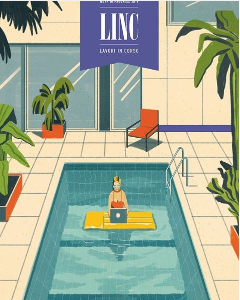
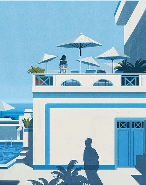
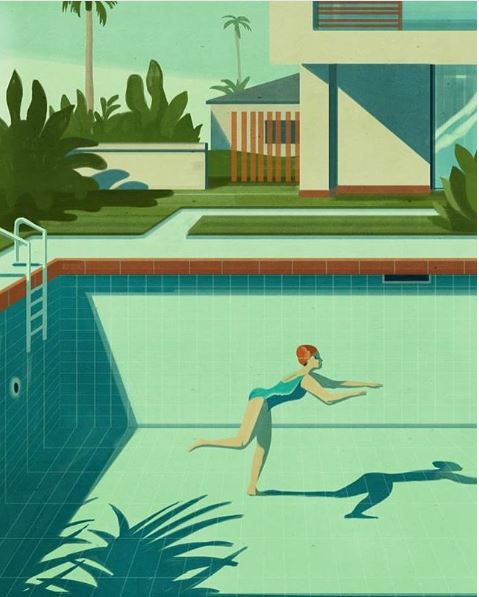
These three illustrations show scenes of everyday life in sunny, calm and silent environments.
Olimpia Zagnoli’s pop art
“She thinks fast, draws faster, and eats spaghetti like a lady”: that’s how one person described eccentric Italian illustrator Olimpia Zagnoli. Her illustrations, as well as appearing on the covers of Italian publisher Feltrinelli’s new editions of Henry Miller’s books, can be seen in The New York Times, The New Yorker, The Washington Post, La Repubblica and The Boston Globe. She has also created advertising campaigns for Clinique and visionary scenes from the Wizard of Oz for Rockport.
She has a unique pop style: her compositions are extremely minimalist, with soft lines and solid blocks of bright, vibrant colours. She recently discussed her use of colour in an interview in the Corriere della Sera newspaper, explaining how she likes to push established boundaries with her quirky, distinctive combinations of hues.
How were colours chosen?
“Initially, I was pretty scared about using colour, even though my design inspirations, mostly falling between the 50s and 70s, were quite colourful, as were the artists and illustrators that I loved: Matisse, Picasso, Paul Rand, Bruno Munari. Then I don’t know what happened but at a certain point I lost some of my inhibitions and began to dare, timidly. Now everything comes more easily and I have fun pushing the limits of colour use: I create combinations that clash somewhat but actually add another level of interpretation to the image. Yellow and brown reminded me of a grandmother’s doilies; I struggled to put them together. Now I use them naturally, like pink with red or blue and black, which was always taboo in clothing. Risk is ever-present because in the printing phase everything changes: a magnificent purple can become drab aubergine, but I think that sometimes it’s useful not to have complete control over what you’re doing.”
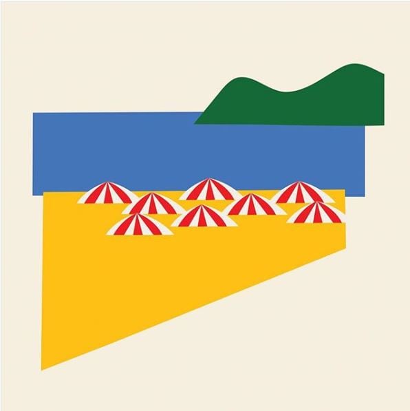
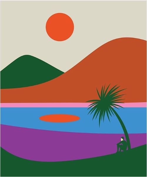
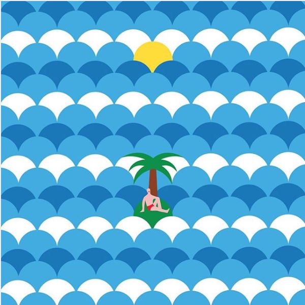
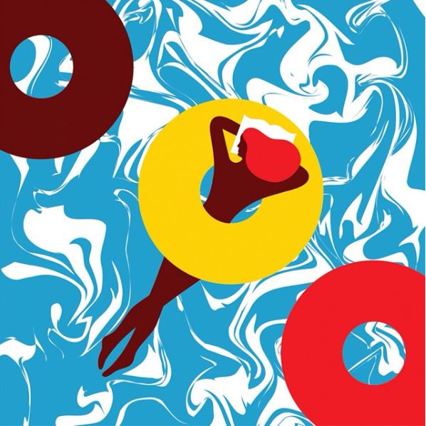
But now we’ll let her vivid illustrations do the talking. We’ve chosen the most summery images from Olimpia’s Instagram account for you.
Yoko Honda’s Barbie world
Yoko Honda is a self-taught illustrator from Tokyo, Japan. She began her career by uploading images of her graffiti to Instagram and Pinterest. Then, in 2013, her collaboration with the fashion brand Afends cemented her success, and she became one of the most famous Japanese pop artists.
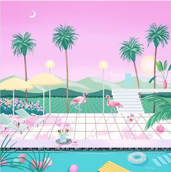
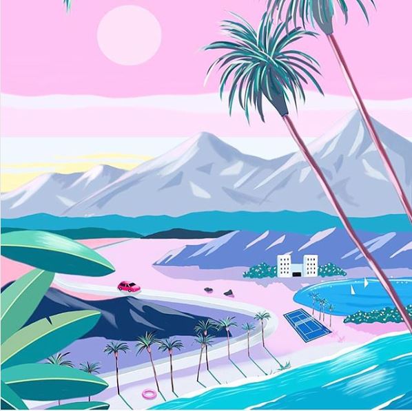
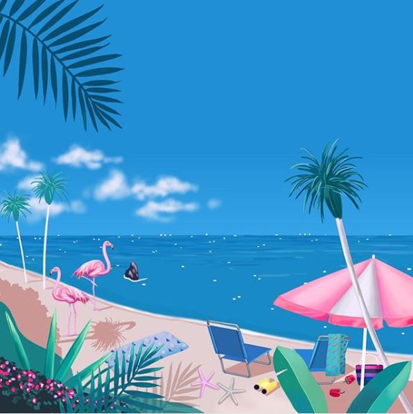
Her illustrations plunder the aesthetics of the 1980s, examining the brightly coloured, eccentric world of America in that period, and particularly the artist’s dream locations: Florida and California. Yoko Honda’s illustrations draw us into a plastic world that celebrates excess and frivolity, where everything has a fluorescent pink hue: the sky, swimming pools, convertibles, beach houses, palm trees, flamingos and the sea. Welcome to Yoko Honda’s Barbie universe.

Agostino Iacurci’s giant swimmers
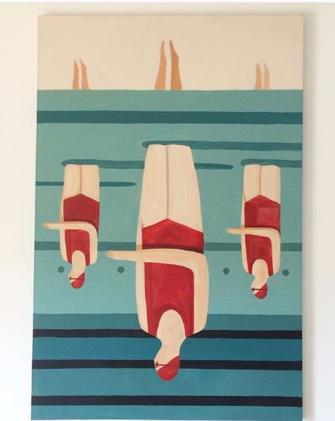
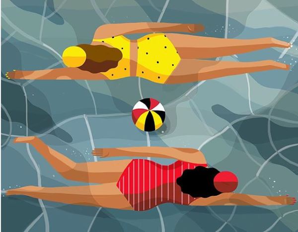
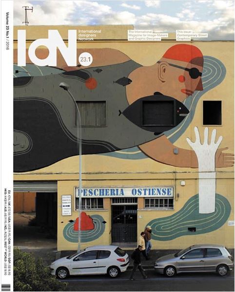
Agostino Iacurci is a man of many talents: he is an illustrator, painter, sculptor, engraver and street artist. He is Italian, but lives in Berlin and works all over the world. His huge figures dominate the walls of blocks of flats in Rome, skyscrapers in Taipei, apartment buildings in Moscow, Paris and Atlanta and the walls of Govind Puri metro station in Delhi. His illustrations on paper have also travelled to festivals and exhibitions in France, the USA, Korea, Japan and Taiwan.
His compositions are simple and effective, dominated by large, stylised figures, with a geometric, rounded design and bright colours. One of the subjects he returns to most frequently is swimmers.
Annu Kilpeläinen’s America
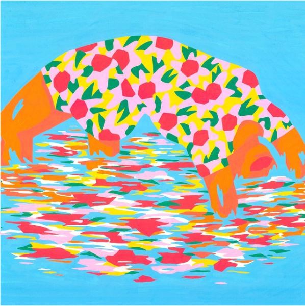
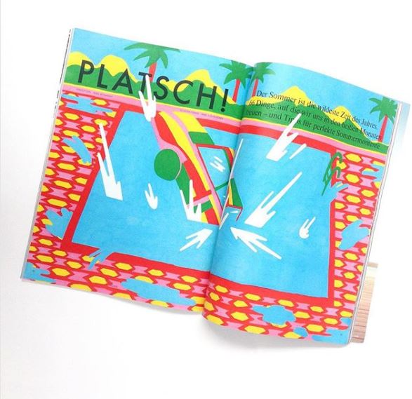
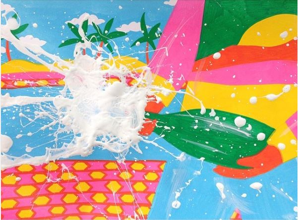
Judging by her illustrations, with their tropical landscapes, pink flamingos, flowers and sun-kissed swimming pools, it is hard to believe that Annu Kilpeläinen grew up in rugged Finland with its harsh, frozen winters. Her illustrations clearly reveal her self-declared fascination for anything exotic. The artist’s sunny landscapes with bright green palms and intense blue skies are drawn with America in mind, her recollection of travelling to America for the first time as a child to visit her grandmother’s sister. At the time, she was struck by the colours of the landscapes and the women with gaudy lipstick and sparkling jewellery.
In her artworks, both space and people are covered with vibrant patterns, in a mix of bold, bright colours. Here’s a snapshot of her America.
On behalf of everyone at Pixartprinting, we hope you have a good summer!
Meta description:

