Table of Contents
Spring in colour analysis: characteristics and recommended palettes
Like all seasons in colour analysis, Spring identifies people who share the same physical features, such as the colour of their skin, eyes and complexion. Today, we’ll be taking a closer look at the main characteristics of Spring and the shades that suit people who fall into its various subgroups.
Spring in colour analysis: key characteristics
People who belong to this colour analysis season have a complexion with a warm undertone, a light value and high contrast between complexion, eyes and hair. In Spring types, colours are bright and vivid, just like those found in nature at that time of year:
- Eyes: blue, green, amber.
- Hair: red, golden blonde, light brown.
- Complexion: fair with warm a undertone, tends to tan easily, turning golden.
When the characteristics above – warm undertone, light value, high intensity and contrast – are balanced in a person, they are said to be “True Spring“. Otherwise, they fall into one of three Spring subgroups.

Light Spring
When someone has a very light complexion with a good level of intensity and contrast, they belong to the Light Spring subgroup. Charlize Theron, Margot Robbie, Cameron Diaz, Cate Blanchett and Chiara Ferragni are perfect examples of Light Spring types.
Warm Spring
The Warm Spring subgroup is characterised by a warm undertone that’s similar to Warm Autumn, and features a colour mix that includes rosy skin and light green or blue eyes, with golden highlights. Hair can be copper blonde or light red. Emma Stone, Amy Adams, Emily Blunt, Miriam Leone and Nicole Kidman are some notable members of this group.

Bright Spring
When someone displays high intensity and the contrast between their different physical traits brings out the brightness of their eyes and hair, they belong to the Bright Spring subgroup, the variant most similar to Winter in colour analysis. Adriana Lima and Angelina Jolie are textbook examples of the Bright Spring type.
Recommended palettes for Spring
Which colours suit people who fall into this colour season? The most flattering shades are warm and bright, bringing to mind nature’s awakening after a long winter: gold, golden brown, peach pink or coral, turquoise, green (mint, apple or meadow), orange, daffodil yellow, cyclamen purple and geranium red. The Spring palette in colour analysis also encompasses more neutral shades like camel and cream. On the other hand, black and colours that are pale and cold, like sky blue or grey, should generally be avoided. Now let’s see which shades really bring out the best of each subcategory.
For Light Spring types, the recommended colours for clothes and make-up are gold, peach pink and turquoise, as well as pastel shades like sea green and light yellow. Those belonging to the Warm Spring subgroup should opt for warm and bright colours like coral, salmon pink, gold and bronze but softened with neutral tones of beige. Lastly, the palette suggested for Bright Spring types consists of brighter shades like orange, baby pink, sun yellow, lime green and bright purple.
Colour analysis in interior design
As we touched on in our article “How colour analysis is conquering fashion, politics and society”, professionals in fashion and beauty use colour analysis to recommend the clothes, accessories and make-up likely to bring out the best of a person’s physical features. Colour analysis can also be applied to the world of interior design to use seasonal palettes to decorate homes or workplaces.
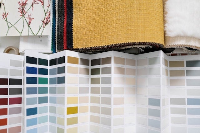
Decorating a house in the seasonal palette that best suits the people that live there can help them to feel more comfortable, making the home feel like an extension of themselves. By using the same palette when picking furniture, fabrics and other accessories, you can create harmonious and welcoming spaces, enhanced with perfectly balanced colour patterns. Now let’s see how to decorate a home from scratch based on the principles of colour analysis.

Choice of palette
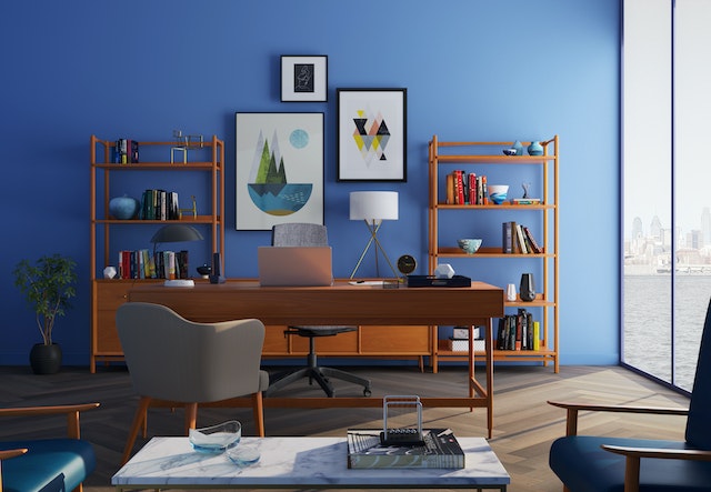
First of all, you need to decide whether you’re going to use a single colour scheme throughout the home, or pick a different one for each part of the house. If the latter is the case, by combining the rules of colour analysis with concepts from colour psychology, you can give each room a “function” based on the palette chosen. As Autumn and Spring tend to have warmer shades and Summer and Winter cooler ones, you could use the palettes most suited to each space. For example, a study with orange walls will stimulate creativity and positivity, while a bedroom with blue or green walls will be conducive to rest and relaxation.
At this stage, you have two options: you can pick the palette that best matches your client’s colour season, or you can choose the one that you prefer. Alternatively, you can take your cues from the existing finishes (for example, the colour of the parquet floor) or from something that the client has already chosen – a piece of furniture, a painting or the colour of the walls – to develop a palette for the room or whole house that works harmoniously with the existing colours.

Combining colours: rules of thumb
To create harmonious colour combinations, use the same palette and experiment with pairing complementary colours and references, for example, by choosing a cushion that matches the shade of wallpaper. Picking shades from the same palette will prevent clashes on the one hand, or a boring matchy-matchy effect on the other.
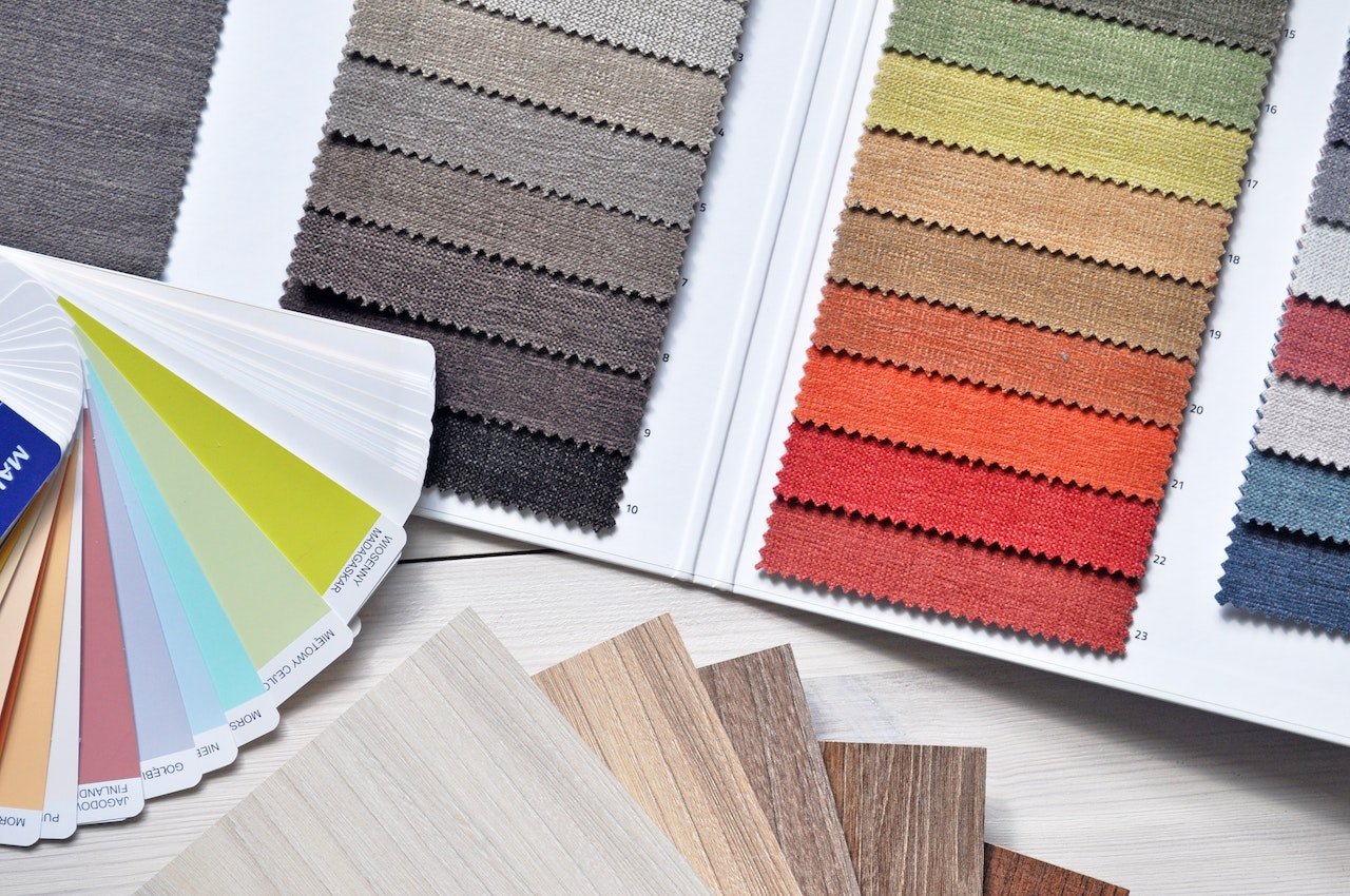
Pay close attention to brightness: levels of natural light in indoor spaces will affect colour performance and the end visual result. What’s more, using certain shades for the walls can help brighten up darker rooms. Once you’ve chosen the right colour scheme, you can start playing around with different combinations of colours, materials and fabrics for furniture, finishes and accessories.
How to decorate a home in Spring colours
As we discussed earlier, the Spring palette in colour analysis consists of warm and bright shades that run from bold tones of blue to different hues of pink, red, orange and green. Black and cold tones, like grey and baby blue, are to be avoided.

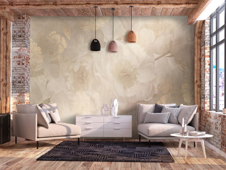
A home decorated in this colour season will feature bold and bright colours offset by more neutral and relaxing shades like beige and cream. Pairing this palette with flooring and furniture made from warm hues of wood – natural oak, teak or afzelia – and terracotta accessories will bring out Spring’s vivid tones. Indeed, there’s nothing better than flowery wallpaper to celebrate the most colourful season of the year.

That wraps up today’s article on the Spring palette, but keep an eye on our blog: in the last article in this series on colour analysis, we’ll be talking about Summer!

