Will I get noticed more if I print or if I don’t print?
That’s the dilemma that at the heart of today’s #Printstory.
Federico is a true creative: he loves illustrations and boardgames, and he’s in his element in both these worlds.
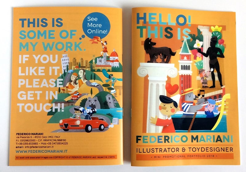
Eager to expand his client base, Federico needed examples of his work in a practical and attractive format that he could easily carry with him.
So he decided to channel his creativity into creating portfolios he could use to showcase his illustration skills and style.
Needless to say, with the help of our printing services, this was a piece of cake.
Printed in a compact, easy-to-carry format, his customised portfolios now go everywhere he goes,
effortlessly demonstrating his vision, imagination and ability.
Whether it’s at a trade fair, in the office or on the move,
Federico’s art now can now be seen print in all its glory, rather than just on a screen.
Want to learn more about Federico and his creations?
Happy reading!

Who is Federico? Tell us a bit about yourself and what you do. Dreams, aspirations and talents. A short but faithful portrait!
My name is Federico Mariani, I was born in 1974 in Carpi, where I still live and work as an illustrator and toy designer. Drawing, comics and illustrated books have been my passion ever since I was in nursery school, so I’ve always known what I wanted to do. After many years working as a graphic designer and junior art director, I finally decided to focus on illustration for publishing and children. For over 15 years, I’ve been creating brightly coloured illustrations, mostly for children and educational materials. But what I enjoy most is creating games and toys, because that’s what I find most fun, and it’s this type of work that I’d like to do more of in future.

Before telling us about your idea, can you explain to our readers what you produced using our printing technology?
I mainly produced promotional materials to take with me to Bologna Children’s Book Fair, and to give or send to potential clients, such as stapled portfolio catalogues. Over the years, I’ve also made posters/calendars and Foamex creations for some of the shows that I’ve done.

Let’s rewind to the very beginning. Where did the idea for this project come from? Is there a particular story behind it?
When I was attending Reggio Emilia’s University of Design, I was struck by a design studio that would always give people comics and other promotional items at the end of a meeting. I thought it was a brilliant strategy and I did the same once I started my own business: I printed little promotional leaflets with my latest work.
Many of my illustrator or cartoonist colleagues were also creating printed sketch books, so I started doing the same.
As for the mini portfolios, I needed a practical tool that wasn’t an iPad or the enormous portfolios that I saw at trade fairs. I needed to be able to flick through it during meetings and leave it with potential clients. So I created a little portfolio catalogue with 20-24 pages in A5 format, which is a size that easily fits in a bag. What’s more, it being printed means that the client gets an idea of what my work looks like on paper.

Once you had found the right idea, you had to set a goal. What did you want to achieve with your idea? What was your objective?
Obviously, the main objective was to be “memorable”, for people to remember me, but it was also important for them to always have my illustration to hand once they got back to the office. Something else that’s very useful for this is the desk calendar, but because they need a specific format and graphic design, I had to use traditional printers.

How did you turn your project into reality? What were the design phases and how many were there? Tell us about the process that brought your idea to life and made it ready for printing.
1. The mock-up 2. Content creation 3. Layout
Much of the material was already in my archive. All I had to create the front and back cover and the internal graphics. The layout phase was the most difficult and time consuming. Sometimes, you don’t know how best to present the photos, whether it’s better to use landscape or portrait. My first portfolios were in landscape, but for the last one I had to use a landscape format, like an album (even though I don’t particularly like it) because several images were panoramic or square, so the layout suited them better.

How did you use print on demand to produce your work? Which materials did you choose and why?
Print on demand is cheaper but still gives very good quality. I used coated or demi-matt paper to bring out the colours of the portfolio. For poster calendars, however, I used an uncoated paper for a more vintage look.
You’ve finally got your printed products in your hands! In your case, printed mini-portfolios. How did you feel when you first flicked through them?
it’s always a really nice feeling to see your own work in print. Particularly the most recent stuff, because it’s really colourful. I’m very happy.

This is just the start! What other projects do you have up your sleeve? Can you share them with us?
I’d like to create little comics/fanzines for kids with illustrations to colour in as well as games and cartoons. At the moment, I’m designing some promotional items, stickers, greetings cards and boardgames like Memory® and dominoes. I really hope that soon you can print playing cards too: it would be really useful for me!

LINKS
Instagram: @federicomarianillustrator

