Table of Contents
Despite the digital onslaught, some paper magazines are standing firm. In the music industry, vinyl is making a comeback, with more and more people buying physical records to enjoy a deeper (in terms of sound) and “slower” listening experience, which offers emotions and feelings that digital versions lack.
Something similar is happening in the magazine world: while many titles lose sales (but not readers) to digital versions, some are managing to buck the trend, and even increase sales, thus setting an example to others in terms of production and promotion.
Among these are both mass-market magazines and niche, pretty much self-published zines that have a global circulation (albeit of only a few thousand copies).
The digital experience only stimulates two senses (for now): sight and hearing (when content is accompanied by video or music), and can’t compete with paper magazines when it comes to touch and smell. Taste isn’t generally considered to be one of the senses involved, unless you want to eat the pages…
So, with this in mind, publishers and designers have looked for ways of enhancing magazines to make them more appealing to senses other than sight: by using innovative printing techniques, embossing, finishes and more, they have made pages and covers that communicate haptically.
Although our list is short and includes a couple of magazines which are out of print or have changed direction over the years, the idea is that anyone can find a copy of one in a newsagent, at a flea market or at a relative’s house. You can then read, analyse and study it with a view to perhaps even designing your own magazine.
There’ll always be demand for things that you can touch, smell and flick through – it’s not just about reading and seeing.
Blessed are the magazines!
Binding
The first thing to note is that magazines which want to stand out from the crowd are perfect-bound rather than staple-bound. They look like books, not throwaway items, and often have a spine, so instead of languishing in magazine racks, they cry out to be kept on a bookshelf.
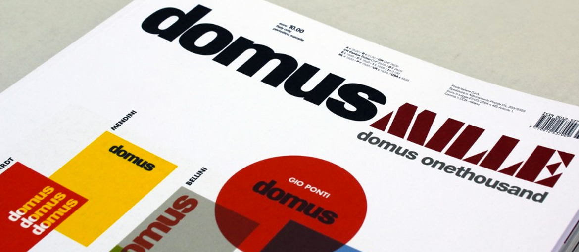
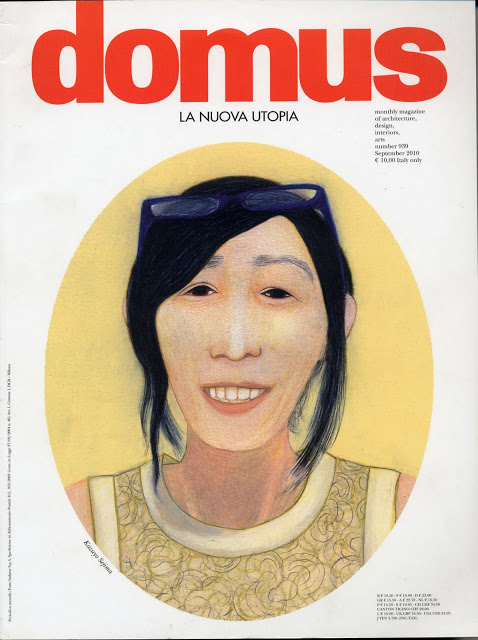
DOMUS
I know, it may seem obvious, but the Italian magazine founded by Gio Ponti in 1928 continues to influence not just architecture and industrial design, but the whole world of magazine publishing.
It’s 90 years old, has published over 1000 issues, is sold across the world and, above all, it has always maintained top-notch design and print quality, even collaborating with renowned graphic designers and illustrators in recent years (for example, the series of portrait covers created by Lorenzo Mattotti in 2010).
WIRED
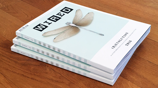
Still a leader when it comes to new printing techniques, dayglo finishes, embossing and much more.
Wired is about innovation and technology, something the magazine strongly emphasises through its graphic design and printing, employing ground-breaking layouts and making extensive use of infographics.
IL – Intelligence in lifestyle
IL is the men’s magazine by Italian business daily Il Sole 24 Ore. It’s not bundled with a copy of the daily paper but, in a bold yet successful move, it is sold separately.
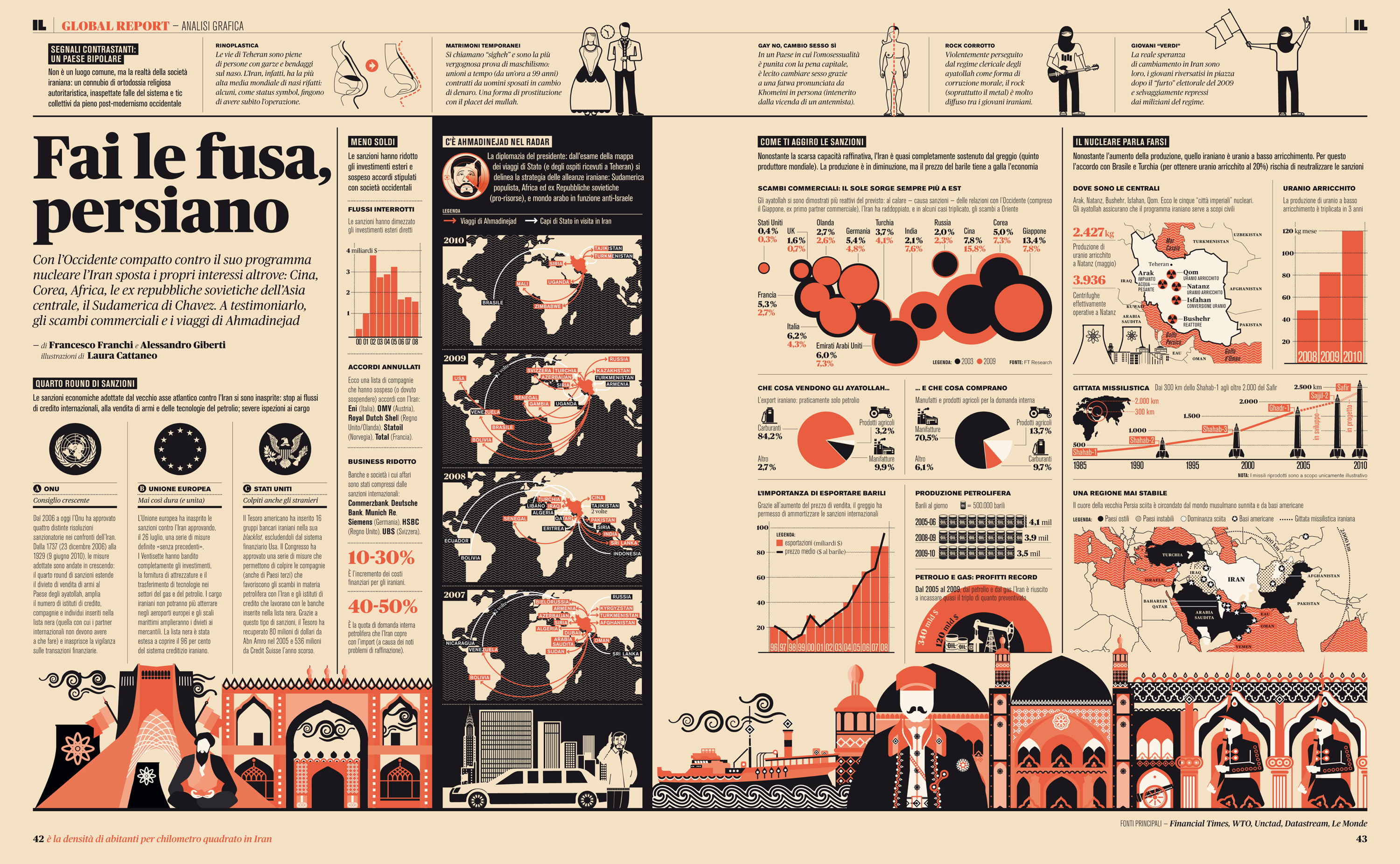
The magazine initially mirrored the elegant, slightly austere graphics of parent publication Il Sole, with its traditional newspaper design and Victorian overtones, but after Francesco Franchi took over as artistic director, it became the most recognised Italian magazine in the world: IL won multiple awards for both content and design, making Franchi a global star in graphic design.
While the large format, lamination and perfect binding gave the magazine heft, the artistic direction of Franchi made it a laboratory for effective and innovative experimentation in editorial design.
With IL, infographics found a special raison d’être, because everything can be described through the visualisation of data, even literature.
It’s worth looking at a few back issues and carefully studying their layout, use of fonts and colours (few and always with the same parchment-coloured background that gives them an old, premium-paper look), the balance of double-page spreads, and the way illustrations interact with grids and columns.
A masterclass.
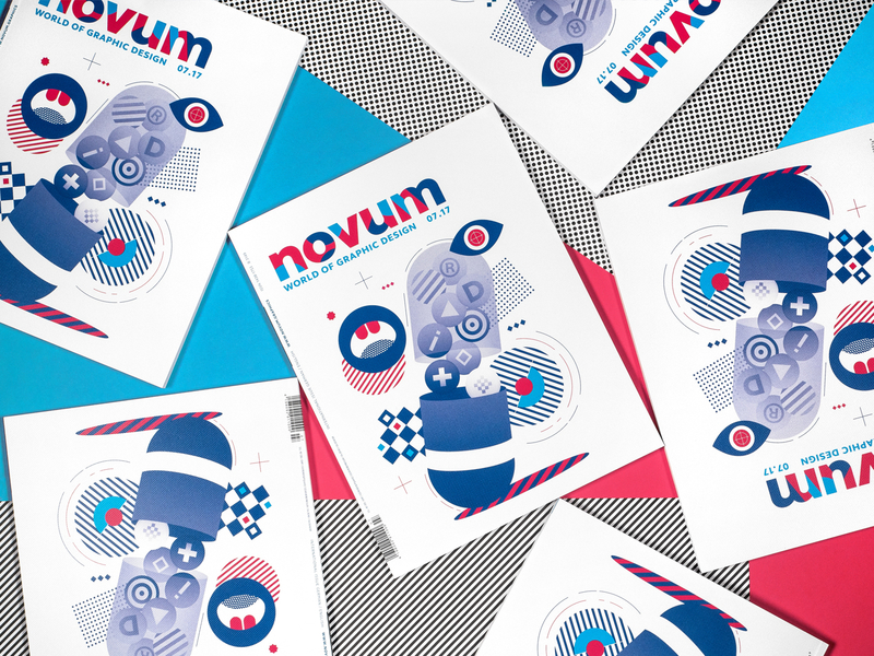
Novum
Another historic magazine, founded in 1924 at the height of the Bauhaus period in Germany, and which continues to thrive today. It looks at graphic design through themed issues, and unlike other magazines in the sector (Graphic, Progetto Grafico and Eye), it explores the latest trends in visual design, remaining enjoyable and compelling even when going in-depth.
It can be hard to get hold of outside of bookshops and major cities, but can be bought online.
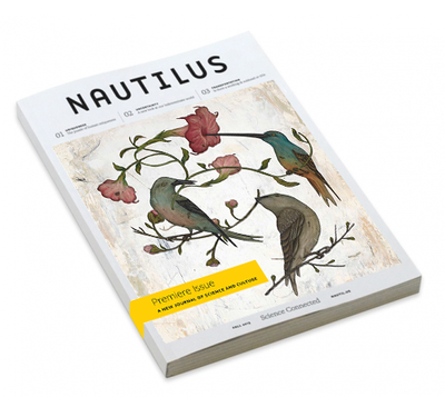
NAUTILUS
Our last example is one of the most beautiful magazines published in recent years, both in terms of content and graphic design. Nautilus is a science magazine that is expertly designed with spectacular use of illustration.
The magazine is sold in the United States, but just by following releases from the web, you can fully understand how a beautiful magazine with great content and stunning graphics can still sell tons of copies and build a devoted following.
To wrap up, if you want to keep abreast of the most beautiful magazines in the world, the Society of Publication Designers, America’s most important trade association for the sector, holds annual magazine awards. https://www.spd.org
Also check out MagPile https://magpile.com/, a community of sorts for magazine lovers where you can discover, buy and read any magazine you can think of from anywhere in the world!

