Table of Contents
“Men Are from Mars, Women Are from Venus”
So goes the title of the best-selling pop-psychology book, associating men with the god of war and women with the goddess of beauty to highlight their different genetic and character traits.
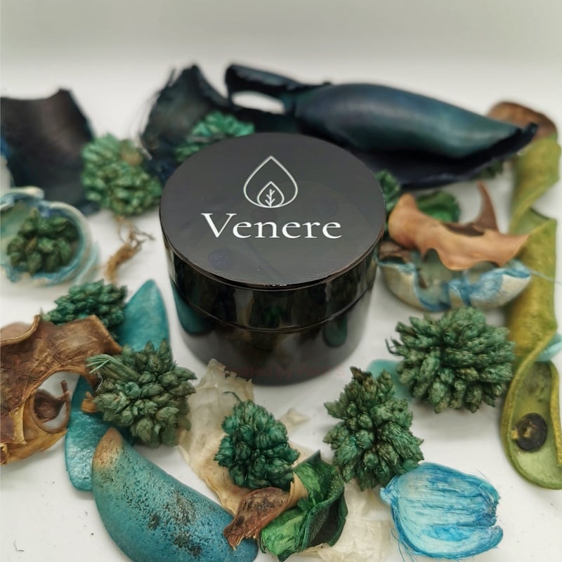
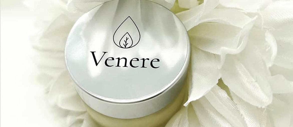
Perhaps that’s what inspired Roberta’s father when he suggested she name her beauty product brand “Venere”, the Italian for “Venus”.
Beauty products are created by a laboratory chemist who sources the finest ingredients and expertly crafts creams for every time of day.
But it’s not just the chemistry she’s mastered: Roberta Bionda also identified a target market, devised a product line, and created her own brand and logo.
A seemingly difficult time in her life quickly became a period of inspiration and creativity, leading her to channel the spirit Venus, the Roman god of beauty.
Who knows if, flattered to see her own name on the labels and packaging, Venus herself decided to sprinkle a bit of magic on Roberta’s products to present them in the best possible light.
Because beauty lies as much in form as it does substance.
And now we’re going to hear in Roberta’s own words how her entrepreneurial adventure began and was turned into reality thanks to the support of Pixartprinting.
Happy reading!
Who are you? Tell us a bit about yourself and what you do. Dreams, aspirations and talents. A short but faithful portrait!
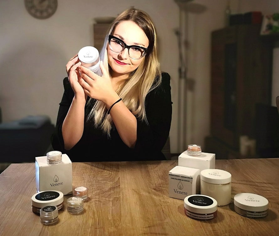
I’m Roberta, I’m 25 years old and I’m a laboratory chemist. I’ve created my own brand of natural cosmetics and I run my own business. Giving them an identity was nice and easy thanks to Pixartprinting’s attractive labels and boxes and the support of your graphic designers, whom I’d like to thank.
Before telling us about your idea, can you explain to our readers what you produced using our printing services?
My dream is to grow this business through hard work and dedication.
Thanks to Pixartprinting’s services, I was able to give my creations an identity by putting the brand’s logo on boxes and labels. It’s possible to customise the labels and choose from a range of colours, shapes and sizes, which is vital for a new line of cosmetics. What’s more, the support from graphic designers and the speed with which customer service gets in touch is amazing. So if you’re stuck with developing an idea or confused, Pixartprinting is great and will help by working ideas out together with you!
Let’s rewind to the very beginning. How did you get the idea for this project? Is there a particular story behind it?
The idea was born one day in February, when I picked up a little notebook and started jotting down a few notes on how to produce a homemade cream. They were dark days. My fixed-term contract had just ended and I had to think about putting myself back out there, but I thought to myself: why not try going it alone? Venere was born over the following months. I have my father to thank for the brand name. He gave me a great idea, just like that, while I was racking my brain for the most suitable moniker. I liked it immediately. As soon as it came out of his mouth, I knew what my brand would be called!
Once you had found the right idea, you had to set a goal. What did you want to achieve with your idea? What was your objective?
My goal was to put myself back out there. Sometimes life tests you. You can come out of difficult situations feeling resentful, or feeling grateful that some things worked out to leave you in a great place! In my heart, I’ve always believed in being thankful, even if things don’t seem to be going the way that you wanted or that everybody expected.
How did you turn your project into reality? What were the design phases and how many were there? Tell us about the process that brought your idea to life and made it ready for printing.
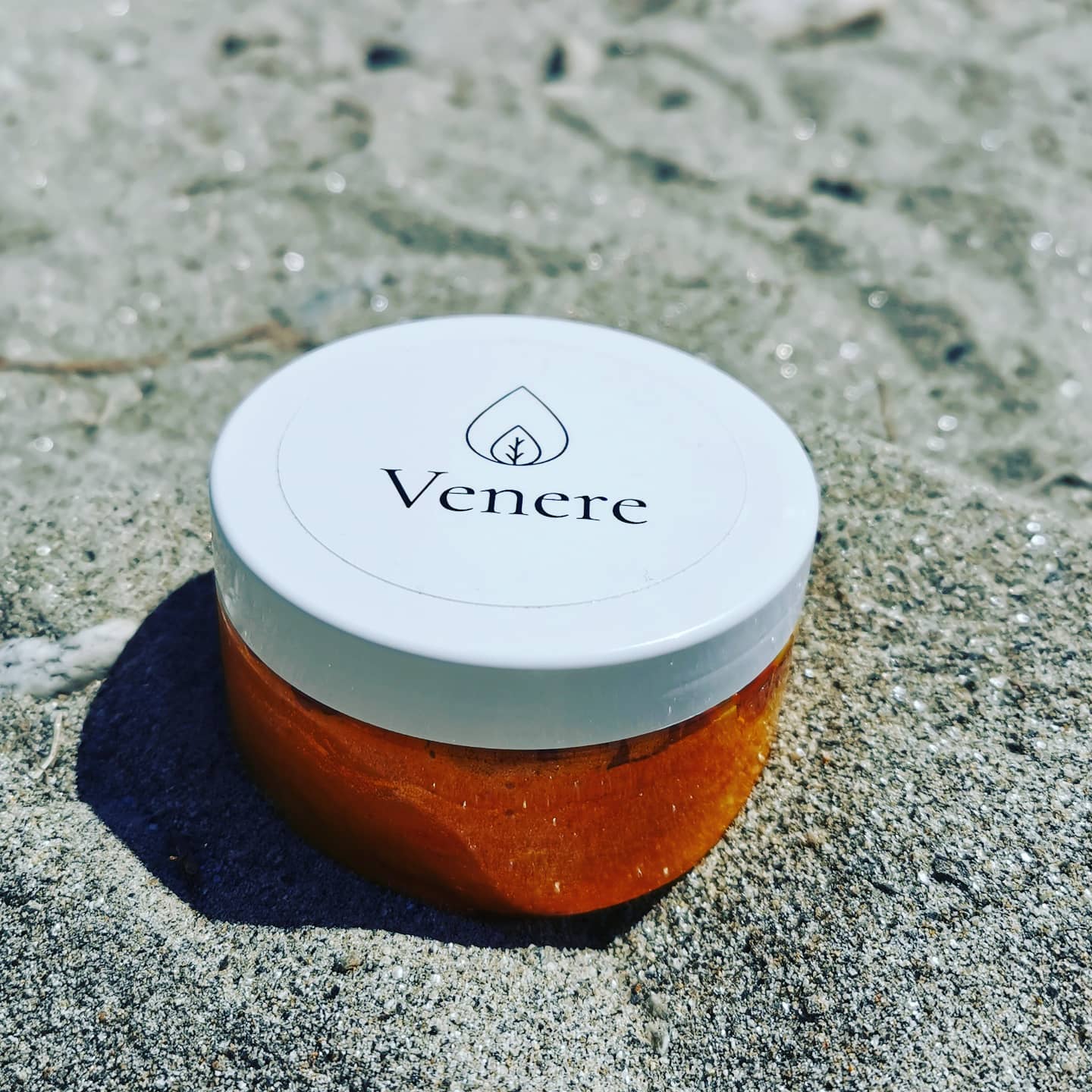
I started from the end, in other words, by making products to see what the target market could be for this type of business. The Venere project was broken down into various aspects. To tell the truth, being a chemist, the part I like most is the making, but obviously there’s more to it than that. Before launching the brand, I needed a logo that could be printed on boxes and labels. So I had to turn to a talented professional who I trusted: my graphic designer. She’s awesome; not only is she a great friend of mine, but I really think she’s gifted at what she does. She’s called Letizia Pesce and she’s from Ticino, like me. We worked together on the logo and she gave me a hand at the start when placing the first order of labels from Pixartprinting. I still remember the thrill of having my very own logo and stunning roll labels to stick on my precious products that I’d poured so much love and passion into.
How did you use print on demand to produce your work? Which materials did you choose and why?
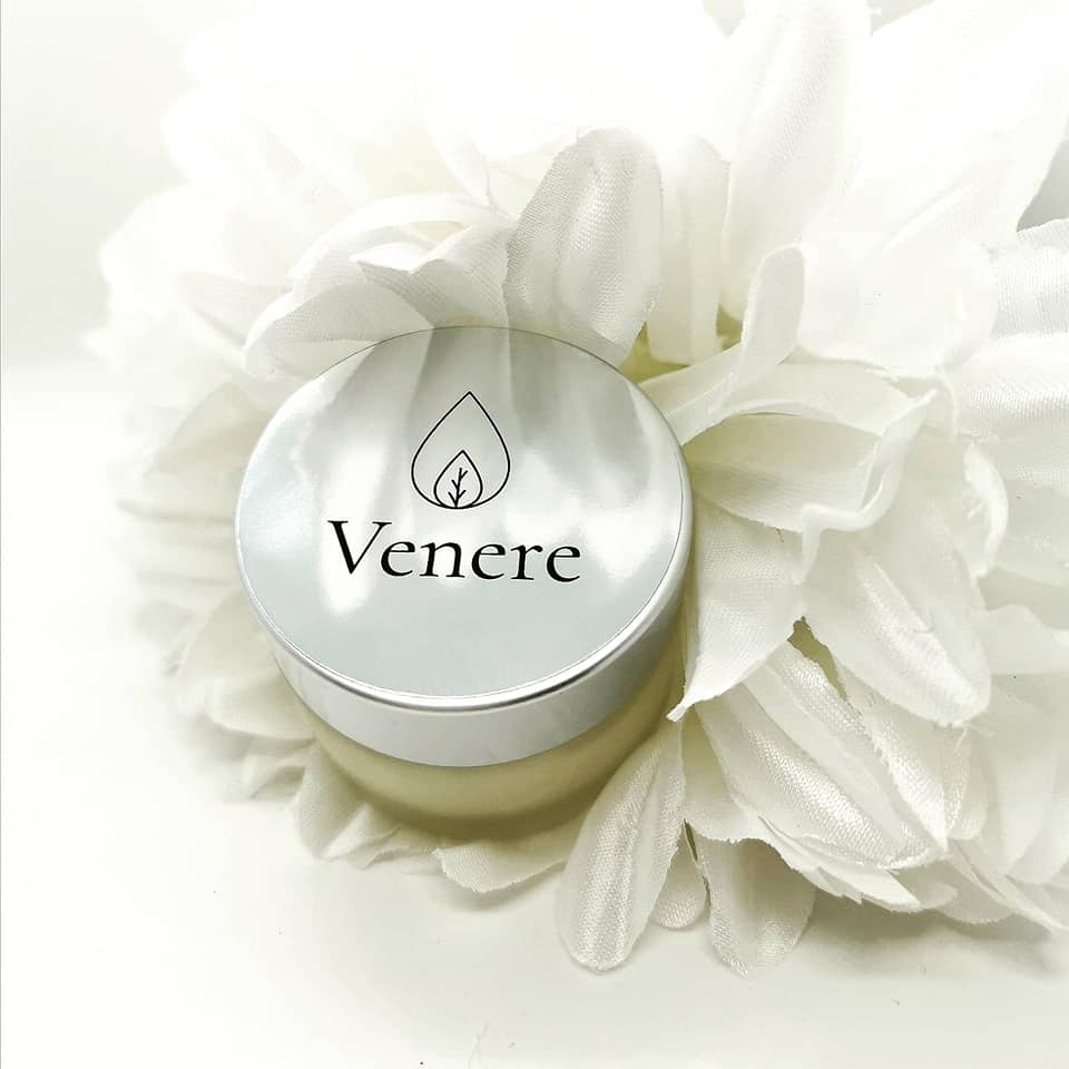
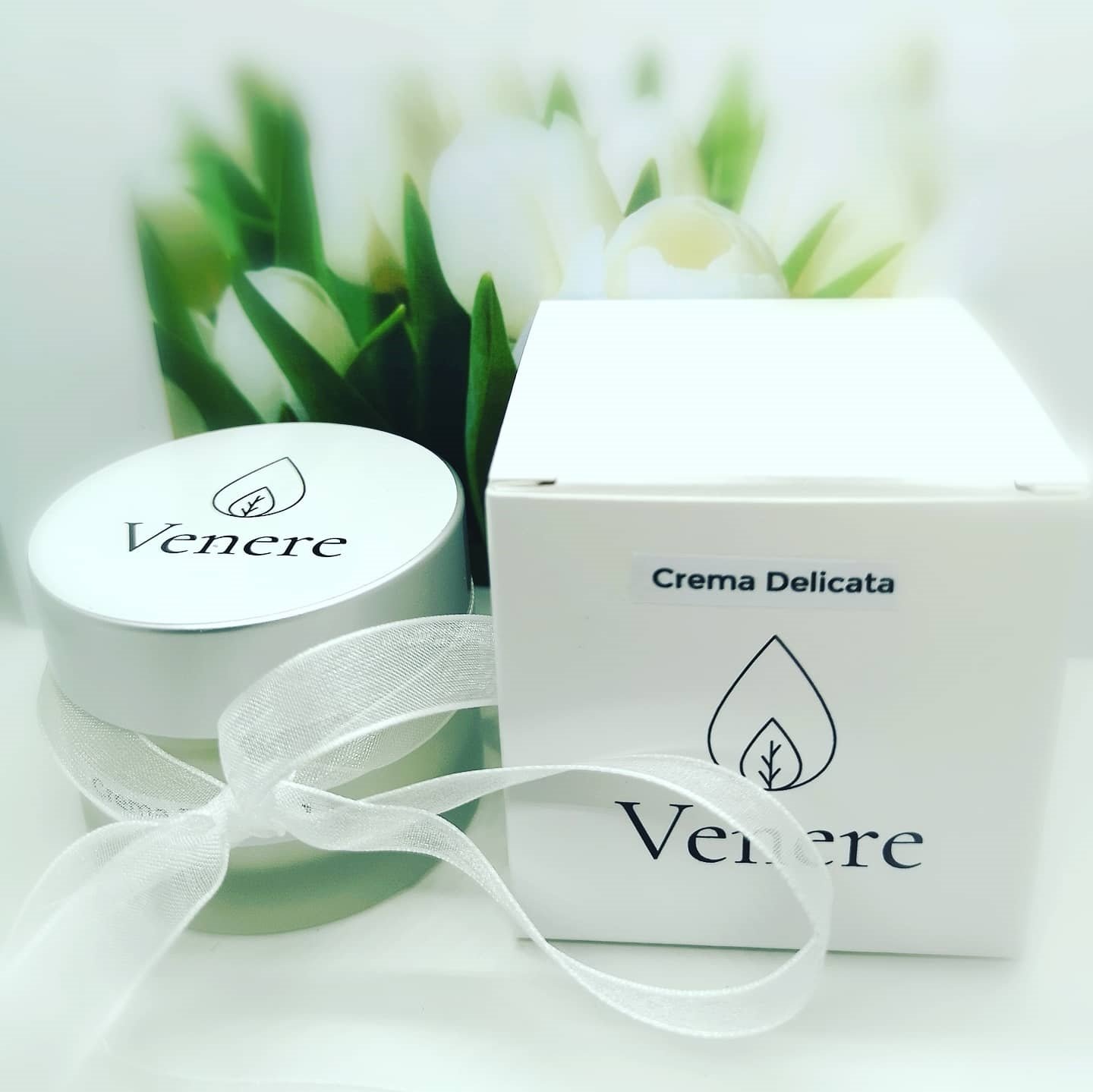
The material I chose was black, white and metallic polypropylene. All three colours look great, and polypropylene is a material I really like: it doesn’t degrade, doesn’t scratch (anti-scratch finish) and there’s a wide selection. In fact, for night creams or my special premium “Sahara” cream, I chose black labels. And for the boxes, I chose white cardboard, except for Sahara, which has packaging that I call “VIP” consisting of an attractive black box with gold foil. It’s just one of the ideas suggested by and developed with the very nice and patient graphic designer from Pixartprinting.
The time has come to use the printed products! In your case, labels for cosmetics. How did you feel when you saw them stuck on your products?
Seeing all your work come to fruition in a stunning label is a unique feeling. You feel a sense of achievement, like something’s taking shape, going somewhere. Those are the incredible feelings that a customised label can bring you.
This is only the start! What other projects do you have planned for the future? Can you share them with us?
I’ve definitely got a long climb ahead: I want the Venere line of natural cosmetics to be as complete as possible and of the highest quality. I have many plans and I hope to achieve them all gradually!
