
Table of Contents
Pastels are in
Pastel colours are those created by incorporating a substantial amount of white into the original colour. In packaging design, they have traditionally been used in specific categories, such as cosmetics or children’s products. However, they have become increasingly popular as brands look for more effective ways to reach their audience.
The lack of colour saturation lends a feeling of elegance and triggers a sense of calm in consumers, who are flooded with the visual stimuli of packaging that seems to “scream” from store shelves. Pastels may not work for every product, but there are certain sectors, such as food, that are benefiting greatly from this option.
Such is the case of Chamberlain Coffee, the coffee empire that American YouTuber Emma Chamberlain has built at just 20 years of age. The brand offers products ranging from ground coffee in both large bags and individual sachets, multiple varieties of tea, oat milk tins and a number of accessories. The packaging is not only characterised by the use of pastel colours such as yellow, green and blue, but also by its cute little animal illustrations.
Up to 90% less sugar than regular ice cream and up to 70% less sugar than plain yoghurt. Low in carbohydrates and lactose, gluten-free, vegan and delicious. This is how Denada ice cream markets itself, the brainchild of three Australians – a pastry chef, a former hockey player and a publicist – whose packaging combines a symphony of pastel colours such as pink, yellow and blue with primary colours for a casual look.
This is also the hallmark of Fizi, a Ukrainian producer of vegan bars that, unusually, was established during the war and whose first foreign market was Poland. They have two lines: Guilty Pleasure, a healthy alternative to classic desserts, and Protein, a real energy boost with 28% plant-based protein. “We have a mission: to make you fall in love with vegan bars from the first bite” is the company’s motto.
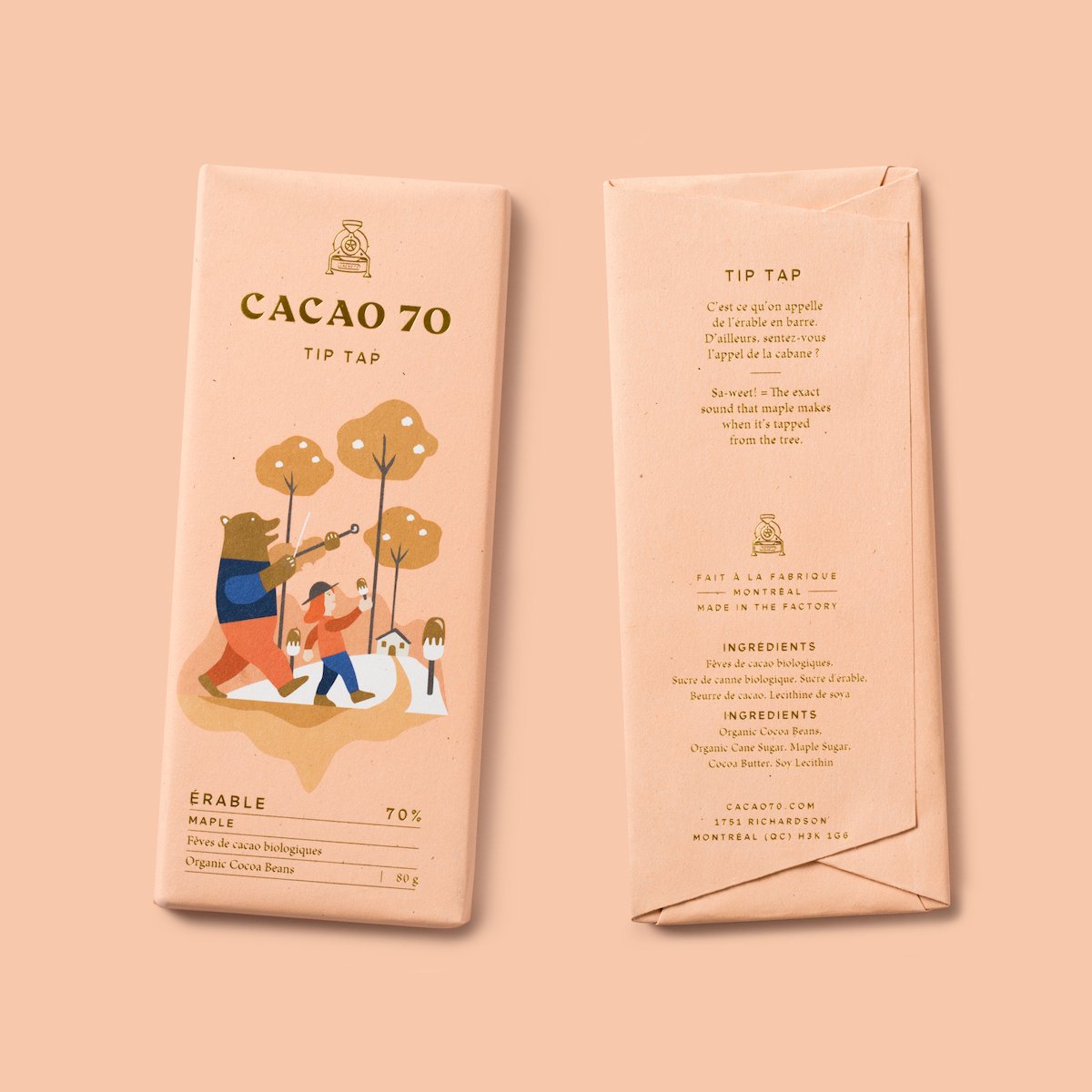
“Chocolate has the power to take you places” is the philosophy used by Cacao 70 to invite consumers to experience all kinds of sensations when savouring one of its delicious chocolate bars. As part of their image, each product tells a short story on the back of the packaging and has an illustration on the front. The Canadian brand not only has its own factory, where it produces chocolate bars, fondues, cocoa powder and hot chocolate, but it is also opening stores throughout the country.
Fruit and vegetable seeds, edible flowers and aromatic herbs from the Italian company Piccolo are specially selected for urban gardens with limited space. Some have been rediscovered in old catalogues and are proven to grow in flower pots, for example. But another of its strengths is the beautiful and colourful packaging, designed to look like a series of miniature books making up a seed library. Each packet contains useful information and tips for growing, such as the amount of light and water needed, or a growing timeline.
The trend for pastel colours extends far beyond food products. It is now even a popular choice for portable coolers, for picnics or even just office lunches. Just look at the retro style of Polarbox, which has even captured the attention of internationally renowned fashion brands. The coolers, designed and manufactured in Spain, are available in three sizes – 6, 12 and 20 litres – and can be customised by combining pastel shades such as lime, orange, olive, coral, yellow, blue and aquamarine. They weigh less than 1 kg and have interchangeable straps to be carried on the shoulder.
As mentioned earlier, pastel shades have always been a big hit for cosmetics. But in recent years the sector has taken further steps to produce sustainable packaging that is also aesthetically unique. The fully-recyclable bottles of Only Good are made with sugar cane from New Zealand, where the brand was founded. They are committed to shampoos with certified natural ingredients, free of palm oil, parabens and petrochemicals.
Shift’s visual identity, including its packaging, is not standard in pharmacological products, especially the use of pastel shades. A logo in capital letters, delicate fonts, an embossed finish and information presented in a clear and concise manner further strengthen this Norwegian brand’s appeal when it comes to conveying the quality of their vitamins.
Sapindus is a genus of shrub that produces a fruit popularly known as “soap nuts”, because they contain saponin, a natural detergent used to wash clothes in countries such as Nepal. This is what inspired the founders of Seepje to launch their own alternative to chemical detergents. The bottle, certified free from microplastics, resembles a bar of soap. The Netherlands-based brand also sells shower gel, shampoo and conditioner in unique packaging, using the same principles of sustainability.
As we have seen in these examples, pastel colours have made a strong impact on packaging design as a way to draw the attention of consumers and generate positive feelings as a brand strategy.