Table of Contents
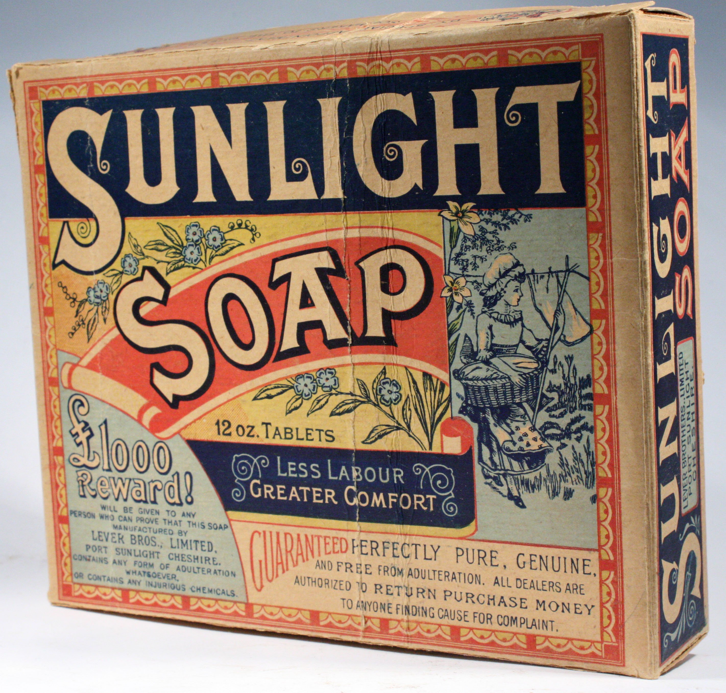
“Your money refunded if you find any cause for complaint”. Not many brands would risk promoting their products with a slogan like this. But William Lever was so sure of the effectiveness of his soap that he had no hesitation. The Englishman, the owner of a grocery business, launched Sunlight in the mid 1880s. The soap made a lather like no other and was also free of additives, but the true secret to its success lied in its wrapping. Different, original, striking. It was the first example of packaging design as we know it today.
Although there are different types of packaging, the one thing they have in common is that they encase a product. It might be to preserve it, protect it from potential damage, transport it from the factory to the point of sale or provide information. But without doubt the main aim is to draw attention. In fact, according to a study by Nielsen, in Europe, 60% of purchasing decisions are made at the shelf, or in other words, when consumers have the product on offer in front of them.
The key: appeal to the senses
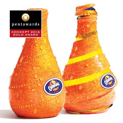
To stand out from the crowd, brands have no choice but to present themselves well. The shape of the packaging, the colours, textures, fonts, graphics and illustrations are some of the tools used in packaging design to ignite that spark in the consumer. The goal is to turn a product into an experience, and to do so you have to appeal directly to the senses. This is the case of the Orangina Spiral Peel juice bottles, by designer Yuko Takagi. In order to drink from them, you have to “peel” the container, as if it were a piece of fruit.
Turning a simple kids’ shoe box into a beautiful and colourful bird to play with requires a monumental exercise in creativity. It’s what the Görtz company did to attract customers to their shops. Original packaging can generate a return on investment 2.5 times higher than investments in marketing, communications and social media. Because it creates a buzz.
Take the packaging design for the Eggs for Soldiers box. In reality they’re just ordinary eggs, but the brand associates the product with masculine virility, thereby attracting a large group. In addition, as the packaging indicates, a percentage of the funds raised go to a charity. This strategy, a packaging trend in this day and age, seeks to drive sales by appealing to consumers’ kindness. There is also a playful side, given that the egg box can easily be turned into a toy tank.
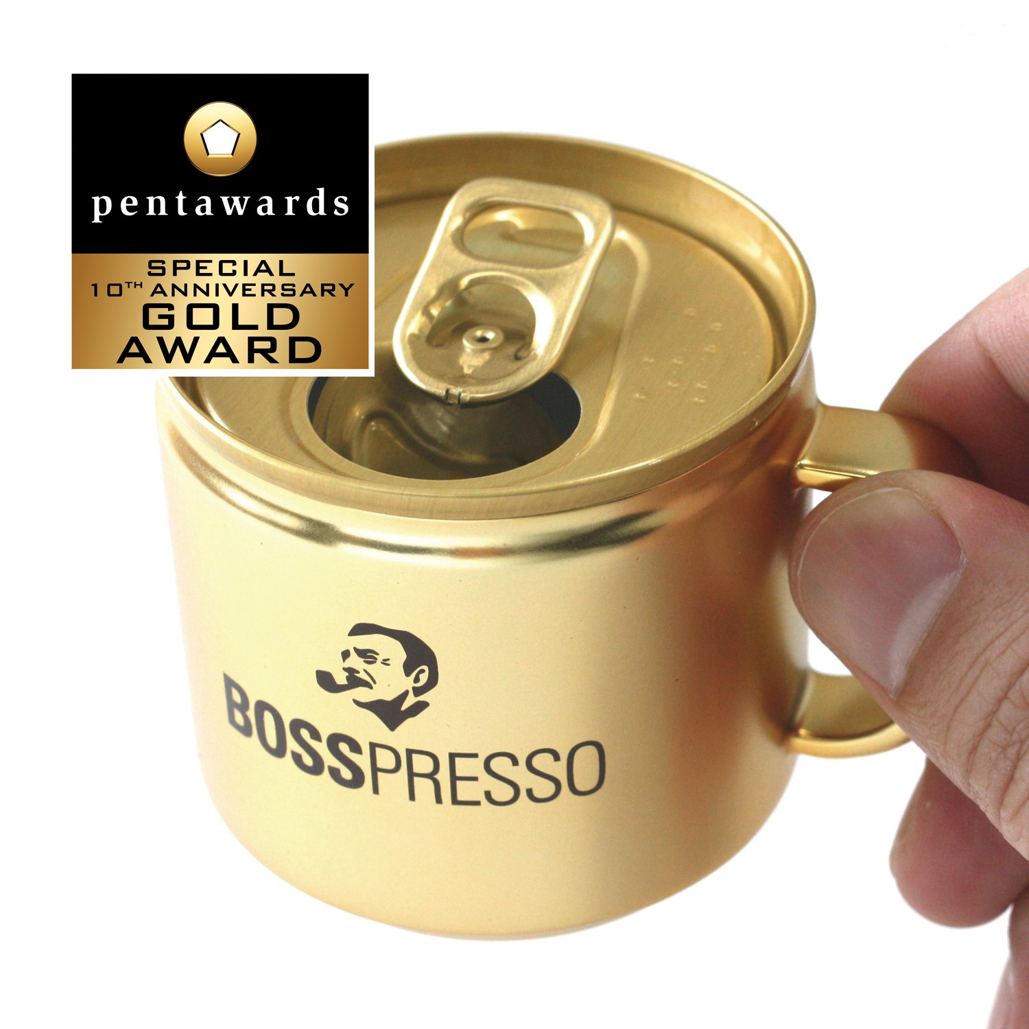
Making the packaging a part of the product is one of the most surprising ideas in the field at present. To grow your own mushrooms at home, why plant seeds in a pot if the packet itself can be used as a container? It’s an idea used in the Resetea grow-your-own kit. The Boss Cup-Can isn’t just any old white coffee. It was designed specifically for executives and has received several awards for its packaging design, including the German Design Award.
The integration of various functions into packaging is gradually gaining ground. Technology has now enabled us to create champagne containers that keep the bottle cold inside. Or even paper water bottles, which in addition to being an original packaging design, are eco-friendly.
The advantages of being a big brand
If packaging design appeals directly to consumers’ emotions, a little humour doesn’t go amiss. It’s hard not to laugh when you see these paintbrushes that turn into a face with a moustache and goatee. The same can be said of the Good Hair Day Pasta packets.
Usually, it’s the big brands that take the risk with this kind of packaging, because their products are already established and that enables them to take some liberties. And do you remember when Coca-Cola decided to put consumers’ names on their cans? Or when, for a while, personalised labels could be ordered for Nutella jars.
Personalisation, like limited editions, has proved to be a successful concept for brands, because it turns their products into genuine objects of desire. Who wouldn’t want to chew a Trident chewing gum when it’s presented in this fun box?
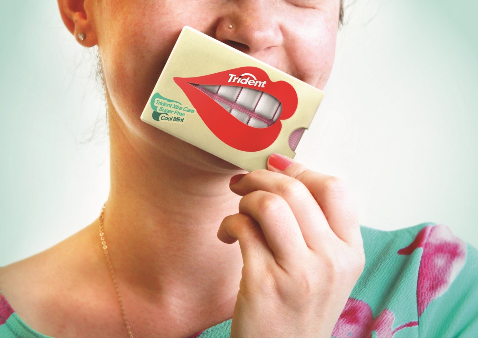
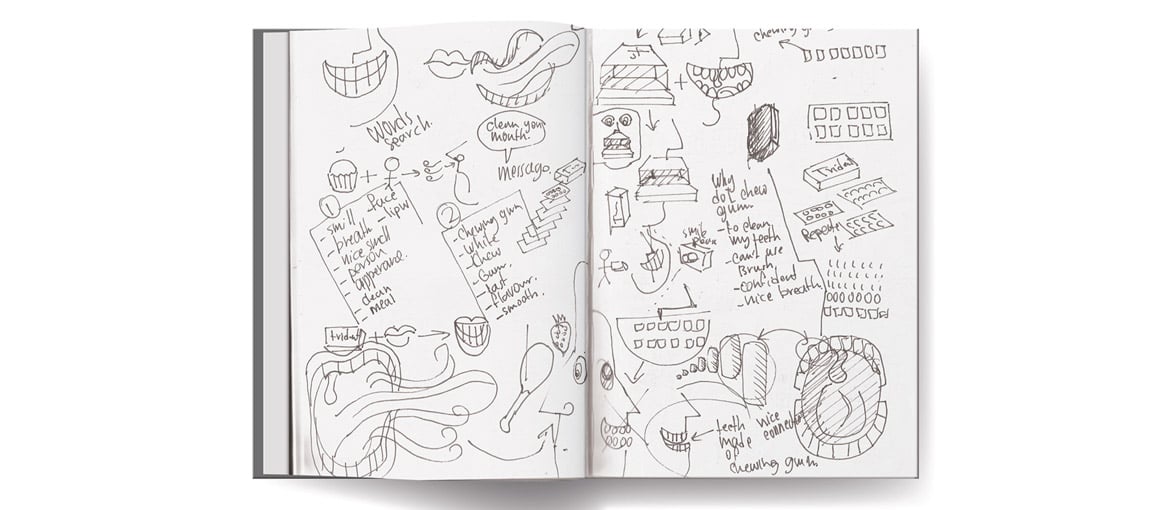
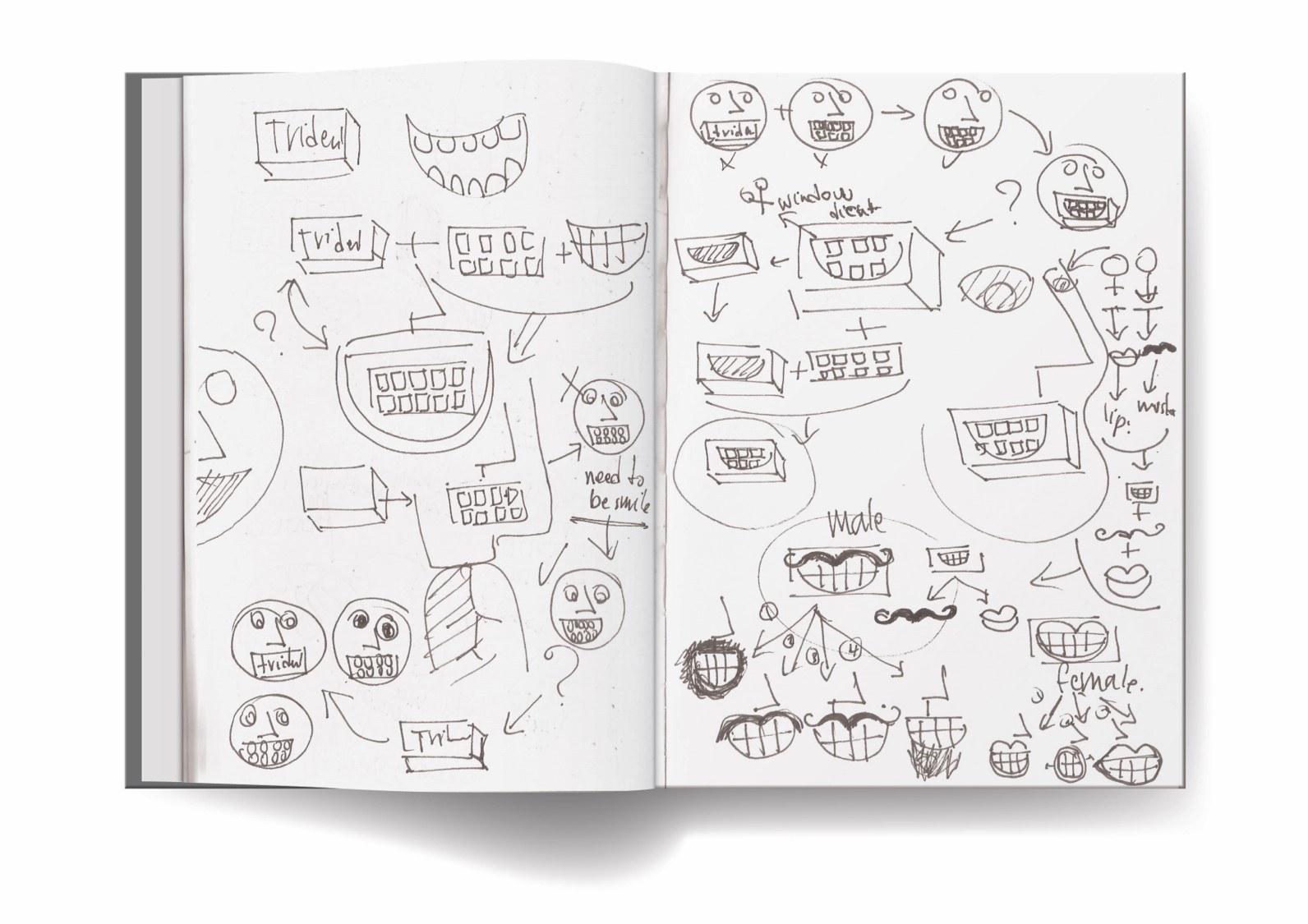
This concept hasn’t been taken to market yet, but its creator, Hani Douaji, has already received some of the most prestigious prizes in the industry. His sketches give us an idea of how the creative process works until an original packaging design is achieved.
The ‘unboxing’ phenomenon
The task of attracting the consumer’s attention is much more challenging when the product can’t be seen, touched or smelled in person, like with online shopping. The e-commerce industry, which is growing by leaps and bounds, has realised the importance of taking care over every detail of the packages we receive at home. So much so, that the action of unpacking itself has become a trend.
‘Unboxing‘, as it is known, is a craze that consists of unpacking a product – typically technology – in front of the camera, before uploading the recording to the Internet. According to YouTube, views of unboxing videos grew by 57% in 2015. And that’s in spite of the fact that, often, very little is said about the product, which doesn’t appear until the end. The explanation, according to the experts, is our love of the surprise factor.
Packaging is therefore no longer a mere container for a product, rather, it is the main means of communication between the brand and the consumer. Pixartprinting has adapted its production line and supply of materials to adjust to this paradigm shift. Catalyst, as the new technology is known, produces a number of packaging products of the highest quality and finish at competitive prices. From cardboard packaging of various sizes to paper bags and small personalised boxes on which to print the company’s design or logo in full colour. Useful tools for entering quickly into visual and tactile contact with the consumer and improve their shopping experience.

