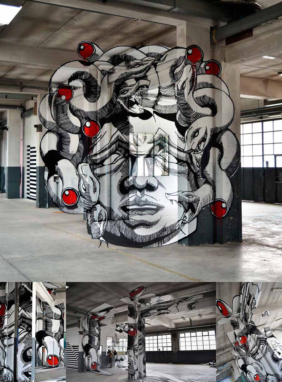
Artists have always been fascinated by optical illusions. The word “anamorphosis” is derived from the Greek word “anamorphoûn” meaning “to transform”. Anamorphosis is an optical illusion whereby an image appears to be totally distorted when seen from the usual vantage point, but appears normal when viewed from a specific angle (perspective anamorphosis), or indirectly in a mirror (mirror anamorphosis).
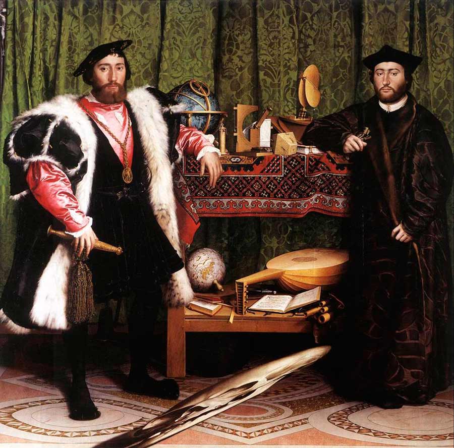
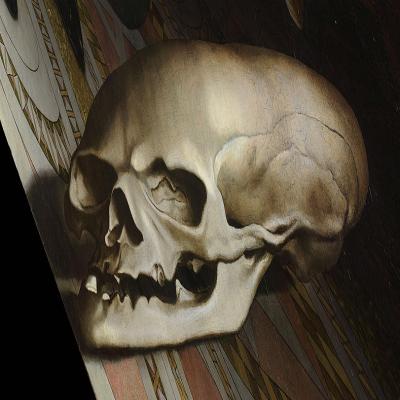
Perspective anamorphosis first emerged in the art world during the Renaissance, while mirror anamorphosis was developed in the 17th century. Historically, it was Italian painter and mathematician Piero della Francesca who laid the groundwork the application of optical illusion. One of the oldest and best-known examples of anamorphosis it the painting “The Ambassadors” by Hans Holbein, which dates to 1533. It features a hidden scull in the foreground that is only visible when viewed from the side.
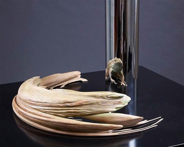
Although anamorphosis is not new, it continues to dazzle, and is very much in vogue among artists and graphic designers today. A notable example is Jonty Hurwitz’s sculpture Kiss of Chytrid, which reveals an anamorphic frog in a mirror.
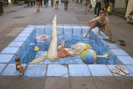
Then there is Julian Beever’s Swimming Pool in the High Street, painted on the streets of Glasgow in 2006.
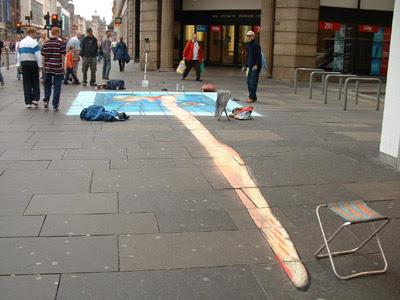
Also worthy of mention is artist Scott VanderVoort’s hidden tribute to David Bowie on the streets of New York.
And, more recently, Swiss contemporary artist Felice Varini celebrated the 20th anniversary of the city of Carcassonne’s listing as a UNESCO World Heritage Site with an anamorphic installation that superimposed 10 giant concentric circles onto the city’s walls.

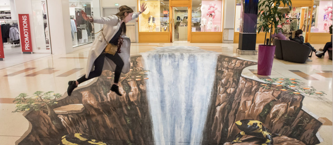
Shopping centres and companies are at it too: anamorphosis is a great way to bring depth to the everyday. In 2017, the Bercy 2 shopping centre in Paris invited 12 international artists to create a series of trompe-l’œil frescos in its shopping arcade.
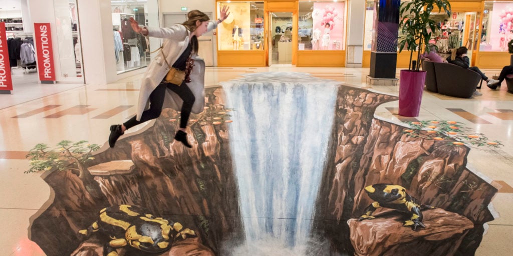
And, in its Lyon offices, biotech firm Amoéba created an anamorphic version of its logo in a 30-metre-long, 8-metre-high corridor.


This same principle inspired Marseille’s Salvator Hospital to write the word “Rêve” (French for “Dream”) in giant letters in one of its corridors.


Even Instagram got in on the act during the 2017 French presidential election. The tech giant created a set of visuals depicting, amongst other things, ideas such as peace, liberty, equality and fraternity on the Léopold-Sédar-Senghor footbridge across the river Seine in Paris.


Advertisers and musicians have also exploited the phenomenon, as evidenced by the TV commercial for the Lacoste L!VE perfume, which uses an anamorphosis devised by famous French street-artist Zoer.
https://www.youtube.com/watch?v=rUnEUXLQ2Go
We see a similar story in the marketing campaign and visual identity created for Russian television channel 7TV by Swiss graphic designer Greg Barth, and in the video “The writing’s on the wall” by OK Go, the American rock group renowned for its inventive and eccentric video.
But anamorphosis isn’t just a neat graphic trick: it has practical applications too. In their proposed signage for a connecting tunnel to Terminal 3 at Lyon St-Exupéry airport, French agency Graphéine created an anamorphic narrative design intended to make journey time along the 250-metre stretch seem quicker. As passengers moved forwards, the anamorphosis would break down, creating a sensation of speed by altering perceptions of space and time, thus making the tunnel appear shorter than it really is.


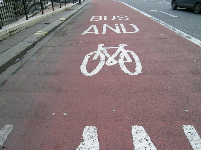
The usefulness of anamorphosis can also be seen in road markings. It is used to ensure that road users get an undistorted view of text or images when seen a certain distance. For example, the images of bikes used to mark cycle lanes appear normal when viewed from distance on the road, but actually look stretched out vertically when seen from above.
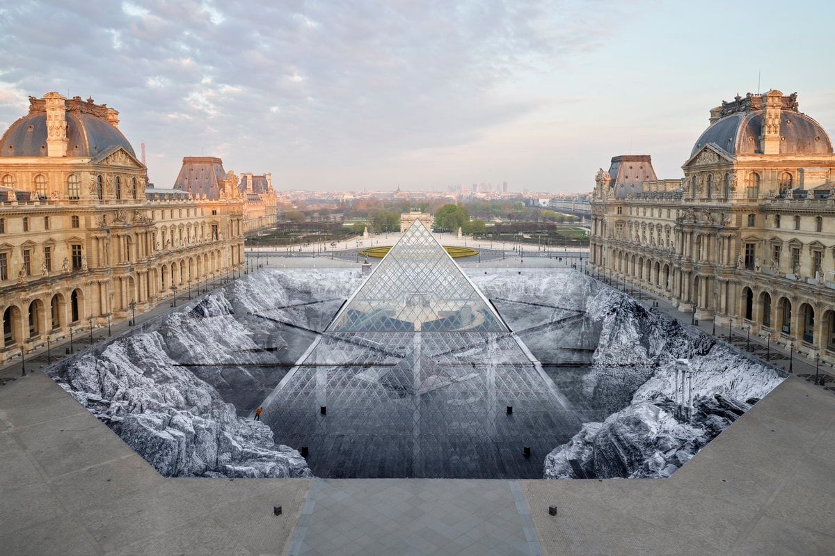
To wrap things up, we return to the world of street art, and the work of French artist JR, whose latest piece, “Le secret de la Grande Pyramide” was created with the help of 400 volunteers and is his largest collage produced to date. Having used anamorphosis to make the Louvre’s pyramid disappear in 2016, this time, the artist famed across the world for his collages, again used the phenomenon in a piece to mark the 30th anniversary of the Ieoh Ming Pei’s emblematic monument.
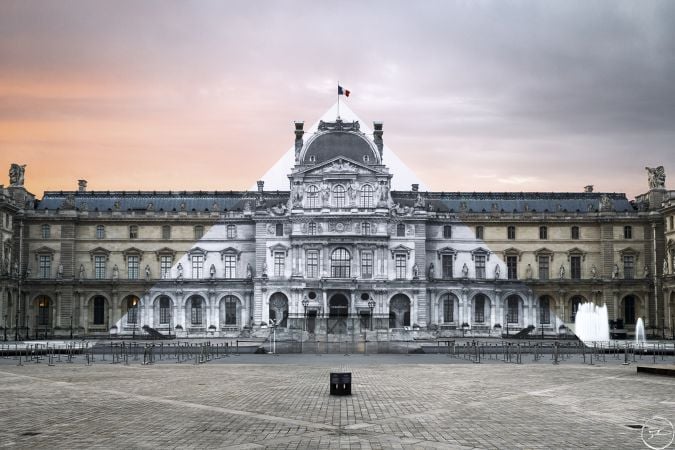
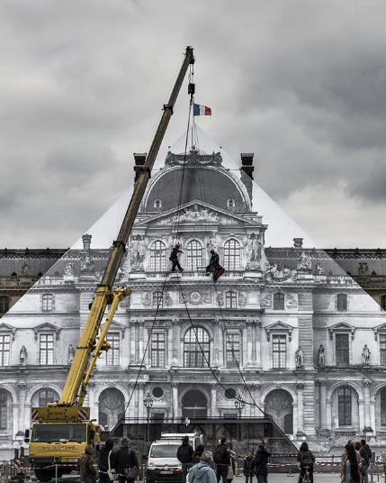
The world’s most visited museum revealed a giant trompe-l’œil depicting the foundations of the pyramid standing in Cour Napoléon.
