Table of Contents
Some magazines are famous the across the globe.
Their name, aesthetic and values are known even by those who have never actually read a copy. Such publications are few and far between, but National Geographic is undoubtedly one of them.
Founded over a century ago on 22 September 1888 by the National Geographic Society, in a world that still resembled that described by Jules Verne in “Around the World in 80 Days”, one in which geography still had an exotic connotation and geographers were still considered explorers, National Geographic soon became essential reading for anyone who wanted to travel the world from the comfort of their sofa.


In 1896, the magazine was sold on newsstands for the first time, and in the early 20th century its illustrations and photos became a defining feature. The tales of exotic and unusual places told in its pages needed accompanying images that evoked extraordinary experiences, unimaginable landscapes and contrasting cultures.
National Geographic’s approach has always been to be as neutral as possible, avoiding prudery, colonial voyeurism and politics, especially in periods when war and conquest were changing the world.

A unique format
While many have never leafed through the pages of an issue, almost everyone can recognise National Geographic on the shelves of the news agents or library.
Its compact, letterbox-friendly 21 x 27 cm format is distinctive and unusual in the magazine world.
Another distinguishing feature is its binding, which is perfect rather than stapled due to a high page count that usually exceeds 140 pages, creating a spine a shade under 2 centimetres thick. This book-like spine lends extra authority: the reader knows that they are holding a collection of in-depth and original journalism in their hands, the type of content that can only otherwise be found in academic journals or non-fiction books, but without the stunning images for which National Geographic is famed (more on that shortly).


A simple but unmistakeable cover
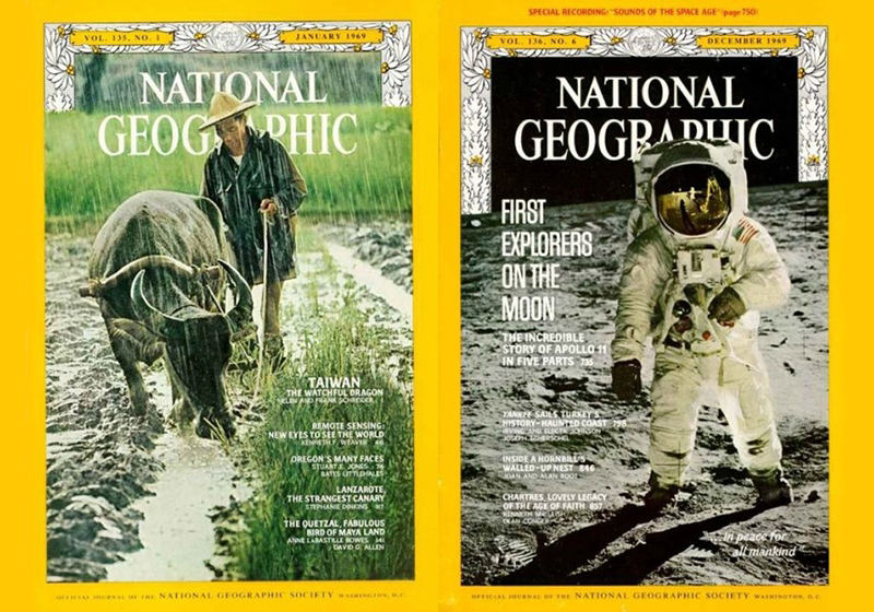
What truly sets National Geographic apart from other titles in newsagents is the unmistakeable bright yellow border that frames the cover photo. And the iconic cover is echoed in the logo, a simple yellow rectangle with a white interior. The bright yellow frame has been used by National Geographic since the very beginning and is indelibly associated with the magazine in the collective imagination.


Of course, a frame needs to contain fantastic images.
The cover of National Geographic has always carried memorable photos: they are inextricably linked with the fascinating storytelling inside.
Perhaps the best example is the legendary cover from the June 1985 issue that features an Afghan girl – Sharbat Gula – photographed by Steve McCurry. It’s as if the girl is talking directly to readers, her grey-green eyes expressing both the fear and pride of Afghan refugees forced to flee war and seek shelter in refugee camps in Pakistan.
Seventeen years later, the same photographer tracked down Gula and took a new portrait of her for a fascinating piece on how photographs can make bring people on the margins of history to centre stage. At the time, neither photographer nor subject had any inkling that the portrait would become symbolic of the plight of Afghan women. It was just one of many photos said Steve McCurry when recalling that day.

Simple yet surprising graphic design
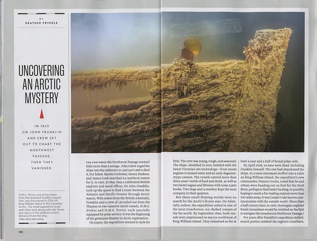
The use of double-page full-bleed images is a hallmark of the magazine: the headlines and text float on the images, which sometimes can be folded out further to create quadruple-page images.

National Geographic images have always been presented in ways that surprise the reader.
Text is given a clean and minimalist layout, usually in two columns and with headlines that aren’t too shouty. However, beneath this apparent simplicity lies a far more complex grid that offers huge flexibility in the use of images, especially the informative illustrations that the magazine does so well.


In 2017, San Francisco design agency Dadich Partners gave the magazine a full makeover. One of the goals was to improve and develop visual storytelling with photographs by adopting more contemporary and unusual solutions. The revamp also new included fonts that were designed from scratch.


Not just photographs
We tend to think of National Geographic as offering large photos accompanied by compelling accounts of exploration, adventure and discovery, even though the magazine has always had an informative and educational tone. To explain sometimes sensational stories, it has always used infographics, as well as maps, illustrations and drawings. A great example is the series of lunar maps released in 1969 to coincide with the Moon landings: they were so successful that they were then sold as posters (as often happens with National Geographic images).
National Geographic has been a pioneer in developing and experimenting with infographics, so much so that a few years back Taschen published a book celebrating 100 years of the magazine’s information design.
They have set a benchmark for newspapers and magazines around the world with a level of quality that is hard to match.


An enduring spirit
What makes National Geographic iconic to this day is its continued ability to embody the spirit of exploration and adventure, as well as a successful recent pivot to TV channels and documentaries, which has brought in younger audiences.
And it keeps moving with the times. 2023 will be the last year that the print version will be available from newsagents: from 2024 the magazine will be online only and paper copies will only be available for subscribers.


The decision follows a major restructuring of the NatGeo group by owners Disney due to high production costs and a steep decline in subscribers: at the end of the eighties, the title boasted over 12 million subscribers in the US alone, and several million more around the world; last year it has fewer than 2 million.
Given the success of its film and television output and the high cost of producing the magazine, whose writers and photographers can take months to publish an article, the decision to change direction was inevitable.
The hope is that National Geographic’s spirit of exploration will live on in new guises.
Image sources:
https://www.nationalgeographic.com/
https://en.wikipedia.org/wiki/National_Geographic
https://medium.com/@dtattingv/the-design-philosophy-of-national-geographic-a63281fbf22d
https://juanvelascoblog.wordpress.com/page/2/
https://mariastenzel.photoshelter.com/
https://www.matthewtwombly.com/eater-of-the-dead-national-geographic-magazine
https://mollysnow.com/project/ngm
https://www.submex.co.uk/product/national-geographic-magazine-dec-1986-dec-1986-oct-1987/
https://www.fastcompany.com/3067134/100-years-of-brilliant-infographics-from-national-geographic
https://godfreydadich.com/work/national-geographic
Sources for information on sales
https://www.agi.it/estero/news/2023-06-30/national-geographic-addio-carta-rivista-22046876/

