Table of Contents
If you’re unfamiliar with the story behind the logo of NASA, the government body responsible for the USA’s aerospace research and exploration programme, you probably wouldn’t expect it to feature quite so many anecdotes and pop references. So we’ve decided to explain all.
From the meatball to the worm and back again
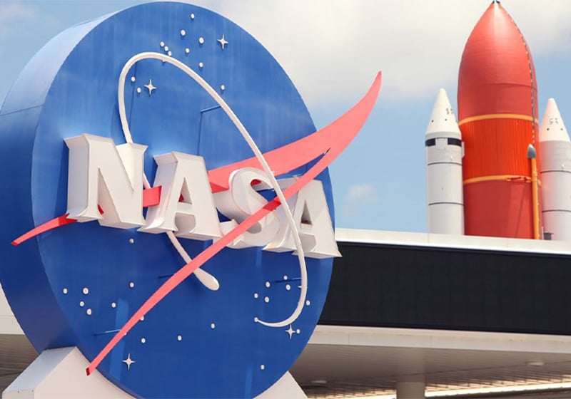
It was 1959 when the National Advisory Committee on Aeronautics (NACA) became NASA (the National Aeronautics and Space Administration), the agency that would go on to make incredible progress in research into space and aeronautics. It needed a new logo, less formal than the previous version, to mark this change. The task of designing the new one was handed to James Modarelli, an illustrator at NASA’s Lewis (now Glenn) research centre. The result was a simple yet equally rather complex design incorporating several references to space missions: the sphere recalling a planet, a sprinkling of stars representing space, a red, V-shaped wing paying tribute to aeronautics and a circular orbit that depicted space travel. Plus the name NASA, written in white in a thick serif font.

Perhaps due to the round shape of the image or the Italian-sounding name of its creator, James Modarelli’s logo was rechristened ‘the meatball’. And it remained popular, with this nickname, until 1975, when NASA decided that the time had come to give its visual identity a makeover.
The redesign formed part of the Federal Graphics Improvement Program, which aimed to give government agencies, which were often burdened with unappealing, bureaucratic-looking logos, a fresh new look. Richard Danne and Bruce Blackburn, the co-founders of the New York-based design studio Danne & Blackburn, were commissioned to create the new design. The result was a minimalist, ultra-modern logo displaying the name NASA in a thick font, with the two As missing their crossbar, and so reminiscent of rocket nose cones. The snake-like, zig-zag style gave the new NASA logo the nickname ‘the worm’.

The futuristic style of the new logo was very popular among designers in particular, but it certainly did not have the widespread appeal of the meatball. Indeed, a feeling of nostalgia for the warmth and familiarity of the previous logo slowly emerged, leading NASA to decide in 1992 to dust off the old meatball, which, it seems, had never really gone away.
‘As legend has it, Dan Goldin, NASA’s newly appointed administrator, arrived at Langley Research Center one Thursday in May of 1992 and noticed the meatball was still on the hangar. “They never did remove the meatball,” Barry, the historian, says. “And they took a very long time to getting around to painting the new logotype on the building.” NASA was in a slump at the time, and Goldin saw an opportunity to boost morale. He asked George Abbey, his special assistant, and Paul Holloway, the director of Langley, if he could reinstate the meatball. “Yes”, they replied, “and you should”.’
This passage is taken from the article Inside the Rise and Fall of NASA’s Beloved Worm Logo, published by Wired magazine.
The revenge of the worm
It seems that NASA logos only ever achieve success once they’ve been decommissioned, as the worm enjoyed a second wave of popularity too. Around 2017, its image began cropping up everywhere: on bags, sweatshirts, t-shirts and other accessories. This nostalgic return so many years on was all down to the clothing brand Coach, which decided to launch a collection dedicated to the topic of space. And what better image to use than the futuristic 1975 NASA logo?
Bert Ulrich, NASA’s brand manager, told Wired: “That was when we started allowing the NASA worm logo to be used on products, as well as the current one [the original meatball]. Before then we received one or two requests a week for permission to use the logo. Now we get twenty or thirty a day.”
The other faces of NASA
As well as the famous meatball logo, NASA also has a more formal version, used at presentations, award ceremonies and other events. As you can see, it features the same elements as the logo James Modarelli designed in 1959.

You should also be aware that every space mission has its own logo, representing its goal. The one shown below was designed for the very first launch of robotic probes to explore space.

We’ll end this brief journey through time with the logo created in 2018 to celebrate NASA’s 60 years as a US government agency. The design, created by NASA designer Matthew Skeins, represents the agency’s launch into the future.

This brings our article to an end, but if you’d like to continue your orbit around this story, we recommend you take a look at the comprehensive guide to the logo by Joseph R. Chambers and Mark A. Chambers: Emblems of Exploration: Logos of the NACA and NASA.

