Table of Contents
First museum in America dedicated to posters opens in New York
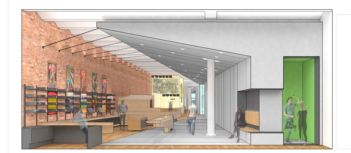
Poster House, a museum dedicated to the most important posters in the history of the medium, opened in June this year in the heart of Chelsea, New York. Inside a 1,400 m² space, a selection of 7,000 posters from all over the world reveal the communicative and persuasive power of this means of communication, in all its various applications. From their first appearance in the late nineteenth century to the present day, posters have had many different functions, from political propaganda and advertising through to genuine pieces of art highly sought after by collectors.

The museum includes two exhibition spaces, an area for children, an educational workshop and various interactive installations designed to reveal the secrets of poster design to visitors of all ages. In addition to the permanent collection, the building houses interesting temporary exhibitions on leading international artists and poster designers. The museum’s interactive installations allow visitors to create their own customised posters using the graphics from various famous examples.


Adults and children alike can learn about the history of the poster and design their own in a style of their choice, using the specially provided photo booth that allows you to superimpose your image onto the graphics of some of the most famous American posters, from James Montgomery Flagg’s ‘I want you’ design to the equally famous ‘We Can Do It’ by J. Howard Miller.
We’ve gathered together some of the most interesting posters on display in the museum for your enjoyment.
‘Progressive Proof (Before Letters)’, Jules Chéret’s poster, 1891
This work by Jules Chéret is the rarest piece in the collection, and represents the final item in a series of drafts displayed at Poster House, where each sheet was used to add a different colour to the composition to make up the final design.

Chéret, the father of the modern poster and a master chromolithographer, managed to obtain previously unthinkable painting-like effects with his special technique.
‘Silence = Death’, created by the organisation ACT UP, 1987
In 1987, ACT UP (an acronym standing for AIDS Coalition to Unleash Power), a group of activists from New York, created a poster to encourage the LGBT community and the population as a whole to help tackle the AIDS emergency.

The streets of the Big Apple were plastered with this poster, which became iconic within the LGBT movement. The key to its success was the use of an abstract shape – a pink triangle, the symbol used to identify homosexuals in Nazi concentration camps, but upside down – and a slogan that was both simple and unequivocal, designed to reach as wide an audience as possible.
‘Resist Unite Together We Must Fight’, created for the Boston Women’s March, 2017
This is one of 4,000 posters donated to Poster House by the movement responsible for organising the Women’s March.

In 2017, millions of women marched in Washington, New York, Boston, Los Angeles and many other cities throughout America and the rest of the world in support of their right to equality and to defend the human rights of women and minorities threatened by Donald Trump’s arrival at the White House. From 17 October this year the museum will house an entire exhibition dedicated to the Women’s March.
‘Visit Dante’s Inferno’, Seymour Chwast, 1967
The designer Seymour Chwast was one of the founders of Push Pin Studios in 1954, alongside Milton Glaser and James McMullan.

This group of New York-based graphic designers and illustrators decided to abandon the cold rationalism imposed by the Swiss Style – the dominant form of graphic design at the time – and created a fresh and ironic new graphical lexicon. This poster became an icon of 1960s advertising as soon as it appeared in Roger Sterling Jnr’s office in the TV series Mad Men. Poster House is planning an exhibition of some of Push Pin Studios’ works in the next few months.
‘Herman Miller Summer Picnic’, Stephen Frykholm, 1985
In 1970, Stephen Frykholm was hired by the furniture company Herman Miller to manage its graphic design department.

One of his first tasks was to create posters for the Sweet Corn Festival, the company’s annual picnic. For 20 years, Frykholm created vibrant posters with Pop Art-inspired images, and received numerous awards for the originality of his work.
‘PKZ’, Otto Baumberger, 1923
With its composition focused on a single, close-up object, this poster, designed to promote PKZ’s department stores, is a classic example of an Object Poster, the figurative style also known as Plakastil invented by German graphic designer Lucian Bernhard in the early twentieth century.

Plakastil, which involved the use of bold colours, large fonts and simple shapes, was continued by Otto Baumberger and other Swiss artists until the early 1950s.

