Table of Contents
Cutting-edge technology, reliability, luxury, prestige, class. All these things are embodied by two words: Mercedes-Benz. Today, we tell the story of the Mercedes-Benz logo and how the firm has stood the test of time, surviving the Great Depression and the Second World War with the same tenacity and toughness as its engines. Let’s start the ignition.
A company born under a star
In 1898, Austrian entrepreneur Emil Jellinek opened a dealership selling Daimler-Motoren-Gesellschaft cars. Two years later, he commissioned the manufacturer to work on a very special project: the construction of 36 racing cars that would be fitted with an engine named after his first born daughter, “Mercedes” (which means “mercy”). With this new car, the 35PS, Emil Jellinek won the Nice-La Turbie motor race. The history of Mercedes had started in top gear. And two years later, in 1902, the name was trademarked.
But this story is still missing an important piece: the “Benz” that would be appended to the name.
It wasn’t until 1926 that Mercedes-Benz was born with the merger of Daimler-Motoren-Gesellschaft with Benz & Cie, a rival manufacturer founded by German engineer Karl Benz in 1883.
The evolution of the Mercedes logo
The first logo, which adorned their cars in 1902, is this.

A horizontal oval framing the brand name. Remind you of anything? The oval shape brings to mind, albeit subtly, the logo of an Italian competitor: Maserati. Risky. Too risky to be mistaken for the competition. Which is why, in 1909, we have the first redesign.

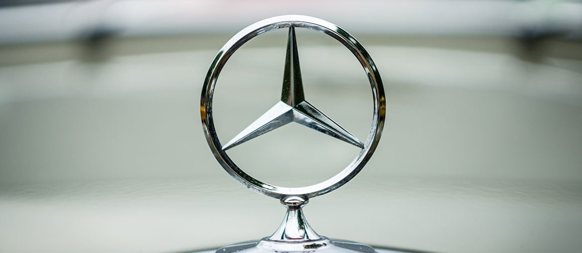
The logo is simple and elegant, with shading that creates a three-dimensional effect, as if to emphasise the brand’s solidity. Gone is the name and in its place a three-pointed star drawn by Daimler: one point for the sea, another for the land and the last for the air. The three modes of travel that Daimler is conquering with its engines for sea, air and land vehicles.
Then, once again in 1916, the Mercedes logo is redesigned: the star is placed inside a circle and the name of the marque appears in full.

The year 1926 is a significant one – we already know why: Daimler and Benz & Cie merge to become Mercedes-Benz. So a new logo is needed to mark the beginning of this new chapter. The badge needs to be a perfect blend of both firms’ the distinctive symbols: Daimler’s three-pointed star and the laurel wreath (which represents victory) of Benz & Cie. The resulting logo was richly detailed. Here it is.

In 1933, the logo was given a pared-down redesign. All decorative elements disappeared, leaving just a flat black star (and from the end of the Second World War, black was swapped for silver). As for the laurel wreath, it was stylised as clean circle surrounding the star.

From 1933 and to the present, the Mercedes-Benz logo has undergone further redesigns, yet remained true to itself. Since 1989, the company name has been written in an elegant serifed font, while the logo has gained volume and corporeality, and is a glittering silver. This colour wasn’t picked at random: it’s a tribute to the “Silver Arrows”, the silver racing cars that represented the company in Grand Prix racing between 1934 and 1939. Silver also brings to mind engineering and technology, while its shine conveys a sense of elegance and class.

The logo perfectly embodies the perception that many of us have of the Mercedes-Benz brand today, which has always been synonymous with leading-edge technology and prestige. And when a logo so completely encapsulates a brand, you know it’s going to last.

