At Pixartprinting, our relationships with customers are ever closer and growing by the day.
We’re not just a web-to-print platform: we’re the key to turning our customers’ desires into reality. Every day, we enable people to bring an idea to fruition, produce a design or communicate a message.
That’s why we’ve decided to collect the stories of customers who, with our help, have been able to achieve their objectives, big and small. We want to share their experiences ( #PrintStories), ideas and the different ways they’ve reached their personal goals.
Today, we’re telling you the story of Maria, an aspiring architect with a huge creative talent. The window display that she created is simply stunning! Want to find out more? Read our interview with her below. You won’t regret it.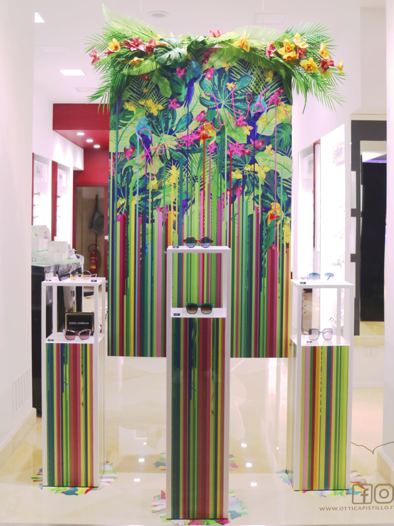
Who is Maria? Tell us about yourself: who are you and what do you get up to in life? Dreams, aspirations and talents. A short but faithful portrait!
I’m an architecture student. I’m 24 years old and ever since I was a kid, I’ve dreamt of unleashing the creative potential inside me. My hands are my tool of choice for channelling my imagination, although the world of graphic design has won me over. So, I’ve spent the last few years dressing windows with my vector designs.
Before telling us how your idea was born, can you explain to our readers what you produced in the end using our printing services?
What you see is a window display designed for an opticians: the brief was to create the right setting for glasses from the new spring/summer collection in a full-height shop window facing one of the city’s main streets, but without a backdrop that would create a boundary between the shop window and the shop itself. It was therefore fundamental to design a 360° solution able to attract potential customers and, at the same time, decorate the shop’s interior.


Now let’s rewind the tape to the moment it all began. When was the idea for this design born? Tell us a bit about how you came up with the concept.
It’s difficult to find the start of a creative story. In my case, the idea met the opportunity, allowing me to express my creativity. For two years, I have been sharing my ideas with the store manager and it’s thanks to him and initial faith that we have experimented with new ways of communicating, not just online with social media activities, but also offline by generating interest from customers in store.
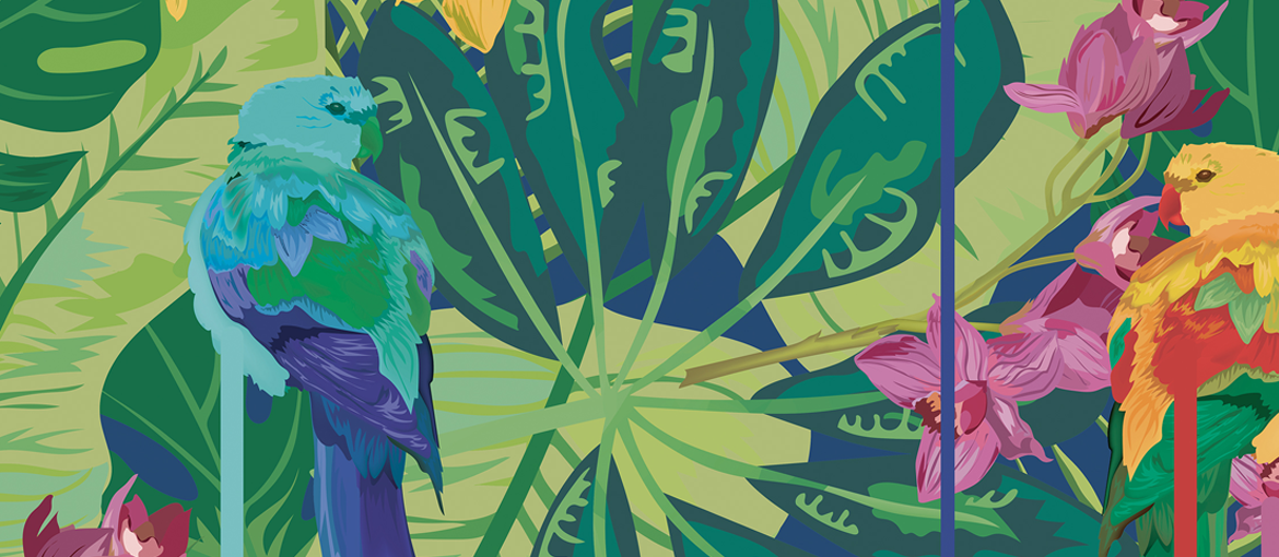
And here I am with this new design that follows what turns out to be a winning strategy: to be daring, to create something different yet on-trend, unique and compelling. In this case, I chose daring colours, following the tropical trend, with original graphics, rejigged to meet the requirements of the shop window. Everything was born out of a simple question: what is spring for me? From many answers, I chose this: an explosion of colour, happiness and hope. So, I tried to transpose all of this into an image and the result is what you can see.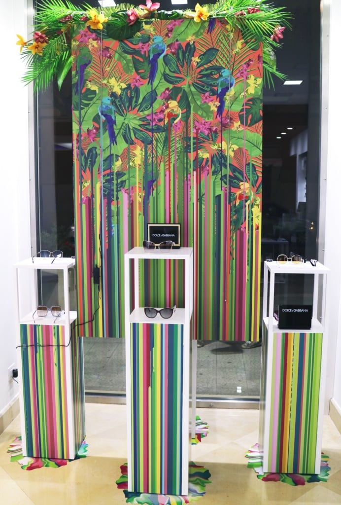
Once you had found the right idea, you had to set an objective. What did you want to achieve with your idea? What would be the ultimate aim of your work?
The idea was to create a seasonal window display that was not associated with a brand and therefore dynamic from this point of view. Obviously, in an opticians… looks also count! It’s hard not to focus on a theme able to attract even the most short-sighted.
We have the idea for the design and its objective. Now we need to create it! How did you do it? What were the design phases and how many were there? Tell us about the process that brought your idea to life and made it ready for printing.
The design phases were outlined like for every other design: based on very tight timings and technical requirements for the display change. Therefore, given the need for fast implementation, you always try to keep each phase as short as possible: drafting and approval of the project, graphical transposition, final approval, printing and application.


It’s time to print! How did you use print-on-demand to produce your design? Which materials did you use? And why did you choose these materials and this printing technique?
Print-on-demand enables continuity and involvement in the final creative process. Thanks to the extensive catalogue and really clear instructions provided, I can freely decide what shape to give my designs, with quality and fidelity guaranteed.
For the design in question, I chose Matt Monomeric Self-Adhesive Vinyl to decorate the stands and floor around their base, matching them with the backdrop created by the double-sided Foamex panel hung in the centre of the composition.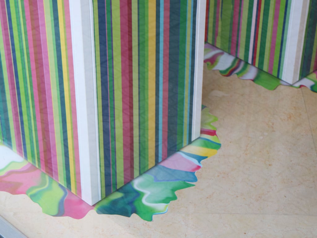
Once the materials have been made, it’s time to use them correctly. In your case, the aim was to decorate and dress a shop window. Can you tell us what inspired when you were window dressing?How did it feel to see your idea come to life in front of your own eyes?
Window dressing is the litmus test: from uploading the print-ready files to receiving the package, it’s one long trailer for every possible disastrous scenario, not to mention any application phase, as in the case of stickers. However, once I received the material, the Oscar for best set design was finally mine!
We then had to put together the different elements: we started with the arrangement of synthetic flowers and leaves, which echoed the artwork on the Foamex and was positioned directly above it; we then decorated the stands, which first involved cutting out a single piece for each side; finally, we applied the self-adhesive vinyl to the floor to create the base on which the stands were placed.
As well as assembly, there was also coordination with the Youngears communication agency, which oversaw all the social media actions associated with in-store activities. I liaised with them to maintain an overarching theme, working with the creative director to devise a communication campaign that was also present online. Through this synergy, I was able to receive feedback and enjoy the dialogue and discussion that so far has always proved useful for new projects.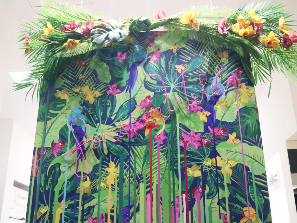
This is only the start! What other projects do you have planned for the future? Can you share them with us?
The first goal is to finish my studies in architecture, something that will lay strong foundations for my future. All the projects I’ve done so far have been my way of taking a break from the hours spent hitting the books, a way of bringing a bit of colour to these grey four walls.
Coming into contact with a creative environment like a communication agency has allowed me to broaden my horizons, to see the new avenues that are just waiting to be explored.
Apart from that, nothing’s planned. My sketch book and pencil are always handy: you could say that I’m a time bomb of ideas just waiting for the fuse to be lit!


