Table of Contents
Employers and recruitment agents spend literally seconds looking at CVs nowadays and there can be hundreds of applicants for some positions. You need to grab their attention and make yourself stand out. The majority of CVs are probably going to be text based. So if you create an infographic curriculum vitae, yours is far more likely to get noticed, rather than be skimmed through with the rest of the pile. For graduates with little experience this can be a big help. If you want to work in the creative industry, it’s your chance to show what you can do right from the start, even if you don’t have a list of previous employment.
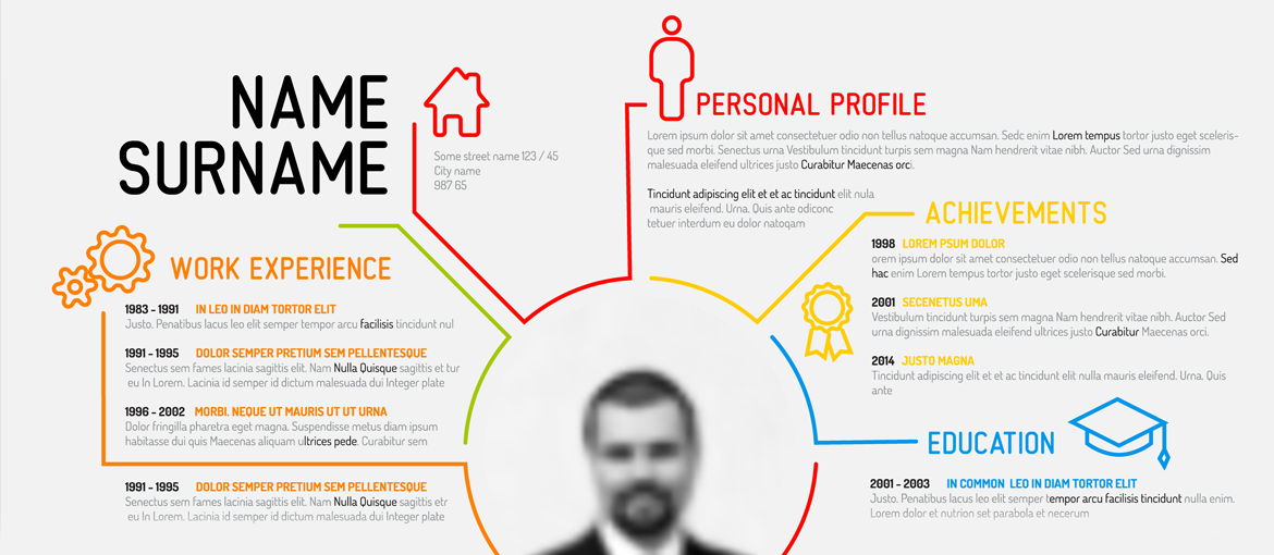
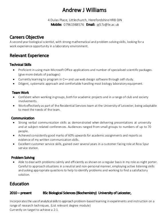
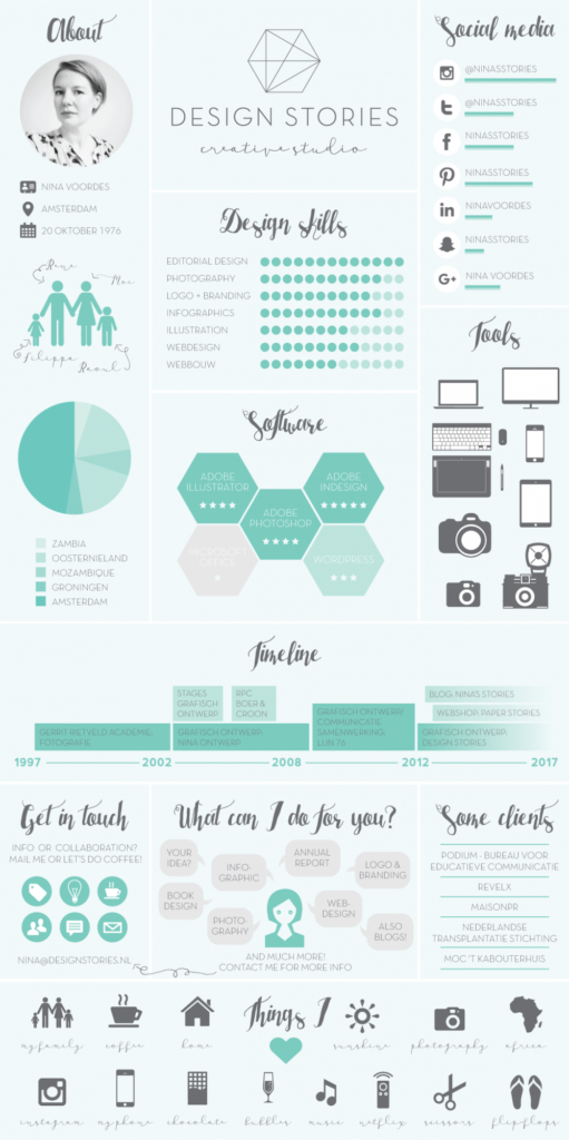
Which CV below would be most likely to catch your attention?
Is an infographic CV right for every job and occasion?
The simple answer is no. If you are applying through some online job systems they may insist on you supplying information in a certain format. However, there is no reason that you can’t have both a creative graphic resume and a more standard one too.
Presenting your benefits to a potential employer
Graphic design is about presenting information well and also about getting yourself or whatever you are promoting noticed. In this case you are selling yourself. Instead of thinking about the benefits of a product or service to its customer, think about the benefits you could offer an employer. You want a recruiter to be able to glance at your CV and quickly see what you can do for them. Doing this with an infographic resume is a lot easier than scanning your way through paragraphs of text.
Condense your CV to concise ideas
So how do you make an infographic CV? First, think about the things that an Employer needs to know. Look at other jobs descriptions for the same type of position and note what they are looking for to give yourself extra ideas. As a starting point take your basic typed out traditional CV and start highlighting key elements you want to pull out pictorially. Make sure you include key information like contact details, education, skills and experience. You might also want to include your hobbies and any awards. Other optional elements are things like testimonials from past clients.
But remember, you are trying to capture the employers attention, show them what you can do and inject a little personality rather than tell them your life story. You can always include more in depth information within an email or in your more traditional CV. Take a look at the CV below by Carla Konarski. It is bold and eye-catching, simple and to the point. If a potential client saw Carla’s CV and liked it, it would tell them all the basic information they would need to know. They could assess if Carla might be a good match to work on their project and follow up for more information. Think of it as an advert as much as a CV.
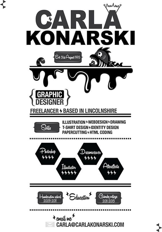
Source – https://www.behance.net/gallery/12078347/Creative-CV
Look for inspiration
Now you have your highlighted CV with key points pulled out, it’s time to start looking for some inspiration. I would suggest creating a Pinterest board where you can keep all your inspiration in one place. Plus, Pinterest is a great place to start your search too. Try searches for words like “infographic cv,” “infographic resume,” “creative cv” or “curriculum vitae ideas”. Save any designs you like to a board. Other great places to find inspiration are Behance and Dribbble. On both these sites you will also find CV templates that you can either purchase or download for free.
Other places that can provide graphic inspiration are royalty free websites such as Depositphotos. If you search for infographics you will find a lot of different examples of charts, icons and ways of presenting information using graphics.
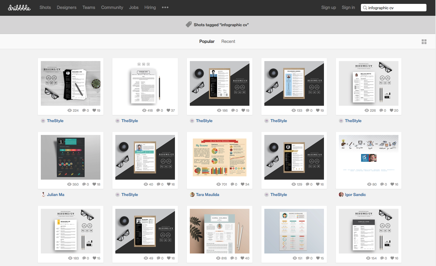
Some Example Infographic CVs
Let’s take a look at a couple of infographic CV examples I found below. Each is very different and not only provides information about the designer or illustrator, but also demonstrates the quality of their work and a bit of personality.
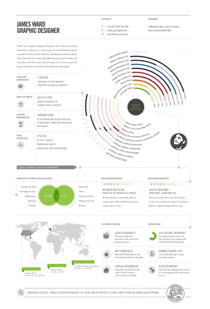
James Ward’s CV is beautifully structured and organised with some nice white space. He uses graphs, charts, maps and icons to represent aspects of his life and career. If I saw James’ CV without reading it I would assume that James was very good at information design and high end corporate work. So as well as the information being accurate, you need to ensure that the graphic style of your CV gives the impression you want.
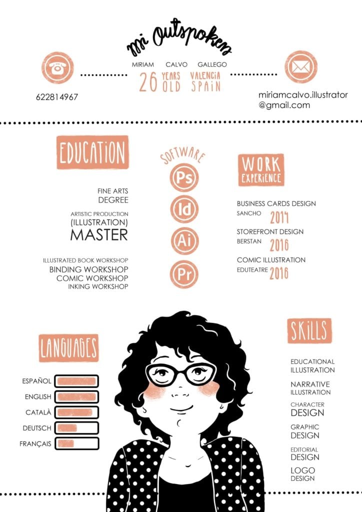
In complete contrast is Miriam Calvo Gallego’s CV which is beautifully quirky and shows off her illustration style really well. She uses very simple icons for her contact details, circles to show her software skills and a little bar chart to represent her language ability.
If you saw both of these creative resumes side by side you would immediately know how good both of these designers are. You would also have a great indication of who was most suitable for certain types of jobs.
Choosing a Theme or Concept for your infographic CV
Now you have your creative CV inspiration, think about what type of impression you want to get across. What theme or concept do you want to use that can demonstrate your style? This could be as simple as choosing a colour scheme and font styles or a bigger concept. For example, if your passion was art you could create bar charts in the shape of pencils and make drawing the theme. If you design food packaging you could make your resume have a restaurant theme. So instead of pie charts you could draw pies or cakes that have been cut up or use a fork graphic spiking numbers to represent your years of work experience.
If you want to work at a specific company, research the person you are going to contact. You can do this by looking at their social media profiles. Do they have any hobbies that you could use as your theme to specifically target them? Imagine that they were a keen football supporter. You could show how many years work experience you have as a number on a football shirt.
Once you decide on your theme try and carry it through the whole CV, without going too over the top of course.
Sketch out thumbnail design ideas for your visual resume
Sketch out thumbnail ideas for how you could arrange your information and what your icons will look like. These can start out as very simple blocks to represent areas on your page. Once you are happy with the general layout then start looking at the details. The great thing about thumbnail sketches is that they let you get ideas down quickly, before working things up on the computer.

What program to design your infographic CV?
If you are a graphic designer then Adobe Illustrator is a good choice for creating your CV. Take a photograph or scan one of your thumbnail sketches. Then place it in Illustrator to use as a guide. Work up your design and experiment with fonts and colours until you are happy with the finished result.
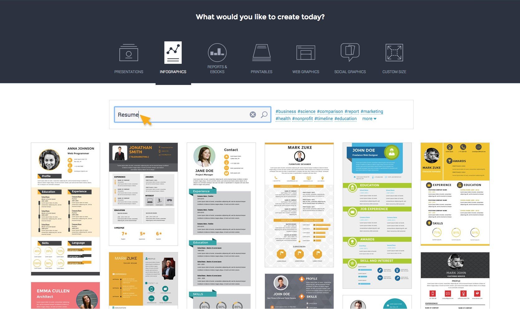
If you don’t feel that confident in your design skills there are other options available. Canva has a small learning curve and has some inbuilt CV templates that you can use as a starting point. There are also other online programs like Vizualize, Venngage and Visme (shown below) for creating your infographic CV. These apps let you start with a cv template and adapt them to you needs.
Where to post and share your infographic CV
Now you know how to create an infographic CV, you need to share it. You can embed it on your LinkedIn profile. share it on social media, put it on your website or blog. You can also Email it out to people such as prospective employers and clients, even if they aren’t advertising for new people. Further ideas might be to add it to online galleries or upload it to places like Dribbble and Behance.

