Table of Contents
Whether it’s for you or a client, creating a logo is always a tricky affair. It’s a lengthy process that requires creativity, diligence and patience. There is of course a graphic aspect to designing and developing a logo. But there is also a technical side that should not be overlooked. Because a logo is designed to live – and live for long – on various media and to be used in different ways. So here’s a tool that should make life easier for many professionals, especially when presenting to clients. Logo Lab is designed to put your logo to the test, on the web and in print, by reviewing the many different situations that it will encounter throughout its life.
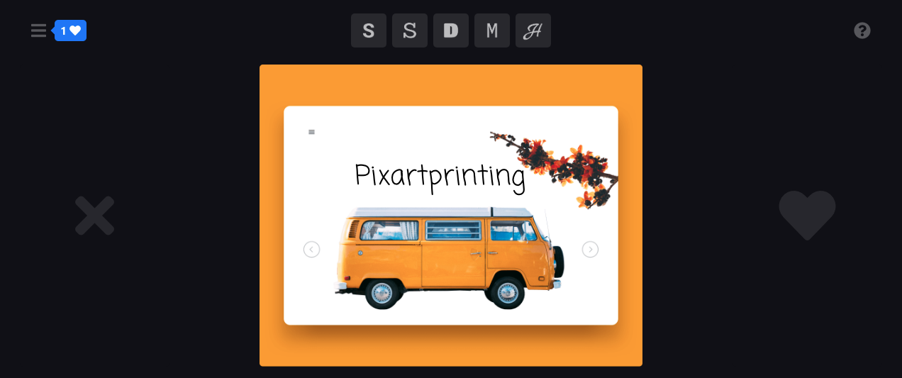
Behind the project is design agency Studio Bros., which was founded in 2006 by brothers Brandon and Brett Shepherd. Originally from Kentucky, they both love graphic design and want to develop tools that help fellow designers. Indeed, Studio Bros. have already produced two other inventive and practical tools. The first is called Font Flipper or ‘Tinder for Google fonts.‘ It allows you to preview over 800 Google fonts over your own designs and, thanks to a ‘hot or not’ rating system, collect those that you like to download and use.
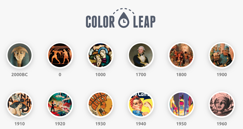
The second tool is Colour Leap. As its name suggests, this amazing tool lets you leap back through time to see the colours used throughout history. More concretely, it’s a collection of over 180 palettes containing the colours most used in 12 distinct historical eras spanning the past 4,000 years. Each palette has been created by sampling works of art from the period in question. This makes it a very useful tool for finding the right colours to use for vintage poster design, for example.
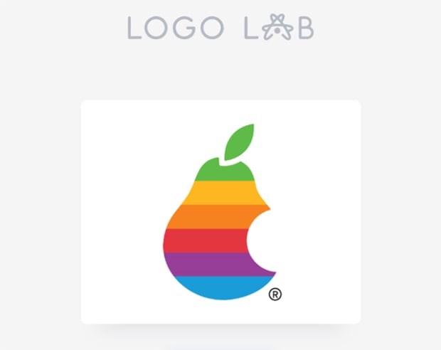
Logo Lab
But we digress. With their third free and easy-to-use service, Studio Bros. provide a sort of checklist so you don’t overlook anything when designing your logo, because the effectiveness of a logo can be judged against a range of criteria. First, upload you creation to the site. And that’s it! Logo Lab will now provide a brief assessment of your logo in 10 situations.
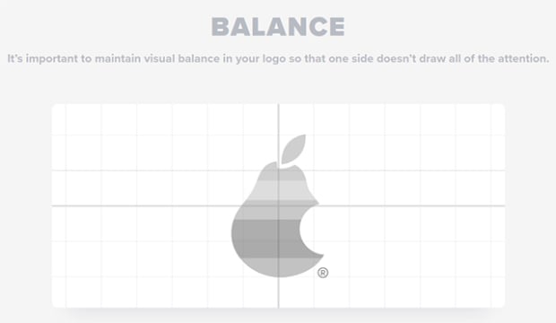
Once your logo has been analysed, the site will first show you its visual balance.
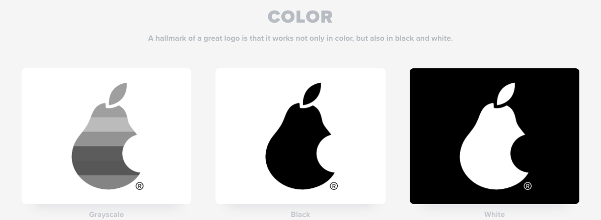
Then it will show your logo in black and white. Some details will therefore disappear.
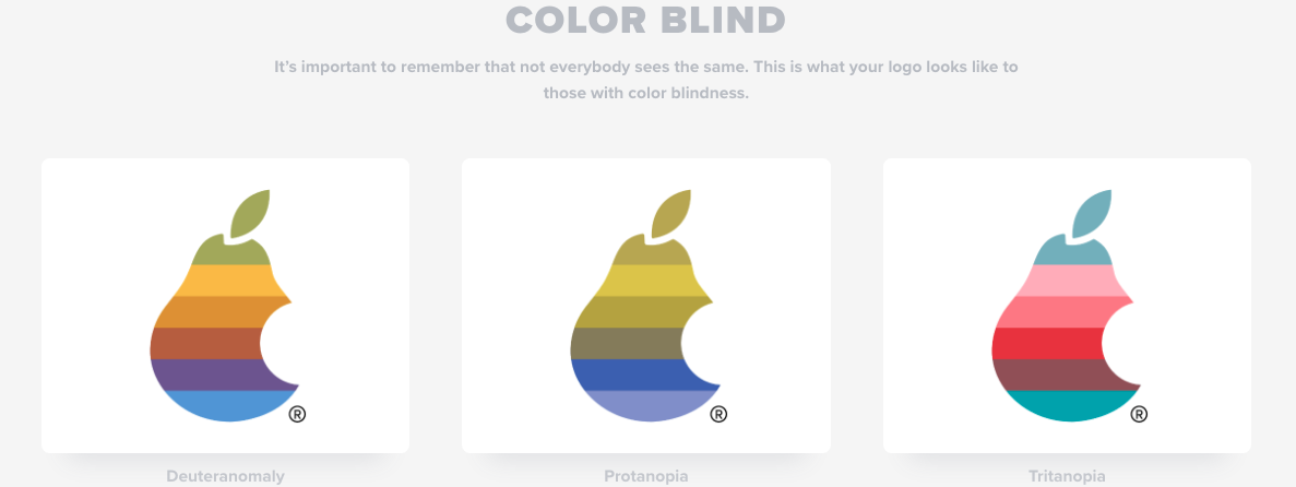
The third step will show your logo as colour blind people will see it. This is important to consider because the latest research shows that around 4% of the world’s population is colour blind: 8% of men and 0.5% of women.
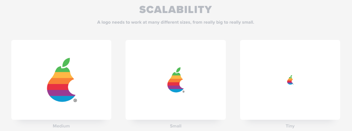
Next, Logo Lab will present your logo in different sizes. Is it legible when really small? How would it work on a business card, for example?
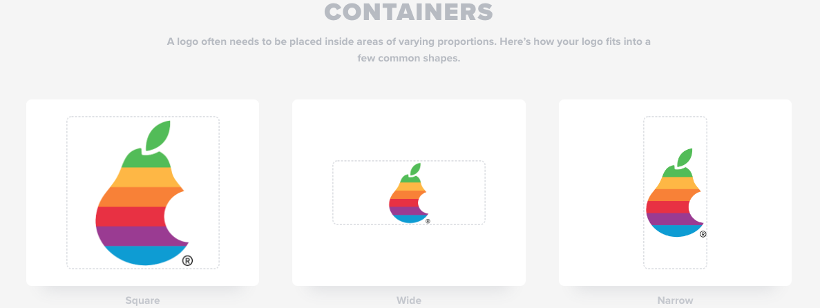
The subsequent step places your logo in areas of different formats.
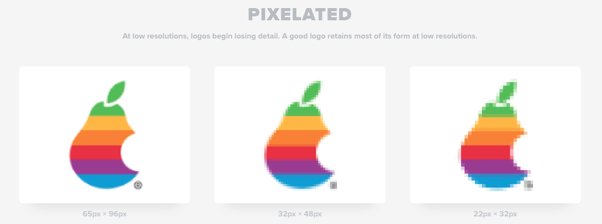
Next: what does your logo look like at low resolution? The site explains that a good logo keeps most of its shape even when pixelated.
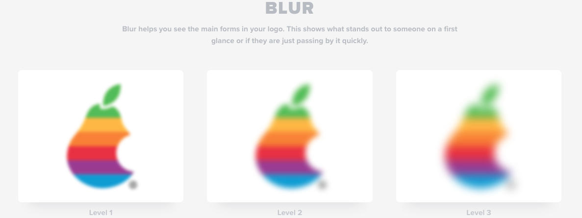
The blurred version shows how your logo would look at first glance or when passing quickly by.
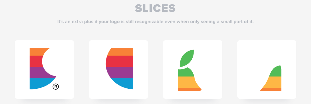
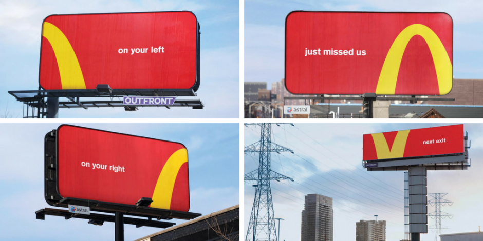
Step eight slices up your logo. Is it still recognisable?
If so, it’s a real advantage, as demonstrated by this highly original campaign for McDonald’s from Canadian ad agency Cossette.
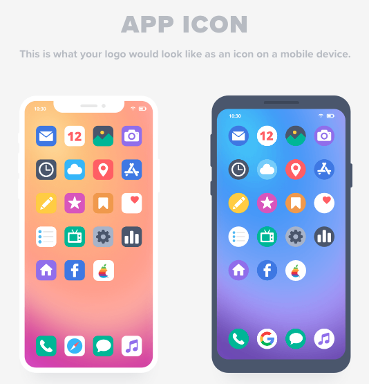
The penultimate step turns your logo into an icon on a mobile device.
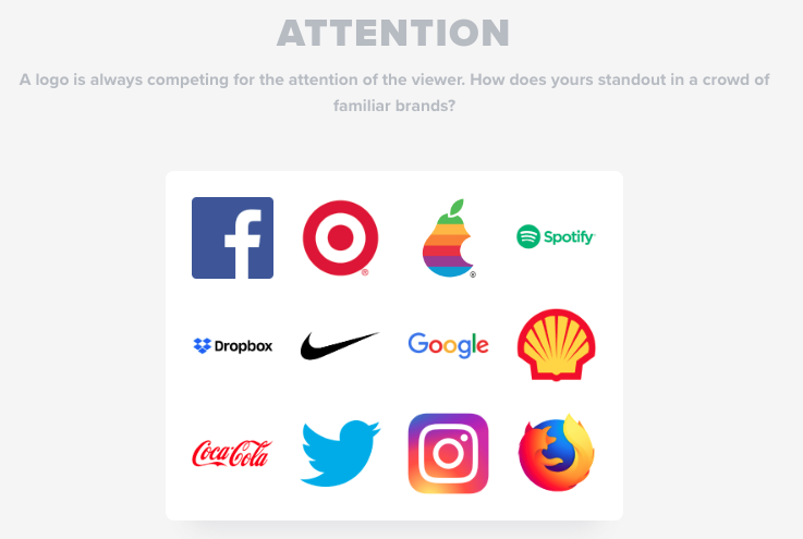
And lastly, Logo Lab displays your logo among those of famous brands. Does it get lost or does it stand out from the crowd? Don’t forget that our eyes are exposed to thousands of advertising messages every day!
Now it’s time to put your logo to the test: https://logolab.app/home

