Table of Contents
One product, now decidedly retro, sparked a mini revolution in the world of graphic design and typography when it was first sold in the early 1960s: Letraset transfers, also known as instant lettering.
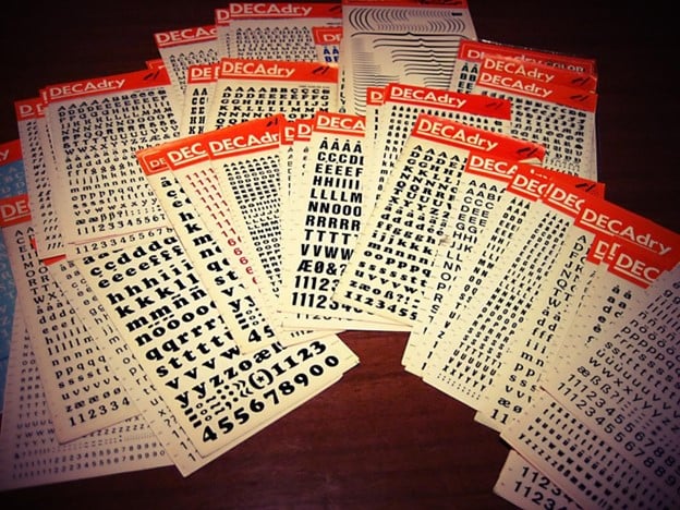
These were special glossy coloured sheets, each one packed with myriad glyphs, letters, symbols and decorations and (later) also logos and small drawings. This straightforward tool and relatively simple innovation nevertheless made something possible that had previously been almost unimaginable: anyone could now make their own posters or fanzines from the comfort of their own home for just a few pence!
Today we’ll tell the story of this iconic brand and how its transfers influenced the look and popular culture of the 1960s, 1970s and 1980s.
Sheets and fonts destined for success
It was 1961, and many events that would leave an indelible mark on the new decade had not yet occurred: The Beatles, for instance, had only just formed, and were yet to start writing their first album, Please Please Me. That year, a newly founded company in London – Letraset – began developing a new product: dry transfers.
The concept could not have been simpler: all you had to do was place the sheets on any surface and rub carefully and the letter would be printed, or to be more precise, transferred. The Letraset sheets were made of a heat-sensitive material, and the letters were printed with special inks. Rubbing them increased the heat and transferred the character to the substrate beneath without needing a thick plate. The result looked like real printing.
It was the start of a miniature revolution: for the first time, people could make any graphic product they wanted from their own home. Absolutely anyone could design and produce their own poster, advert, fanzine or flyer!
Patented in 1962, Letraset transfers were an instant commercial hit, and ended up in millions of people’s homes. In the years that followed, other businesses took advantage of the same technology, with transfers produced by the Veneto-based company R41 becoming very popular in Italy, for example.

Graphic composition within everyone’s reach for the first time
We now take it for granted that anyone can make a flyer with a range of fonts, decorations and images using their computer or smartphone. But in the 1960s this was something completely new, and it remained that way for several decades – the first PCs only started to appear thirty years later.

In the 1960s, putting together and printing a graphic product still required hugely expensive machines and the expertise of graphic designers and typographers. Transfers, meanwhile, only cost a few pence and did not require great technical skills to use. They were the first DIY graphic composition technology and, unsurprisingly, they were enormously successful.
As a result, transfers had a huge influence on the look and popular culture of the 1960s, 1970s and 1980s. The new accessibility of graphic composition sparked the creativity of amateurs and professionals alike. And the world of graphic design became more… democratic.
People began experimenting: the iconic transfers were used by graphic designers, design studios, architects, ad agencies and artists. Everyone started exploring options that until then had been considered taboo: playing with printed letters and lettering, breaking up and rotating words, using myriad different fonts that were finally available at an affordable price, and altering them by manually lengthening or shortening the glyphs.
https://www.youtube.com/watch?v=MLvbLnFwQn0&ab_channel=ARTE
The ‘anarchic’, low-cost and unmediated nature of transfers made them very popular among the era’s counterculture movements. In some cases, employing a publisher or professional graphic designer would have increased the risk of whatever the creator had in mind being censored or not produced at all.
This is one of the reasons the punk movement loved transfers, as this interesting documentary on the Arte channel (in French) explains: the technology was frequently used on record sleeves.
What happened to transfers?
Transfer technology remained popular for many decades. Letraset also used it over the years to create children’s games.
In the 1990s, people started buying their first PCs, and naturally instant lettering began to become obsolete. However, one little-known fact is that in those years Letraset also went digital: the British firm produced various graphic design programs for Macintosh, including ImageStudio and ColorStudio, which, to be honest, were not particularly successful.
However, the firm managed to survive until the 1990s on the back of the rights to its fonts that had become popular thanks to instant lettering and that were gradually digitalised. Indeed, certain fonts still include the word Letraset in their name today.

Letraset’s legacy is therefore still very much alive, and not just as the first company to democratise the world of graphic composition! For example, Letraset apparently popularised the use of Lorem Ispum as placeholder text, as Letraset sheets were some of the first objects to contain it.
In addition, the dry transfer technique retains a certain appeal because of its tangible nature in an increasingly digital world. Malcom Garret, a professor at the Manchester School of Art and one of the first to use instant lettering on record sleeves in the 1970s, describes the amazed looks of his students when they first discover the technique.
If you’ve been hit by a wave of nostalgia or want to experiment with this technique, you can visit Letra Shop, an online shop that still sells Letraset transfers! Alternatively, the London-based publisher Unit Editions has released a beautiful limited-edition book entitled Letraset: The DIY Typography Revolution.
How about you? Have you seen transfers before? Would you still use them in your work?

