
Table of Contents
“If adventure has a name, it must be Indiana Jones!”
For people who grew up in the 1980s, and indeed many others too, this short but effective tagline is enough to elicit a series of images. A dusty fedora hat, the crack of a whip, Harrison Ford’s sly smile, mysterious objects, imaginative traps and chases of all descriptions: just some of the unforgettable elements of the highly acclaimed Indiana Jones film franchise.
Many of these features appear in the iconic opening scene of Raiders of the Lost Ark, Steven Spielberg and George Lucas‘ 1981 box-office breaking hit, which launched the saga that tells the tale of an archaeologist who is afraid of almost nothing (apart from – famously – snakes).
Over the years, a further four films were added to the franchise, making Indiana Jones the second-highest-ranked hero of the last 100 years and one of pop culture‘s most recognisable characters.
Today we’d like to tell the story of the Indiana Jones films through their posters, both those produced in America and across the globe – meticulously crafted printed products that have accompanied all the exploits of the planet’s most adventurous archaeologist through the decades.
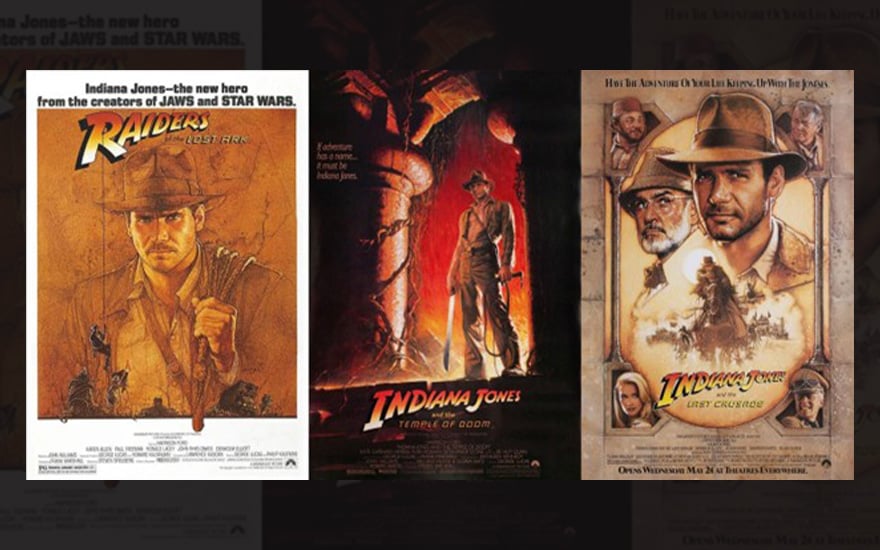
The poster for the first Indiana Jones film: Raiders of the Lost Ark
The American film-maker and producer George Lucas – the creator of the hugely successful Star Wars saga – sketched out his first ideas for Indiana Jones way back in the early 1970s. His main inspiration came from popular 1930s adventure-filled TV series, which Lucas wanted to bring back into vogue. Indiana Jones – who was initially going to be called Indiana Smith – was meant to be a sort of James Bond, but without the gadgets.
However, the project only came to fruition years later, when George Lucas met Steven Spielberg – who would later direct the film – to develop the idea. And so, in 1981, the man who would become the most famous archaeologist of all time made his cinema debut.

The first film in the saga – Raiders of the Lost Ark – saw Indiana come face-to-face with Nazis searching for the mythical Ark of the Covenant, which would make them invincible.
The design for the first Indiana Jones poster was entrusted to Richard Amsel, a young and talented American illustrator. This inaugurated an important tradition: all the major Indiana Jones film posters that followed would be drawn by hand.
Here’s an interesting facts you may not know about the poster for Raiders of the Lost Ark: Amsel designed two versions, one in 1981 and the other in 1982. The 1981 poster had to depict Indiana Jones before he became universally known. As is often the case, the illustrator did not have the chance to see the full film before getting to work, resulting, as some admirers have acknowledged, in a poster that reflects the character’s more enigmatic and energetic nature.

As this interesting summary explains, creating the poster turned out to be far from simple: the producers had to get Amsel to make several changes to the image, and the whole poster project teetered on the brink of collapse. One request was to reduce the size of Amsel’s signature on the poster, which originally was almost as big as the name of the film’s protagonist!
Raiders of the Lost Ark became the most watched film of 1981. Following its extraordinary box office success – which made Indiana Jones a household name across the world – the film returned to the cinema in 1982. For this re-release, the poster was obviously quite different. By this point, Richard Amsel had seen the whole film, along with several million other spectators.
The poster featured a remarkable collection of different characters, a format the designer previously used for his poster for Murder on the Orient Express. Unlike the 1981 poster, this one captured another of the film’s essential aspects: Indiana Jones’ face is lit up with a friendly grin, reflecting the film’s undeniable humour.

One final interesting fact about this poster is that it took Amsel countless attempts to find the perfect pose for Indy’s iconic whip crack.
The two posters for Indiana Jones and the Temple of Doom
By 1984, Indiana Jones had become a byword for adventure. This was the year the second film in the saga came out: Indiana Jones and the Temple of Doom, a prequel to the first film, set a few years earlier.
George Lucas decided to make this film somewhat darker than its predecessor. This time, Indiana Jones was engaged in helping a village to search for a mystical stone to save its inhabitants and their children from a dark cult practising human sacrifice and black magic.
The first poster accompanying the film’s release was therefore very dark too, depicting Indiana Jones at the entrance of a dimly lit temple. This very mysterious poster was designed by Bruce Wolfe.

Unfortunately, some of the millions of cinemagoers eager to watch the new film about their favourite archaeologist were not expecting the adventure to take such a dark turn. Some parents complained that they would not have taken their children to see it if they had known. The distribution company therefore tried to repair the damage by producing a second version of the poster, after the film’s release.
Since they had very little time available, they opted for a safe bet. The alternative design for Indiana Jones and the Temple of Doom was entrusted to the man Stephen Spielberg considered the best poster designer around at the time – Drew Struzan – who had already created an alternative poster for the first film.

Struzan’s had previously created the iconic Star Wars poster, and he continued his successful work with George Lucas, Steven Spielberg and other greats in the years to come. Other unforgettable films in the American illustrator’s portfolio include Back to the Future, The Shawshank Redemption, Rambo, Harry Potter and The Lion King – along with 100 or so others.
Drew Struzan’s style became intricately tied to Indiana Jones’s identity in the years that followed.
The poster for Indiana Jones and the Last Crusade, featuring Indy’s dad
In 1989, five years after the release of The Temple of Doom, Steven Spielberg and George Lucas unveiled Indiana Jones and the Last Crusade: the third chapter dedicated to the archaeologist’s exciting adventures.
After a foray into darker storylines – and the resulting criticism – in this film Indiana Jones returned to a more light-hearted atmosphere. And the baddies from the first film – the Nazis – also returned, this time searching for the Holy Grail, an idea the screenwriters only settled on after various rewrites. Discarded ideas included various suggestions inspired by Chinese mythology, including a peach that offered immortality to whoever ate it.

Indiana’s character was greatly enriched in the film by the depiction of his unique relationship with his father, played by Sean Connery. The idea of adding this vital character also came after years of rewriting, this time following a suggestion by Steven Spielberg.
The posters also give Indiana’s dad a prominent position – they were designed by Drew Struzan, whose art style had now become associated with the saga. The poster even mentions the ‘Joneses’, referring to father and son, and Sean Connery’s face appears next to Harrison Ford beneath the rim of his now iconic hat.
One of the alternative posters, meanwhile, is dedicated to a half-length portrait of Indiana Jones and his whip, but the accompanying text mentions his father’s arrival on the scene.
The poster for Indiana Jones and the Kingdom of the Crystal Skull
Although way back in 1977 Steven Spielberg and George Lucas had signed a contract for five films, Indiana Jones’ creators thought it should naturally be wrapped up as a trilogy.
Indiana Jones and the Last Crusade had taken years of work, and had caused Stephen Spielberg to miss out on directing other films, including the (later much-acclaimed) Rain Man.

However, in 2008, almost 20 years after the release of the previous film, they changed their mind: a fourth chapter in the cult saga was released in cinemas around the world: Indiana Jones and the Kingdom of the Crystal Skull.
This film – the biggest-grossing Indiana Jones film – was packed full of all the saga’s most iconic elements.
There was the sexiest archaeologist in cinema, still played by Harrison Ford. There was Stephen Spielberg behind the camera, directing a story by George Lucas. There was a magical object to be found. There was an exotic location (Peru, to be precise). There were baddies – Soviets this time, as the tale was set in the 1950s.
And, of course, there was a hand-drawn Drew Struzan poster.
The poster for Indiana Jones and the Dial of Destiny
While the fourth Indiana Jones chapter was a fantastic celebration of the explorer with the whip and hat, in 2023 an Indiana Jones film was released that – at least in formal terms – lacked many of the saga’s staple features: Indiana Jones and the Dial of Destiny.
The franchise had been acquired by Disney, and Steven Spielberg and George Lucas were no longer directing it, although they did remain executive producers.

But all was not lost. When it came to the poster, some fans were pleased to note that the distribution company had remained true to the tradition of using a hand-drawn image. Here too, however, there was something new. The poster was not drawn by Drew Struzan, but by the American graphic designer Tony Stella. The artist did, however, follow the style used by his predecessors, creating a well-balanced composition of the various characters, this time in a 1960s style to reflect the film’s setting.
Compared to its predecessors, Indiana Jones and the Dial of Destiny was the least successful at the box office: a real flop given the exorbitant production costs.
Indy, a global icon
As usual, we will close with one of our favourite things to do: a round-up of posters from all over the world. Ever since its first release in 1981, Indiana Jones has earned a special place in the hearts of generation after generation of international fans.
But which printed posters have accompanied the explorer’s journey and his films? Some posters kept the style, and in some cases the illustrations, of the American versions. Here, for example, are three posters created for the release of Raiders of the Lost Ark, in Argentina, Italy and France respectively.

Other posters, meanwhile took a decidedly different approach from the style of the originals. One highly unique and rare example is a Japanese poster, which does not focus on Harrison Ford as Indiana Jones, but on the film’s two creators, Steven Spielberg and George Lucas.

As is often the way, the Polish posters deserve a special mention. Below you can see the film poster for the 1983 Polish release of Raiders of the Lost Ark, created by Jakub Erol. Erol became famous for his highly surreal style and bizarre choices, not only here but on designs for other cult American movies like Alien and Terminator.

Here are some other Polish posters for Indiana Jones and the Temple of Doom and Raiders of the Lost Ark. You certainly can’t say they lack originality!

Here is the German poster for Indiana Jones and the Temple of Doom, featuring a fairly original composition of images from the film, bordered by Indy’s iconic whip crack.

Here’s another noteworthy Japanese poster. Can you guess which film in the saga it refers to?

The Czech poster for Raiders of the Lost Ark, meanwhile, chose a completely different approach from the light-hearted American posters. It looks more like a history documentary!

Finally, here is one of the Japanese posters created for the final chapter in the saga: Indiana Jones and the Dial of Destiny. The entire poster is taken up by a mysterious Indiana, shrouded in darkness. Does the 1980s hero have any more surprises in store for us?
