Table of Contents
At a time when the concept of ‘customer experience’ has become a full part of companies’ marketing strategies, it is incomprehensible that there are still packaging producers who are determined to make life difficult for us. It’s happened to us all. Something you bought online arrives in a package, or you get a gift, and there’s no way to open the box – or you even hurt yourself trying to. It may seem like an exaggeration, but according to a study by packaging company DS Smith, Spaniards spend 49 days of their lives struggling to open packaging, and 90% admit to feeling frustrated when they’re unable to open it.
If the majority of the population finds something so simple difficult, the problem is multiplied for those who have a disability or some other kind of physical limitation. In the search for a solution, the inclusive packaging model was born. It is based on developing products that are easy to access for the greatest possible number of individuals, no matter their age, cultural level or physical or cognitive capacities, without the need to create adaptive versions. To do this, it uses elements of graphic design – allowing the function of the product to be quickly recognised – and structural – for ease of use.
Here are some of the most innovative designs that are currently or soon-to-be available.
Easy-opening and readable packaging for the elderly
Most countries in the world are experiencing an increase in the number and proportion of older people. The United Nations ‘World Populations Prospects 2019‘ report states that the number of people aged over 80 will triple by 2050. However, packaging design often overlooks age-related challenges, such as loss of strength and difficulty in gripping due to arthritis, rheumatism or diseases such as Parkinson’s. Therefore, packaging needs to be smaller, more manageable and easier to open.
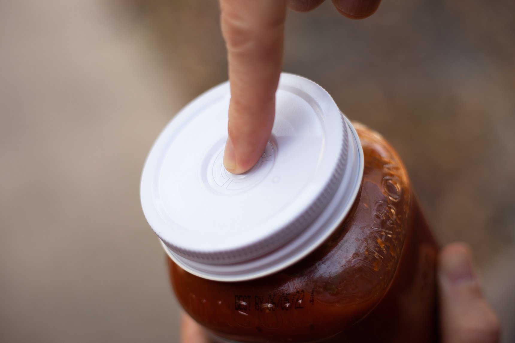
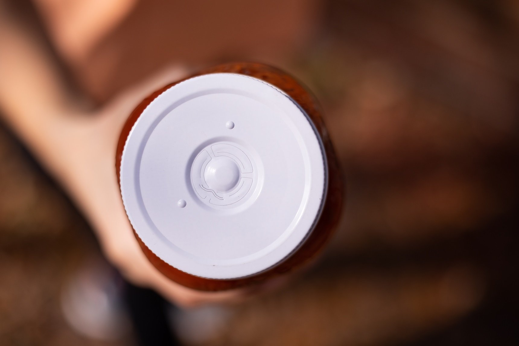
The US company Consumer Convenience Technologies has created the world’s first aluminium screw cap, which requires 40% less strength to open. It has a button that, when pressed, breaks the vacuum in the container to turn the lid more easily. After using the product, the button is pressed again to close the lid and prevent spillage.
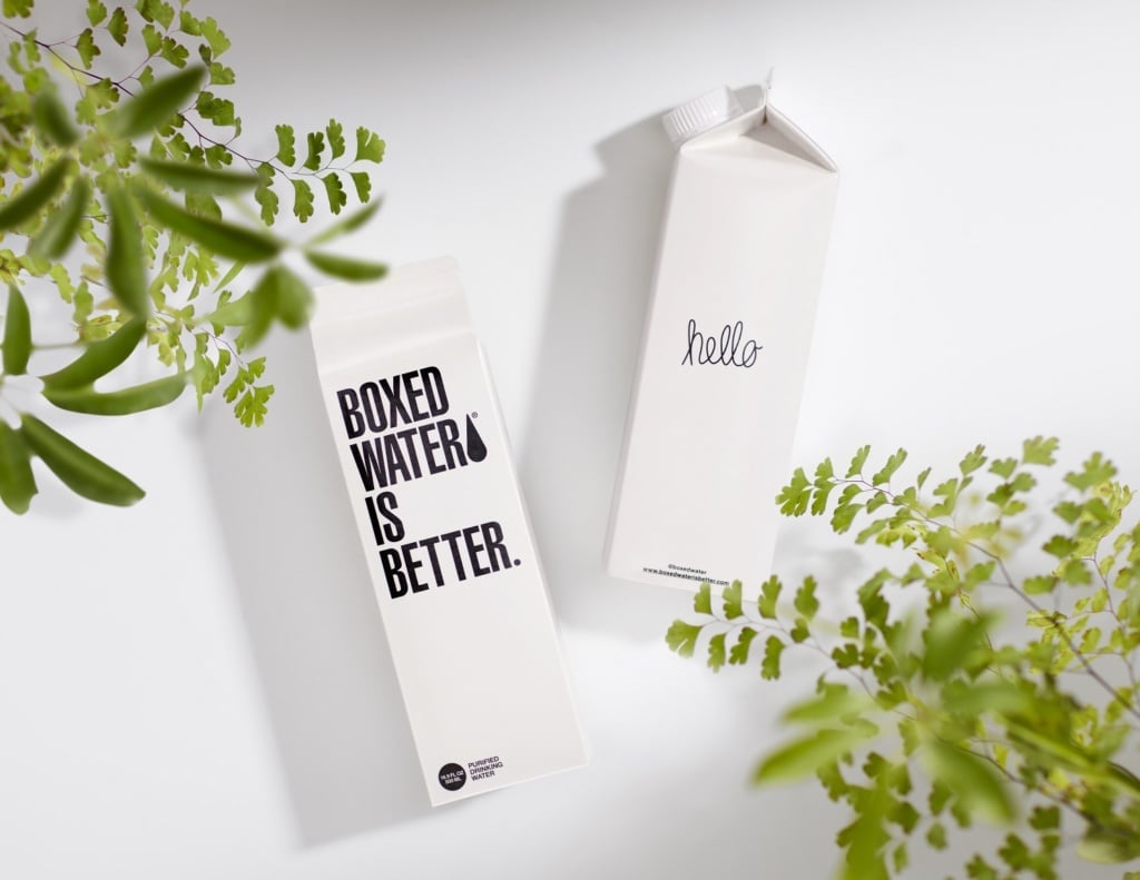
Older people can also have problems reading text or instructions on products due to the size, which is why it is important to use large and readable fonts. Representative images or illustrations can also be included for better identification of the product. This is something that Boxed Water has taken into consideration when creating their water tetra briks which, in addition to being made from 90% recycled materials, also use large and concise texts.

Markings and codes for the visually impaired
For people who are blind or have some degree of visual impairment, there is no way to differentiate between two products that are different but have the same packaging, such as a can of soft drink and a can of beer, or a bottle of shampoo and a bottle of conditioner. Inclusive packaging offers solutions for easier recognition and use of a product, such as braille labelling.
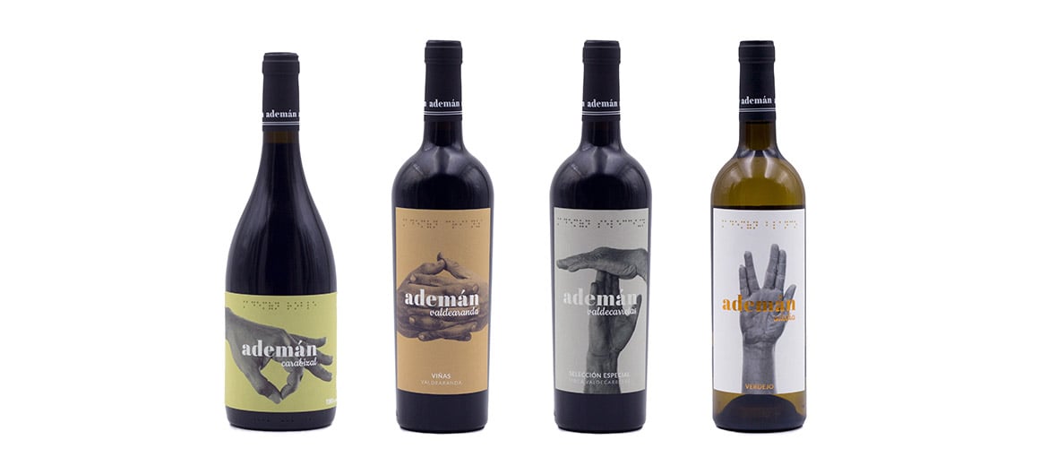
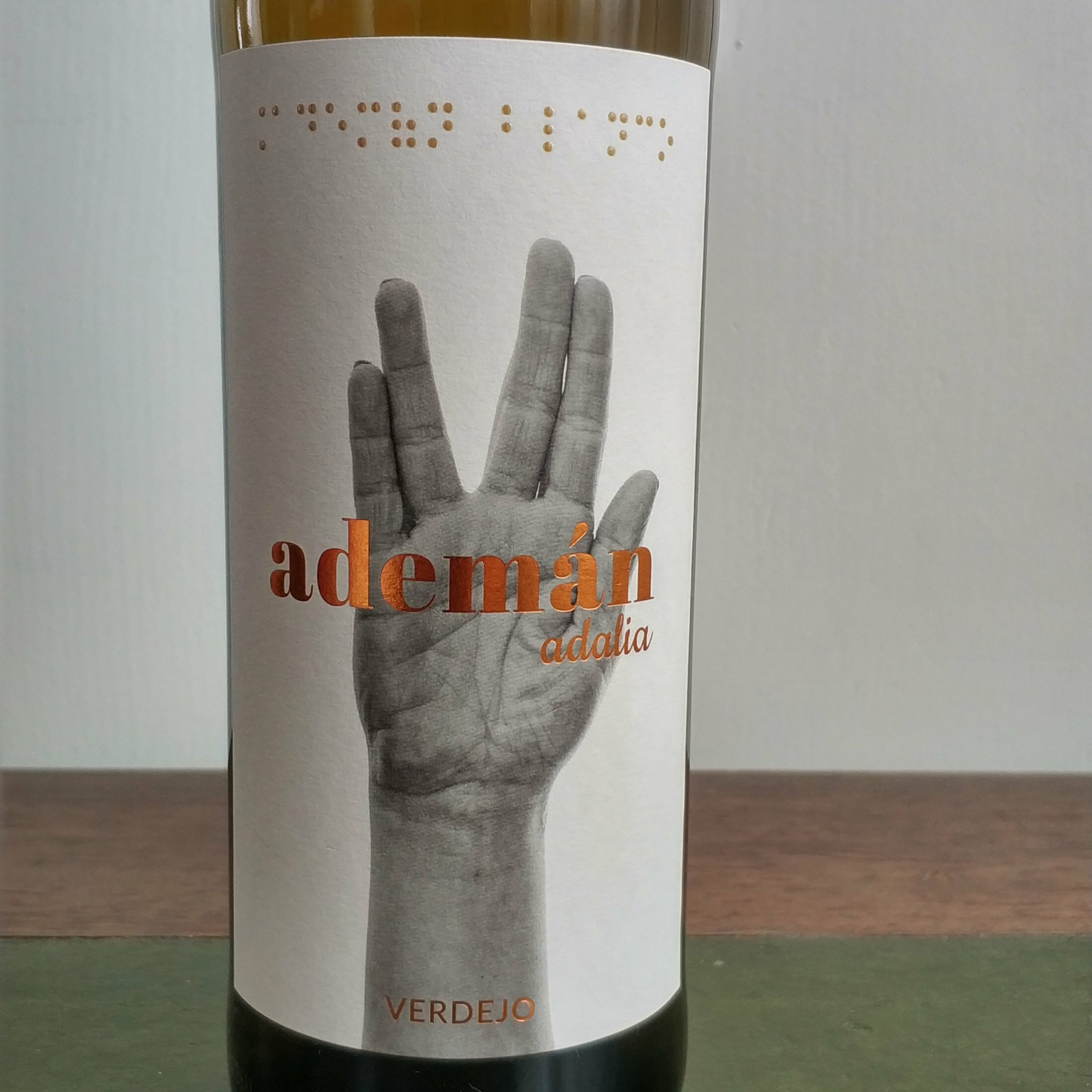
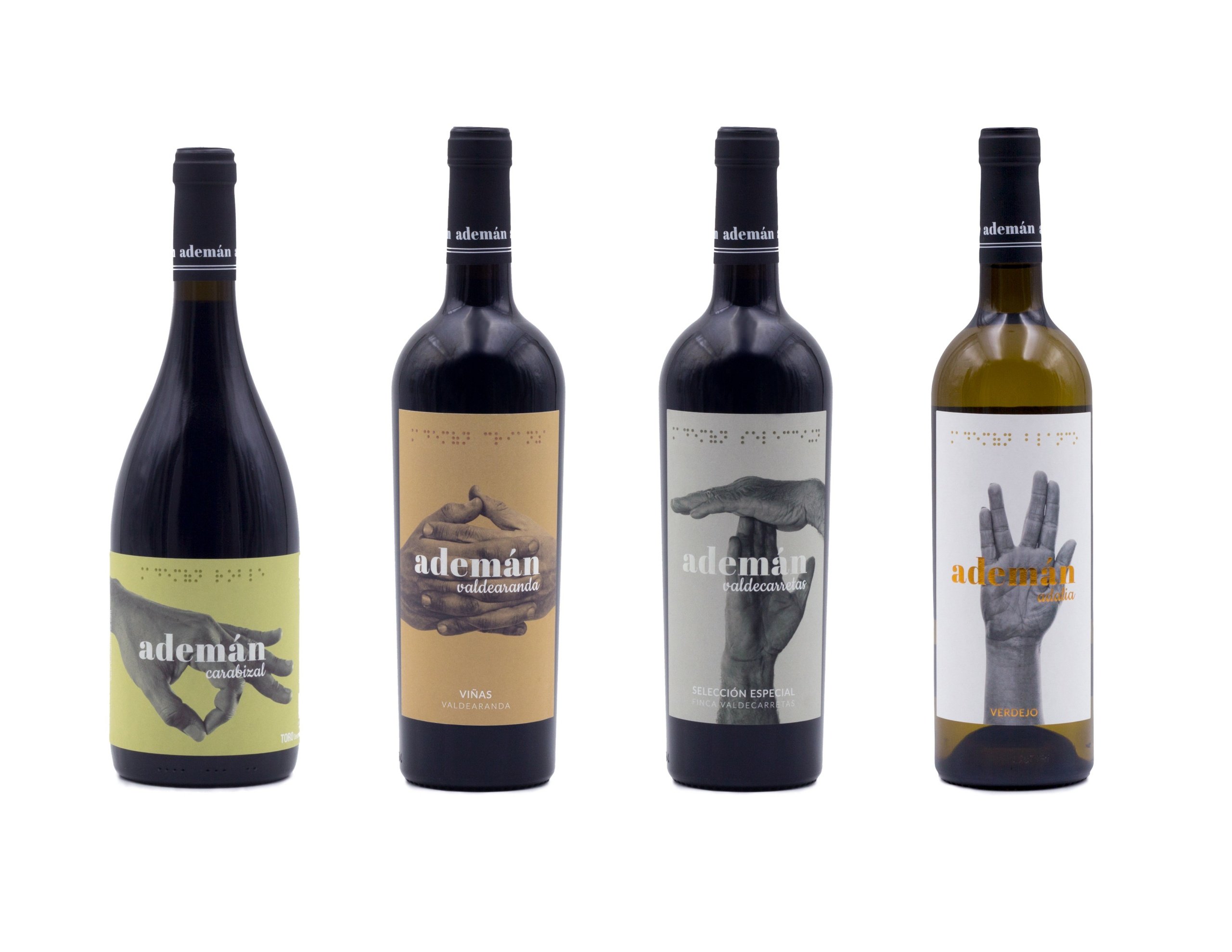
Bodega y Viñedos Maires has opted for this practice on the four bottles of its Ademán wines. This family-run Spanish winery wanted to represent different stages of people’s lives through the gestures that can be seen on the labels. The Roble is represented by a young hand making the symbol of a three-pointer in basketball; the Crianza, with mature hands making a gesture of reflection; the Selección Especial by the hands of a farmer making the time-out sign; and the white is the Vulcan salute from the ‘Star Trek’ series. At the same time, the braille system makes it easy for people with visual impairment to identify each bottle.
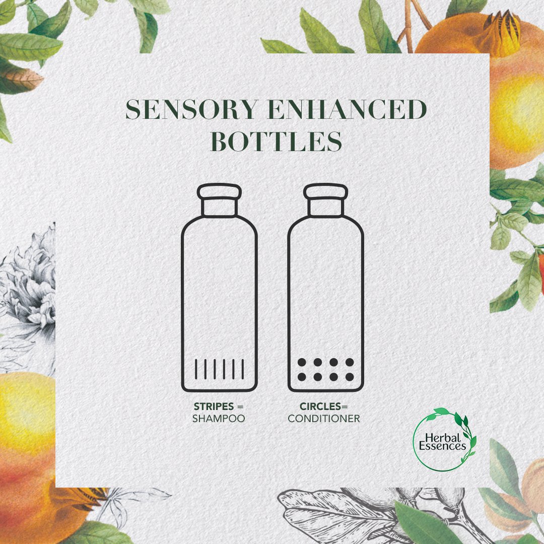
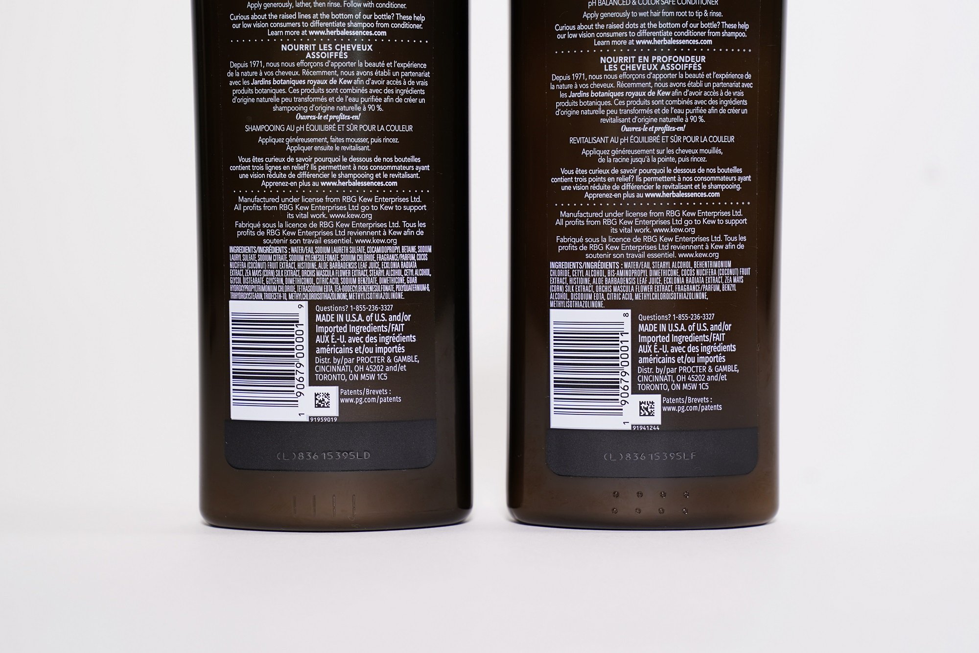
Herbal Essences, meanwhile, has opted for a system of embossed markings for the packaging of its organic range. It features one row of lines for the shampoo and two rows of dots for the conditioner, both on the bottom of the bottles. Since the markings by touch alone, it is a universal design, which also includes people who have not had the opportunity to learn braille.
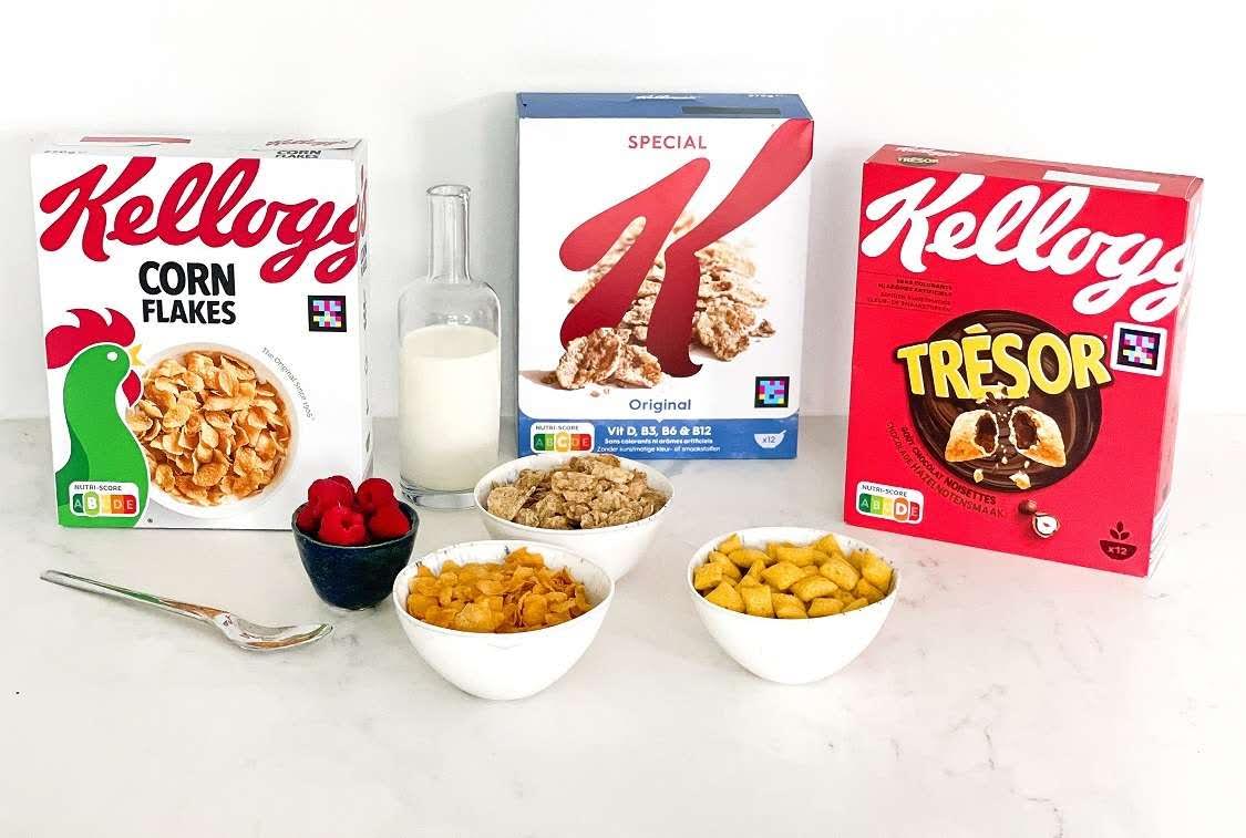
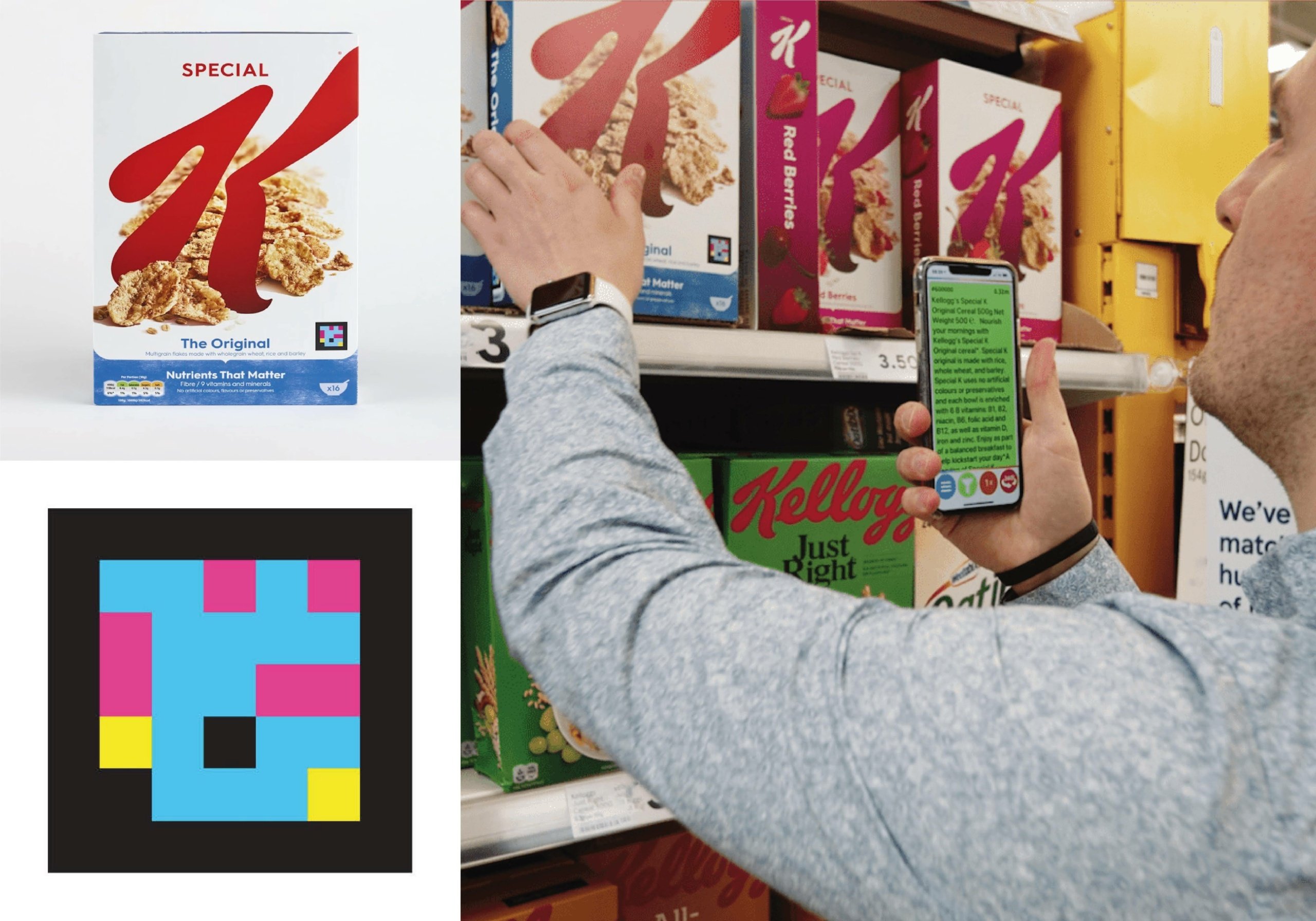
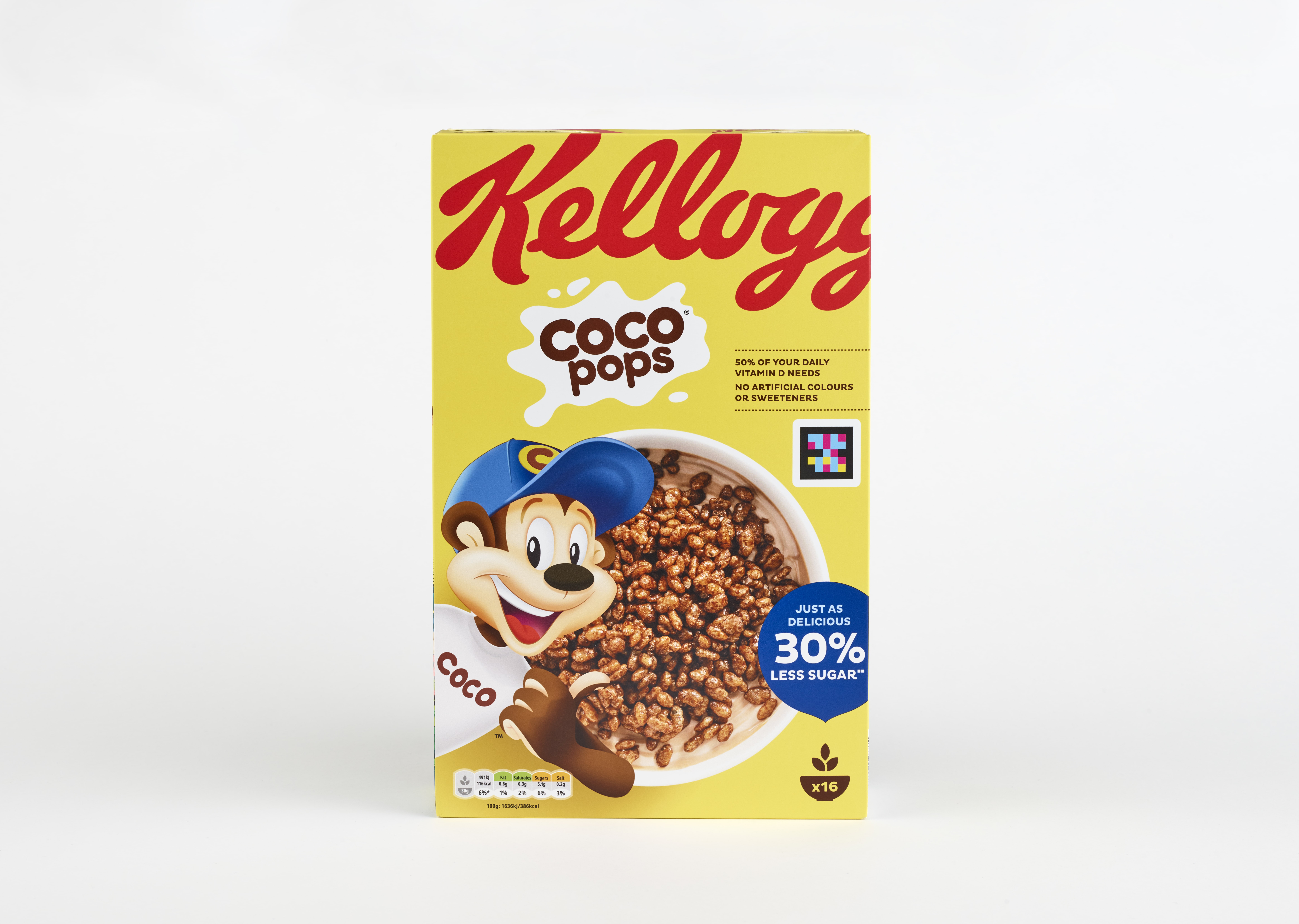
The company Kellogg’s has announced that all cereal packaging sold in Europe in 2022 will include the NaviLens code, to ensure that the labelling is accessible to visually impaired people. This technology, developed by Spanish company NaviLens in collaboration with the University of Alicante, includes a high-contrast coloured square on a black background. The user does not need to know exactly where it is – they just have to point their phone in the direction of the cereal box at a distance of up to three metres. They can then choose to have the information about ingredients, allergens and recycling read aloud, or they can read it on their own device using their accessibility tools.
Products designed for universal use
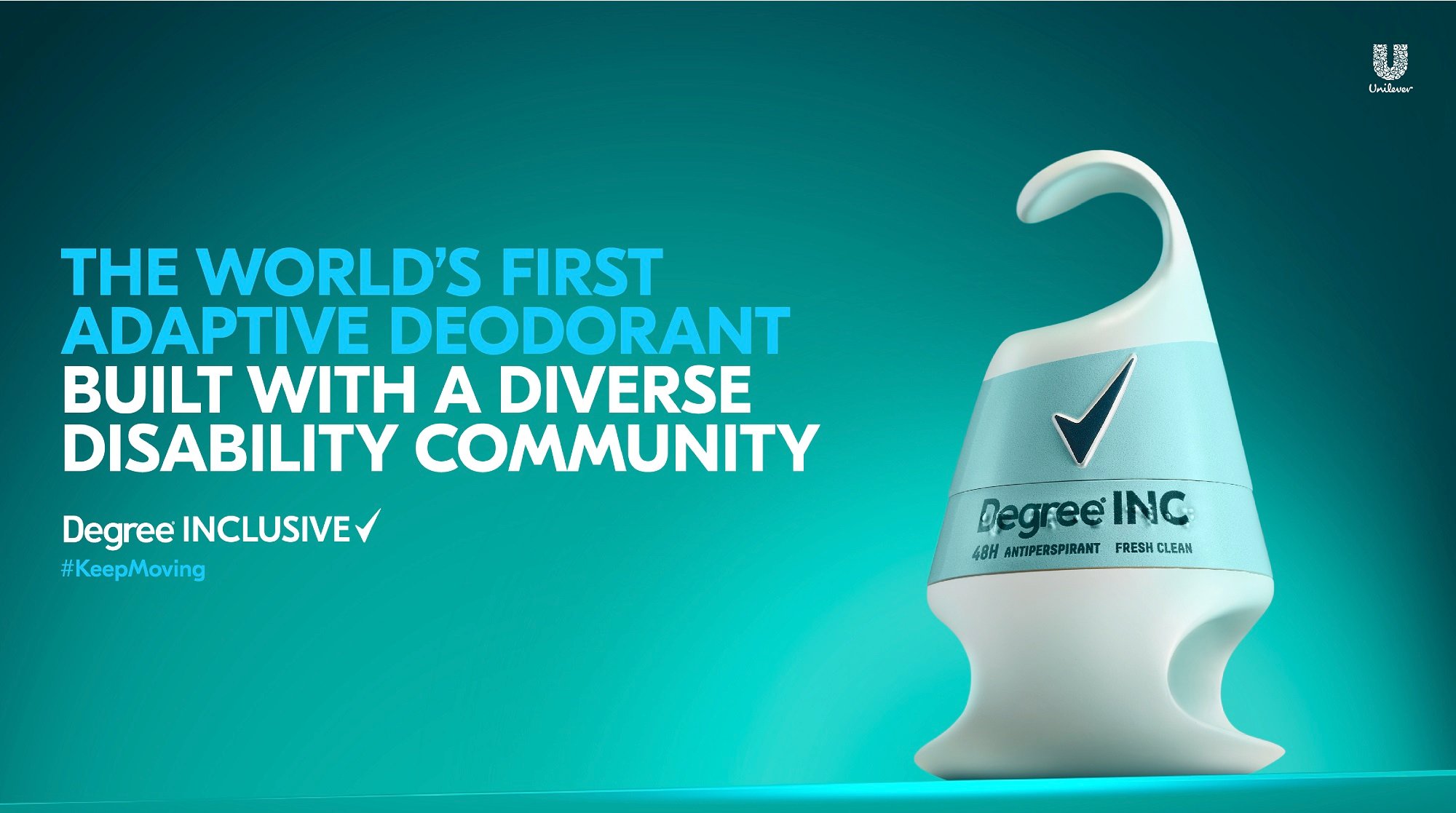
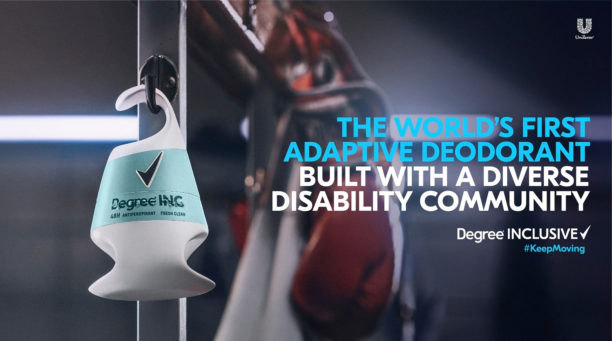
The ultimate goal of inclusive packaging is that the same product works for everyone, which is what Unilever has set out to do with its Degree Inclusive, designed in collaboration with a multi-disciplinary team of people with different disabilities. It is the world’s first inclusive deodorant, designed for people with upper limb disabilities and visual impairments, but also for general use. It has a hooked lid so that it can be opened with one hand, incorporates Braille text on the label, and has an ergonomic design on the bottom.
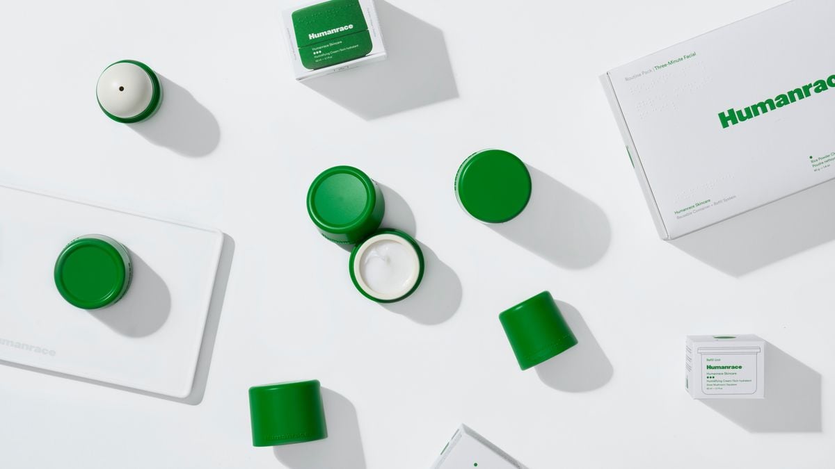
Everybody has skin. It is a universal characteristic regardless of gender, ethnicity, race or age. But the majority of beauty products are aimed specifically at one group of people. That was the jumping off point for rapper and music producer Pharrell Williams to create an inclusive brand of gender-neutral face products – cleansers, exfoliants and moisturizers – named Humanrace.
Ultimately, the packaging industry has a responsibility to put products on the market that are adapted to the needs of all customers. Paying attention to these sorts of issues can also be key to successful sales, since when consumers perceive a brand as inclusive, their loyalty increases. Conversely, 32% of consumers admit that frustrating packaging has led them to not buy the same brand, according to the DS Smith study. The good news is that companies are now becoming more sensitive to this issue.

