Table of Contents
Welcome to the latest leg in our journey around the fantastic world of illustration, exploring the many possibilities offered by this highly imaginative form of communication.
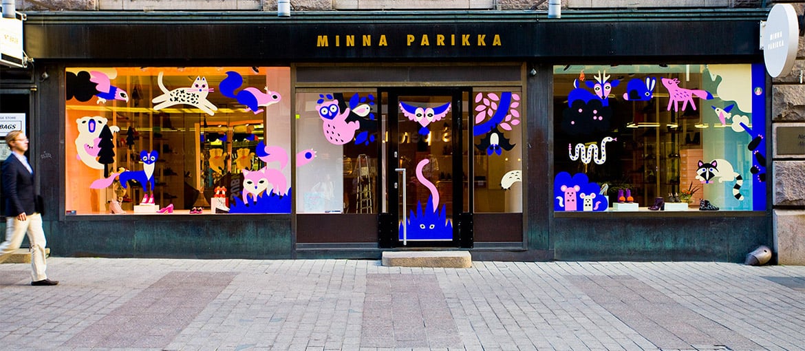
In a world dominated by photography, using an illustration, particularly in large format with unusual pairings of bright colours, is a sure way to attract attention. One of the places where marketeers have always had to fight hardest to stand out and sell products is on the high street, where passers-by browse shop windows. What people see in window displays affects their purchasing decision-making even if they buy the objects online: people love going into shops, department stores and boutiques as it gives them an opportunity to see and test out the products and provides an overview of the different options available, so they can choose the one they want.
Illustration and shop windows from the 1920s to the 1970s: a labour of love
Illustration has always been popular in shop windows all over the world.
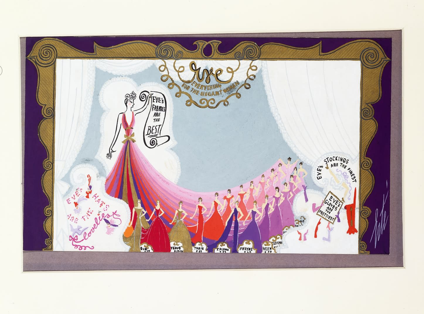
As far back as the glittering 1920s, shops were pulling out all the stops to attract people in and turn them into customers.
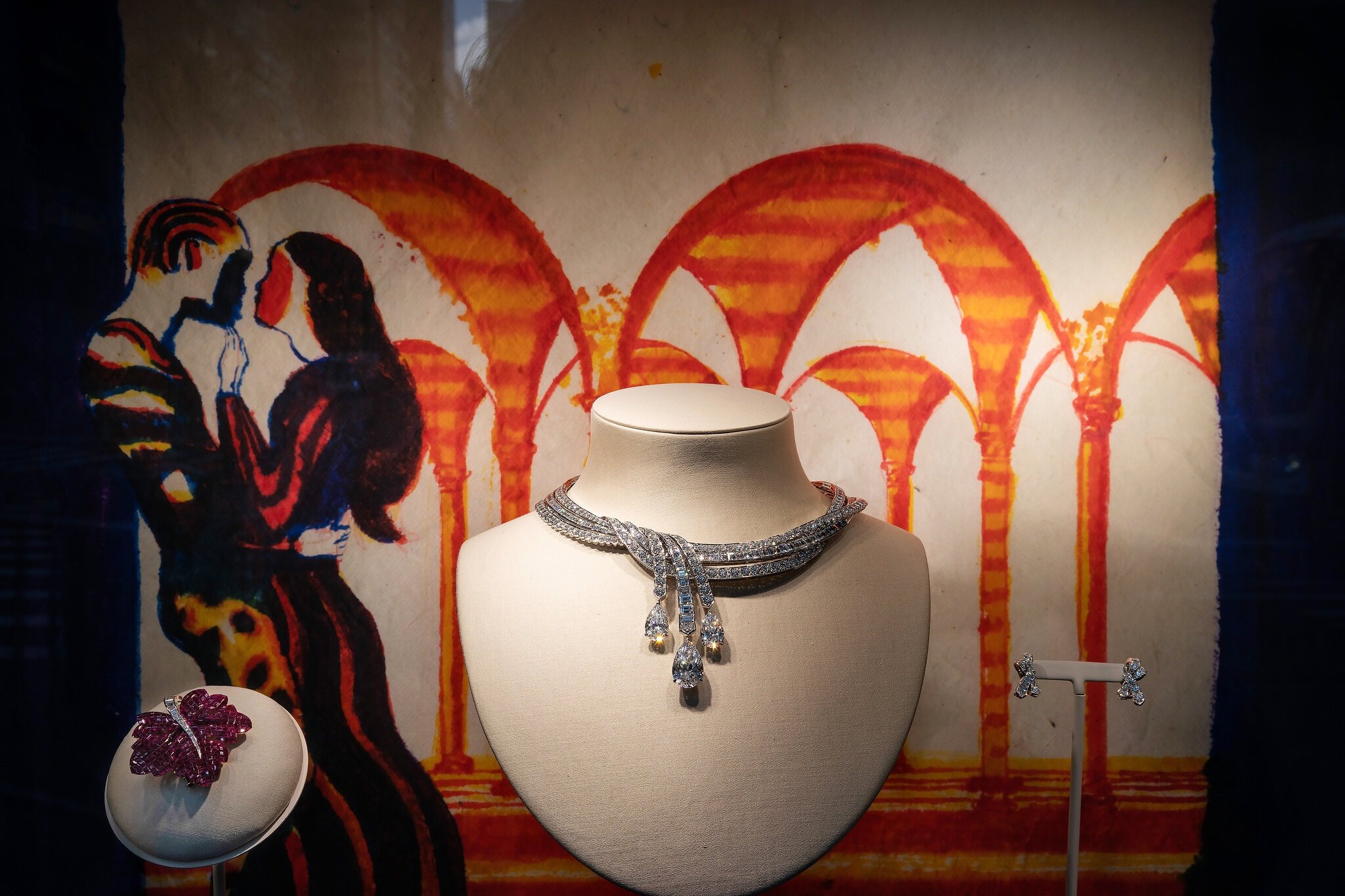
Backdrops for shop windows were often drawn by hand, like the two extraordinary examples shown below created by Erté, an innovative figure in the world of twentieth-century illustration.
Advertising became increasingly ambitious in the interwar years, with poster designers producing more targeted and daring images. At the same time, developments in graphic design and printing techniques enabled more accurate copies, dynamic compositions and bright colours to be produced.
Harrods department store in London and Macy’s in New York both showcased these new trends, but in fact every major world capital was illuminating and brightening up its high streets with multicoloured window displays that changed in line with the seasons and holidays.
In Italy, the department store La Rinascente in Milan played a crucial role in experimenting with and developing new marketing techniques and ways of encouraging purchasing in the 1950s and 1960s. They hired designers, artists and illustrators like Bruno Munari, Max Huber and Albe Steiner to make the shop more engaging, both inside and outside, with innovative and often brilliant window displays.
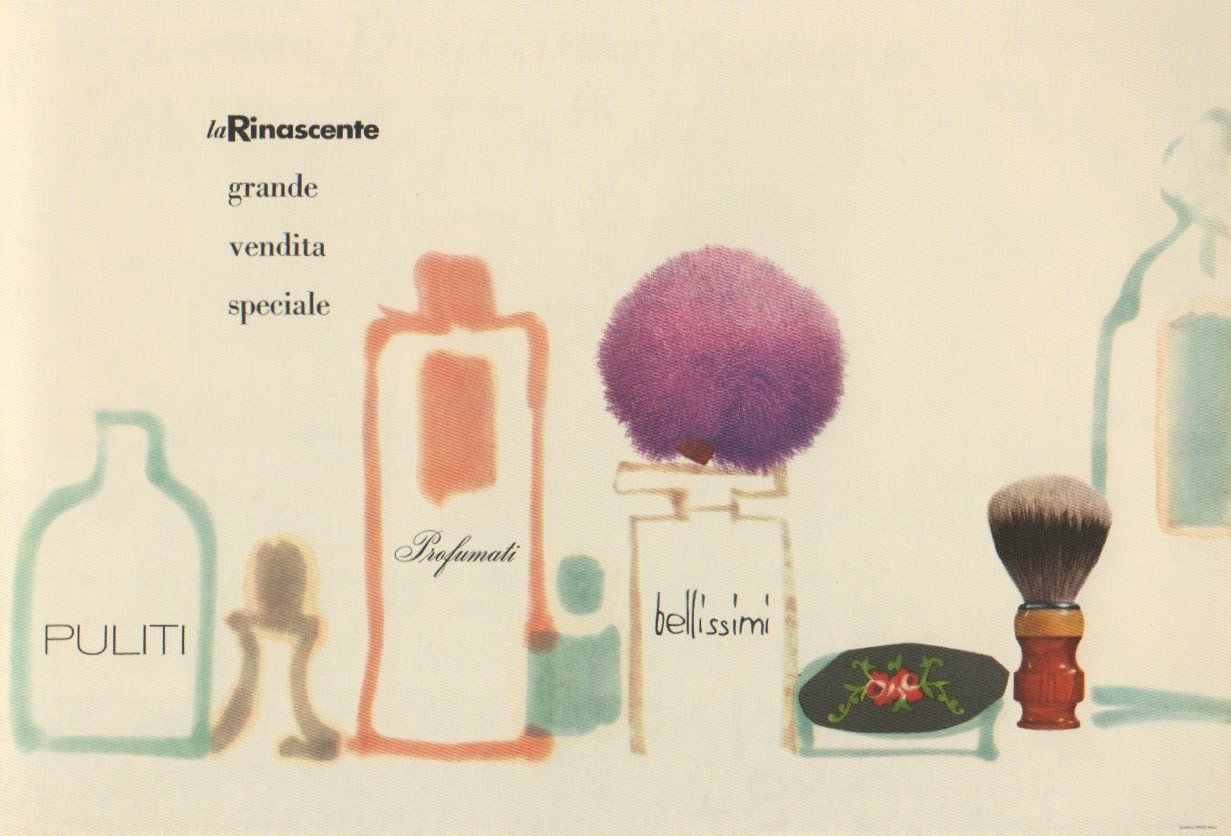
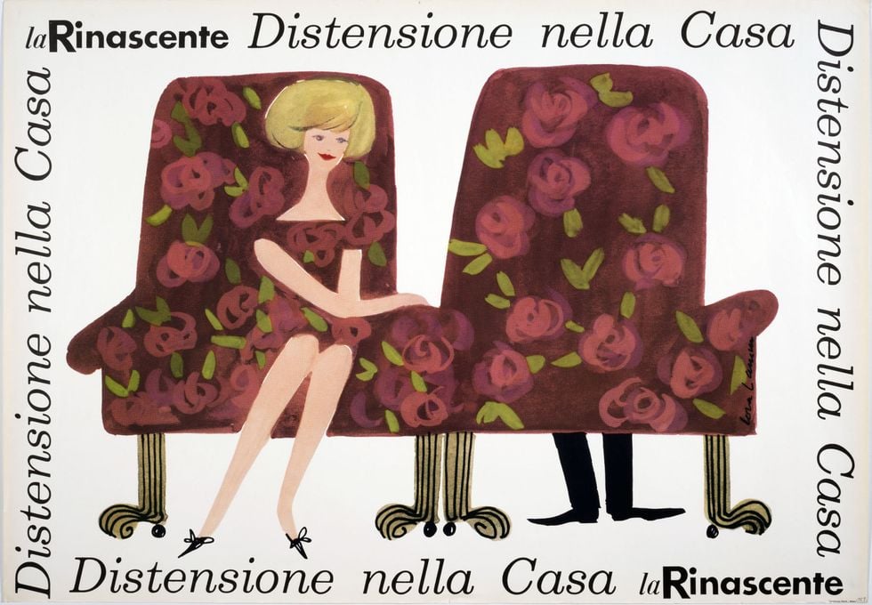
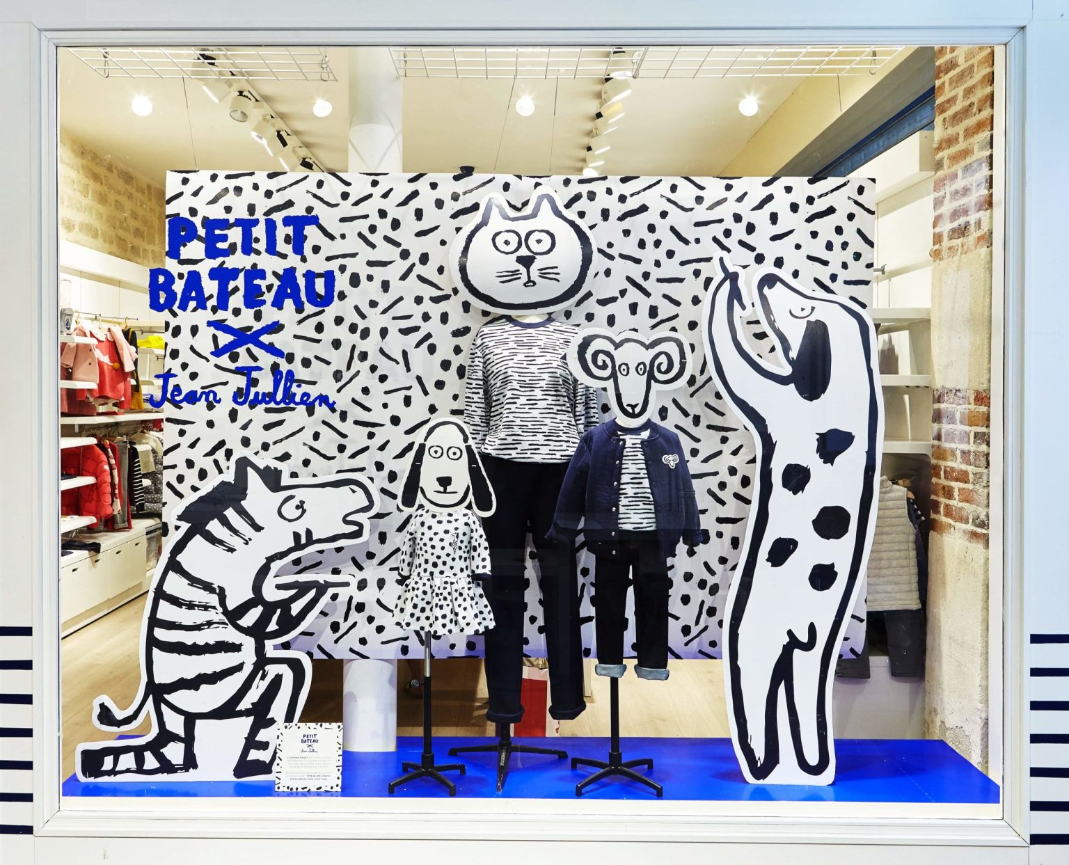
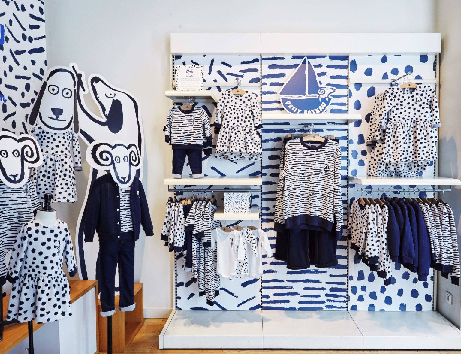
Illustration is versatile: it can provide the backdrop to a shop’s furnishings, it can be the centre of attention when applied to or created directly on the window, it can become a graphical motif when it is repeated over and over again, or it can simply be used decoratively.
Illustration and shopping: from a crisis to its rebirth in the 2000s
Between the 1970s and 1990s, marketing underwent some major changes: the concepts of franchising and big chains arrived on the scene, everything became globalised and the various visual languages were mixed up. And at the same time illustration experienced a period of crisis, as it was slowly edged out by photography.
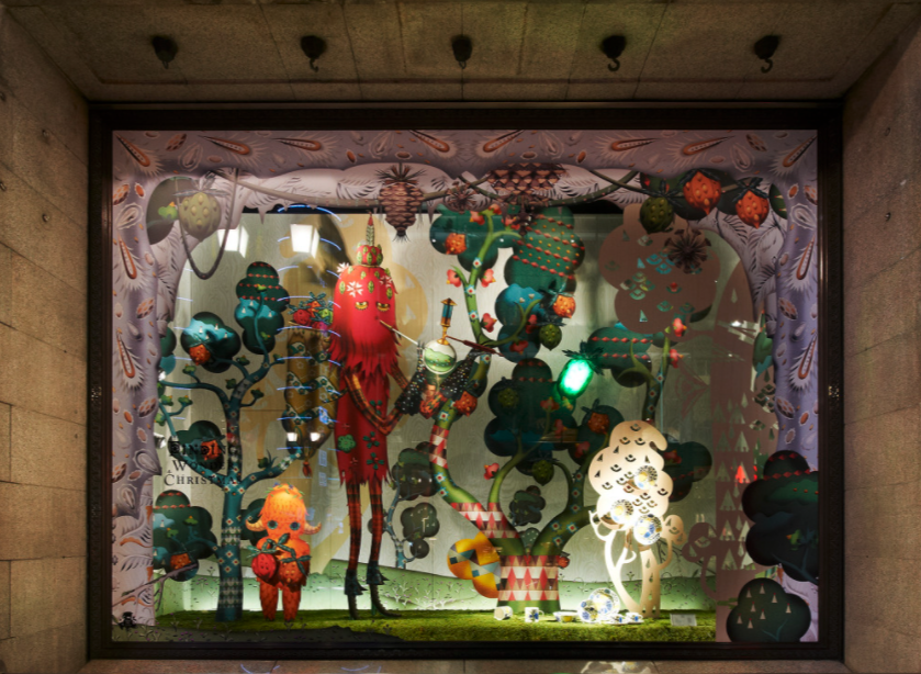
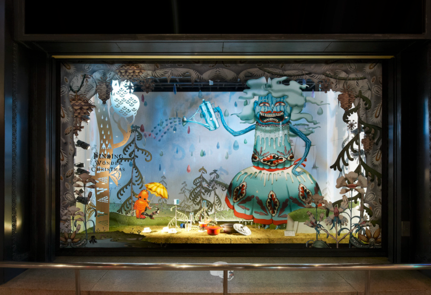
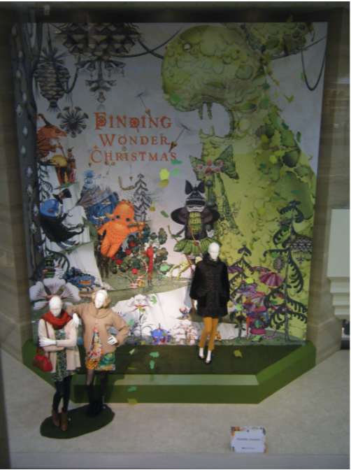
But in the 2000s, thanks to creative artists who began using drawing and colours with great freedom and imagination, illustration once more took centre stage, and shops and shop windows were again full of fantasy images, mythological creatures and incredible colours.
New ways of fitting out stores were devised, including creating specific sections, using posters, POS displays and cut-outs of all sizes, decorating walls and introducing screens playing videos and animations. The images created by artists to brighten up stores were sometimes repeated on packaging and in adverts. Increasingly versatile, cheap and easy to install stickers and wallpaper meant it was no longer such a challenging endeavour to make every shop and every window original and memorable: artists no longer had to paint murals or draw on the glass, they could produce their images in a vast range of different formats instead. As a result, the customer journey could be transformed into a voyage to a fantasy world: elements that began life as drawings were made three-dimensional using 3D printing, resin models, sculptures and cut-outs.
Illustrations and fashion: a harmonious relationship
Among this great raft of ideas, the works commissioned by major fashion brands stand out both in terms of their creativity and their budget.
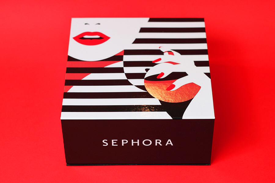
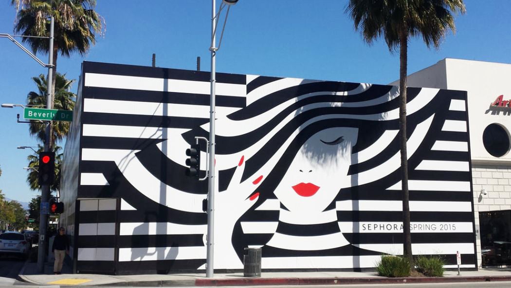
Some, including Prada and Hermes, are well accustomed to using artists in unique, one-off collaborations to launch new products, produce seasonal campaigns or furnish their stores in capitals across the world. This contrasts with the wholesale use of illustrations and their conversion into branding by less exclusive brands, including Sephora, which works with one of the leading illustrators of the past twenty years, the iconic Malika Favre. As well as designing images for the chain’s shop windows all over the world, she has created designs for a cosmetics range for the brand and even the graphical motif of the company itself, with simple black and white lines recalling the concept of stylish, mythical elegance of the past.
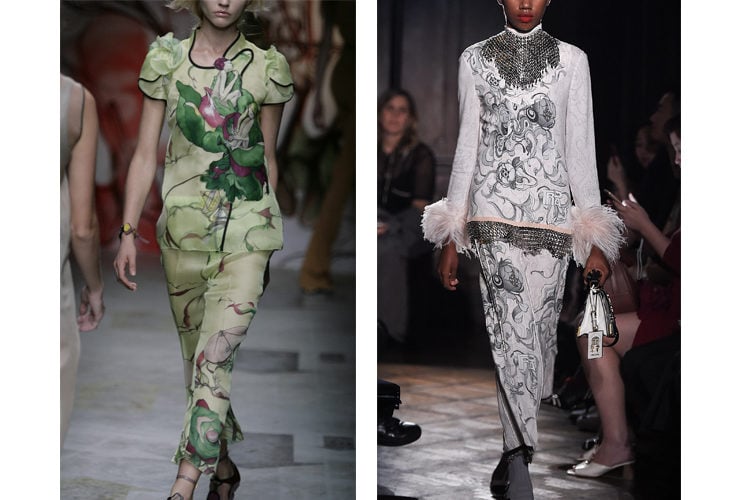
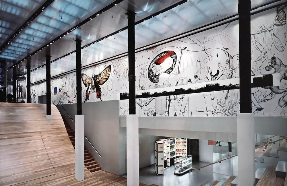
The artist James Jean, who started out in the world of comics before becoming a painter renowned for his imaginative work and exhibited in galleries and museums all over the world, has been hired by Prada to create various images over the past ten years, including the decoration for its Soho store in London. The bond between the artist’s work and the brand’s ideas is so strong that some of his illustrations have even been turned into clothes.
Illustrations and retail: amazing and inspiring customers
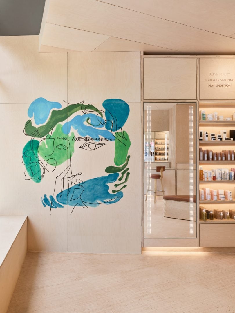
The current trend in shops, shopping centres and chains is to be bold and daring, even in European countries where the visual languages of young people tend to be given less prominence: street art, illustration, lettering, comics and painting are all being mixed in a creative kaleidoscope that encourages people to delve into their imagination. While photography continues to be used when a didactic, realistic or evocative result is desired, illustration is employed to define spaces as well as to decorate them; it can also provoke amazement and play on people’s emotions, maintaining interest in places that otherwise look more and more alike, and which are identical in every city across the world.
As you can clearly see from some of the images in this article, illustrations can make shop windows more like the walls of a museum: people visit them to photograph the work on display and share it with their friends on social media or save it on their smartphones: in an era in which artworks can be reproduced ad infinitum, photography and illustration have become bedfellows once more.
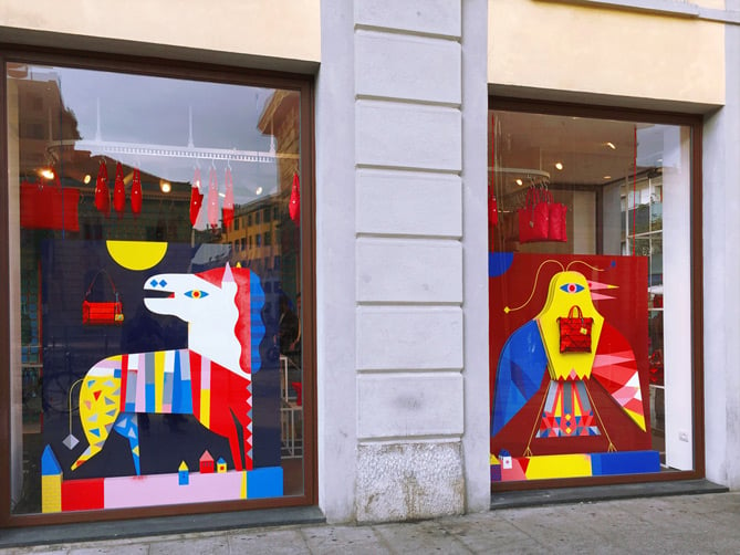
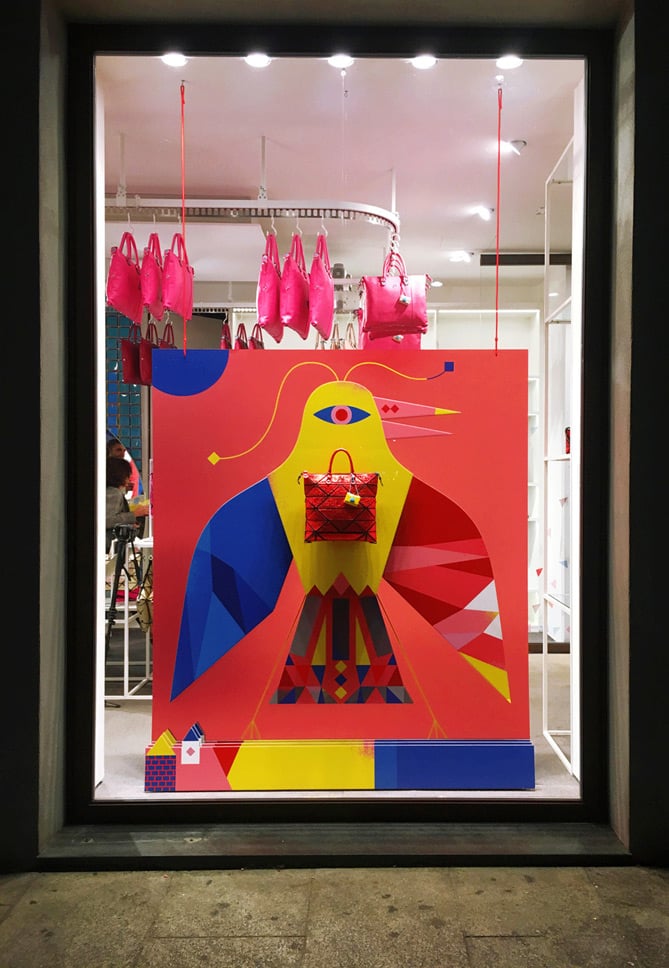
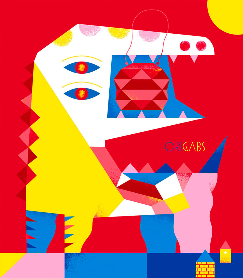
The artist Camilla Falsini created the interior decor and shop windows for the Origabs shop in the Brera district of Milan, drawing on various typical design elements found in bags.
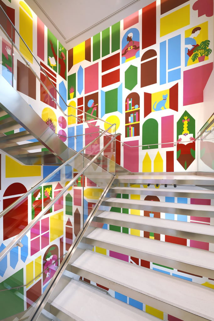
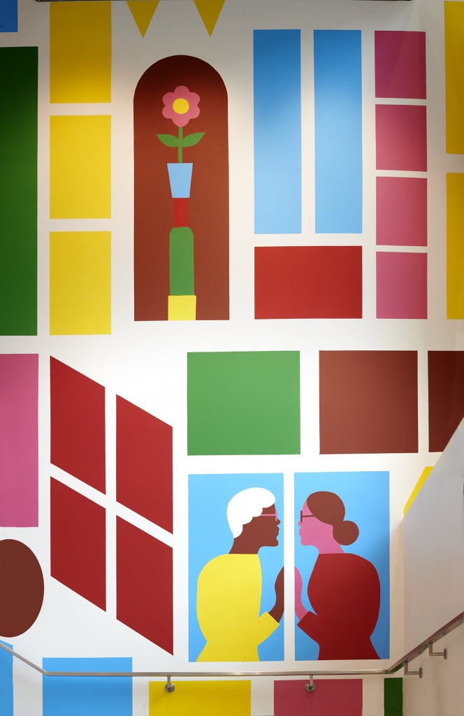
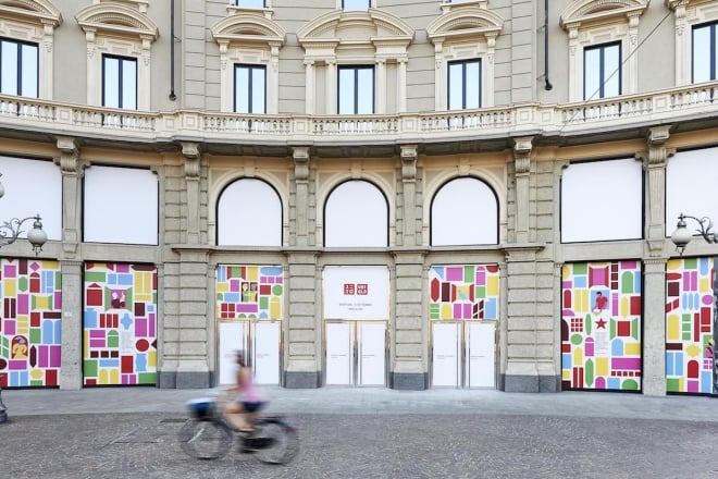
In 2019, for the opening of the Japanese clothing brand Uniqlo’s first Italian store, the artist Olimpa Zagnoli created the shop’s decoration based on the theme of the city’s window displays.
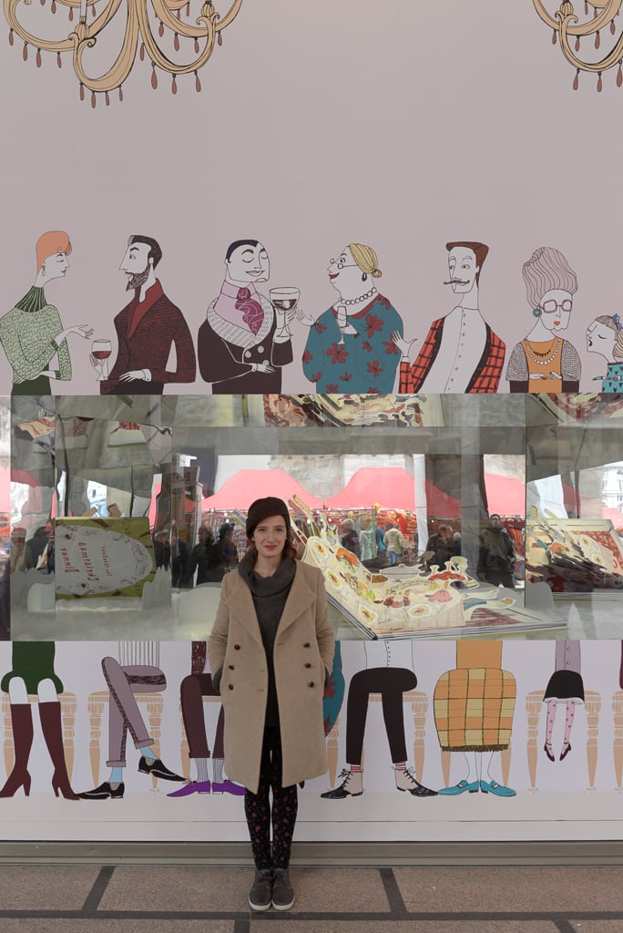
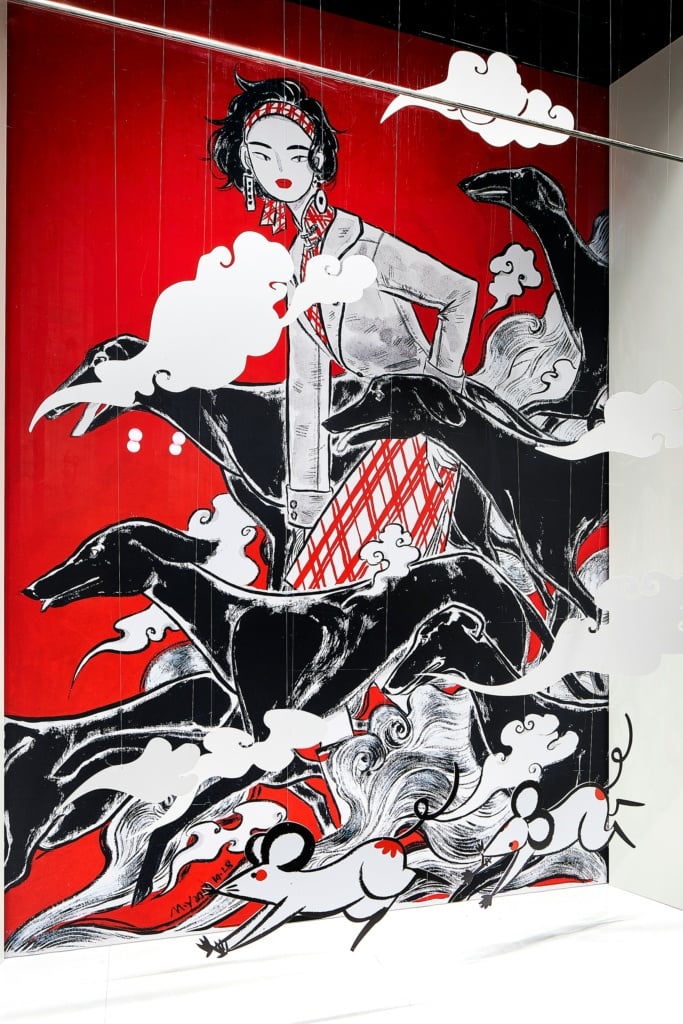
La Rinascente has also reiterated its love for illustration in recent years, using its windows like display cases in an art gallery. For example, in 2014 it invited various emerging illustrators to create its Christmas windows, while in 2020 it commissioned Chinese artist M.Y Chen Zuer to produce works to celebrate the Chinese New Year.
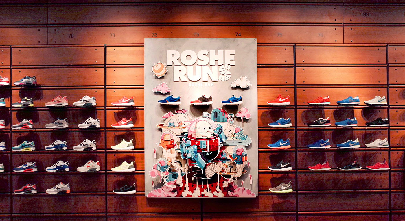 An illustration for a Nike product by Chinese artist Veiray Zhang.. Source: https://www.behance.net/gallery/16447773/Nike-RosheRun
How to add illustration to your shop
Illustrations are within reach of all stores, large or small, both in terms of the budget required and how complex the project is to manage. We discussed where to find illustrators in a previous article. There are various products available at all price points that can be decorated with illustrations to make your shop more attractive. Wall or window stickers are an excellent option for temporary graphics. We have a section dedicated to products for window displays here. We also have a vast range of large-format items, from rigid materials to wallpaper, which can transform any wall into a creative masterpiece.

