Table of Contents
In this article, we continue our exploration of the commercial uses of illustration by examining a topic that throws up plenty of surprises: how illustrations are employed in restaurants and other eateries.
We’re leaving aside graphics, logos and advertising campaigns, and instead looking at the times when the owner of a hotel, restaurant or cafe commissions a renowned or up-and-coming artist to create images to give their premises a unique look.
Often these projects do not aim to fit a certain brand image; instead they seek to characterise and embody the spirit of the place, as well as making it more visually appealing.
The earliest examples: the twentieth-century artistic avant-garde
An early example of the combination of food and painting is the work of the Italian futurist artist Fortunato Depero, who, during a two-year stint in America in the late 1920s, was commissioned to design the interiors of two restaurants in New York: Zucca (where he designed all the furniture and murals) and Enrico and Paglieri. Unfortunately, both were destroyed a year later to make way for the Rockefeller Centre, and a few black-and-white photos are all that remains of them.
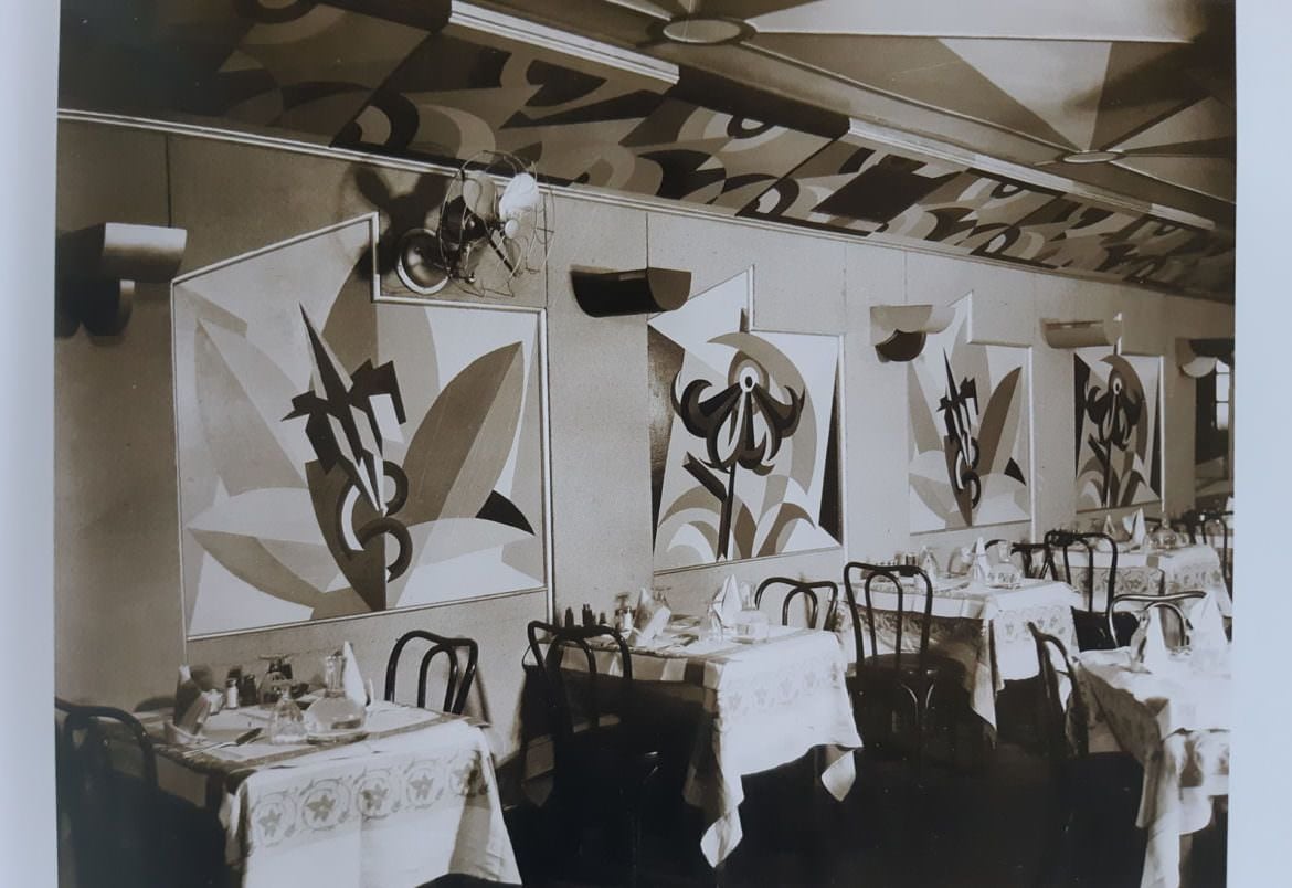
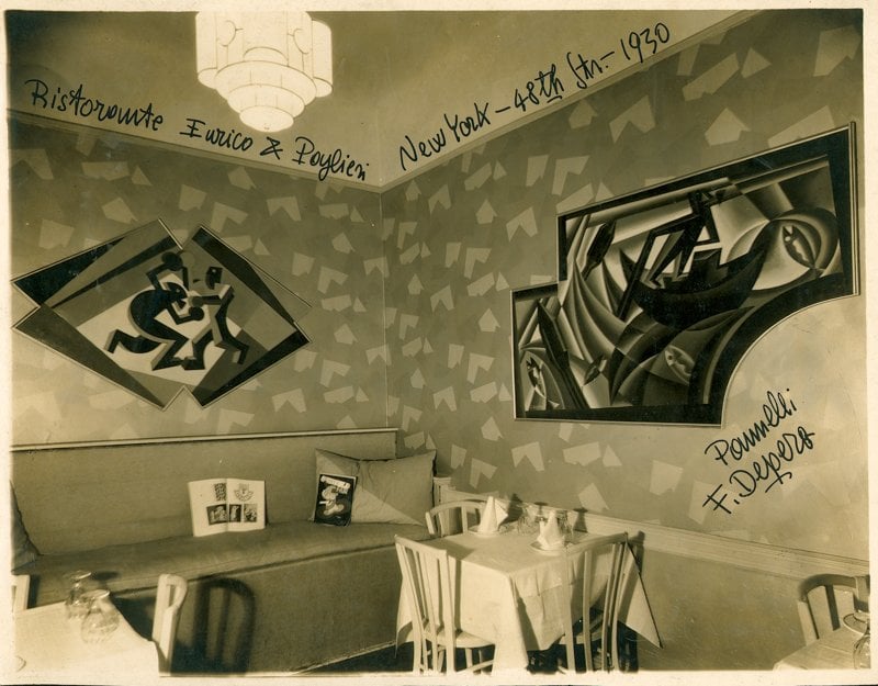
In those years, artworks tended to be commissioned by wealthy individuals to decorate exclusive properties with no public access; the first venues to invest in art were therefore luxury hotels and casinos.
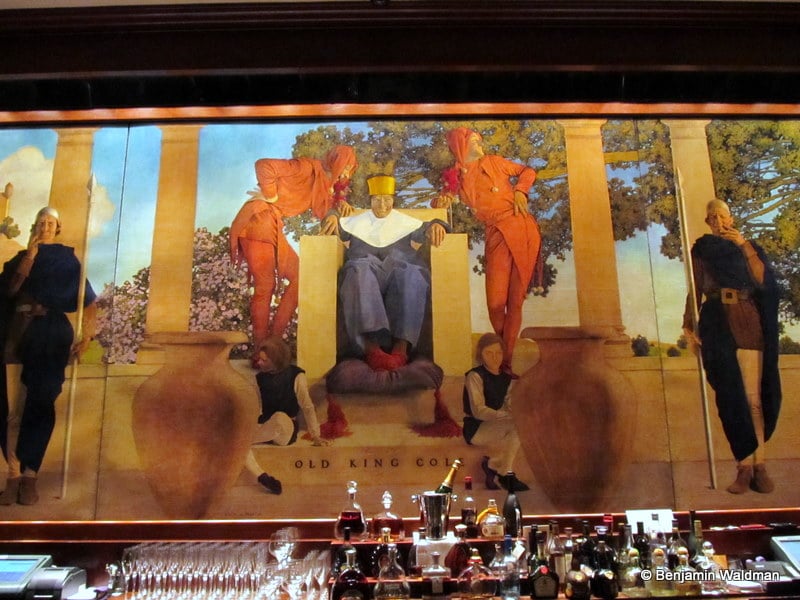
In the early twentieth century, New York was a sort of artistic clean slate, and it needed art to make its new buildings – which symbolised modernity and progress – more attractive. An example of this is Maxfield Parish’s mural for the Knickerbocker Hotel, which still retained a traditional feel.
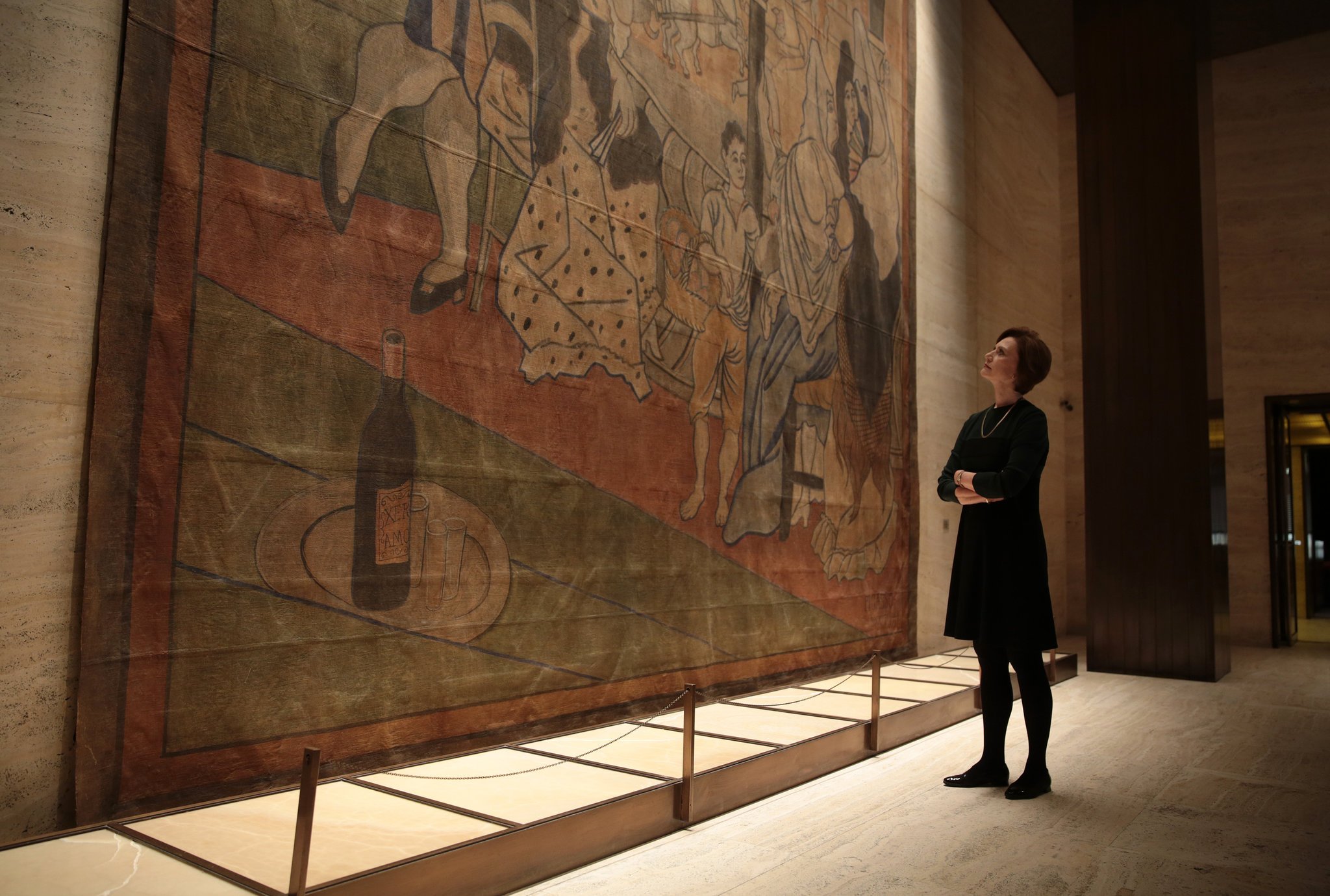
Now let’s jump forward to the 1950s, when the post-war recovery led to a wave of new, more ambitious designs. Take, for example, the Four Seasons restaurant, again in New York, located within the Seagram Building and designed by renowned architect Philip Johnson. The management of the Four Seasons always wanted the very best, and so they asked the director of the MOMA in New York to recommend a contemporary artist to create exclusive works for the restaurant. It became embroiled in one of the most controversial commissions in contemporary art history when it tried to enlist the troubled Mark Rothko … but that’s another story!
A tapestry by Pablo Picasso was hung inside the building, giving an exclusive atmosphere to a place attended by jet-setters from all over the world.
The pairing of art and cuisine became stronger and stronger, with chefs and business owners buying paintings by famous artists to display on the walls of their premises. Involving artists directly, however, was a much rarer – and more expensive – process, normally part of a more extensive interior design and furnishing project.
In the 1950s, the Hotel Plaza in Cincinnati, a piece of futuristic, innovative architecture with a spaceship-shaped terrace, first asked Joan Mirò to create murals for the interiors of the terrace restaurant, then a few years later asked Saul Steinberg to contribute too, combined with various sculptures by Alexander Calder. The result was a totally unique graphical style.
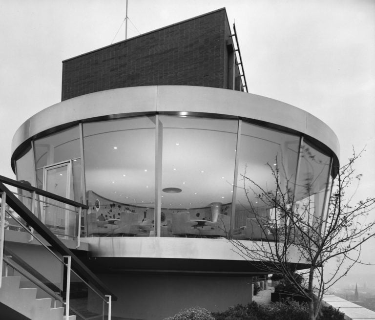
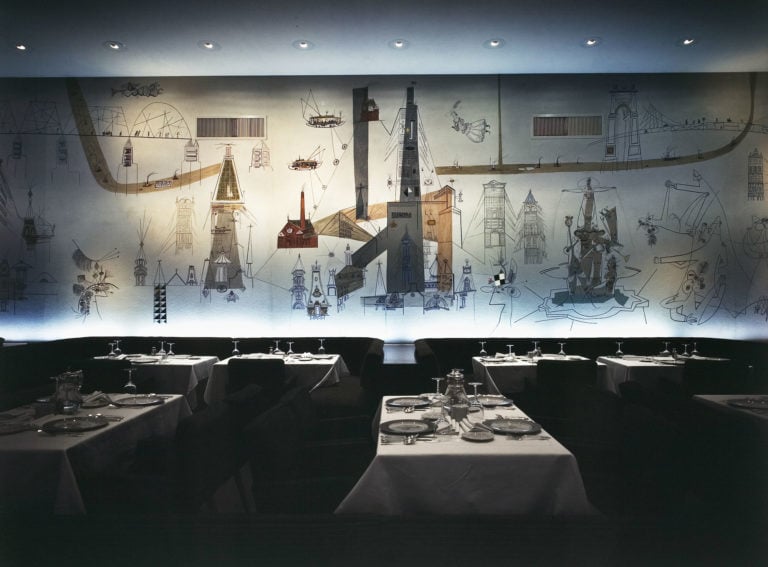
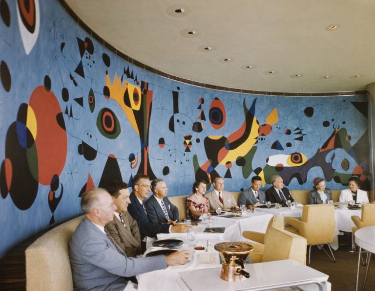
The pairing of Mirò and Steinberg represented a milestone in this particular kind of work, as while the former was an established and renowned artist, the latter was better known as an illustrator, who mostly worked for newspapers, magazines and publishers.
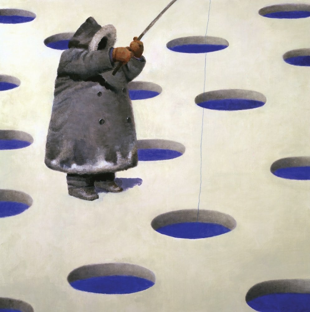
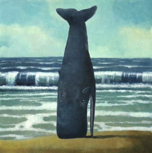
Skipping a few decades, which to be honest were decidedly lacking in major illustration projects in hospitality venues, it was once again a luxury establishment that invited someone widely considered to be the most important illustrator of the past 50 years to work on a restaurant design. The place in question was the Rio Casion in Las Vegas, and specifically the Seafood buffet, and the artist was none other than Brad Holland.
Holland stayed true to his nature, creating surreal and grotesque panels which were fixed to the walls behind the tables, generating a surreal effect that gave the eatery an instantly recognisable and exclusive feel.
An explosion in popularity in the 2000s
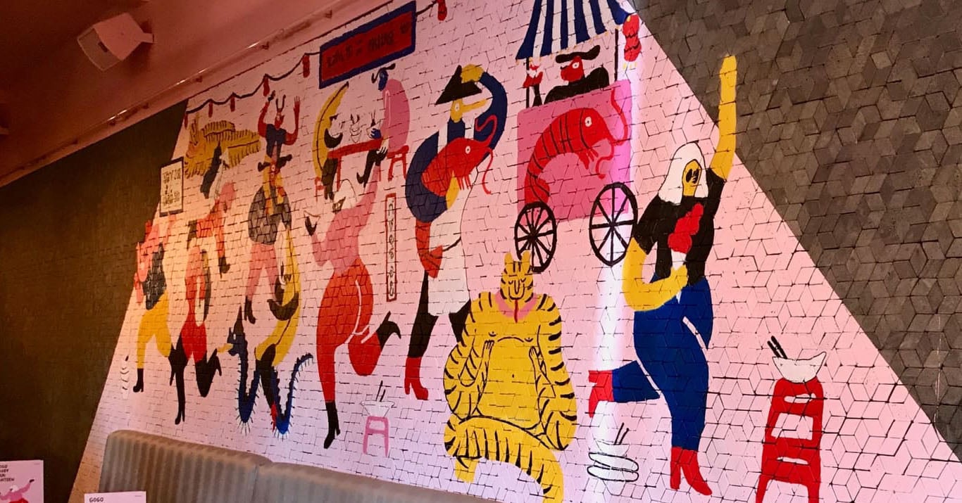
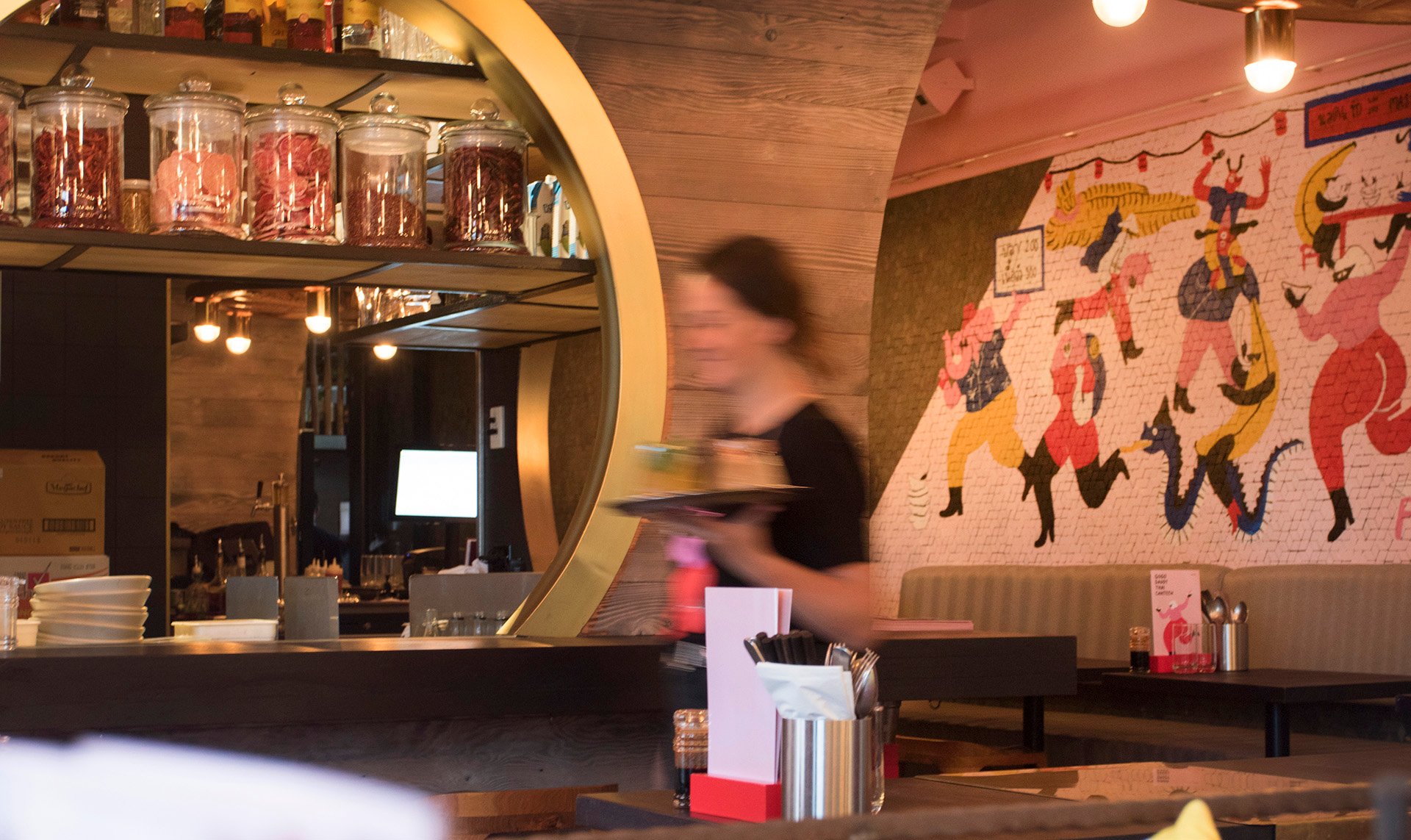
In the 2000s, thanks to developments in PVC printing technology and the growing popularity of street art, artistic experiences of this type became easier to create and therefore much more numerous. Increasing numbers of cafes and restaurants hired graphic designers and illustrators to brighten up and personalise their walls, menus and windows. Thanks to the web, these images can be shared across the world with the click of a button: why not take a virtual world tour and discover how the Thai restaurant in New Zealand Gogo Daddy created a unique image by entrusting its interiors to the Lithuanian (!) artist Edle Zvirblyte.

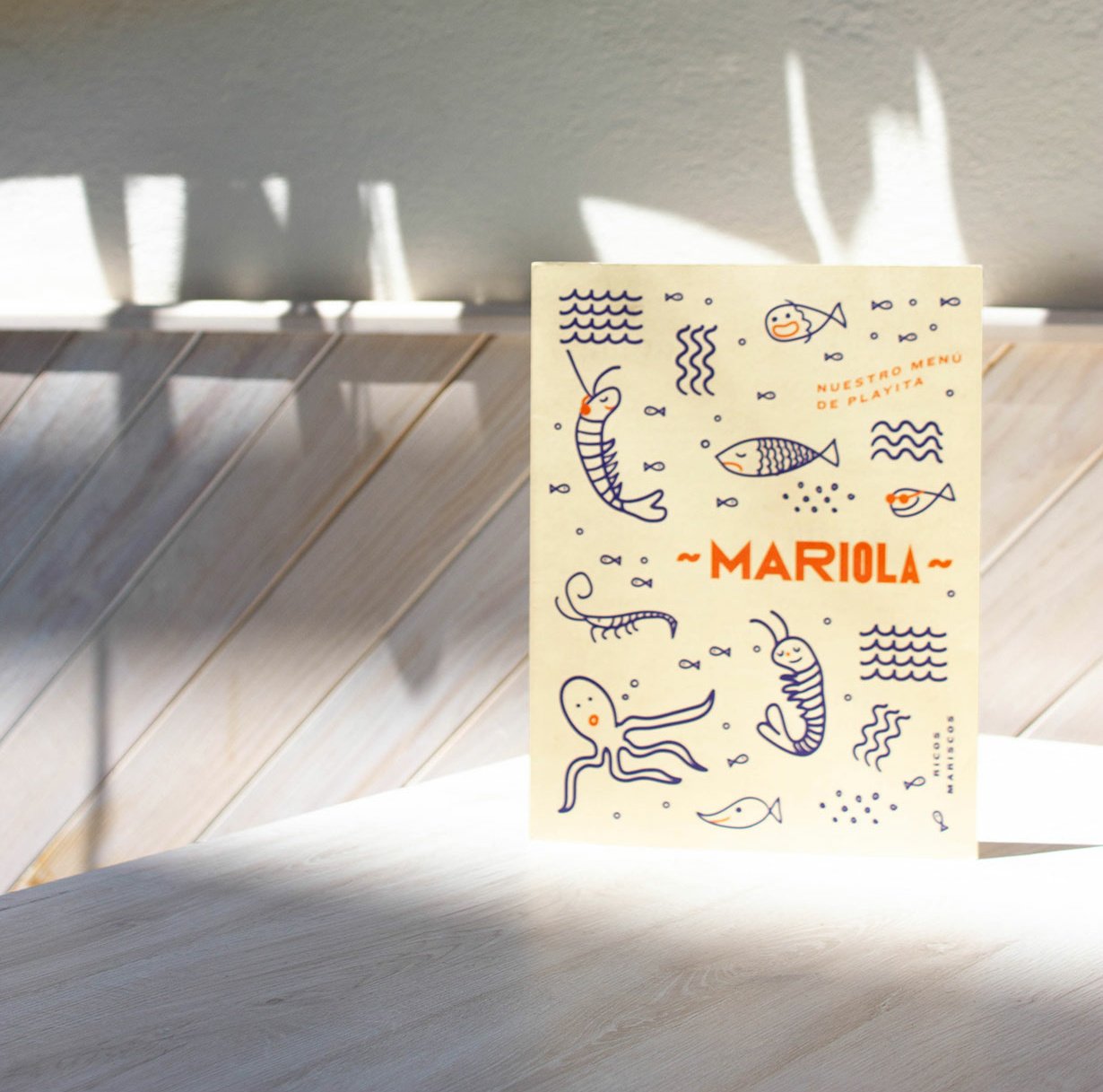
Alternatively, you can travel to Mexico City and visit the small fish restaurant Mariola, which provides one of countless examples of illustration used for a brand identity.
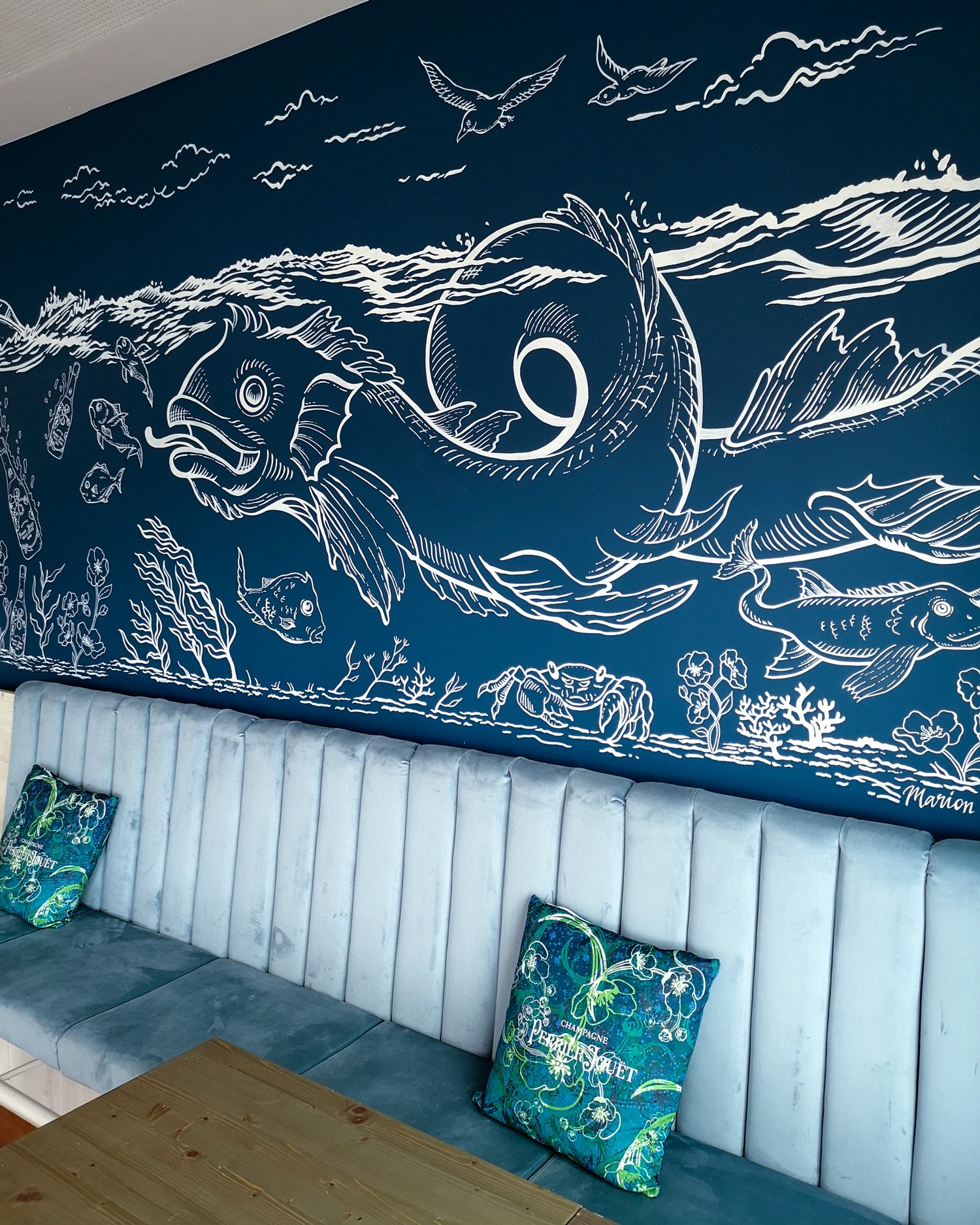
Back in Europe, you can admire the brushwork of artist Marion Kamper at another fish restaurant, Ungeheuer in Austria.
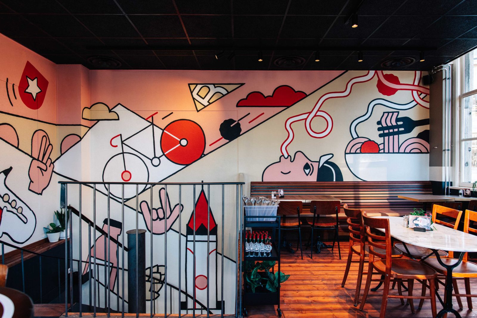
Maastricht, Belgium, is home to another hand-painted mural, created by illustrator Sjoerd Verbeek for the Bavet spaghetti house.
Meanwhile, the illustrations that decorate the walls of Falafel Etc in Zagreb – the work of Robert Lucic – are printed, not painted.
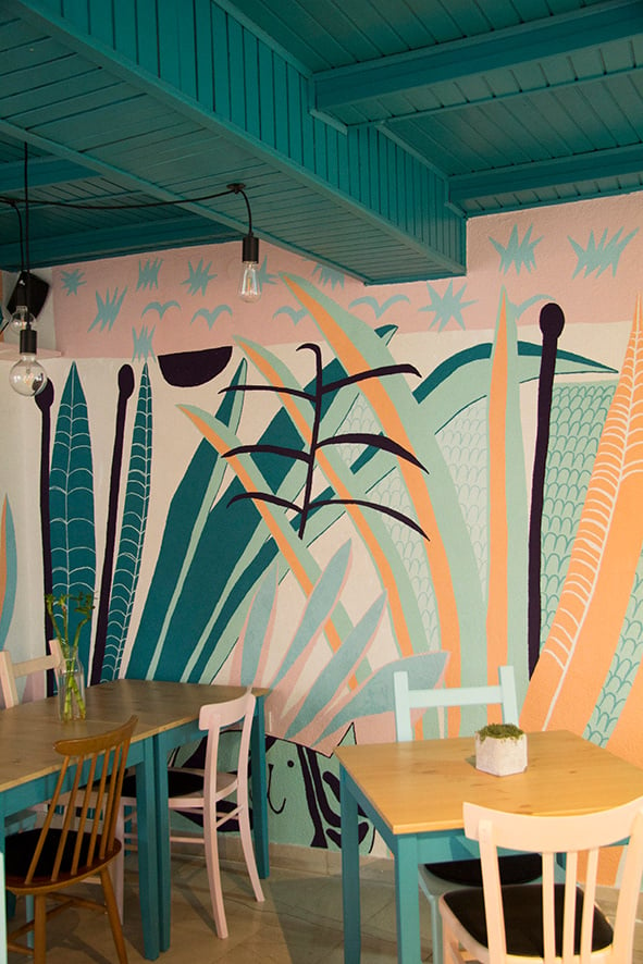
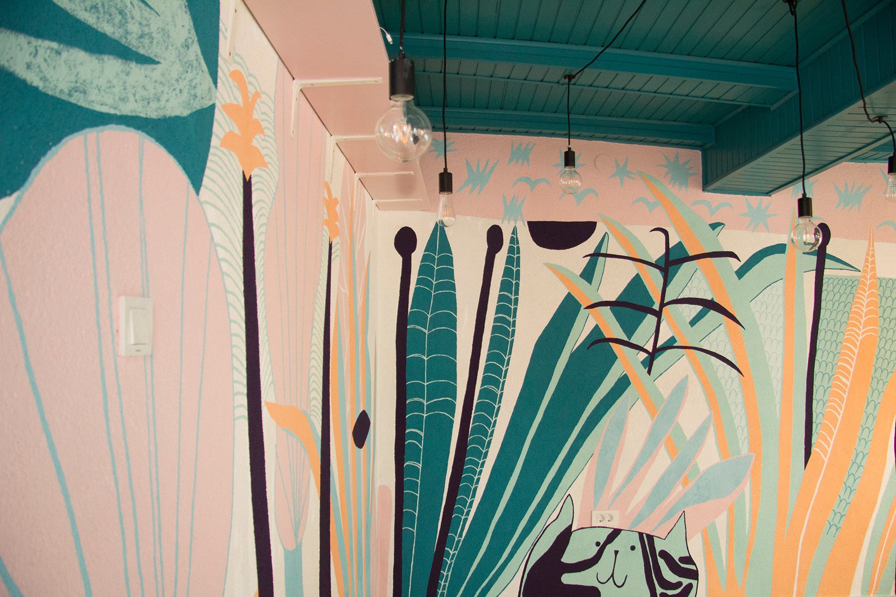
These panels, created by interior designer Katerina Shahmanova for the Riviera restaurant in Belgorod, Russia, are extremely stylish and sophisticated.
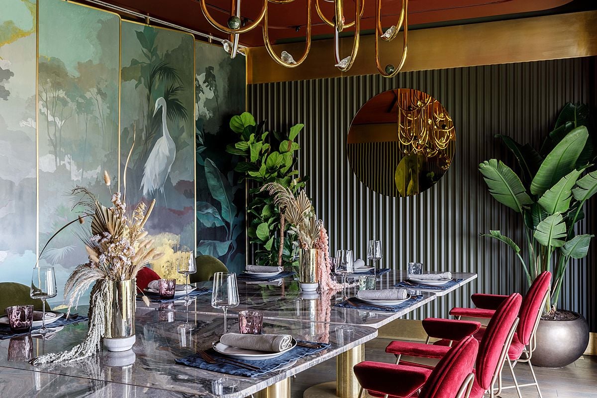
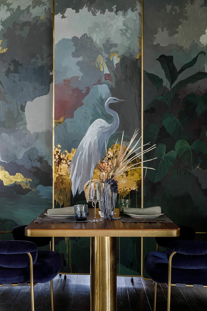
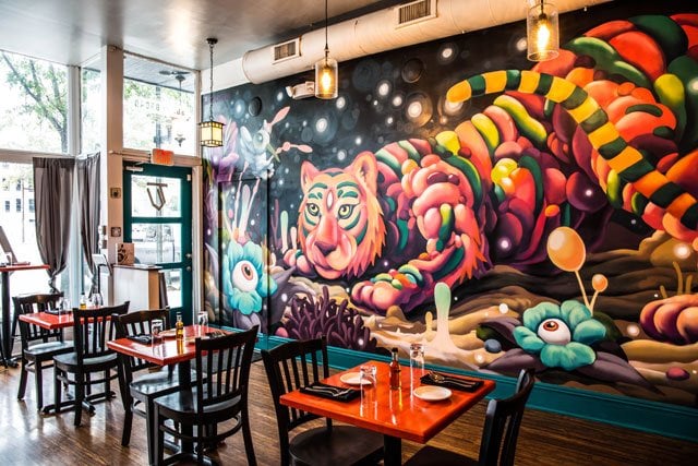
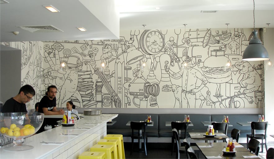
As we’ve seen, one of the simplest solutions, and one adopted by many venues, is to paint a large mural on one of the walls.
The street artist Wingchow’s work at Tiny Victory in Richmond.
Ciudad Grill in Seattle opted for some rather unusual illustrations in a bid to attract a younger clientele, with striking imagery based on folklore and traditional legends by illustrator Stacey Rozich. Here, as with some of the other examples above, there is a clear link between a refined interior design style and high-quality cuisine.
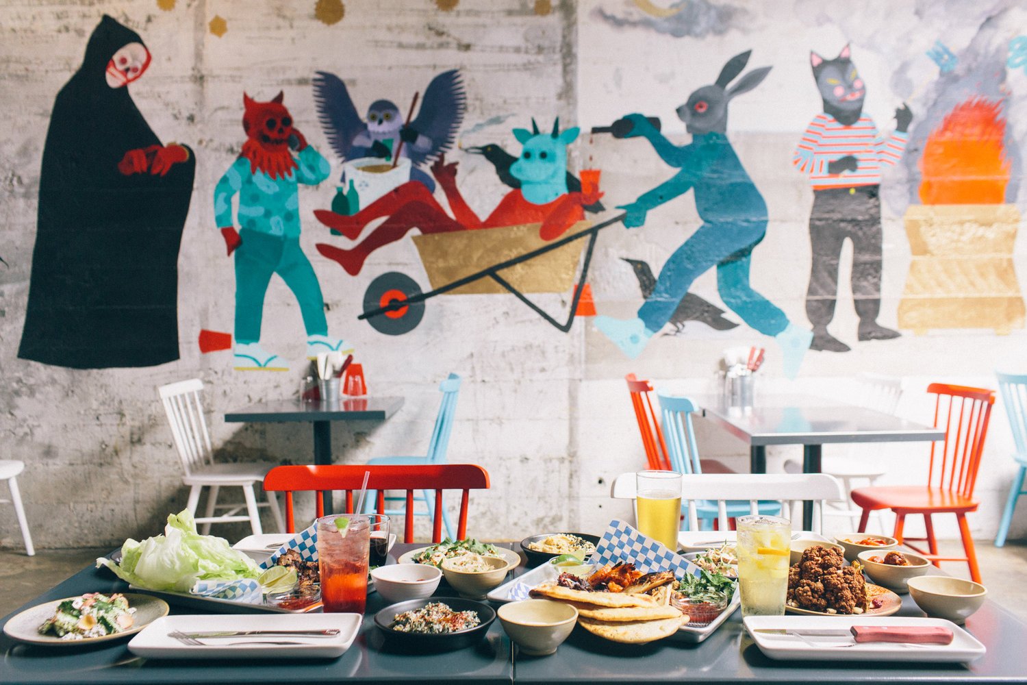
Murals or wall stickers?
Many of these examples were created on site by the artists. This has many advantages, including the interest generated by the artist’s performance, but it also has some drawbacks: the designs are difficult to wash and clean, the work is susceptible to damage and cannot be moved or transferred elsewhere, and it is difficult to reproduce it on other forms of communication.
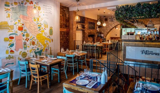
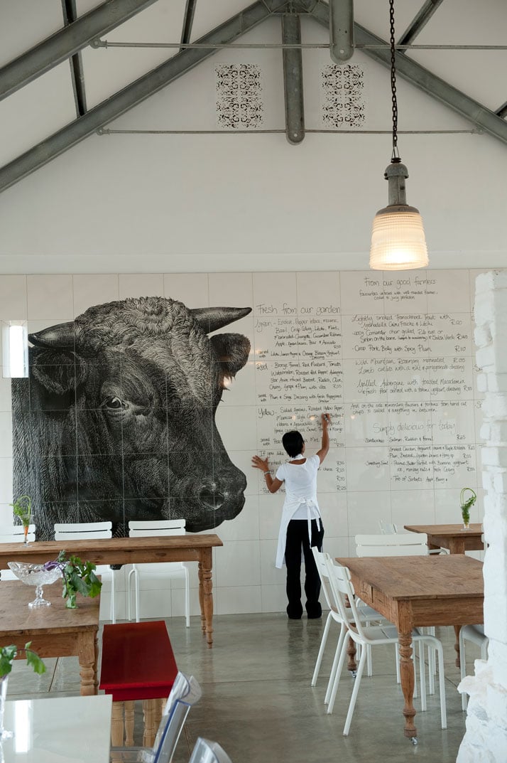
One solution for those wanting to use the same images on all of their restaurant’s branding, or for those who would like their surfaces to be easier to clean, is PVC wall stickers, which can be cut and printed in various shapes and sizes, and which are very easy to apply.
Meanwhile, if you don’t have large areas to decorate and would prefer panels that are easy to remove and move around, so you can rotate the images on display around your eatery, for example, we’d recommend prints on rigid materials, which are simple to fix to the walls.

