Table of Contents
As we’ve explored in previous articles, illustration is a versatile and engaging communication tool.
Eye-catching and appealing, it can convey complex messages through metaphor and symbolism. It can create new characters and worlds, firing viewers’ imaginations and inviting them to explore alternative universes.
And it’s this magical side to illustration that sets it apart from photography.
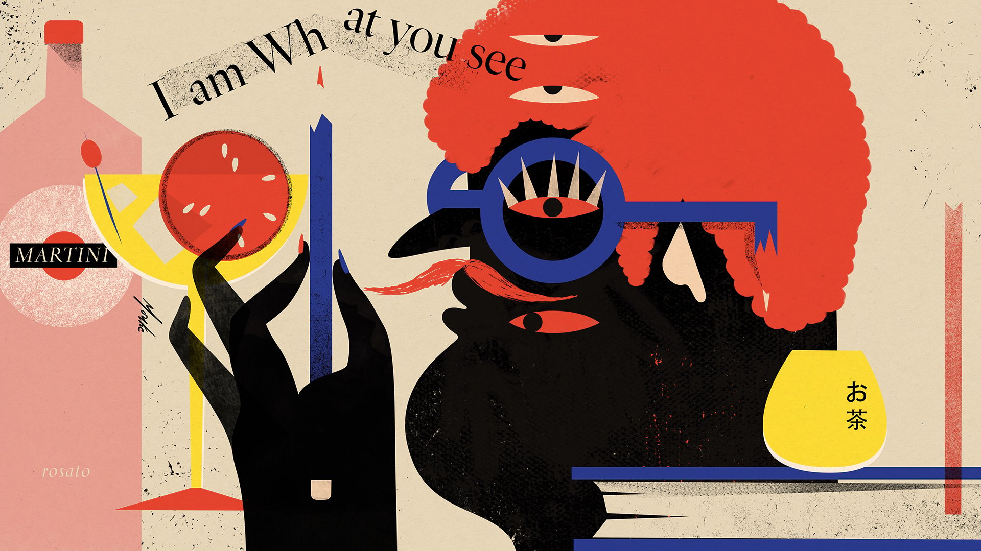
In recent years, we’ve seen imaginary characters increasingly used in the corporate world. Illustration is carving out an ever greater role for itself in visual communication, aided by new technologies and media, as well as new ways of interacting that emphasise user feedback and immersive experiences.

Illustrations for companies: when creativity supports business
In this article, we’re going to take a look at some of the most interesting uses of illustration in the corporate world.
We’re used to thinking of illustration as a communication tool for specific marketing actions, such as print advertising, as if books and magazines were the natural habitat for these types of images. But we’re not used to thinking of illustration as a tool for promotion and storytelling, as a fundamental part of brand identity, as a vehicle for brand missions and values, as a defining characteristic of packaging, or as a means of communication within an industry. We’re not used to thinking of illustration as a sort of contemporary animation based on the movement of a few key elements, or even to think of murals as anything other than giant illustrations.
Many firms are forcing us to reconsider these preconceptions, extending the use of illustration from books and posters to pretty much anything that calls for graphic design.
Tech-companies: illustrations make brands
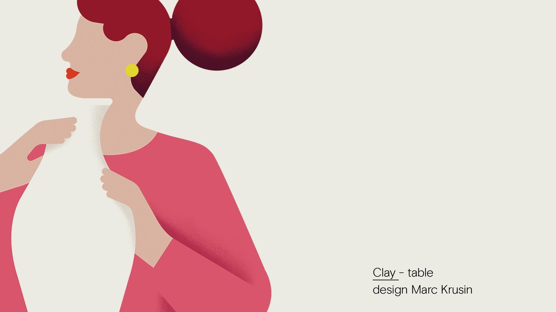
Many tech firms make extensive use of illustrations, each in their own characteristic style and with their own colour palette (we’ll dig deeper into this in a future article).
One of the best examples is the brand identity revamp undertaken a few years back by Mailchimp, one of the world’s leading email marketing firms.
To meet the usability needs of apps, this sector has massively embraced flat design with simple, stylised illustrations and use of few colours. But today we’ve reached saturation: now all apps look the same, giving the impression of having used the same or similar stock images. A prime example is the Italian government’s contact tracing app, Immuni.
In the images below, you’ll notice the marked difference between the original “artistic” choice of Mailchimp and the ordinariness of the others…
(Here’s the post on Mailchimp’s blog that announced the new design)





Corporate offices: illustrations embellish and brighten up the workplace
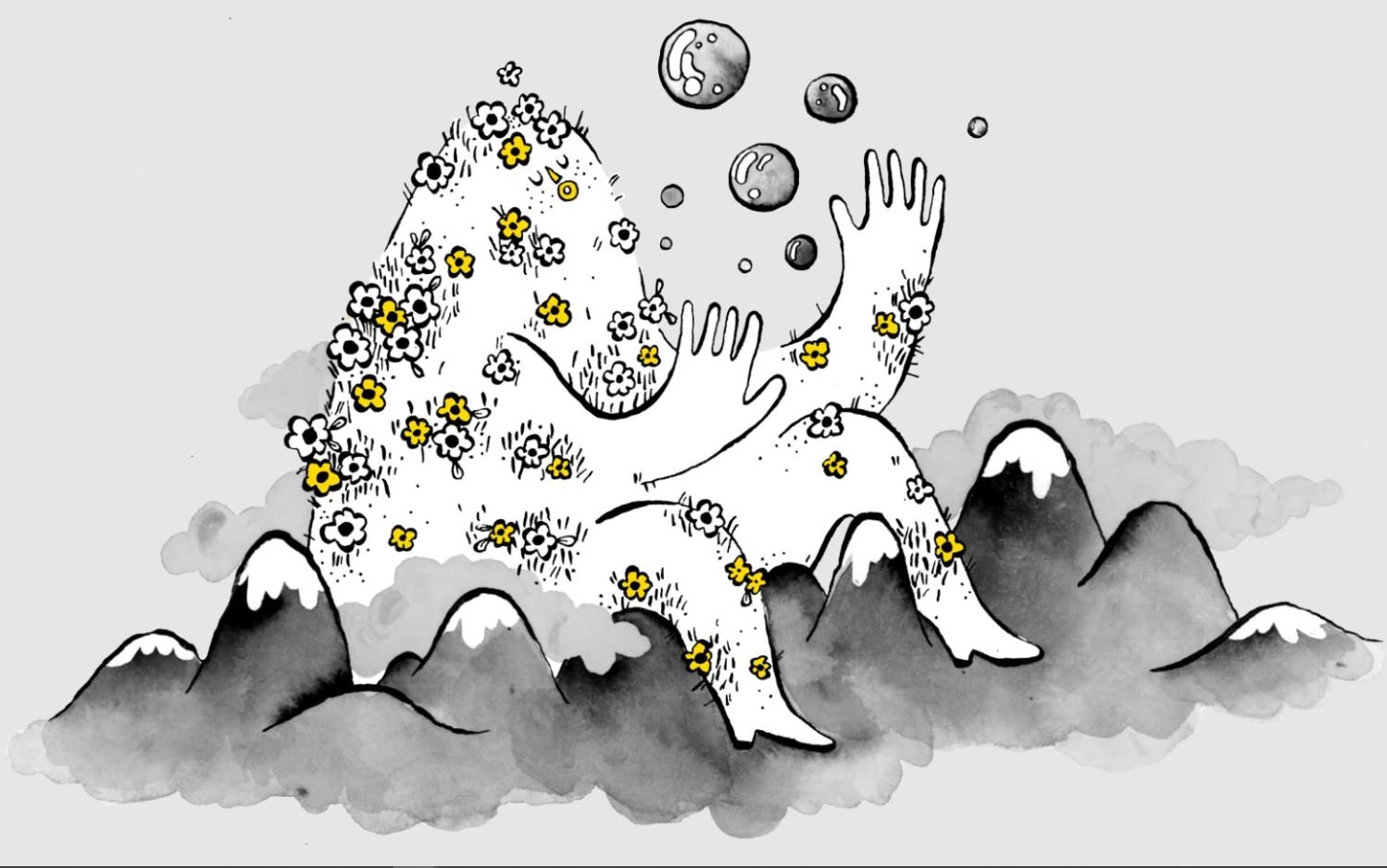
Another way that companies use illustration is by enlarging and using it to decorate internal spaces and offices. We’ve already talked about it in this article, but it’s worth looking at a few more examples that show how the difference between a mural and an illustration is now just a question of scale. What’s more, it allows companies to convey the fundamental ideas behind them, their values and mission.
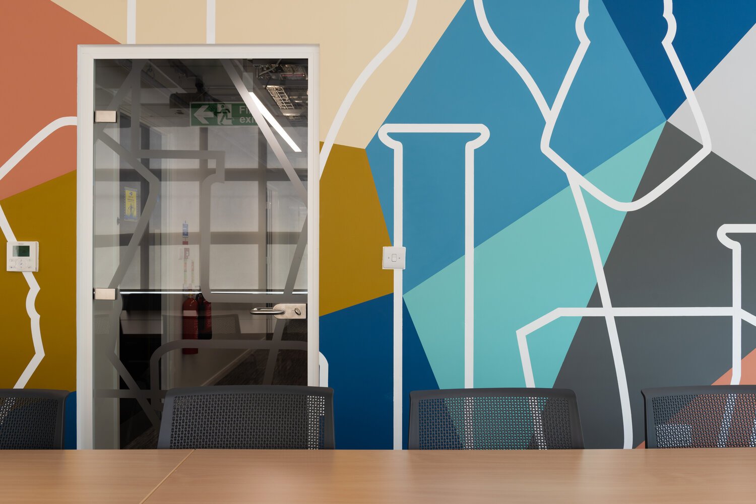
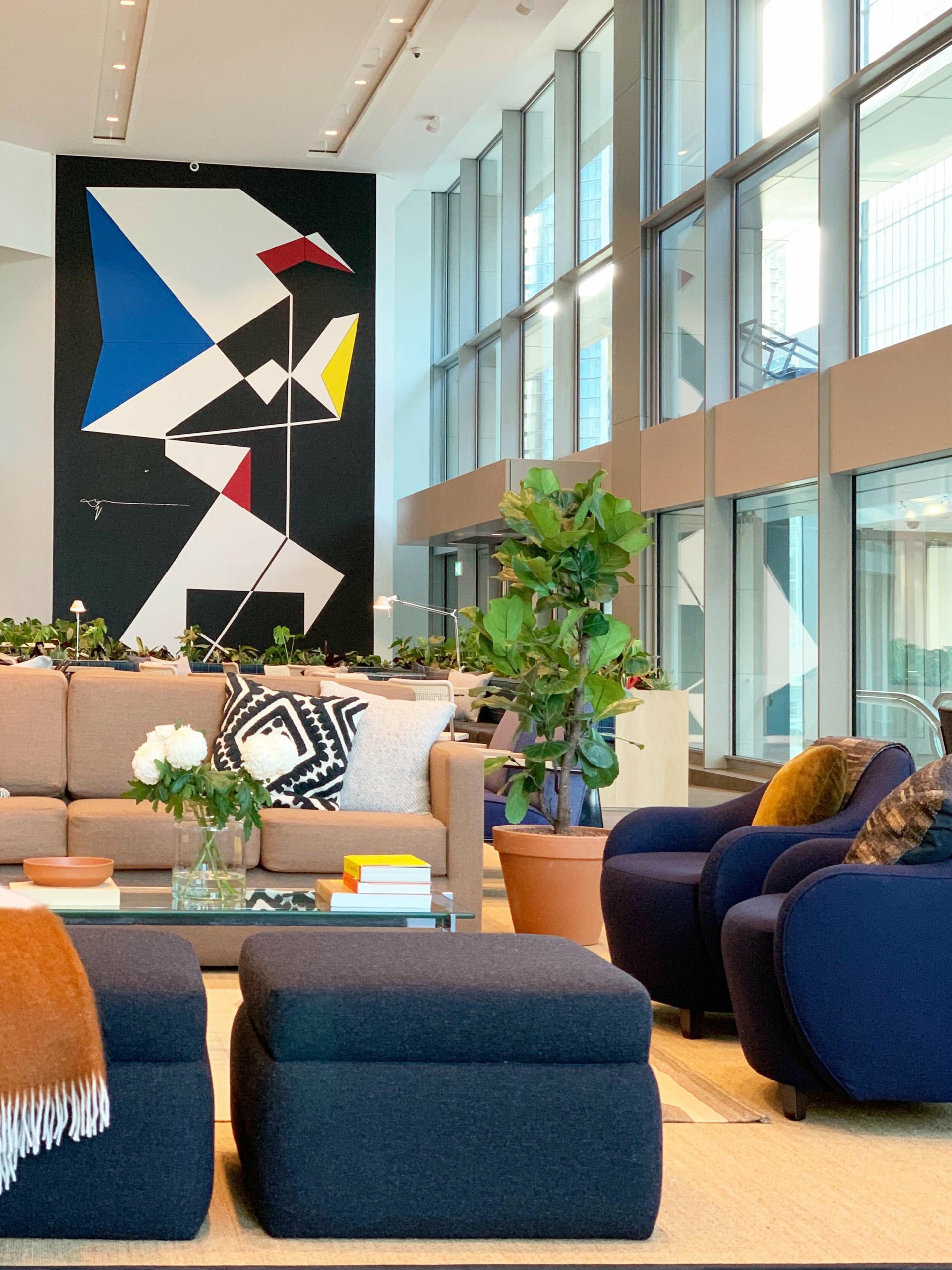

Illustration: the extra weapon to make a product recognisable at first glance
Illustration isn’t just a tool for specific campaigns, it’s an increasingly important part of advertising.
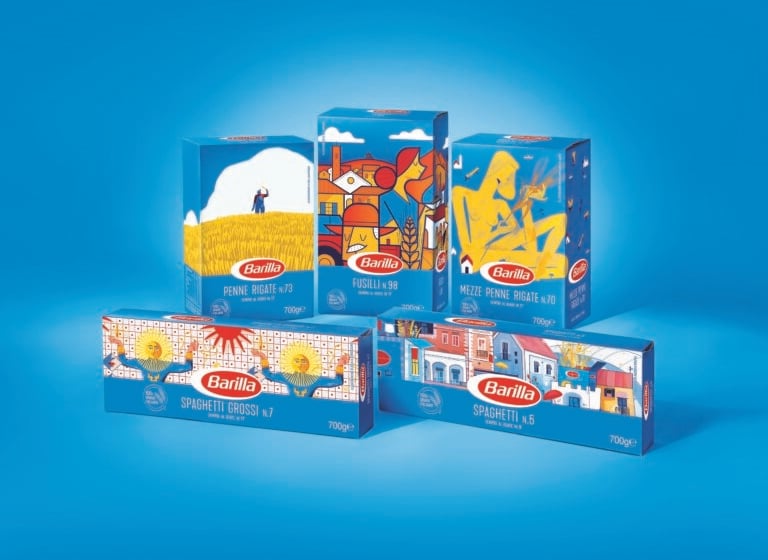
It’s also a key part of packaging, like in this limited edition for Barilla pasta in which the firm collaborated with some of Italy’s best contemporary illustrators, showcasing the signature style that characterises the work of many Italian artists (and which we covered in this article).
Barilla’s project celebrates the meeting of art and product design, and includes a virtual exhibition.
Click here to see the exhibition.
Another internationally renowned Italian firm using drawing and illustration in an original way is Davines, a leader in haircare products. By using a type of image that has gone out of fashion, the firm has been able to make its products stand out from those of its competitors.
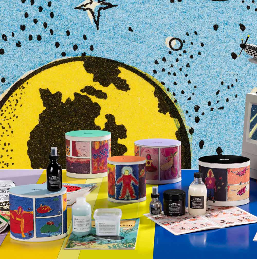
Illustration for companies: evocative messages and emotions beyond the product
As well as the ability to escape reality and enter a completely imaginary world, illustration also opens up graphic design possibilities for communicating messages more metaphorically and less directly.
Indeed, abandoning realism can be useful when you want to talk about an intangible experience, like a scent, or when you want to transport people into a magical world in which dreams are more important than reality. A great example can be seen in the latest ad campaigns and packaging for Pan Di Stelle biscuits from Mulino Bianco. They move away from the brand’s traditional style, which places a strong emphasis on realism, and instead embraces a world of dreams, imagination and possibilities illustrated with white-lined drawings.
Illustration is gradually becoming a less childish and more mature tool as firms realise its power to promote their content and values in a compelling and comprehensible way.

