Table of Contents
Many firms like to use illustration, not just for communications, but also for visualising their business idea and expressing the spirit of their company.
This article will not be so much about those firms, such as multinationals like Coca Cola and Nike, which often use illustration in their advertising, but rather the companies that have tied their values to illustrated images in a more profound sense.
In recent years, illustration has come back with a bang in corporate communication. It’s a bit like what happened at the turn of the 20th century, when brand identity consisted of incredible hand-drawn lettering and logos, artist-created posters and adverts, and elaborately decorated packaging: graphic design and illustration were practically the same thing.
But ever since graphic design became more functional, shifting from the ornate to the minimal, illustration has been used less in these areas and instead reserved for editorial and advertising applications.
However, there have been pockets of resistance, such as the case of Red Bull which, while being innovative, also shows originality and wit with its drawings by a veteran illustrator who uses a quintessentially British old-school style: R. O. Blechman. Since 1985, he has created all the advertising illustrations for the brand, be it for print or television, creating a strong brand identity.
Today, Blechman is over 90 years old and continues to entertain us with his animations.

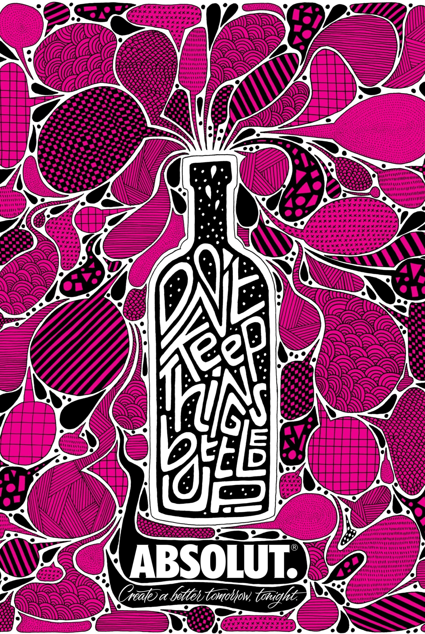
Another incredible example of the use of illustration comes from Absolut Vodka, who, also in 1985, commissioned none other than Andy Warhol to create a poster to advertise its iconic bottle.
The campaign was so successful that Absolut didn’t stop there: first, it asked Warhol to involve other artists, like Keith Haring, in reinterpreting the bottle; then, it commissioned artists to design limited-edition bottles in what would become an annual art competition.


In Italy, the approach of asking artists to reinterpret an iconic brand has been extensively used by oil firm ENI over the past 10 years. It has showcased new talents with its Enyzime project, as well as commissioning emerging illustrators for its advertising campaigns and various other projects. In these, the six-legged dog, the brand’s emblem, has been revisited in countless different ways.


Recent developments and the supremacy of flat design
One of the most ubiquitous trends in recent years is so-called “flat” design, which is often favoured by tech start-ups because it perfectly suits their use case: flat-design images are created digitally, use just a few simple colours, work well on the web and in apps, comprise few elements and are easy to read. Indeed, they can seem more like hieroglyphs than actual illustrations, so simple and schematic are they, but they have quickly conquered the market because they catch the eye and and focus it on a single point, without distractions.
The use of flat design has grown with the recent development of mobile technology and its systems that favour simple, no-frills two-dimensional graphics. And it hasn’t taken long for this approach to bleed into the world of corporate identities.
A great example of flat illustration used in a corporate identity is Airbnb, an innovative tech company that has revolutionised the holiday home market. The minimalist design of their website is accompanied by illustrations that are just as simple, and little more than icons: it’s a sort of anti-illustration in which the author is less important than the outcome.

Digital corporate identities are fluid by their very nature: graphics, images and drawings intersect and overlap; logos are often just lettering; and design is used to convey a feeling, a specific mood that is on the same wavelength as the user.
This type of approach has proliferated, making the flat style an unstoppable trend that has resulted in ever more clones and standard stock images.
The flat design philosophy has been adopted by many tech firms, including Etsy, Shopify, Asana, WeTransfer, Notion and Lingo, to mention just a few.
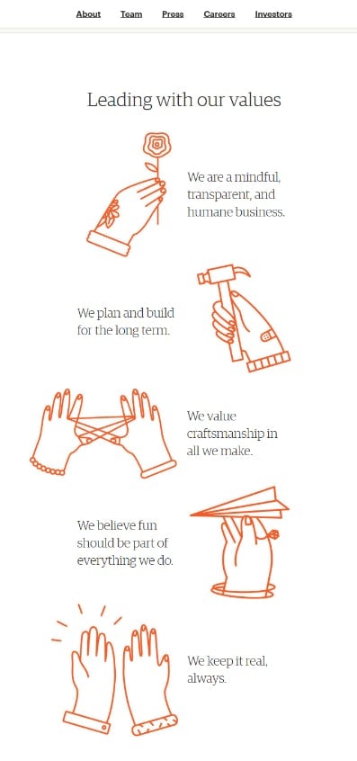
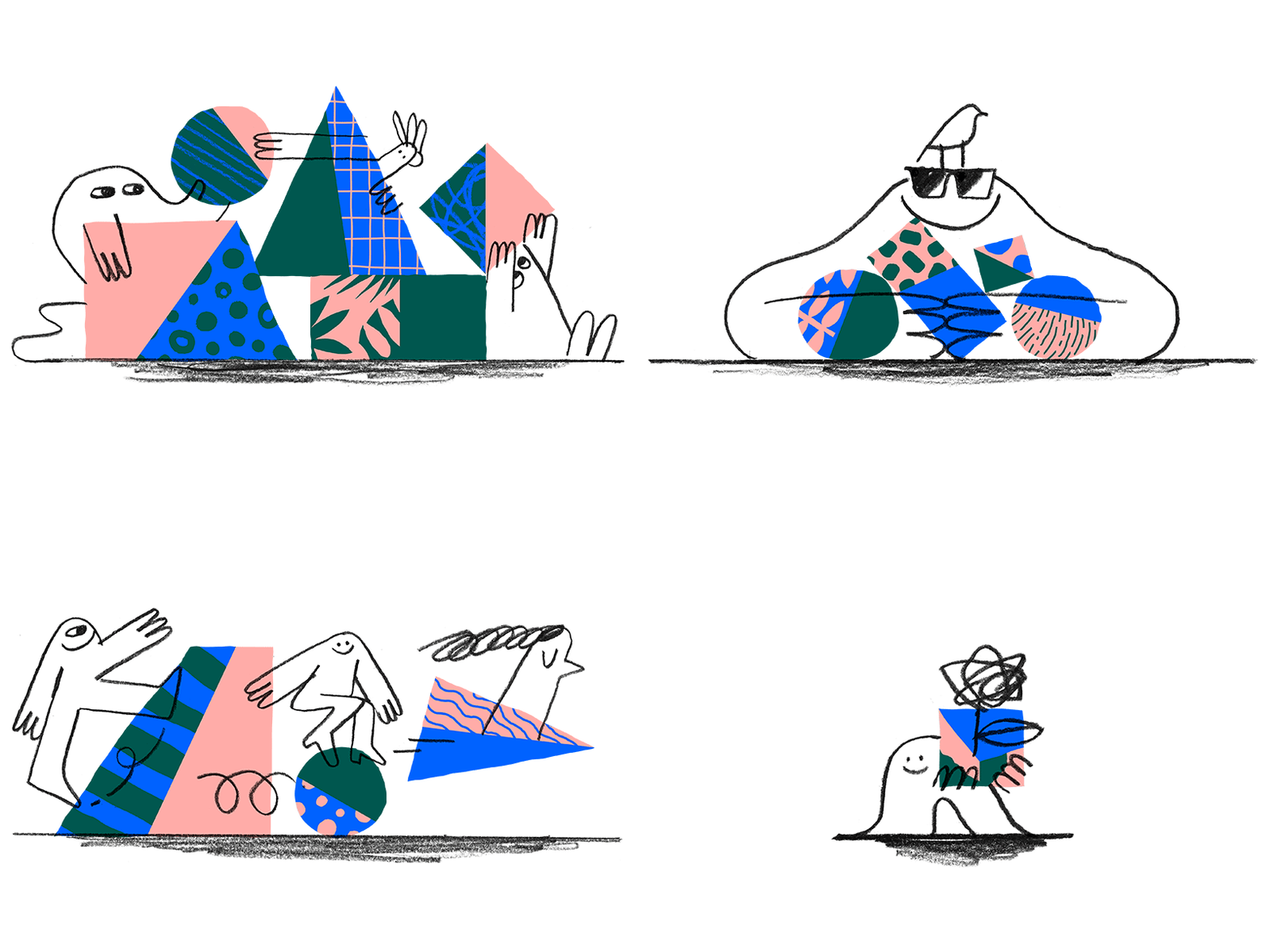
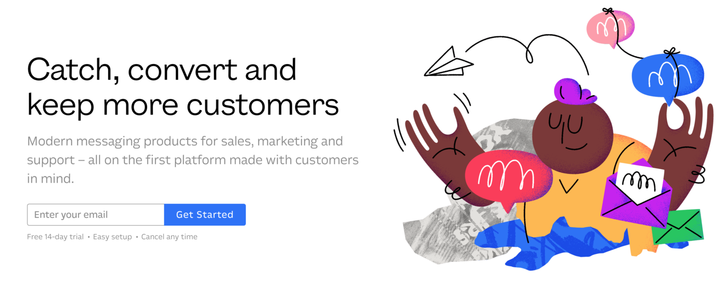
Fortunately, some companies have opted for alternative approaches, in which the illustration style is more oriented towards orginality and wit, as is the case of Dropbox (with the 2017 redesign) and Intercom.


The return of drawing and a new aesthetic
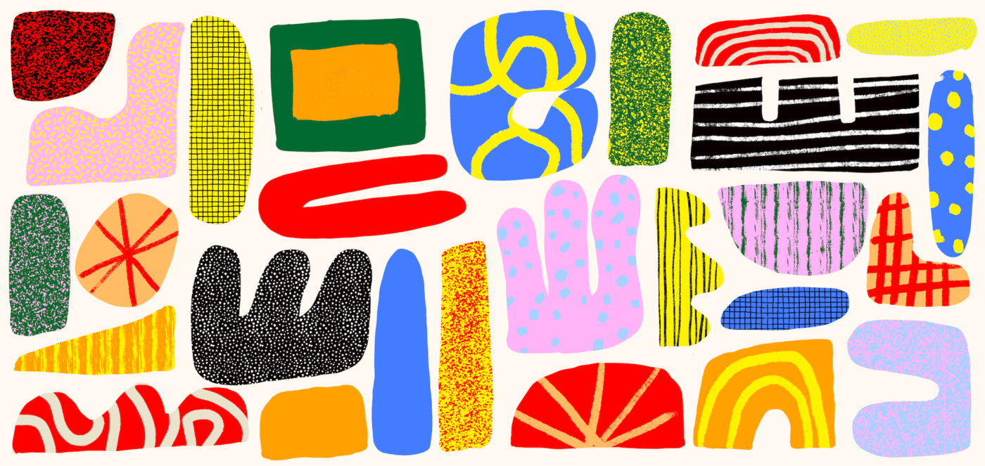
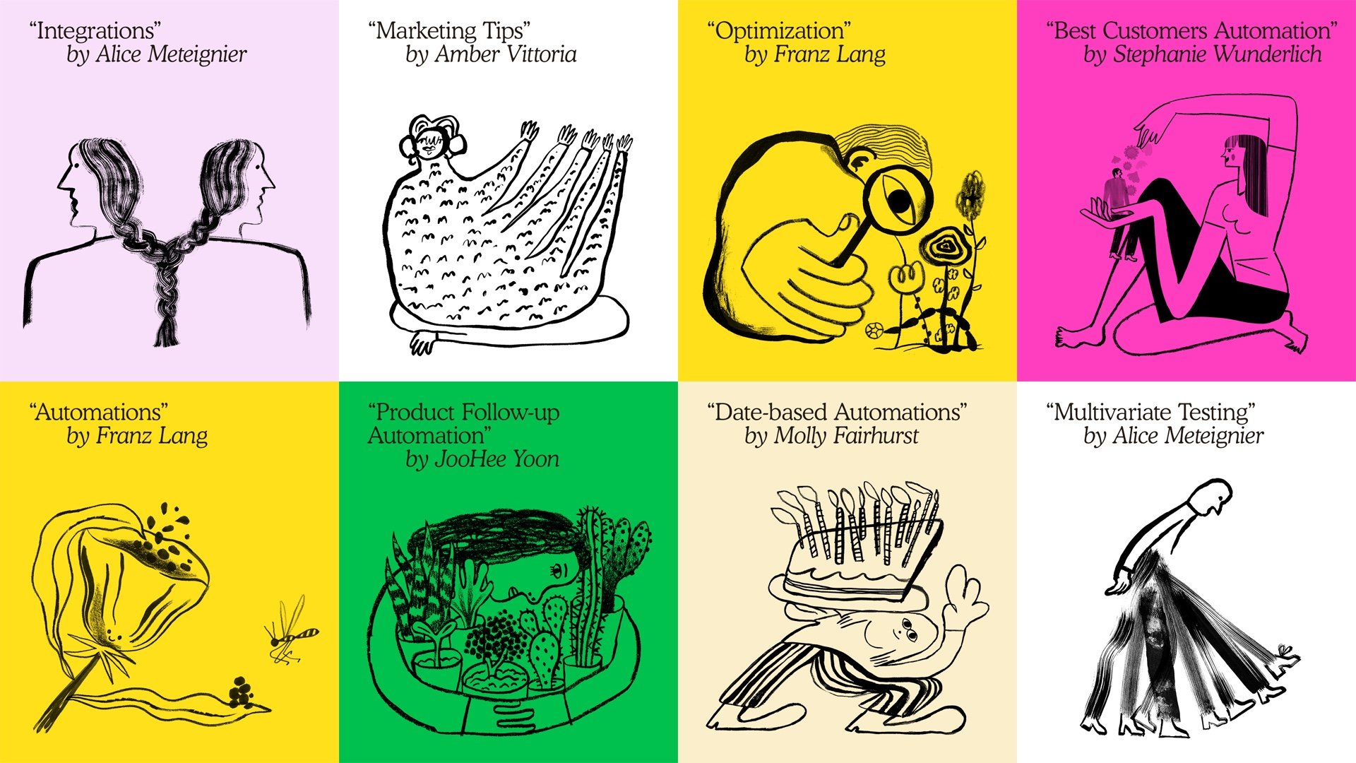
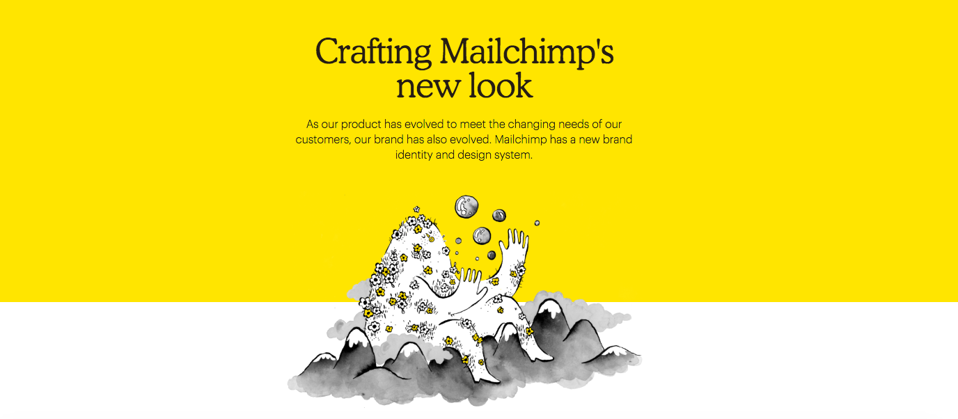
Mailchimp has followed an orginal path, signalling a clean break with the flat design that has dominated much of the tech sector until recently: in 2018, with its brand identity redesign, it drew upon the vitality and imagination of seven artists (Stephanie Wunderlich, Sarah Mazzetti, Franz Lang, Molly Fairhurst, Amber Vittoria, Alice Meteignier and JooHee Yoon), asking them to create drawings that are unruly and messy. It’s a marked contrast with the excessive neatness and tidiness of the flat illustrations used by their competitors.
Another brand that, just like Mailchimp, has adopted a very specific aesthetic is the Copenhagen-based shop chain Flying Tiger, which is fast conquering the world. Its imperfect, hand-made look has been made up as the firm goes along by commissioning various artists – some of whom are world famous – to work on its point-of-sale communication, catalogues and product lines. Here we see illustrator David Shrigley showing off some of his irreverent stationery designs for the Danish brand.

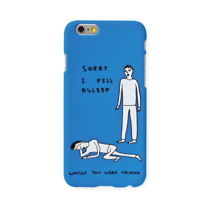
Illustration is good for companies
To wrap up, it’s clear that illustration can really benefit firms, both in their external communications and in the expression of their brand values, helping to make them recognisable and attractive.
The use of illustration is increasingly widespread today, with drawing – and the immediacy it offers – also reaching new heights of popularity.

