Table of Contents
Whether you’re a freelancer building your own visual identity or graphic designer crafting a corporate image, there’s one essential you can’t do without: a business card, preferably original and well-designed.
If you’re looking for great business card ideas, you’re in the right place! Despite the increasing digitalisation of communication, having an original and well-designed business card can definitely help customers remember your brand or the company you work for.
Here’s our list of eight great ideas for business cards: from the most useful formats, fonts, and colours to business card templates… our helpful tips for creating original business cards.
To draw up this list of ideas for business cards, we enlisted the help of an expert: graphic designer Matteo Pietra.
1. In keeping with the corporate image
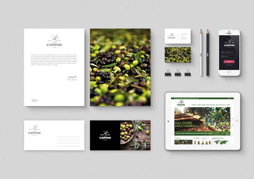
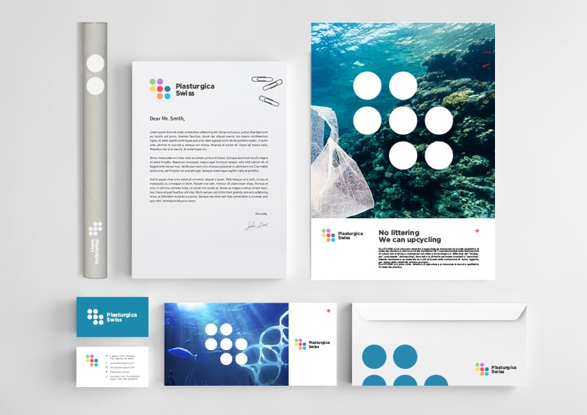
Of all the business card ideas that we suggest today, there’s one that should guide all your work: the card’s graphics must be in perfect keeping with the brand’s other visual elements (website, logos, brochures, letterheads and so on, if you work for a company; CV, portfolio and letterheads for invoices if you’re a freelancer).
As we’ll see in the following ideas for business cards, this will influence the choice of colours and fonts, as well as the creation of new graphic elements.

2. What software should you use to design your business card?
If you have ideas for business cards, you should use a professional desktop publishing program like Abobe InDesign or the many free (or almost free) alternatives which can also be found online: read our guide.
Expert graphic designers will probably prefer to use Adobe InDesign, which lets you create different layouts for print projects, but there are also a number of free or very affordable programs that may well fit the bill and also give you business card templates from which to start.
3. Should you use business card templates?
Using business card templates exactly as they are is probably not a good idea…an effective business card is original! There’s nothing worse than an anonymous, impersonal business card that looks like a thousand others.
But that doesn’t mean that business card templates are completely useless. If you have just a little graphic design experience, they can be an excellent source of inspiration.
Programs like Microsoft Word or Canva allow you to search databases with hundreds of ideas, but you might also find inspiration on a site like Behance. From these, you can learn a lot about positioning elements and take away some original business card ideas, reworking them according to your personality or the elements already present in the corporate visual identity.
4. Business card dimensions and material
Among the many business card ideas out there, you’ll notice that the rectangular format is the most common. This is mainly for practical reasons: a rectangular business card can be easily slipped into the wallet or pocket. The format normally used is 85×55 mm or 75×45 mm.
When printing business cards, it’s advisable to use heavy paper for durability. This also results in a card that’s easy to handle, practical, elegant and pleasant to the touch.
If the most common formats don’t do it for you, let your imagination run wild and experiment with original and unusual formats. A good starting point is checking out some of the more original business card templates found on the web.

5. Ideas for clearly legible business cards
Our list of great ideas for business cards wouldn’t be complete without some tips on which font to use, and on legibility. If it’s hard to read, your business card will be ignored by casual observers and irritate people who are interested.
For the font to be legible, it must contrast with the background and be large enough for the chosen format: don’t write too small, and use colours that go together.
For a professional-looking business card, it’s better to avoid fancy fonts, unless your business requires it, in favour of simple, clean lines.
Sans Serif fonts are often used because they are extremely modern and clean and offer many families to choose from. One of the most popular fonts in recent years is Gotham, the use of which exploded after being employed by Barack Obama for his communications in the 2008 presidential elections.
Among the most interesting fonts today is Mensrea, a family of fonts that combines a wide range of styles. Others include: Nibbles, a linear typeface inspired by food and food trucks and ideal for branding and editorial use; Auro, a friendly, rounded font that is legible whether large or small and lends a touch of personality; Deleplace, a modern, delicate and refined typeface that is both contemporary and hints at a classical past.
6. Choosing colours for business cards
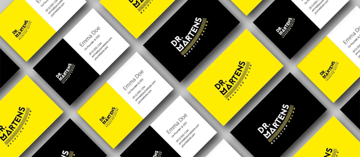
The choice of colours should always be based on very precise criteria: if there are corporate colours, it’s always good to use them to remain coordinated with the firm’s image, as discussed at the start of our list of business card ideas. For example, if your company logo is green, it’s not advisable to use red as the main colour: always maintain a common visual thread!
Colour choice significantly influences the way we are perceived by others: cold colours like blue can convey a sense of calm and reassurance, while warm colours like
red and yellow are associated with extroversion and imagination.
7. Ideas for very succinct business cards
Business cards are small, with a brief text that is immediate and easy to understand. Your business card design will be successful if it does the following:
- Says who you are
- Says who your company is
- Gives contact details in a simple and clear manner
You therefore need to choose the most important information, and avoid the temptation of adding anything superfluous, like a photo, or useless information.
A good business card should feature: the name or logo of the firm, your name and position, address, phone number, e-mail address, website and social media contacts. In other words, the essential details are a reminder for future contact.
8. Original business cards: how to stand out
Creative ideas for good business cards are both limitless and limited, precisely because you have to remain faithful to the company’s image, its market and what you want to convey.
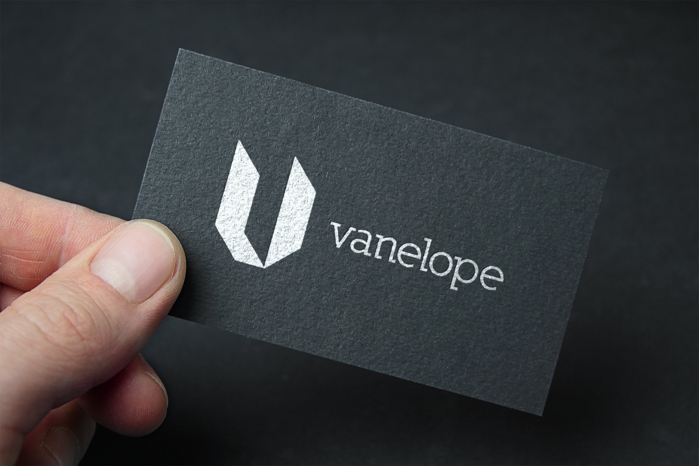
To create original business cards, you need to add differentiating features: elements that make you stand out from others. And these can be inspired by the company logo. Special shapes, colours or tones and much more are features that can be developed to emphasise your corporate image and generate interest.

We’re confident that this list of business card ideas will help you to keep in touch with your future customers!

