Table of Contents
Iconic posters from cinema history
From the first French posters at the end of the 19th century to the movie posters of today, the history of posters is intertwined with that of cinema in particular and the visual arts in general. Until the Second World War, posters were one of the main methods for advertising films and played a decisive role in their success. Over the years, many of these posters have become collector’s items.
The origins of the movie poster
The first film posters appeared in France around the end of the 19th century when cinema was in its infancy. Jules Chéret and Marcellin Auzolle began advertising the Lumière brothers’ invention using lithographs with an Art Nouveau style that featured vibrant colours and characters illustrated down to the finest details.
The so-called “painters of cinema” were tasked with representing the film through an attractive illustration that would catch the eye of passers-by. Detailed depictions of audiences and scenes from the film told the public the type of genre it belonged to (comedy, adventure etc.) and whether the release was suitable for all the family.

In this period, a stock poster was often used, to which was then added information about a particular film. Below is a famous stock poster by Adrien Barrère.

Movie poster distribution in the USA
With the rise of Hollywood after the First World War and the first full-length films, posters started featuring the cast (or the star), the director’s name, the film’s title and a plot summary. They continued to be printed using colour lithography, the only technique capable of producing high-quality illustrations at the time, albeit expensively. Posters often carried portraits of the cast, but for stars like Charlie Chaplin, Marlene Dietrich, Marylin Monroe or Audrey Hepburn, the entire poster was given over to their picture, giving rise to the star system.

Iconic posters from cinema history
In fifties America, directors like Otto Preminger, Billy Wilder and Alfred Hitchcock started making and promoting their films independently with the help of Saul Bass. This American designer began creating the entire visual identity for their films, from opening and closing credits to posters. In doing so, he introduced a completely new style of minimalist and highly suggestive design. For the first time in film poster history, Bass managed to capture the meaning of films through a symbolic language of bold primary colours and geometric shapes.
One of his most famous pieces of work is the title sequence for Otto Preminger’s 1959 film “Anatomy of a Murder”. Set to the rhythm of a jazz score, parts of a body outline slide on and off the screen, highlighting the credits as they go. Bass used the same graphic design concept for the film’s poster.

Even more famous are the title sequences and posters he produced for the Hitchcock films “Vertigo”, “North by Northwest” and “Psycho”. Bass’s striking graphic design undoubtedly contributed to this success of these directors.

Forties and fifties’ Italy saw the birth of the neorealist movement: directors like Luchino Visconti, Vittorio De Sica and Roberto Rossellini portrayed the lives of ordinary Italians in the aftermath of the Second World War. For these films, Italian poster designers opted for watercolour illustrations that showed scenes from the film, or a loose representation of the plot. Anselmo Ballester and Ercole Brini designed some of the era’s most recognisable posters. In the poster for “Bicycle Thieves”, Brini deliberately chose a “tender” image with soft colours to offset the harsh reality shown in the movie.

In the sixties, competition from television pushed Hollywood directors be more ambitious and devote ever bigger budgets to films in an attempt to fill cinemas. It was during this decade that British artist Philip Castle introduced a completely new technique to the world of poster design: airbrush. This tool allowed artists to create very sharp and detailed images, perfect for the raw realism of films like Stanley Kubrick’s “A Clockwork Orange” and “Full Metal Jacket”, two of the most iconic movie posters of all time – and both designed by Castle.

In the following decade, American illustrator Bob Peak also used an airbrush to design posters for some of the most famous films of the seventies, from “Apocalypse Now” to “Star Trek”.

The photographic poster
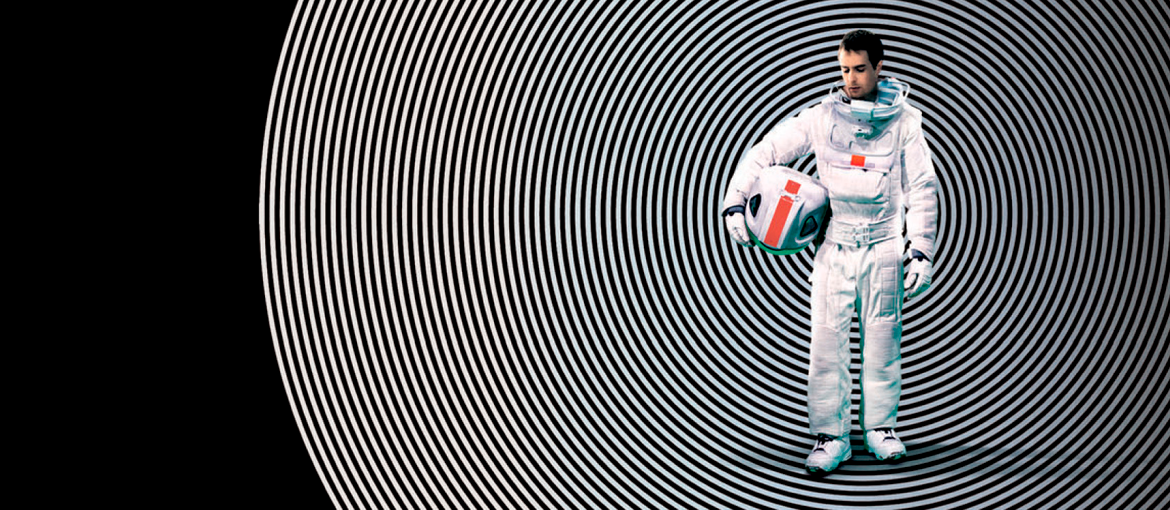
The advent of video recorders at the start of the eighties followed by the Internet and pay TV in the nineties pushed film poster design to new levels. With the arrival of digital editing programs, photography completely replaced illustration. Furthermore, posters started using a formulaic composition consisting of the main characters/stars’ faces and a few stills from the film, very often to cold and ascetic effect. There are, however, some notable exceptions, like the poster for Quentin Tarantino’s 2003 release “Kill Bill” with its retro illustration, or the poster for “Moon”, Duncan Jones’ 2009 sci-fi flick that skilfully combines graphics and photography.


