Table of Contents
How do you make a leaflet and print it with Pixartprinting? In this article we explain the different types of leaflet you can create with Pixartprinting, how they work and how to configure a good-quality, error-free graphics file for printing the leaflet! But first of all, do you know the difference between leaflets, flyers and brochures? If you don’t check this out!
Leaflets have countless different uses. For example, you can print the programme for a multi-day festival, create promotional material for your products, publish a tourist brochure or make a city map packed with information. And because creating a leaflet online is so simple, it lends the format to more unconventional uses too: there are, for example, literary reviews printed as leaflets, and there’s no reason why the format couldn’t be used for a creative CV or a portfolio of your work.
The creative possibilities are endless, but to help you get the most out of this versatile format, we’re going to explain the basics of making a brochure, so you can avoid the most common mistakes in configuring your graphics file and produce a brochure that looks exactly how you designed it.
So here’s our guide to making leaflets and printing them online with Pixartprinting. How to make a leaflet: sheets, folds and panels.
Before getting into how to make a leaflet, we first need to explain a few things about this format.
The leaflet, also called a folded flyer or brochure, is a product printed on a single sheet that’s folded once or more. So when we talk about the sheet we mean the flat format on which the graphics are printed – either on one side or both. Here’s an example of a flat sheet.
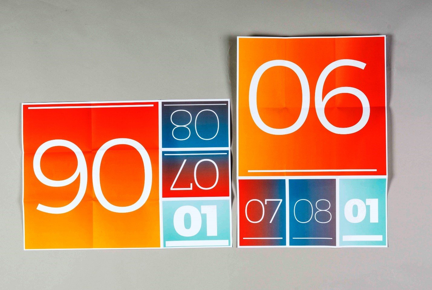
Sheets come in various different formats, such as A2, A3, A4, A5 and others. Depending on the type of leaflet selected, you’ll be able to choose from several different formats on the Pixartprinting site.
The sheet will then be folded to create panels. The panels are therefore the parts of the sheet that are delimited by the folds. For example, in the image below, you can see a leaflet in A4 format with 2 folds: this creates 3 panels on the front and 3 on the back, 6 panels in total.
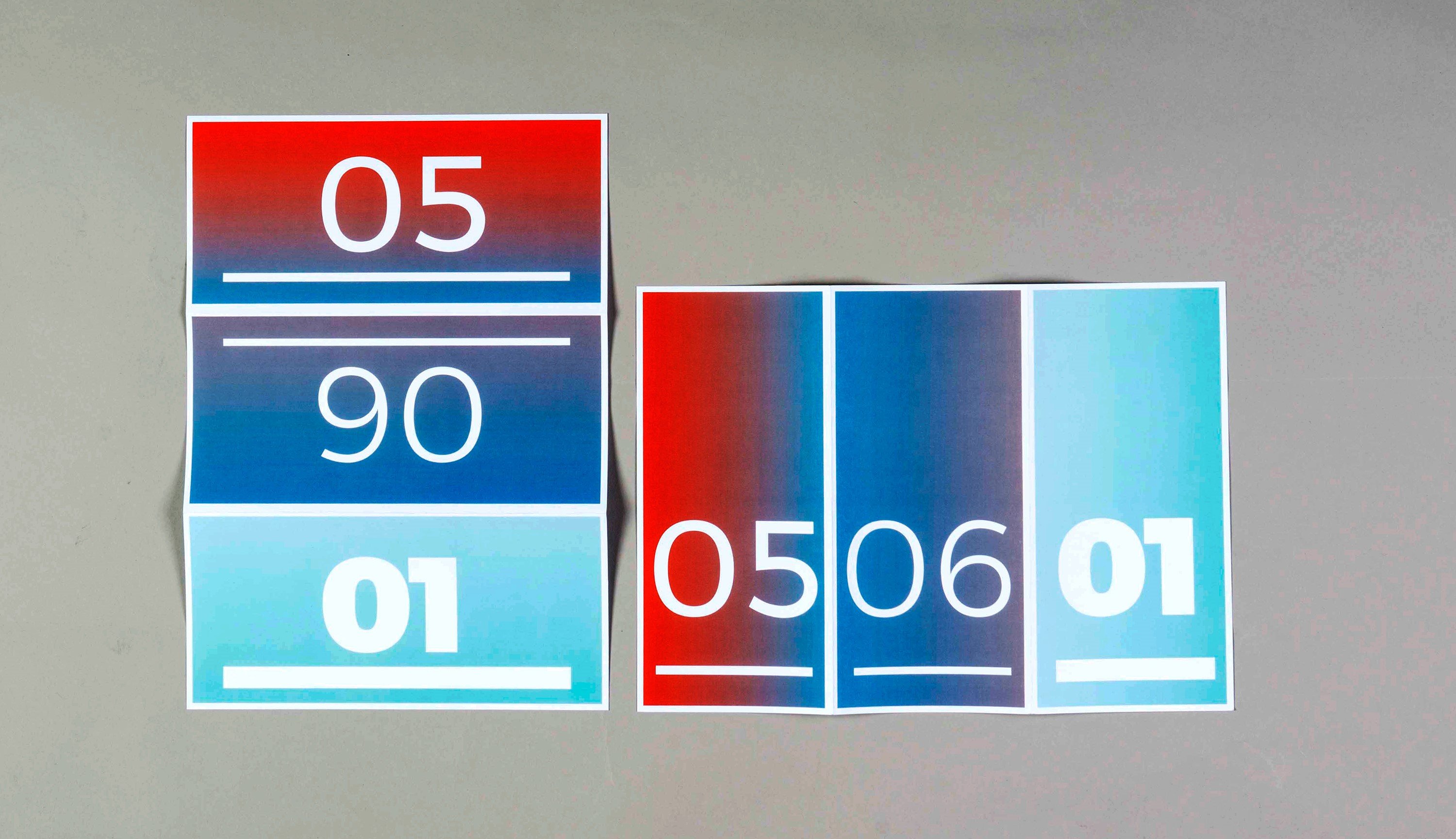
The folds are the lines along which the sheet is folded to create panels. Varying the number of folds and their position lets you create leaflets that open and read in different ways, depending on your requirements.
How to make a leaflet: step one, make mock-ups to help you choose the best format.
We now get down to the nitty gritty in our guide on how to make a brochure. You’ll have worked out that by combining different formats, types and numbers of folds, you can create products that are very different from one another. When you start to create a leaflet online with Pixartprinting, you can browse all the different types of leaflets available, as this image shows.
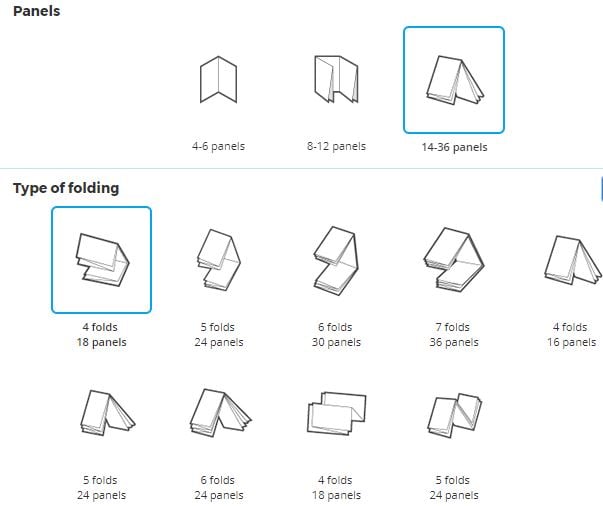
But how do you choose between these formats and fold types? And how do you know what the right number of panels is for your project? The first and most basic tip in our guide on how to make a leaflet is this: create mock-ups of your brochure!
Creating a brochure mock-up is very simple. In the Pixartprinting interface, select one of the many formats available. Scroll down and, before you place your order, download the template.

In the zipped file that you download, you’ll find various types of file. For now, use the PDF file. When you open it, you’ll find markings for the front and back of a sheet that you can print or re-create by hand on a blank sheet of paper.
That’s what we did. And in the next step of our guide on how to make a brochure we show you three types of mock-ups that we created.
How to make a brochure: our mock-ups
6-panel leaflet with 2 tri-folds
The first mock-up we show you is a 6-panel leaflet with 2 “tri-folds”. You can choose this type in the Pixartprinting online interface for creating a leaflet, under the “4-6 panels” category. The result is what you see in this video: we show you the brochure first in landscape, then in portrait orientation.
Now try creating your own mock-up by watching the video and using the template that you can download from Pixartprinting.
8-panel leaflet with French fold
Let’s have a look at another brochure mock-up. In this instance, we have 8 panels with a French fold. Again, we first show the landscape orientation, followed by the portrait orientation.
18-panel leaflet with 4 folds: 2 Z-folds and 2 tri-folds
In this last leaflet example, we have 18 panels and 4 folds. You’ll find this model on the Pixartprinting page for creating a leaflet under the “14-36 panels” category. Once again, in the video we first show you the landscape orientation, then the portrait orientation.
Don’t be fooled by the numbers that you see printed (which go up to 8): in this case, different panels have been joined to create a single image. There are, however, still 18 panels. Now have a go at creating this mock-up yourself, before completing your order, using the templates you can download from the Pixartprinting site.
Once you’ve practised with these mock-up leaflets, you can go wild and try all the different combinations available on Pixartprinting before choosing the right format for your project.
We continue our guide on how to make a leaflet by explaining how to modify a template, insert your graphics and correctly prep a file for printing.
Which program should you use to create a leaflet online?
To create a leaflet online with Pixartprinting, once you’ve chosen the format you want, you need to modify the template that you downloaded by inserting your graphics.
To do so, you can use Adobe Illustrator, the most widely used vector graphics editor. With it, you can open and modify the files contained in the template pack.
How to make a leaflet: modifying the template and inserting your graphics
Once you have opened the file, you can insert your graphics. It’s important to follow the orientation of the panels that are in the template. So if you find an “upside down” number on a panel, you’ll need to rotate the content you’re inserting – images and text – by 180 degrees.
You’ll find different coloured lines in the file. These will help you to position images and text to avoid problems during printing.
- The green line is the bleed – a safety margin that indicates where the sheet will be printed on beyond the cut line: you’ll therefore need to extend coloured backgrounds and graphics to at least this point to avoid unwanted white borders.
- The light grey line is the cut line – the blade that cuts the material will follow this: we recommend you leave a gap of 5-10 mm between this line and any text or important content.
- The dotted grey line is the fold line – it indicates where the material will be folded: if you don’t want text or images to be printed over the fold, leave a gap of 5-10 mm from this line.
- The red line indicates the safe area: this line helps you see up to where you can position text or images so they are visible.
Follow these guidelines when positioning your graphics, and once you’ve created your leaflet, remember to delete all the lines mentioned above, except the green one.
Here ends our guide on how to make a leaflet
You’ve reached the end of our guide on how to create a leaflet on Pixartprinting.co.uk. For extra peace of mind when it comes to the end result, we recommend choosing the Professional File Check option when ordering, so the Pixartprinting team can check your file is correct and ready for printing!
Highlighting the Importance of Typography
Typography is a fundamental element in leaflet design that significantly impacts both readability and aesthetics. The right choice of fonts can convey the tone and personality of your brand, making a strong impression on the reader. Here are some detailed guidelines to enhance your leaflet with effective typography:
1. Font Selection:
Choose fonts that reflect your brand’s voice. For a professional and modern look, sans-serif fonts like Helvetica or Arial work well. For a more traditional or elegant feel, serif fonts like Times New Roman or Garamond can be appropriate. Ensure the fonts align with the overall design and message of the leaflet.
2. Hierarchical Structure:
Use a typographic hierarchy to guide the reader through the content. This involves varying font sizes, weights, and styles to distinguish between headings, subheadings, and body text. For instance, the main headline could be bold and large, subheadings slightly smaller and italicized, and body text in a standard size and weight. This hierarchy helps readers easily navigate and prioritize information.
3. Readability and Legibility:
Ensure that your chosen fonts are legible at different sizes and in various lighting conditions. Avoid overly decorative fonts for large blocks of text, as they can be hard to read. Maintain adequate spacing between lines (leading) and between letters (kerning) to enhance readability. Contrast is also key; dark text on a light background or vice versa improves legibility.
4. Consistency:
Maintain typographic consistency throughout the leaflet. Limit the number of fonts to two or three to avoid a cluttered and disorganized look. Consistent use of fonts helps establish a cohesive visual identity and makes the leaflet more visually appealing.
5. Emphasis and Focus:
Use typographic styles like bold, italic, or underline sparingly to emphasize important points or calls to action. Overusing these styles can diminish their impact and make the text difficult to read. Instead, use them strategically to draw attention to key information, such as offers, contact details, or critical instructions.
By focusing on these aspects of typography, your leaflet can effectively communicate your message while ensuring an aesthetically pleasing and professional appearance. This attention to detail in font selection and usage will enhance the overall impact of your leaflet, making it more engaging and memorable for your audience.
All that’s left now is for you to let your creativity run wild in leaflet form! Now you can create your restaurant’s wine list, wedding menus, wedding order of service, thank you notes or whatever you want and have fun!

