Table of Contents
Before sitting down to write this article, we grabbed something refreshing to drink. I’m sure you’ll agree that you can’t write an article on soft drinks without having one on hand to sip, especially if it’s hot and sunny outside. Go on, top up your glass too. Reading this is liable to give you cravings for your favourite beverage…
Coca-Cola, the history of an iconic soft drink
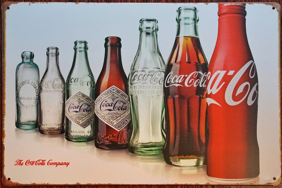
It’s hard to hear the name Coca-Cola without visualising its iconic small, curvaceous bottle. However, in its early years, the drink was only ever sold in draught form. Coca-Cola was founded in Atlanta in 1886, invented by the pharmacist John Stith Pemberton. To begin with, the tasty and thirst-quenching drink was marketed as a takeaway drink, sold at five cents a glass. And it wasn’t called Coca-Cola – it was Frank Mason Robinson, the company’s accountant, who suggested the name and designed its unique logo featuring the name written in italics. The logo has remained virtually unchanged over the years; take a look at the first version, from 1887.

The first bottled Coca-Cola was sold in Vicksburg in 1894, in a shop run by Joseph Augustus Biedenharn. Facing growing demand, Joseph installed a machine for bottling the drink at the back of his shop, and numerous crates of Coca-Cola began to be distributed from there.
Inevitably, as the product became more popular, more and more imitations were produced. The first Coca-Cola adverts warned consumers of the risks of buying a contraband product, telling them to “Demand the original”, and saying “Don’t accept substitutes”. The product therefore needed to become even more recognisable – Coca-Cola had to be immediately obvious, “even with your eyes closed”. This is one of the reasons the iconic contour bottle, was created, designed on 16 November 1915 by the Root Glass Company in Terre Haute.

Now let’s look at Coca-Cola’s adverts, which are every bit as iconic as the bottle, and which have been accompanied by timeless slogans, illustrations and jingles for years. For instance, do you remember the slogan “The Pause that Refreshes”? Incredibly, it’s almost a century old! It appeared for the first time in The Saturday Evening Post in 1929. Then there were Norma Rockwell’s famous illustrations for Coca-Cola:

The jingle “Things Go Better with Coke“, which became a radio hit, might be familiar. And you probably remember some of the brand’s old adverts too. Refresh your memory with these two.
Fanta, celebrating imagination
When we went to birthday parties as children, we were divided into two factions: those who drank Coca-Cola, and those who preferred Fanta. However, what the two sides didn’t know is that they were actually all under the same flag, since Fanta is a Coca-Cola product. The drink was first created in 1941 in Germany, when Max Keith, a Coca-Cola bottler, was forced to stop importing the drink due to the war. To ensure Germany wasn’t left parched, he invented a new drink made from an extremely limited number of ingredients, the only ones he had to hand: fruit rind, apple pomace, beet sugar and whey. He gave this mix the name “Fanta”, a contraction of the German word “fantasie”, meaning “imagination”. However, there was another crucial chapter in Fanta’s history, this time centred on Italy.
In 1955 the drink started to be produced in Italy, in a factory in Naples to be precise. Here the southern Italian oranges that would become its trademark ingredient were introduced for the first time. To celebrate this new pairing, a few months later Fanta launched its famous ring bottle made of ridged glass.

“Fanta, l’aranciata d’arancia” (Fanta, the orange-based orangeade) – the slogans that accompanied the first advertising campaigns focused entirely on the natural juice and the drink’s authenticity. Given its huge success, in 1958 The Coca-Cola Company decided to buy the rights to it and invest in its positioning – Fanta was marketed as a drink with a bubbly personality that released energy and creativity. It is no coincidence, therefore, that the first adverts used cartoon characters and immersed young viewers in a brightly coloured fantasy world. Do you remember them? Let’s watch them again together!
Fanta, 1984.
Fanta, 1986.
Fanta, 1990.
Sanbittèr, the ultimate Italian soft drink
Let’s remain in Italy and jump forward to the early 1960s, the years of the Dolce Vita and sipping aperitifs in the piazza. Bitter Sanpellegrino was first created in 1961: a non-alcoholic drink with a distinctive bitter flavour and intense red colour, made from a mix of herbs and served in an iconic single portion bottle. It’s not just a soft drink; it’s the ultimate soft drink. Not many people know that Bitter Sanpellegrino was the first alcohol-free aperitif to reach the market. From then on, it came to symbolise of time spent in good company, and a typically Italian liking for the small pleasures in life.

The first advertisements began to appear in the 1970s, and they soon acquired cult status. The very first one, still in black and white, was filmed in Porto Venere in Liguria. The advert has just one aim: to cement the product’s name in people’s memory and to invite consumers to ask for the drink using its proper name, despite it being a bit long.
You’ll have noticed that up to now we’ve called it “Bitter Sanpellegrino” and not “Sanbittèr” as it is known today. It was given its current, shorter name in the 1980s, when the firm decided to make it more simple and memorable: “Sanbittèr c’est plus facile!” To launch it and imprint it in consumers’ minds, in 1987 Sanpellegrino introduced the renowned adverts featuring the barista Mario.
https://vimeo.com/121610675
In the 2000s there was another significant moment in the history of Sanbittèr – the redesign of the bottle. The aim was to make it even more recognisable, so the product stood out on bars and supermarket shelves.

The shape comes from the seamless fusion of two geometric shapes that have become iconic representations of the brand: a triangle and a cylinder. The glass is not smooth, but bedecked with droplets that give an incredible sense of freshness. The bottle redesign was the work of the Italdesign Giugiaro design studio, a firm founded in 1968 in Turin by Giorgetto Giugiaro and Aldo Mantovani that also designed the graphics and packaging for Estathé. Speaking of which…
Estathé, the taste of summer
Michele Ferrero created Estathé, a thirst-quenching still drink, in 1972, and his choice of name plays on the Italian word for summer, “Estate”. A very original design was chosen for the packaging – a white bottle covered with a thin aluminium film that could be perforated anywhere.
Rewatching the old Estathé adverts, you realise how much the drink accompanied many Italian customs: from a breaktime snack at school to a refreshing drink to sip on the beach. The drink was, and indeed still is, always present at all fun social occasions, meaning it’s hard not to have happy memories associated with it. And this is also thanks to the adverts that marketed the product. One of the earliest dates back to 1983, starring two lovers who tease each other on the beach, before grabbing an Estathé to quench their thirst.
https://player.vimeo.com/video/102366550?title=0&autoplay=1&byline=0&portrait=0
Another TV ad that appeared in the 1980s recommended Estathé as a drink for children, as it was made using only tea and lemon, with no artificial colourings.
https://player.vimeo.com/video/125066520?title=0&autoplay=1&byline=0&portrait=0
Then came perhaps the brand’s most popular advert in the 1990s. Anyone remember the gringo Pedro? Here he is, enjoying a siesta with his friend, in the shadow of a large sombrero. He is woken up by the sound of the straw piercing the bottle of Estathé – “You can hear when it’s Estathé”.
And now… Cheers! On behalf of everyone at Pixartprinting, we hope you have a good summer!

