Table of Contents
Headed paper: templates, inspiration and advice
Every day, lawyers, doctors, architects, designers and other professionals print their headed paper with us. Our presses produce all sorts of headed paper, which is why we wanted to share some tips on how best to design yours.
In this article, we look at headed paper design.
We explain what headed paper is and what characteristics it should have, and then show you some great templates that could serve as inspiration.
Lastly, we show you how to produce your own with tips for creating a headed paper template in Word and a tool specially for graphic design. Let’s get started!
Headed paper: what is it and what is it used for?
Let’s start with the basics: headed paper is blank paper that carries a person or firm’s contact details at the top. It’s the paper used by companies and professionals when communicating with the public. It should always feature:
- The name and logo of the company
- The name and surname of the professional
- Company information
- Contact details (postal address, phone number, email address)
In other words, the recipient of correspondence on headed paper must have all of the information they need to contact you.
No less important: headed paper should be recognisable, should be in keeping with the company’s image and, therefore, consistent with its brand identity. It should bring out your personality through small details: layout, graphics, colours, fonts and paper type. And because it’s about the small details, it involves subtle and careful work.
What makes good headed paper
From a graphics point of view, what features make some headed paper better than others? The same features found in any good graphic design.
1.Clarity
The role of headed paper is to inform, so it should be easy to read: pay attention to the font, which should be legible without difficulty, even at small sizes (it’s better to use a sans serif font), and also watch out for line spacing. Often, in an attempt to take up as little space as possible, there’s a tendency to condense every piece of information into one corner of the page. But this renders the text illegible, not to mention unattractive.
2.Simplicity
Aim for a simple layout. The letterhead should not interfere with the content of the paper, but rather contextualise it. It’s a case of less is more.
3.Recognisability
As we’ve already said, headed paper should be consistent with brand identity. So, if you use colours, make sure they match the brand’s palette (we suggest using no more than two colours); when choosing the font, stick to those used in the rest of your communications.
With this in mind, let’s take a look at some really good examples.
Headed paper templates for professionals
We’ve put together a selection of outstanding headed paper designs and organised them by profession. Check them out.
Headed paper: doctors and dentists
On headed paper for medical professionals, as well as basic information, you need to include the specialisation and, crucially, opening hours. From a design perspective, keep things sober and opt for a traditional layout that conveys a sense of seriousness and professionalism. For the palette, if you don’t have specific colours you must use, go for blue tones, which create a sense of calm and sincerity.
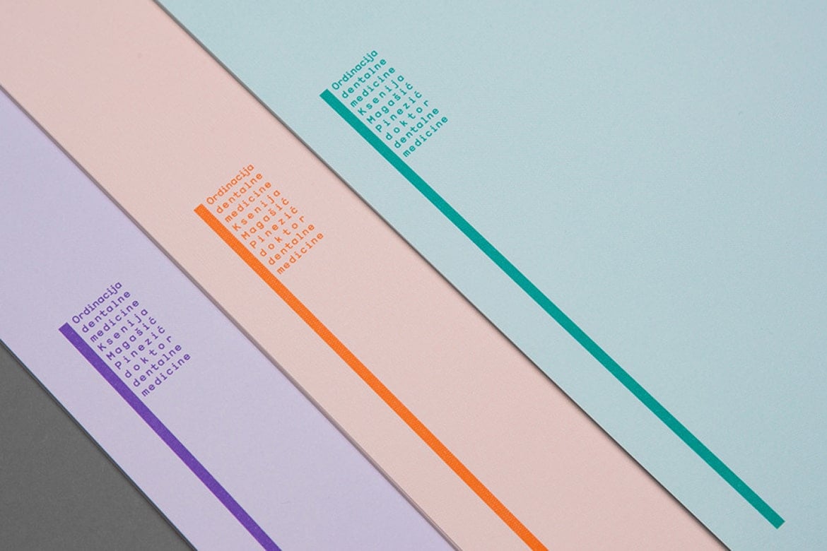
Keeping things sober doesn’t, however, mean overlooking the small details that make you stand out. Look at this example, which is decidedly different from the usual templates. Clearly, a letterhead like this is not for everyone: it must go hand in hand with a bold identity.
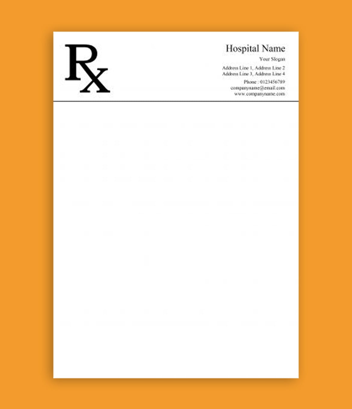
On the other hand, here is a more sober yet sophisticated design. Simple, but at the same time different from the headed paper typically used by doctors.
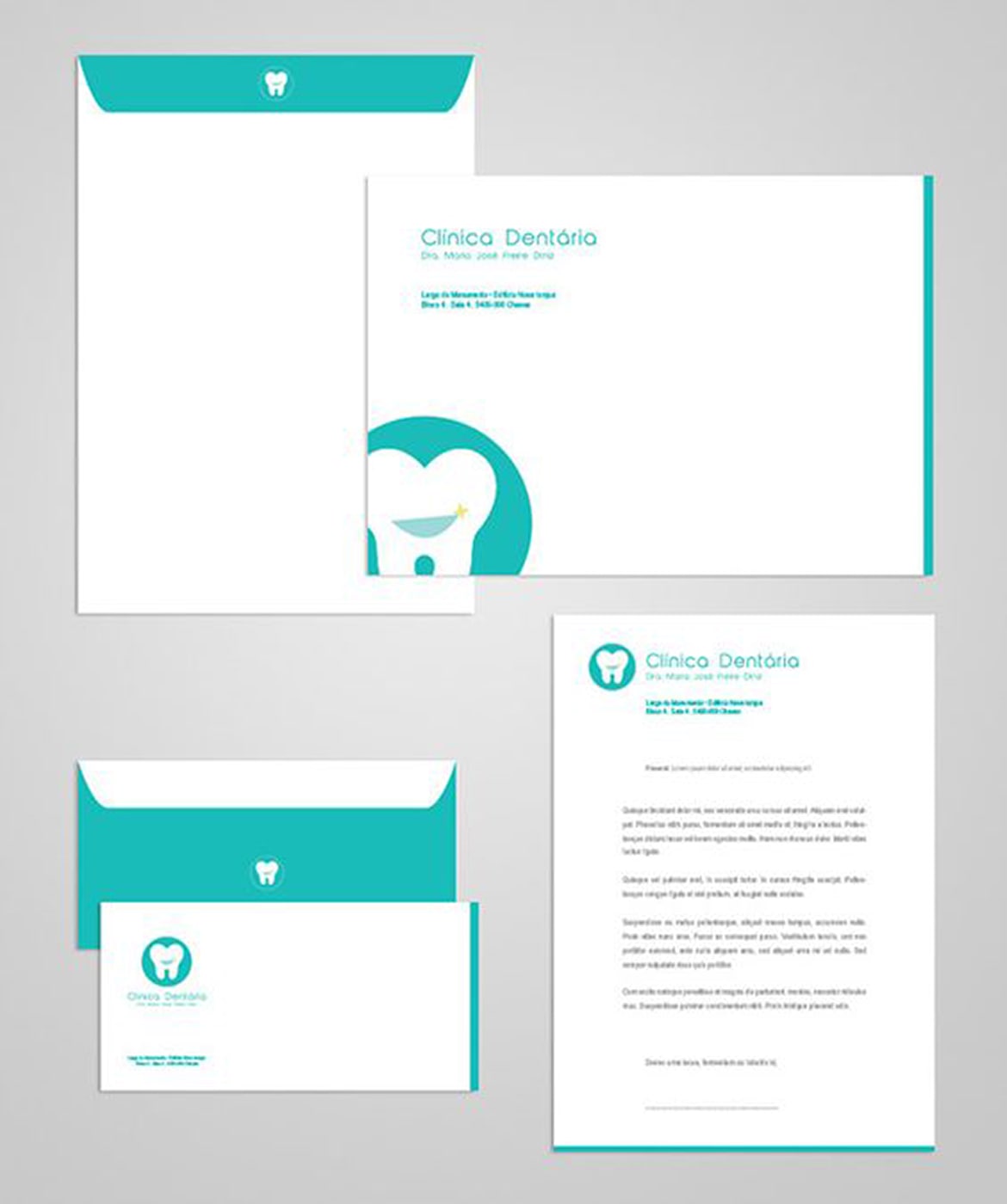
Here’s a more fun version (well, as fun as going to the dentist gets): a letterhead that conveys closeness and warmth, that reassures.
Headed paper: lawyers and law firms
In addition to the standard information, headed paper for law firms should also state opening hours, a lawyer’s specialisation and details of their professional qualifications. When it comes to design, opt for understated elegance. Here are two examples that we think would work well for a law firm.
This headed paper is simple and elegant, without being too pompous.
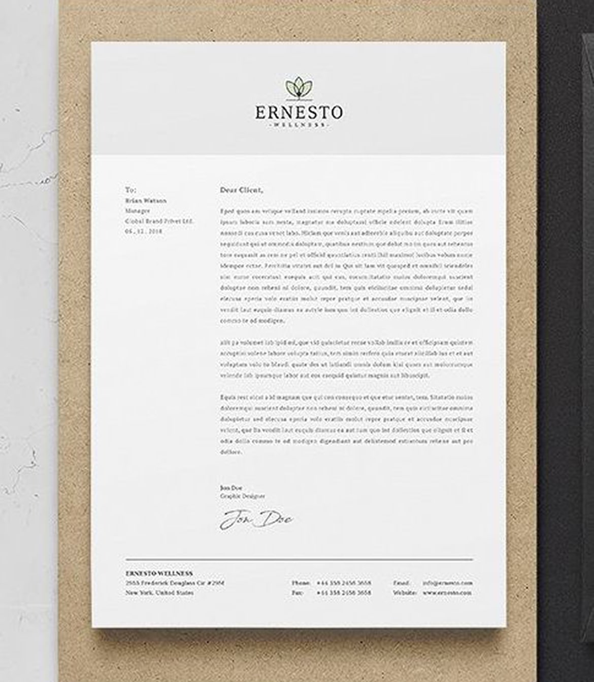
Here’s another classic legal letterhead that’s elegant and prestigious.
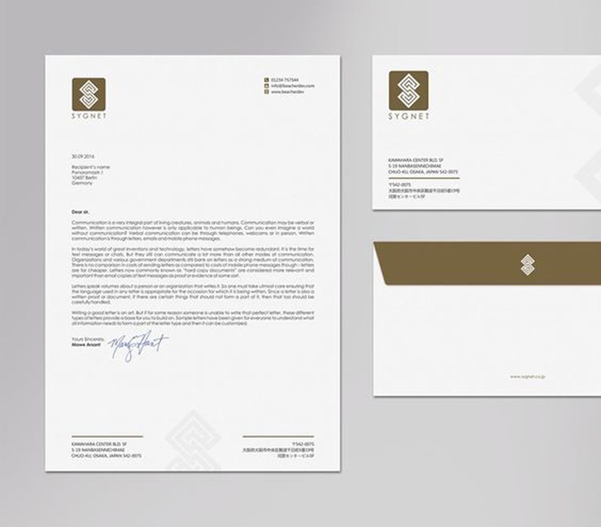
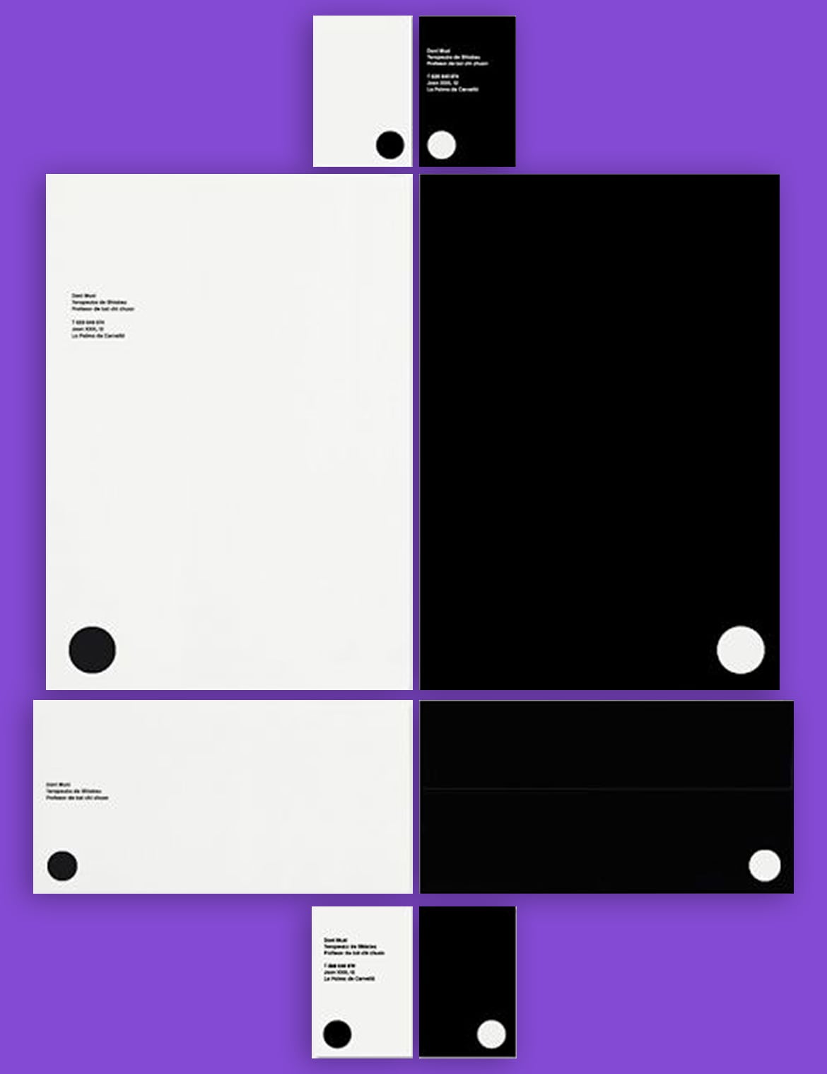
Headed paper: designers and architects
It goes without saying that, in this case, aesthetic choices are even more important, as they say much about the taste and skill of the firm or professional. We’ve picked out a selection of excellent designs that we hope you’ll find inspiring.
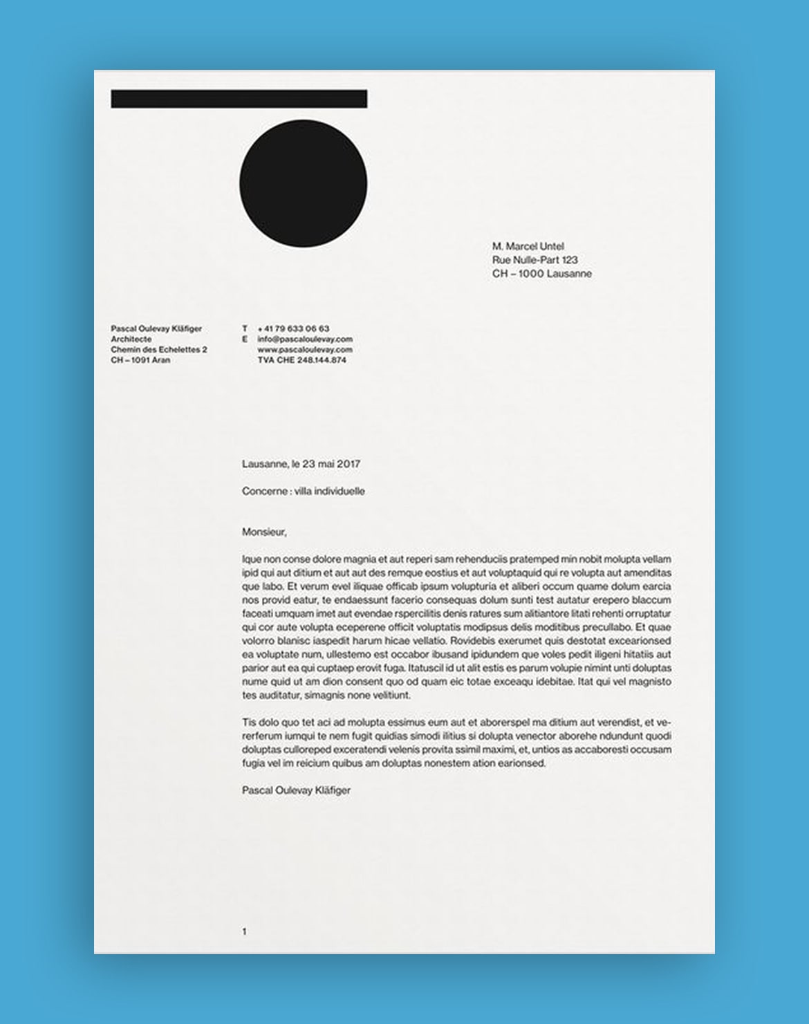
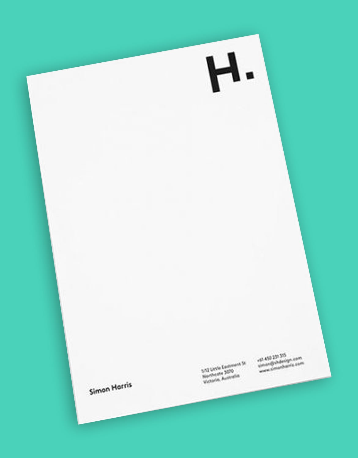
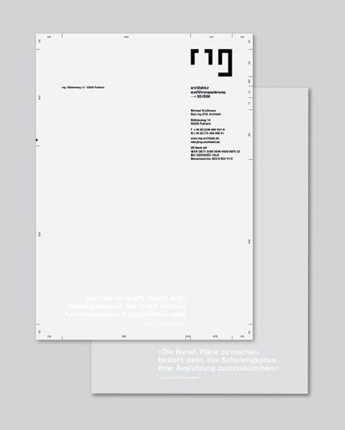
Headed paper for food industry professionals
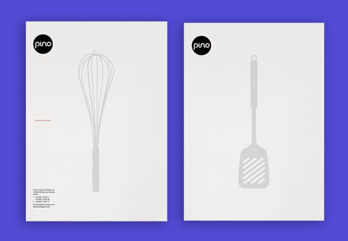
Creativity is also a key ingredient in cooking. That’s why, for those working in the food industry, we recommend avoiding overly traditional letterheads and experimenting, just as you would in the kitchen. Here’s an example whose elegance and originality caught our eye.
Headed paper for invoices
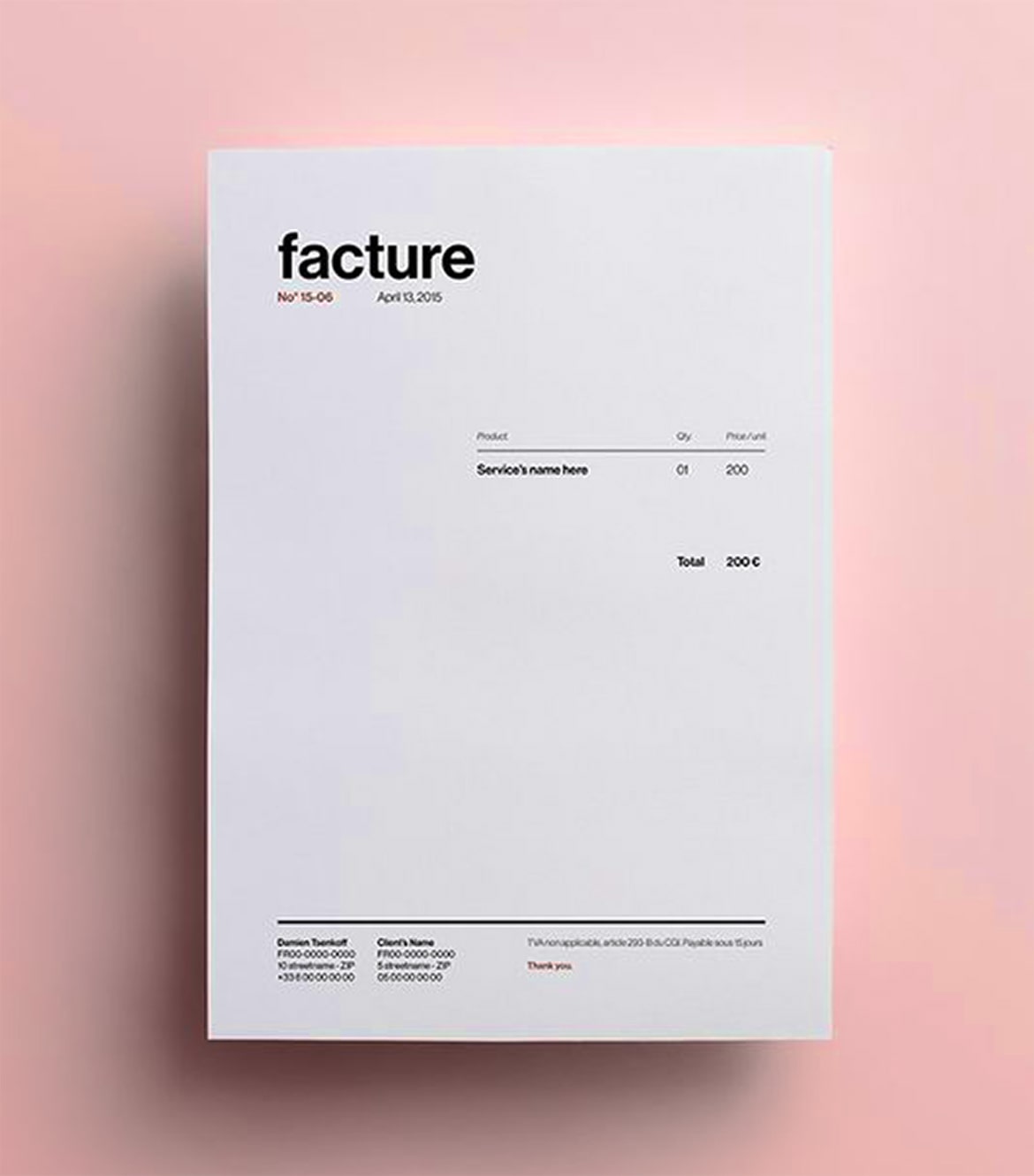
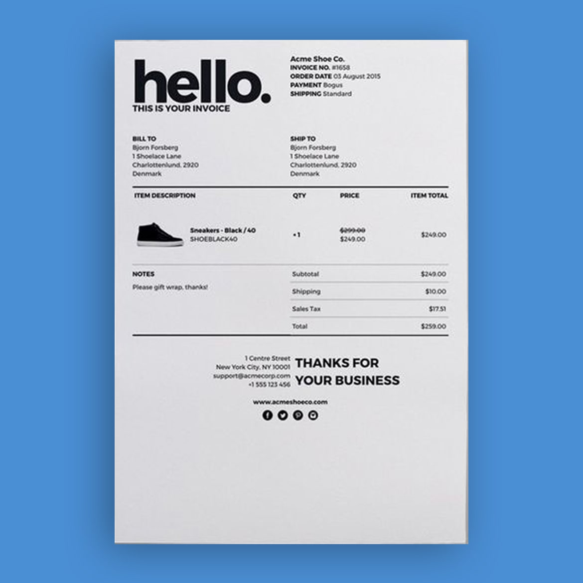
Lastly, we want to devote a short paragraph to headed paper for invoices, because they often use a different template. It’s important to pay particular attention to this document because it usually serves as a “goodbye” to a client. As such, it’s the last memory they’ll have of us. We’ve got two examples of sleek design for you.
Tools for creating headed paper
This part of the article is aimed at those who have no graphic design experience. In it, we show you the tools you can use to create your headed paper without having to muck about with super complicated software.
The Word headed paper template
If you don’t have lofty aesthetic ambitions and want to opt for a very simple letterhead, then all you need is Word. Through the “Header” and “Footer” functions, you can create a letterhead template with a logo and other information. We’re using the word “template” because the sheet can be saved and used to create different documents all with the same letterhead.
The really simple steps for creating headed paper in Word are as follows:
- Open a new document.
- Under Layout > Margins: set the margin sizes for the page (we recommend keeping them fairly wide).
- Under Insert > Header: choose the layout that you prefer and then insert your logo and text.
- Under Insert > Footer: choose a layout and then insert your text.
- Save the document as a template.
Tools for designing headed paper
Canva
Alternatively, you can opt for a graphic design tool that gives you greater scope for customisation. Many of you will be familiar with Canva: we’ve recommended it in the past for creating graphic designs. So, you’ll be glad to know that Canva has a section for creating headed paper. Once you’ve signed in, a work page like this will open where you can start creating your design.
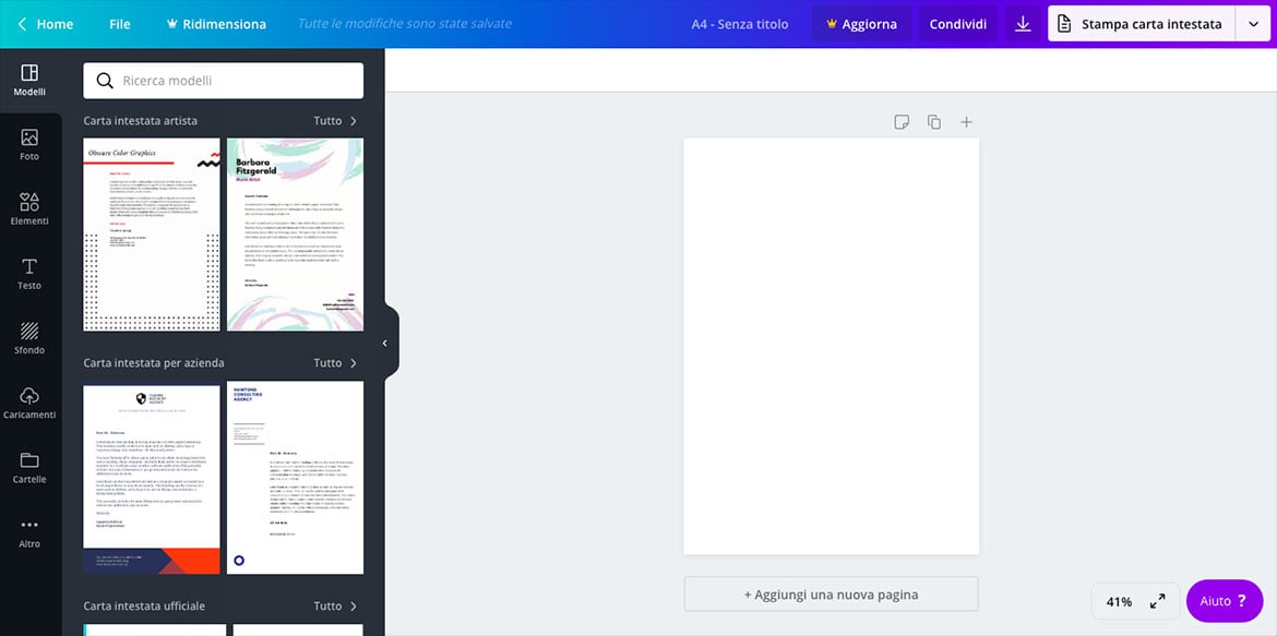
You can choose from various headed paper templates and then customise them as you see fit by changing the background, adding a logo or image, altering the size, position and font, changing the text colour and text boxes or adding graphic elements. Basically, every detail in the template can be customised. Then all you have to do is print it.
Flipsnack
Flipsnack is another excellent option to use for headed paper designs. Whether you need branded stationery for your business or want to make a strong impression with your personal documents, Flipsnack’s user-friendly interface and diverse design options make crafting eye-catching headed paper easy.

With various customizable templates, you can effortlessly arrange text, logos, images, and other elements to prepare a headed paper design that aligns perfectly with your vision. Documents made with Flipsnack are easy to share and track, and whether you require physical prints or digital documents, Flipsnack has you covered. You can easily transition from online viewing to high-quality printing, ensuring your brand image remains consistent across all mediums.
Adobe Express
Another very simple graphic design tool you can use online is Adobe Express, which can be considered the famous Adobe’s response to Canva.
Adobe Express also has a huge number of professional letterhead templates: you can either use the templates as a source of inspiration, or as a starting point for your graphic design, modifying them using a simple drag&drop interface. Adobe’s extensive archives allow you to add royalty-free images or graphics to your headed paper, and you can also create or upload a logo, to use in this or other projects.
Adobe Express has a powerful free version that will be sufficient for creating your own headed paper. The Premium package, however, offers a few extra handy tools, and, most importantly, full access to the archives.
Remember that headed paper is, in its own way, very much like a business card: the care taken in its design says a great deal about the care with which you work. So, never leave anything to chance.

