Table of Contents
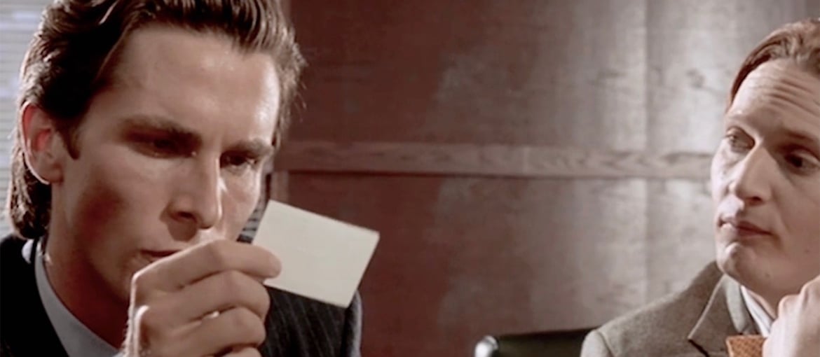
Look at that subtle off-white coloring. The tasteful thickness of it. Oh my God, it even has a watermark...
These are the envy-filled words Patrick Bateman utters in a famous scene from American Psycho, as he admires his colleague’s business card before letting it fall from his hands. In the sequence the protagonist – an ultra-competitive and materialistic investment banker – proudly presents a hot-off-the-press business card to his colleagues, providing details on the typography and paper. When his colleagues do the same, Patrick Bateman is overcome with anguish as he notices how much more sophisticated theirs are than his own.

In reality, the four business cards are very similar, practically indistinguishable to the untrained eye, but it is precisely these insignificant material details that provide the basis for the development of the character’s obsessive personality.
The choices of font and printing technique are at the centre of the discussion, and so the props – the business cards – were designed to match the script.
Think there are no graphic designers in cinema? Think again!
Graphic designers are not necessarily the first people you think of in relation to film production, but many of the props that appear in films, such as newspapers, shop signs, logos and packaging, require the skills of a designer to ensure they appear credible and realistic. This role is particularly important when the film is set in the past and needs to reproduce the style of the period, or for sci-fi movies or films set in an imaginary location that require an entire coherent world to be built from scratch.
A cinematic graphic design champion: Annie Atkins
Any discussion of graphic design in cinema must pay homage to Annie Atkins, an exceptional designer who for years has been working alongside leading directors including Steven Spielberg and Wes Anderson on the props for their films. Joker, Bridge of Spies, The Grand Budapest Hotel and Isle of Dogs are just some of the films she has worked on.
Annie Atkins is a pioneer who has shaped the profession; her props are not just a response to a particular request, they are true pieces of art.
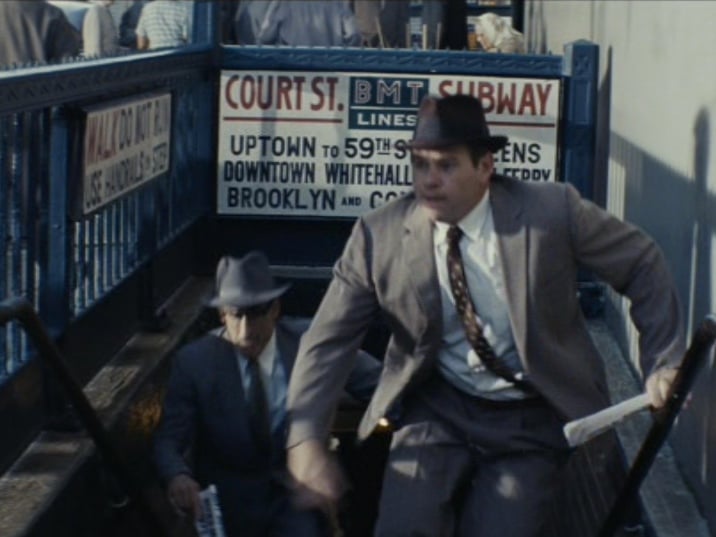
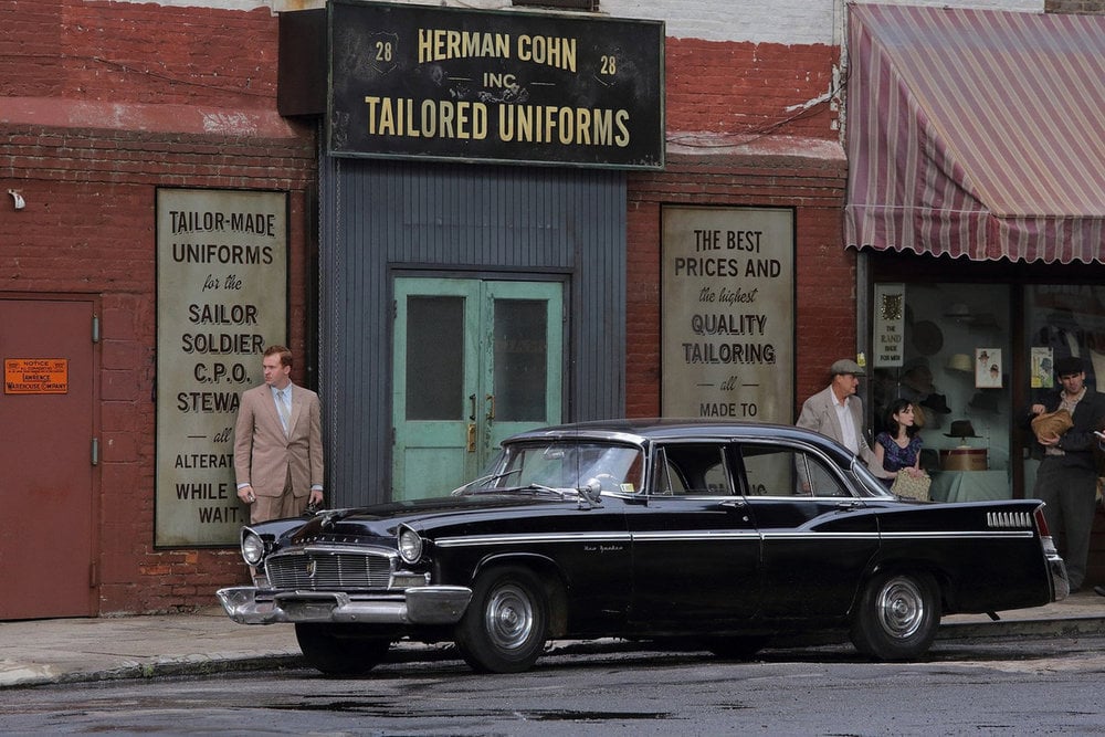
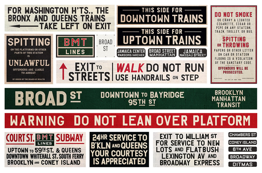
Atkins originally trained as a director, before discovering that her interest lay more in the details than the production as a whole. Her work involves painstaking research in archives and flea markets in search of inspiration to help her reproduce historically accurate graphical objects. Another of her key traits is a willingness to ‘get her hands dirty’ in her search for the most efficient way to produce the items, such as conducting a range of tests with teabags and instant coffee to find the one that gave the perfect ‘aged’ appearance to paper.
Most of the time the props she works on with such care and attention remain in the background rather than being the centre of attention, but that does not mean her work is unnecessary; quite the opposite, in fact. One of the purposes of props is to create a coherent world for actors and directors to immerse themselves in and so better identify with their character.
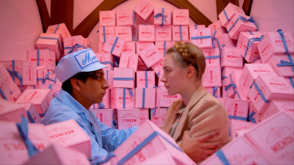
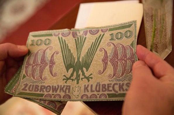
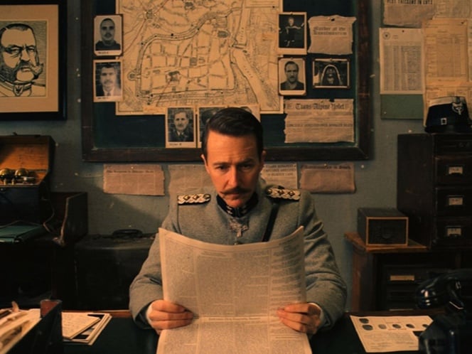
This was particularly true in The Grand Budapest Hotel, where graphic design plays a prominent role and where the designs created by Atkins, who worked closely with Wes Anderson and the production designer Adam Stockhausen, are often in the limelight. The film is set in a fantasy hotel in the imaginary empire of Zubrowka, and the director sought to recreate this world in great detail. Looking meticulously at early twentieth-century graphic design, Atkins created an endless number of props, including banknotes, newspapers, passports, receipts, emblems, signs and letters for the film. The beautiful boxes for Mendl’s patisserie that appear in several sequences made a particularly strong impression on viewers. This packaging also has a funny story to tell: after the 3,000 boxes had been produced, Atkins noticed an obvious spelling mistake: ‘patisserie’ was spelled with a double T. No harm done: the error was corrected in post-production, and when the boxes started to sell for a small fortune on eBay, even the most diligently altered copies were immediately uncovered by those in the know.
Fantastic graphics… and where to find them! Miraphora Mina and Eduardo Lima
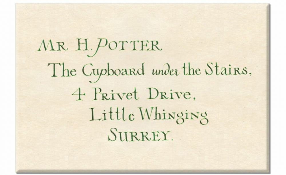
Atkins is not the only film set graphic designer to produce props that are highly coveted by collectors. Miraphora Mina and Eduardo Lima, the designers behind the graphic world of the Harry Potter saga and the Fanastic Beasts films, are also pioneers in this field of graphic design. Mina and Lima first met on the set of Harry Potter, and since then they have continued to work together, launching a studio, MinaLima, that creates designs and illustrations for the entertainment and publishing world. And they are still involved in Harry Potter too.


Their contract for the first film only lasted a few months, but they were asked back for all eight films in the series over the course of more than ten years. Like Annie Atkins’s work, their designs are rooted in a vast amount of historical and materials-based research. Although the story is set in the present day, the duo chose a historic approach with a fantasy flavour rather than trying to invent a new style from scratch. The style they came up with, which is credible, unique and dreamlike at the same time, perfectly captures the magical atmosphere of the books.
Although it’s a very small niche, graphic designers who work in the world of cinema and television are increasingly in demand. If you are a graphic designer and you love research, storytelling and experimenting with materials, it could be your ideal job!

