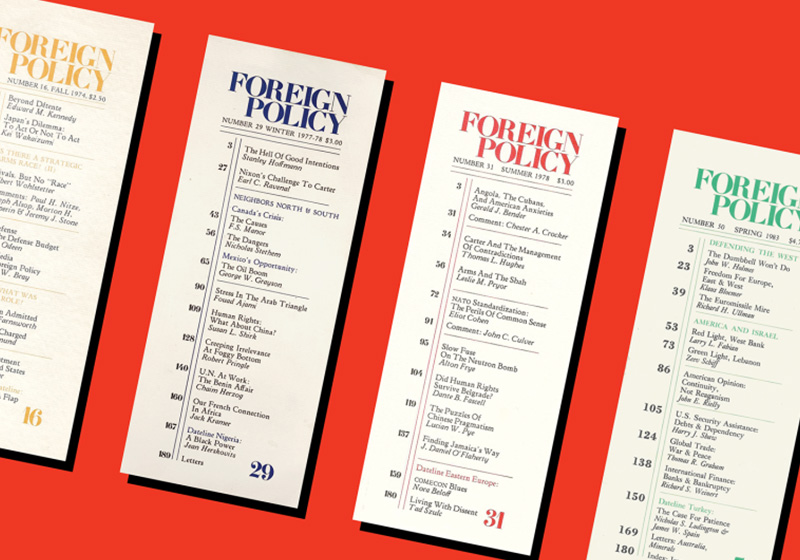
Table of Contents
In 1970, at the height of the international crisis sparked by the Vietnam War, revered American political scientist Samuel Phillips Huntington and influential investment banker and publisher Warren Demian Manshel founded what would become the pre-eminent international relations magazine in the Western world: Foreign Policy.
Originally published by the Carnegie Endowment for International Peace, one of many philanthropic initiatives launched by industrialist Andrew Carnegie, it soon became one of the leading publications on international affairs, frequently setting the foreign policy agenda at home and abroad.

With online content published daily and a quarterly print edition, Foreign Policy is an American magazine with a global readership.
The publication is sent directly to subscribers and has never appeared in news agents. Its annual special edition dedicated to the 100 top global thinkers is eagerly anticipated each year.
Although Foreign Policy’s circulation is around 35,000, relatively small compared to other well-known publications, it boasts a powerful and influential readership.


Effective content
Current affairs magazines aren’t generally renowned for innovative graphic design, and Foreign Policy was no exception in its first four decades: it adopted a simple, conventional layout with two or three columns of text, a photo at the beginning of the article, and headlines, running heads and subheads to provide order and structure.
The fonts used are classic serifs, such as Caslon and Big Caslon, which marry excellent legibility with design elegance.
A unique feature of early editions was a long and narrow format with the contents printed on the front cover. Over the years, however, this morphed into something more conventional, with a cover photo framed by a white background.

Impactful and intelligent covers
In keeping with many other international magazines on politics and economics, the cover carries a logo/header in the top left, a full-page image and cover lines for the main features inside.
In 2001, Foreign Policy’s masthead was shortened to FP and placed in a claret box, which was then changed in the 2014 redesign to a more recognisable bright red that is sometimes jettisoned to leave just two letters in black or white, depending on the image below.

The cover almost always featured photographs until the turn of the millennium, when illustrations began to be used, too. In 2014, cover composition became more sophisticated, with illustrations placing greater emphasis on opinions and concepts in a way that photographs, with their focus on reporting and documenting reality, could not.


Politics needs creativity too
After the makeover, design choices were bolder, and the serifed font used for text was accompanied by a modern sans serif typeface for headlines, which now slotted in above columns to create more dynamism on the page.
The creative team made increasing use of illustrators with unconventional styles as well as full-page infographics.
Foreign Policy continues to offer authoritative content and graphic design that is up there with the best in world publishing.


The most respected magazines on international relations and economics are holding their own in the digital age. Titles like Foreign Policy and the Economist are excellent examples: their print editions have survived and thrived, aided by the skilful use of infographics, conceptual illustrations, photo journalism and dynamic graphic design.


Foreign Policy continues to publish authoritative and exclusive content accompanied by graphic design that is up there with the best in world publishing.
Image sources:
https://foreignpolicy.com/the-magazine/
https://edxjohnson.com/Foreign-Policy-features
https://www.behance.net/valeriopellegrini
https://www.racheljoyprice.com/foreign-policy-mag
https://www.theispot.com/whatsnew/2021/6/dan-bejar-for-foreign-affairs-magazine.htm
http://stuffonpaper.net/tag/foreign-policy/
The images in the article belong to their rightful owners and are used for informational purposes only. All rights reserved.

