‘Keeping it in the family’.
This common phrase reflects the natural human tendency to handle all the challenges, big and small, that life throws up by drawing on the various skills of members of one’s family.
Family is one of the main cornerstones of our lives.
It represents our origins, our history, our experiences, our joys and our sacrifices.
A product created by a family business combines all this with the passion and dedication of people related by blood and working in pursuit of a common goal.
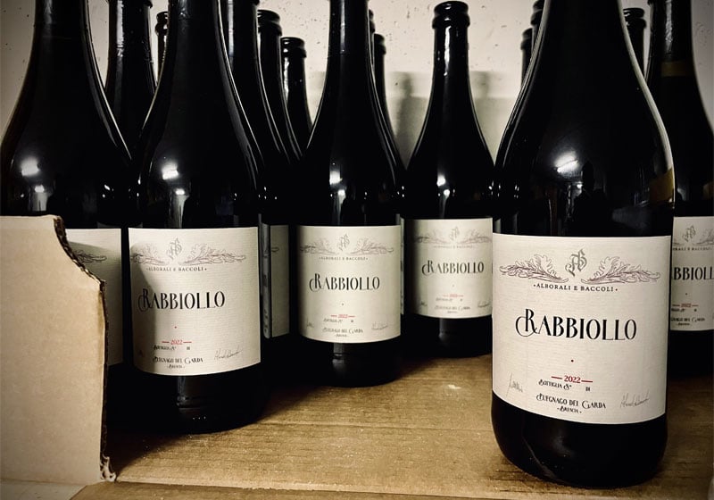
When the perfect opportunity presented itself, multitalented Alessandro wasted no time and decided to harvest and process the produce that grows in the beautiful area near Lake Garda, where his family lives.
The next step was to come up with the perfect branding to give the wine the best possible appearance, which he did, evoking his ancient family coat of arms.
Pixartprinting helped by turning Alessandro’s idea into something tangible: it printed the special finish labels that now adorn the bottles of fine wine every time they make an appearance on the dinner table.
But let’s find out more about Alessandro and how he came up with this small yet extremely satisfying undertaking.
His story begins with the radio, moves on to graphic design and ends… with a full glass!
Happy reading!

Who is Alessandro? Tell us about yourself and what you do: your dreams, aspirations and talents. A short but faithful portrait!
I’m a radio producer, DJ, graphic designer and video maker.
I initially trained as a food services technician, but a passion for music made me change my career path. I studied sound engineering and sound design at NAM in Milan and eventually achieved one of my dreams: I joined the RTL 102.5 family, where I am responsible for all the graphics and video productions for the webcam stream, concerts and events.
As well as everything audio-related, I am mad about video and cinema, as seen from behind the screen – I love getting my hands dirty and creating things myself!
When I’m out with my camera, meanwhile, I love capturing everything that is difficult to see with your bare eyes; my preference is for macro photography, really, really close up – I love details and natural subjects.
My passion always keeps me going!

Before telling us about your idea, can you explain to our readers what you produced using our printing technology?
Our family – originally from Salò, Lake Garda – together with the Alborali family, decided to give a name, and therefore a label, to the family wine. Given my profession, I designed the graphics myself, and the Rabbiollo and the Lugana Alborali e Baccoli were born. Our next goal is to create the label for what we call ‘Oro del Garda’ (Garda Gold) – our extra-virgin olive oil.
Let’s rewind to the very beginning. Where did the idea for this project come from? Is there a particular story behind it?
There is no back story: the idea came to me one day, I talked to my uncle, and two weeks later we had the bottles ready to label! That’s how all the best ideas come about 🙂

Once you had found the right idea, you had to set a goal. What did you want to achieve with your idea? What was your objective?
Our aim is to give prestige to a genuinely high-quality and non-commercial product, which you won’t find on the shelf of your local shop: a family exclusive that will be given as a token of gratitude, and hopefully always appreciated.

How did you turn your project into reality? What were the design phases and how many were there? Tell us about the process that brought your idea to life and made it ready for printing.
There were few stages involved: I followed your guidelines to set up the design in Illustrator, I created the vector graphics for the family coat of arms, and the rest basically did itself. The only thing I’d say is that adding the special finish to the text requires a bit more attention to ensure the parameters are set correctly! But I got the result I wanted.
How did you use print on demand to produce your work? Which materials did you choose and why?
I wanted a label that enhanced the end product, so I chose one of the best papers for this project, with a special texture that offers a pleasant tactile sensation as well as a stylish appearance. Then to give it even more prominence I decided to add a clear finish to the text, giving it that essential touch of sophistication and refinement.

The time has come to use the printed products! In your case, some stylish labels for an upmarket wine. How did it feel to see them ready for the table?
It was very exciting to finally see our name on the bottle on the table. Naturally, that same evening, after applying the labels, we organised a dinner and toasted our success with our bottle number one of Rabbiollo. Cheers!
This is only the start! What other projects do you have planned for the future? Can you share them with us?
As I mentioned before, the next project could be to restyle the brand identity of our extra-virgin olive oil… Or perhaps something else. Watch this space!
Full speed ahead!

