Table of Contents
We’re bombarded by images every day. But can we decipher them?
In today’s world, we’re surrounded by images. We live in a visual societyin which we ourselves are images (every time we take a selfie, for example).
We live in a world full of images, yet we lack imagination, or the ability to create images in our head.
We rely on everything we see on the web, in the cinema, in magazines, on posters or in adverts. We’re bombarded by images without understanding them.
But we don’t know how to make them; we don’t know how to construct images.
When we try to take a nice photo, we usually fail: “I don’t have the technical skills” we think, in other words, the technical ability to get the most out of a camera.
Yet
this isn’t the only reason: it’s also the case that we don’t know how to construct an image.
Every time a graphic designer finishes a job, they have created at least one image. Let’s take the example of a poster: the end result of the designer’s work will be an image that will probably contain a picture (photographed, drawn or illustrated) and text that has been put together in a particular way, with a particular style and particular colours, dimensions and placements.
How many of the characteristics above can we include when we describe a poster?
How much of the creative process and design choices are we able to understand from that poster?
We generally perceive it as a whole, without properly understanding how it was constructed.
In short, we constantly create images without understanding them.
Most of us are visually illiterate. We don’t know how to read images, but by learning to construct them, we can understand how to understand them better.
Learning how to read and understand images
How?
It’s not enough to simply read books on how to do graphic design.
We need to experiment, to learn by doing.
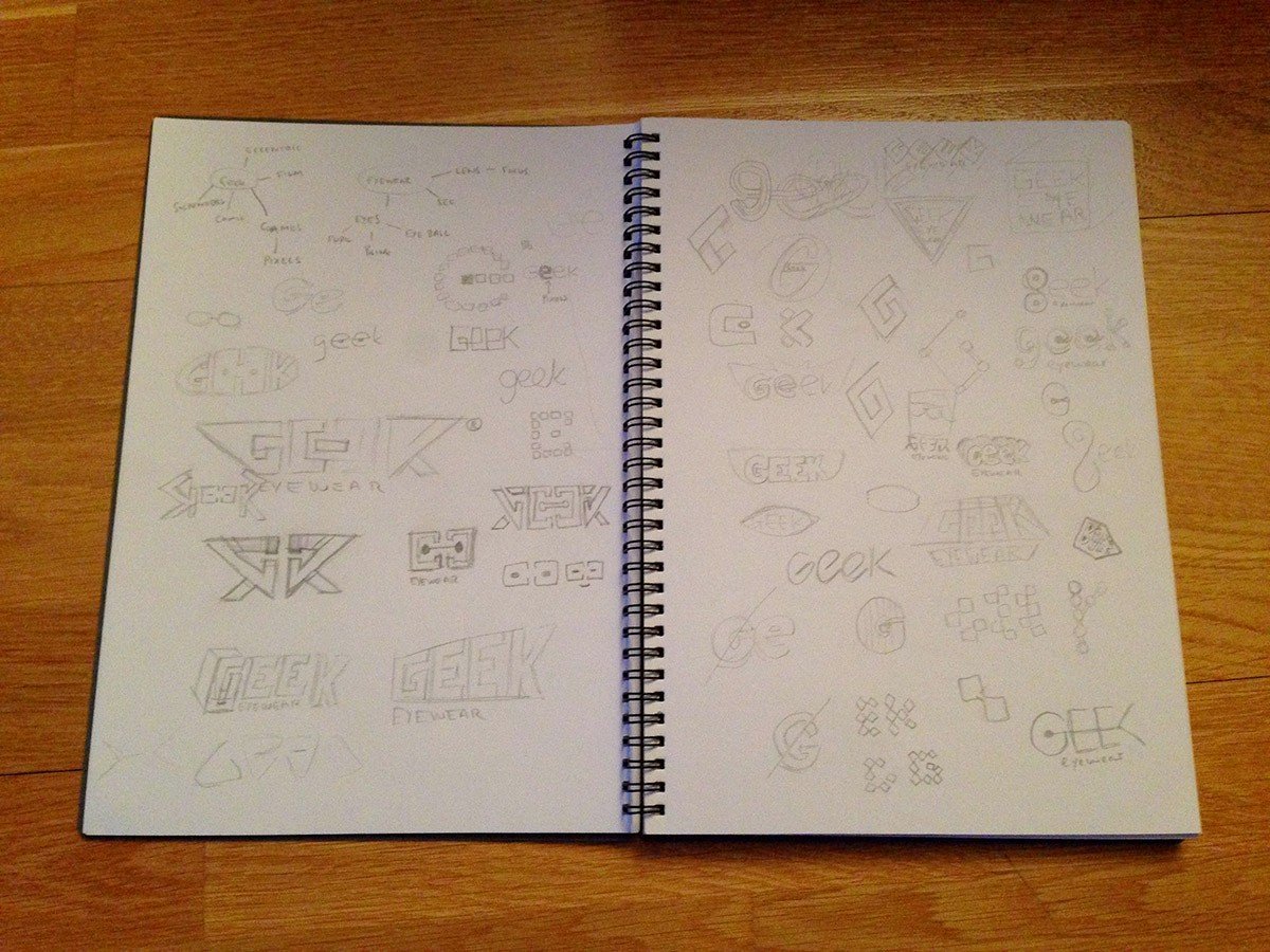
Take a pencil and paper and try to recreate that poster and make it our own.
We need to learn how to think about the poster, to design it, to break it down and understand its structure.
We have to draw back the curtain and try to understand what’s happening behind the scenes, to work out how everything works and fits together.
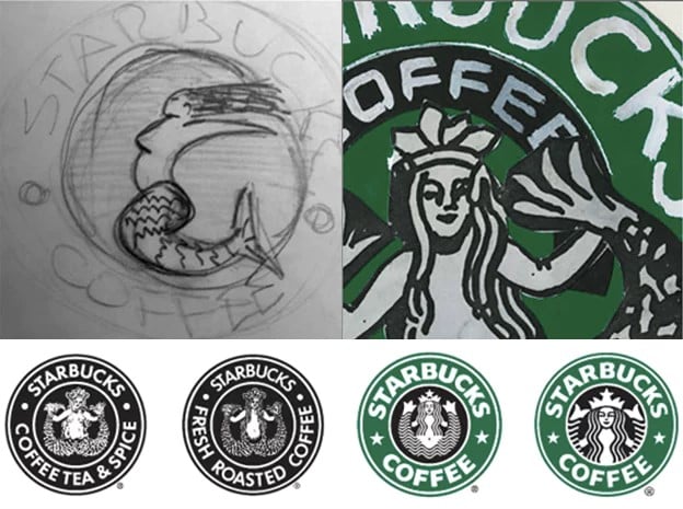
Drawing is the cleverest and simplest way to understand how an image is constructed.
Every designer draws after thinking. Sometimes they draw while thinking, or better still, think while drawing.
In design phase, we’re not interested in the end result, but the design process itself. It’s about presenting or building or superimposing or composing the elements you have at your disposal: the verb changes depending on the way you think about things.
To add colour, you just need some felt tips.
It’s important to look at the design from afar, really far, which means drawing small: the larger you go, the more detail you’re forced to add, losing the structure of the image. Once the structure has been established, you can insert other elements.
Constructing and deconstructing an image, using trial and error to find the best combination is one of the many ways of stimulating our visual thinking and improving our design skills.
So, what’s the secret? Draw, break down, imagine
Anyone who’s ever studied design will remember the many sketches they drew for their course work.
But how many do we draw when we’re working for our clients?
How much do we rely on easy structures and images that we remember, without experimenting and exploring other avenues?
Drawing (whether with a pencil and paper or an iPad) continues to be the designer’s best friend, because it’s the most effective way of visualising thoughts: it’s quick, cheap, accessible to all and doesn’t require artistic skills: you just need to know how to draw lines, squares, circles and the letters of the alphabet.
A tip for starting to think about design through drawing:
re-draw layouts for graphics by great designers and try to understand their secrets: just do a Google search, look at any book on design or our free e-book “Graphic Design Trends” to find examples of good design that you can redraw, reversing the process to arrive at what might have been the original idea.
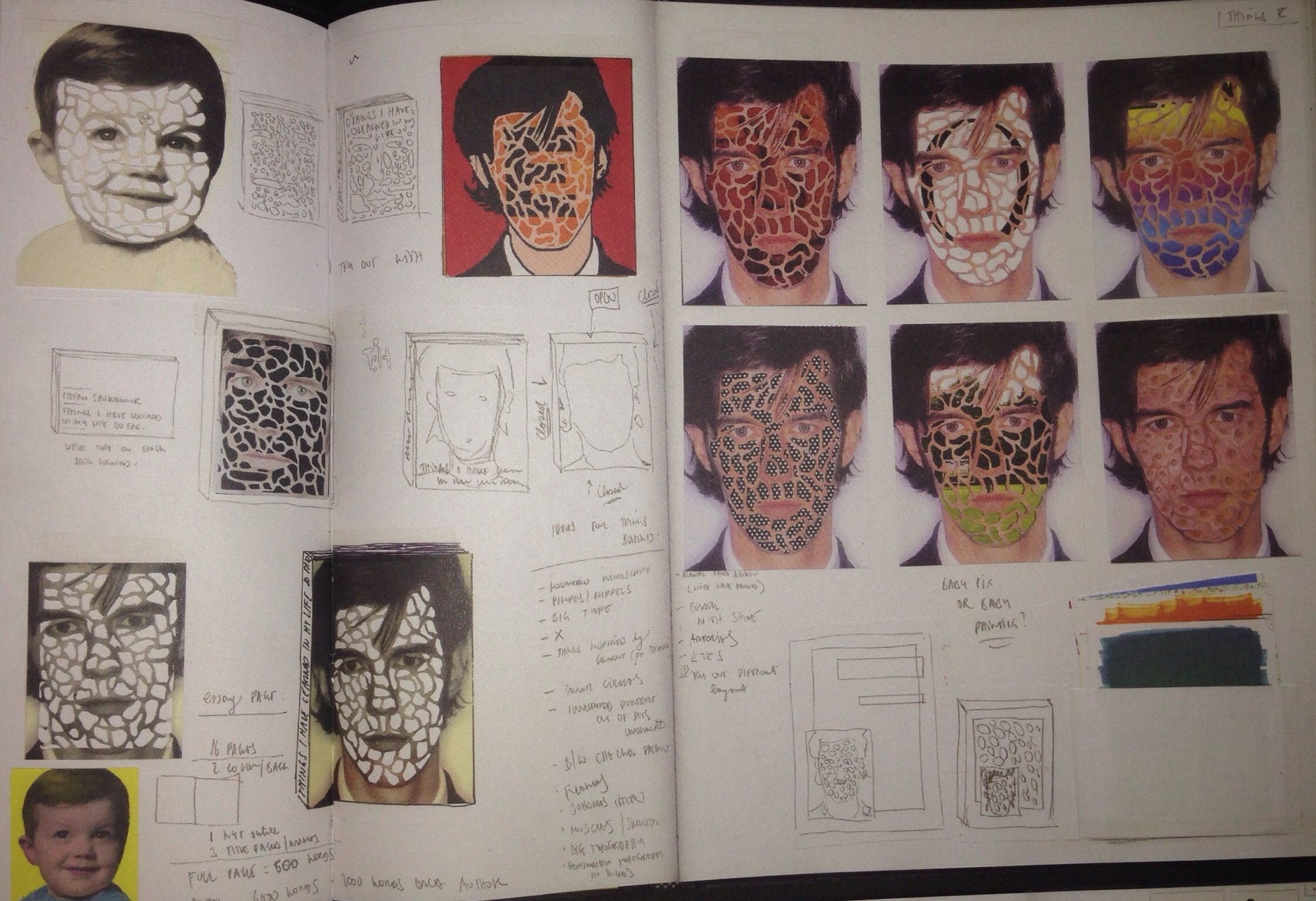
So, for the next layout, poster, cover or flyer that you develop, first try thinking about the design on paper by drawing it with felt-tip pens and pencils. Next, try to find every possible solution and only then sit down in front of your computer.
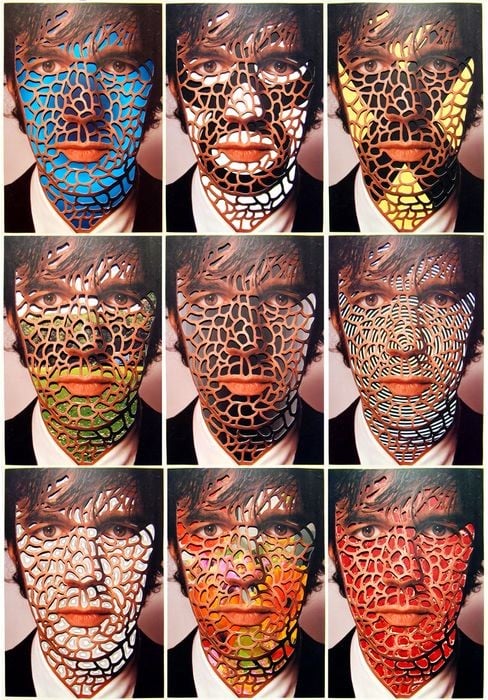
You’ll slowly see your imagination re-awaken, your fingers stained with ink and your designs become ever more creative.

