
Table of Contents
Very few European periodicals truly embody the concept of investigative journalism: fearlessly taking uncomfortable positions, risking everything and not bowing to market forces, while at the same time selling thousands of copies.
One publication that does, however, is the German magazine Der Spiegel, which is renowned in Germany for its leading role in numerous scoops, and across Europe for being one of the independent titles that opened the Wikileaks Pandora’s box. The repercussions of that event are still very much being felt across the world, both politically and socially: while people are generally quick to forget, certain investigations capture the imagination and strong-arm their way into our everyday lives.

Der Spiegel (which translates as ‘The Mirror’) was founded in Hamburg in 1947, in a war-ravaged and divided Germany. Its importance grew steadily over the years, and it reached an initial peak of popularity and authoritativeness in 1962, when the ‘Spiegel affair’ cemented the magazine’s reputation as a defender of press freedom (we will leave it to readers to do their own online research on this topic if they so wish!).
With an average circulation of 700,000 copies in 2023, it is also one of Europe’s leading publications in sales terms, bolstered by a website that receives close to a million daily visitors. Der Spiegel‘s readership is highly educated and politically active, with an average age of between 35 and 55, and this target audience has a direct effect on the choices made regarding the magazine’s content and graphic design.

At least 500 journalists work at Der Spiegel, one of the most detailed and reliable sources of investigative journalism in the western world, based both at its newsrooms in Germany and in over 20 global offices. Its media archives are some of the world’s most extensive, and the majority of its new images from the last 20 years have been put into a digital archive, so photo editors can easily access them and add them to the layouts.

Modernity and tradition
Der Spiegel is certainly not one of the most innovative publications in terms of its graphics and typography, but, as we will see, it has succeeded in staying up to date, with an effective and tasteful design.
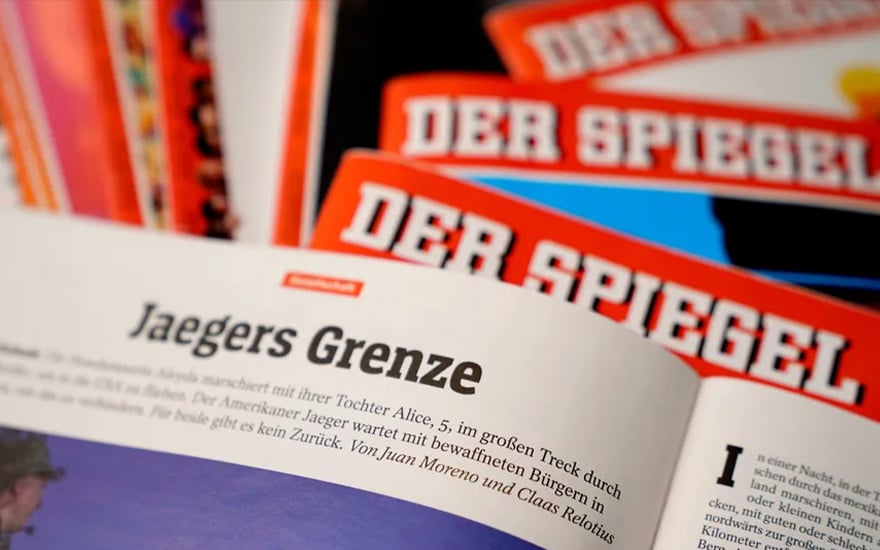
The magazine has a classic stapled A4 format, which is not typically associated with in-depth publications; it was chosen predominantly for ease of reading and to create a bridge between the world of investigative journalism and that of highbrow magazines. A4 is in some ways not the most practical size, as it tends to end up bending, but it provides ample room for laying out the contents, and keeps up the appearance of a traditional magazine; in general, specialist political or economic magazines tend to be closer to the size of a book (like the Italian publication Limes, for example).

The inside sections are clearly separated and recognisable, with bold titles, distinctive colours and introductory pages acting as gateways to the content. In other magazines, even attentive readers struggle to make out where one section ends and the next begins.
Der Spiegel was redesigned in 2021, in a process that improved the magazine’s graphics without doing anything too revolutionary, focusing on readability, impact and simplicity.
As creative director Judith Mohr explained: ‘We were guided by two questions: how much design can a magazine that is defined by its content take? And what does a print magazine have to do in an era when many people get their news in a digital format? Instead of making everything new, we opted for a modernisation process that made lots of things better“.


Strong and provocative covers
One of the magazine’s strengths, and a feature that ensures a high level of public recognisability, are its provocative, satirical and bold covers, which are often not very politically correct.Large images are framed by a thick, red background, in some ways recalling the colour and layout of Time magazine, but stronger, displaying a sort of decisive muscularity that symbolises the publication’s bravery and resolve. These two features are at the heart of Der Spiegel’s journalism, which is rooted in courage, determination, research, documentation and independence.
As you can see from the image below, the publication’s logo has been redesigned several times, although the trademark white, bold font that stands out effectively against a red background has remained largely unchanged for a long time.
Simple and well-organised graphics
The inside pages have a simple and systematic design. They are laid out in three columns (or four when notes are used), with images that take up a lot of space on the page. The magazine has used Linotype Rotation, a bold Egyptian serif font, for its headlines since 1997, recalling the font used in the logo and replacing the Franklin Gothic used previously. For the texts, meanwhile, the magazine decided to use a classic font, Times New Roman, designed specifically for use in daily newspapers. By the 2000s no magazines were using it any more, and it seemed a perfect way for Der Spiegel to highlight the importance it placed in the content.
The new design sought to make the magazine easier to use in digital format, and to offer a similar reading environment on the website and on paper.

The magazine’s graphic layout was then redesigned again in 2021. This makeover improved the reading experience, but left the colours, fonts and general appearance untouched. The graphics had previously been updated in the mid-1990s, when the website was built, while the font system was developed over time, through ongoing dialogue with type designers, who created various versions for the publication.

As for the layout, the widespread use of lines to separate and underline the text epitomises the magazine’s simple, no-frills approach, which dives straight into the news without getting lost in decoration or embellishment.This streamlined graphic design is also reflected in the infographics, which always serve the content, and are never added just for the sake of it. Similarly, the photographs always have to help readers understand and deepen their knowledge of the subjects covered. Geopolitical maps, economic charts and historical timelines are used to back up the articles with data, ensuring they are accessible even to less-informed readers.
Diseño simple y bien organizado
Las páginas interiores tienen un diseño sencillo y sistemático. Están dispuestas en tres columnas (o cuatro cuando se utilizan notas) con imágenes que ocupan mucho espacio en la página. La revista ha utilizado Linotype Rotation —una fuente serif egipcia en negrita— para sus titulares desde 1997, recordando la fuente utilizada en el logotipo y reemplazando la Franklin Gothic utilizada anteriormente. Para los textos, por su parte, la revista decidió utilizar una fuente clásica, Times New Roman, diseñada específicamente para su uso en periódicos. En la década de 2000 ya ninguna revista la utilizaba y a Der Spiegel le pareció una manera perfecta de resaltar la importancia que le daba al contenido.
El nuevo diseño buscaba facilitar el uso de la revista en formato digital y ofrecer un entorno de lectura similar en la web y en papel.
El diseño gráfico de la revista se rediseñó nuevamente en 2021. Este cambio de imagen mejoró la experiencia de lectura, pero dejó intactos los colores, las fuentes y la apariencia general. El diseño ya se había actualizado a mediados de los años noventa, cuando se construyó el sitio web, mientras que el sistema tipográfico se fue desarrollando con el tiempo a través del diálogo continuo con los diseñadores tipográficos, quienes crearon varias versiones para la revista.
En cuanto a la maquetación, el uso generalizado de líneas para separar y subrayar el texto personifica el enfoque sencillo y sin florituras de la revista, que se sumerge directamente en la actualidad sin perderse en decoraciones o adornos.
Este diseño gráfico optimizado también se refleja en las infografías, que siempre sirven al contenido y nunca se añaden porque sí. Del mismo modo, las fotografías siempre tienen que ayudar a los lectores a comprender y profundizar su conocimiento de los temas tratados. Se utilizan mapas geopolíticos, gráficos económicos y cronologías históricas para respaldar los artículos con datos, garantizando que sean accesibles incluso para lectores menos informados.


Provocative illustrations
The illustrations, however, play a different role; both on the cover, as we have already mentioned, and inside the magazine. They are often provocative and sarcastic; sometimes playful and sometimes fierce. They are always very colourful, and sometimes even opt for a caricature style, which is increasingly rare across Europe.


In 2005, MOK, the Museum of Applied Arts in Vienna, dedicated an entire exhibition to Der Spiegel’s illustrations. This event captured the spirit of the magazine, and showcased all the great illustrators that had been asked to produce powerful and provocative images over the years.


Takeaways
Der Spiegel is a rigorous and substantial magazine, renowned for its brave investigative journalism. Its graphic design matches its mission: it is austere, simple and leaves little space for decoration or innovation. The illustrations, however, have a more creative role, and reflect a more fun and rebellious spirit.
The publication continues to fearlessly expose scandals and irregularities with far-reaching consequences in the worlds of politics and business, and is one of the few big names in investigative journalism still in circulation.
Data and specific information source: