
Table of Contents
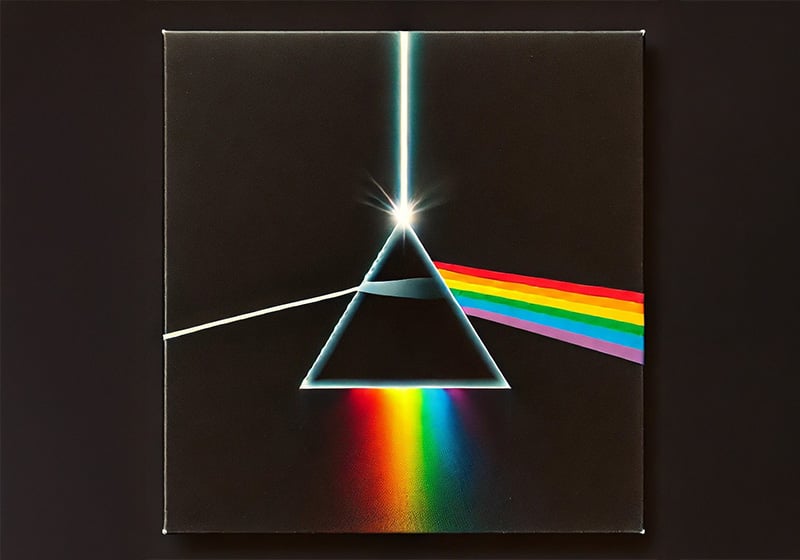
A mysterious prism seems to float deep in space. A beam of white light of unknown origin strikes it, generating a colour spectrum that disappears into the darkness. And that’s it. Nothing else: not even a title, or indeed any words at all. A simple, powerful and legendary cover. We are, of course, talking about the album art of one of the best-known records in history: The Dark Side of the Moon by Pink Floyd.
The Dark Side of the Moon, the British band’s eighth album, was released on 1 March 1973 by Harvest Records, eight years after the band had formed in 1965. When it came out, the band consisted of Nick Mason on drums, Roger Waters on bass and vocals, Richard Wright on keys and vocals, and David Gilmour on guitar and vocals; they had already lost their genius founder member, Syd Barrett, who had left the band after the release of their debut album, partly due to his deteriorating mental health.

But over the years, something else had changed in the band too. Their sound – once purely psychedelic – was now becoming more experimental, complex and mature, ultimately giving rise to one of the biggest-selling records of all time. A unique concept album that included classic tracks that are still played on the radio and streamed repeatedly today, like Time, Money and the incredible vocal ride that is The Great Gig in the Sky.
In total, The Dark Side of the Moon is estimated to have sold 45 million copies. And it holds another impressive record too: on its release it went straight to number one in the American charts, and, incredibly, did not drop out of the top 200 until 15 years later: a record that no other album in the history of music has managed to beat.
But there’s another thing about this historic album that still remains peerless: its iconic cover. And today we’d like to tell you its story.
A very different cover: the story behind The Dark Side of the Moon‘s prism
Pink Floyd hired the historic design studio Hipgnosis to create the cover for The Dark Side of the Moon. Founded in 1968 in London by Storm Thorgerson and Aubrey Powell, better known as Po, Hipgnosis created covers for Led Zeppelin, Genesis and AC/DC in the 1970s, but it was The Dark Side of the Moon that confirmed its legendary status.
This was not the first time Thorgenson and Powell has encountered Pink Floyd; they had created other album art for them, always in their favoured abstract photographic style. For example, for Atom Heart Mother – Pink Floyd’s fifth record, released in 1970 – they chose a photo of a cow. That cover has since become iconic too, but at the time the record label EMI turned its nose up at the suggestion of using this bizarre image with no title or even the band’s name.

However, when it came to The Dark Side of the Moon, the band – and Richard Wright in particular – fancied something different. Something very simple, and a graphic design rather than a photograph. Here accounts vary somewhat: the inspiration may have come from flicking through an American magazine describing the refraction of light, or a physics textbook. Other sources describe a brainstorming session held at the dead of night. But whatever the precise origin of the idea, we know for certain that when it was suggested to the band they were all immediately enthusiastic: it was definitely a Pink Floyd-worthy image.

Either way, the prism and the beam of light stemmed from some brilliant sources of inspiration. One of these was one of the first record covers ever made, produced in 1942 by Alex Steinweiss. Widely considered the inventor of the illustrated record sleeve, Steinweiss created a powerful image for the New York Philharmonic’s recording of Beethoven’s fifth piano concerto, depicting a beam of white light that hits a piano and is split into the colours of the rainbow.
In addition, light shows were one of the trademark features of Pink Floyd’s psychedelic live shows – indeed, they were popular among many avant-garde bands at the time. They were produced using either coloured lasers or by shaking liquid solutions in a range of hues in front of a projector to create shifting patterns of light and colours.

Having received the band’s approval, Hipgnosis hired a long-time external partner of theirs – George Hardie – to create the final image. Hardie tweaked the initial idea slightly, and provided the exact colour percentages to use for printing each of the coloured rays. The prism was then airbrushed black on white and then inverted on a black background to create the final effect.
The rest, as they say, is history.
If you’d like to know more about this iconic cover, we recommend you watch a recent documentary – Squaring the Circle by Anton Corbijn – which describes the creative story behind this and the other album art the legendary design studio Hipgnosis created in the 1960s and 1970s.
What does the cover of The Dark Side of the Moon represent?

Between them, Thorgerson, Powell and Hardie created a striking image. Commercially speaking it hit the jackpot: it was vibrant, simple and unforgettable. ‘It’ll look great in shop windows’, David Gilmour commented, although he couldn’t quite put his finger on why it worked so well.
There is no text of any kind on the cover: neither the band’s name nor the album title is included. This helps make it even more mysterious and evocative. The refracted light is an excellent symbol of the British band’s sonic universe, which combines science, psychedelia and existentialism. The background is black and ‘spacey’, in stark contrast with the six-colour rainbow that is often interpreted as symbolising the complexity of the human experience.
The concept album describes human beings’ fragility – mental health is evoked in tracks like Brain Damage and Eclipse – the feeling of being lost in space, and the enigma of the forces governing human beings, such as Time and Money.
The rest of the The Dark Side of The Moon sleeve
Initially, Pink Floyd’s record was meant to be contained within a classic square cover. But the record label changed its mind and decided to invest in a more complex format. It chose a gatefold cover, which opens like a book and was very fashionable from the mid-1970s onwards. As well as being used for double albums, this format was also popular because it provided a larger surface for printing additional materials, such as additional images, lyrics and sleeve notes.
This offered an enticing opportunity for a concept album like The Dark Side of the Moon, which Pink Floyd and the cover’s designers grasped with both hands. Roger Waters came up with the idea of extending the cover image, so that the strip of rainbow light continued its journey inside the record sleeve, eventually turning into the heartbeat that crops up multiple times during the course of the record. Roger Waters’ song lyrics were also included, the first time the words had been published in a Pink Floyd album. The cover ended with another prism that reunited the rainbow colours in a strip of white light.

There was also a surprise for fans inside the cover: two posters and two stickers. One of the two posters was a very artistic print: an infrared photograph of the pyramids of Giza, taken by moonlight, and therefore continuing the theme of the prism on the cover and the record’s lunar atmosphere. The other, more traditional poster contained a montage of photographs from one of the band’s gigs.

Alternative covers for The Dark Side of the Moon
The Dark Side of the Moon‘s cover works so well, none of the subsequent versions – special editions released to celebrate major anniversaries – have ever strayed from the original concept. Instead, they have played with subtle or not-so-subtle variations on the theme of the prism.
Talking about variations, we should mention that back in 1973, when the record was newly released, different editions of the cover were produced, which have now become collector’s items. Here, for instance, is the Japanese version of the original record, which didn’t stick to the concept of not including any text.

The ultra-rare Italian version of the record, released in 1973 by Harvest Records, is a very special case. Curiously, the cover features a slightly different version of the iconic prism: the rainbow stripe has brighter colours and the design of the triangle is slightly different.

In 2004, to mark the thirtieth anniversary of the album’s release, the band decided to refresh the iconic original cover. This work was so complex it could only be entrusted to the person who had helped create the 1973 cover: Storm Thorgerson.

Thorgerson himself has described how this new version of the famous prism came into existence. It is a photograph of a real stained-glass window, tailor-made from old French glass with the exact proportions of the original cover.
The iconic pyramid also provided the starting point for the packaging that celebrated the 50th anniversary in 2023.

Hipgnosis entrusted the production of this special box to the Pentagram studio, which created a series of nesting boxes, just like a mysterious, ancient tomb. The result is an excellent example of paper engineering!
The cover of The Dark Side of the Moon, all over the world
The cover of The Dark Side of the Moon is now a universal cultural icon. As well as being one of the covers other musicians love to quote and parody, Hipgnosis’ graphic design is still recognised and celebrated all over the world.
In 2016, Royal Mail decided to commemorate this and other Pink Floyd records with stamps depicting their covers. The Dark Side of the Moon was undoubtedly one of the best in the series.

To celebrate the record’s 50th anniversary, the cover image was projected, reworked and celebrated in complex light shows in squares, planetariums, space centres, theatres and cities across the globe. The famous prism also features in numerous pieces of street art, from Bogotà to the USA.

And there are even artistic tributes to the design in people’s private gardens.

One person – presumably with no wall available – decided to use their van to immortalise the album cover instead – celebrating the 50th anniversary of its release.

And someone else built a turntable in the shape of the artwork.

But Hipgnosis and George Hardie’s image is probably most popular today in the ultra-creative world of merchandise.

You can buy the famous prism printed onto objects of all kinds: t-shirts, caps, rugs, mugs, lighters, puzzles, skateboards, magnets, guitars and myriad other objects – you name it, they (probably) sell it! I wonder what the creators of this little masterpiece of graphic design make of it all!

Parodies: https://blog.travelmarx.com/2021/11/album-cover-parodies-and-tributes-to-Dark-Side-of-the-Moon.html
How about you? Have you ever paid tribute to the cover of The Dark Side of the Moon in any of your projects?