
Table of Contents
The latest stop on our tour of the greatest newspapers in Asia takes us to India, where we explore Dainik Bhaskar, the Hindi-language daily that is the country’s bestselling newspaper.
Founded in 1958, Dainik Bhaskar was the world’s fourth-biggest selling daily newspaper in 2016, with a circulation of three million, according to the World Association of Newspapers.
Starting life as a regional paper in Bhopal, in the state of Madhya Pradesh, Dainik Bhaskar began expanding its readership beyond the city in the mid-nineties: first to the neighbouring state of Rajasthan, then to the rest of the country, eventually becoming a leading national news source.
The paper’s innovative growth strategy serves as a case study for Indian publishing because it was built on in-depth market research to understand local needs and preferences.
To reflect India’s multi-ethnic make-up, the paper is published in languages other than Hindi, including Gujarati, Marathi and English, and also boasts many local editions.

A sun in the logo
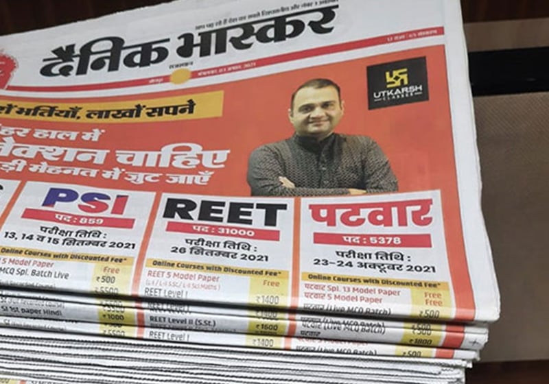
The logo is written in Devanagari script and consists of the newspaper’s name with an orange sun above it. “Bhaskar” means “rising sun”, and is meant to symbolise a bright future for India.
In the masthead, the sun now sits below the title, at the centre of a coloured band, which is usually red.

The graphic design is familiar to British newspaper readers, with large and clear headlines in bold. The page is divided into eight columns, with articles separated by white space rather than rules.
The design must appeal to an audience that is vast and diverse, both in age range and geography, hence its instantly recognisable visual identity built on clarity and simplicity. There is a clear distinction between news and analysis thanks to different colour choice, fonts and layouts.

Colourful Indian graphics
A distinctive feature of Dainik Bhaskar’s design – especially given its positioning as an authoritative news source – is bold use of colour. It’s important to remember that India’s visual environment is full of vibrant images and decorations, which often use strong colour contrasts.
Unlike authoritative newspapers in Europe and the Far East, which tend to user more sober tones (black, white and pastel colours), Dainik Bhaskar employs a bright and contrasting palette that includes red, blue and yellow. These colours do not just catch the reader’s eye, but also differentiate different sections of the paper.

Red is the dominant colour in headlines, its visual impact highlighting the biggest stories.
Blue is used for general news sections and in-depth articles, lending a sense of reliability and trustworthiness.
And yellow, with its levity and vibrancy, signposts entertainment news, cultural events and lifestyle articles.
This colourway creates contrast that helps readers navigate different sections and enhances readability.
Organised information and clear layout
At first glance, the general appearance of Dainik Bhaskar seems unremarkable to Western newspaper readers. In India, printed newspapers are still widely read, despite the steady advance of digital news sites. The newspaper market is crowded, and many titles have cluttered layouts jam-packed with news, something that Dainik Bhaskar consciously tries to avoid. Use of colour is also a feature Indian papers, many of which appear loud and busy, with shouty headlines and big photos. In a garish newspaper landscape, a liberal use of colour combined with a clear layout helps Dainik Bhaskar to stand out on the news-stand, and probably creates a more serious image.

India’s newspapers. Source: https://www.campaignindia.in/article/good-growth-for-newspapers-but-cost-remains-a-challenge/475861
Takeaways
Indian newspapers have some of the widest circulations in the world, not to mention a significant international readership. In this market, Dainik Bhaskar stands out with a style that is more sober and serious than its rivals. A balance between tradition and modernity, plus an effective digital presence, make Dainik Bhaskar a leader in the contemporary Asian media space. Read by millions of Indians, it’s a singular example of printed news well worth studying by anyone looking to broaden their horizons in newspaper graphic design.