Table of Contents
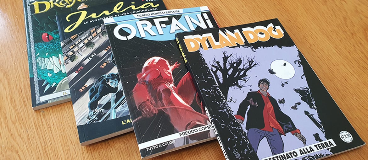
For years, newsstands in Italy have been packed full of home-grown comics produced in the classic “bonellide” format, an industry term used to indicate a specific album format with a page size and material that is the hallmark of mainstream Italian comics.
Comics like Tex, Dylan Dog, Nathan Never and Martin Mystère, published by Milanese publisher Sergio Bonelli Editore (hence the adjective “bonellide”), have won over legions of readers of all ages, drawn in by these tales that span genres including Western, horror and science fiction.
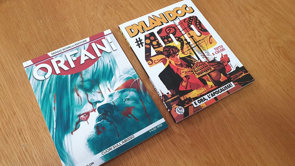
The term bonellide initially had a negative connotation, but over time this became neutral, simply indicating a publishing format. After 1986, which saw the huge success of Dylan Dog, many Italian publishers began using this format for their comics, like Editoriale Aurea and Bugs Comics. Some of the most famous comics to use the format are Dago, Lazarus Ledd, Orfani and, more recently, Samuel Stern.
Many aspiring comic artists and illustrators choose Pixartprinting to print their stories or create an attractive portfolio in the Italian style with bonellide format. To do this successfully, you need to know the specific conventions of this publishing format.
Luca Lamberti: our guide to the bonellide format
So, how do you create an Italian-style comic in bonellide format? What rules do you need to follow if you want to create a portfolio or self-produce a comic that follows these conventions?
To discover the secrets of this world, we spoke to Luca Lamberti, an author and illustrator who has worked in the Italian market on John Doe and is currently working on the weeklies Skorpio and Lanciostory for Editoriale Aurea. His is also part of the creative team behind the Samuel Stern series, for which he has illustrated several issues. Furthermore, alongside Leonardo Cantone, he is the editor and author of Fantasy, which will be released in 2022 by Bugs Comics. He has also worked in the American market, collaborating with IDW Publishing on the Star Trek comic.
With Luca’s help, we’ve put together this guide on how to create comics in bonellide format: it’s a huge subject area, one that can take years to master. So this guide is not meant to be exhaustive, but just an introduction for anyone thinking about turning their passion into a career, or who is simply interested in better understanding the conventions of this popular style of Italian comics.
The grammar of popular Italian comic art
As we already saw in our guide to creating Franco-Belgian comics, different regions have different ways of structuring the pages of a comic. However, there are some key elements that all comics have in common, regardless of where in the world they are created:
- Panels – the single drawn images.
- Grid – the collection of panels that together form a page or strip.
- Gutters – the white spaces that define the narrative time.
When it comes to Italian comic art, there are many authors who have influenced this style: reading and studying them is a first step in understanding how to create a piece of work in this genre (although it’s impossible to cite them all here).
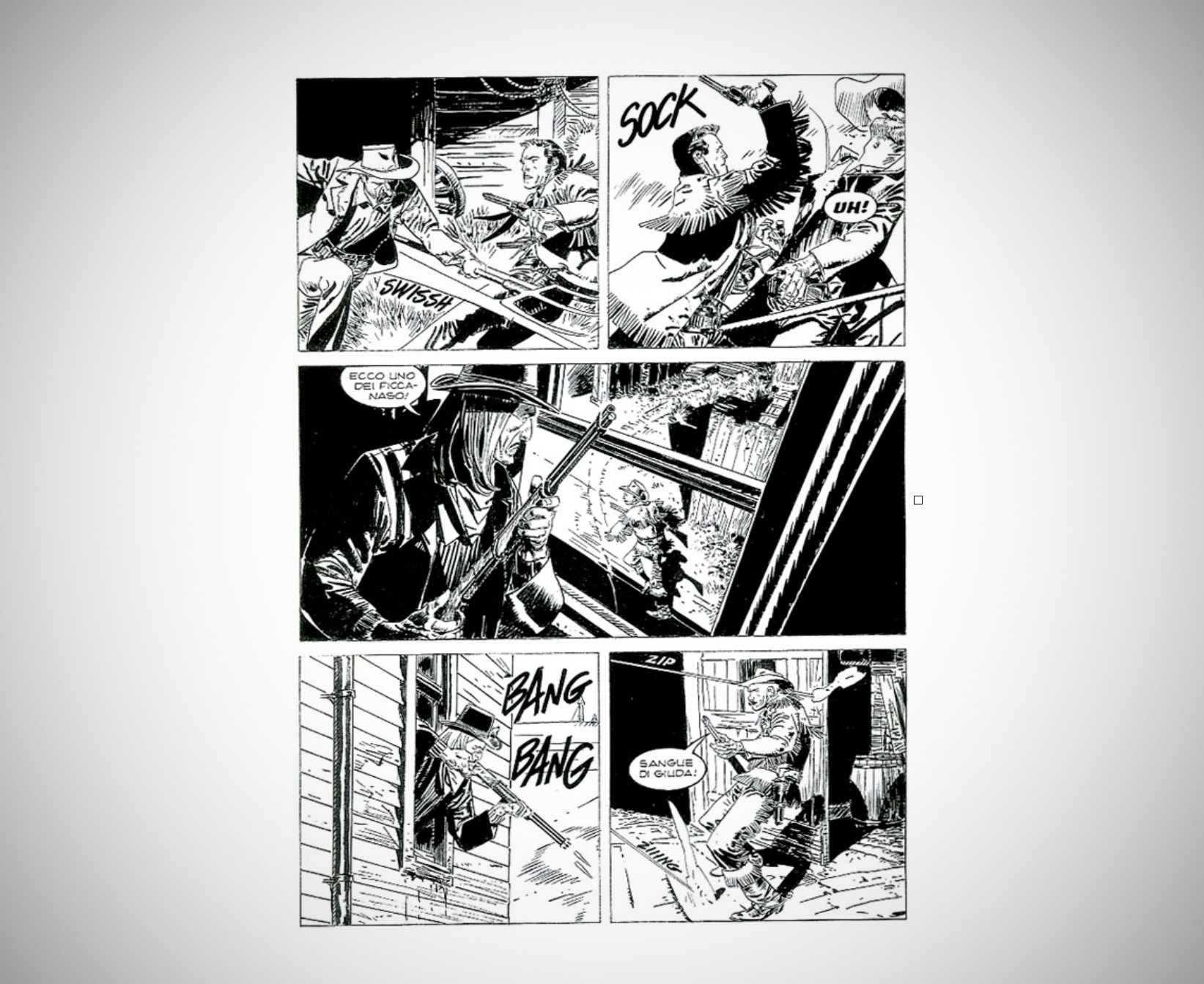
The blueprint is without doubt Gian Luigi Bonelli’s Tex, originally drawn by Aurelio Galleppini, and first published way back in 1948. Initially, Tex was published in strip format, containing a maximum of three panels per page. This continued until the end of 1953, after which time it was published (and continues to be published) in bonellide format.
When it comes to more recent authors, Luca Lamberti recommends three:
- Massimo Carnevale: for his caricatured, dirty but peerlessly elegant style.
- Stefano Andreucci: talking of elegance, for Lamberti, this is the defining feature of classic bonellide drawing: “I’m sure many would think of Claudio Villa as the finest, but although his technique is exemplary, I prefer the more distinctive and personal style of Andreucci.”
- Corrado Mastantuono: an eclectic illustrator, he can go from drawing a realistic Tex (but with a highly personal and recognisable style) to a Topolino, jumping from one style to another with incredible ease.
The key features of the bonellide format
Once you’ve read the seminal albums and studied their authors, you need to understand the “rules” used in this format.
Luca Lamberti explains them to us:
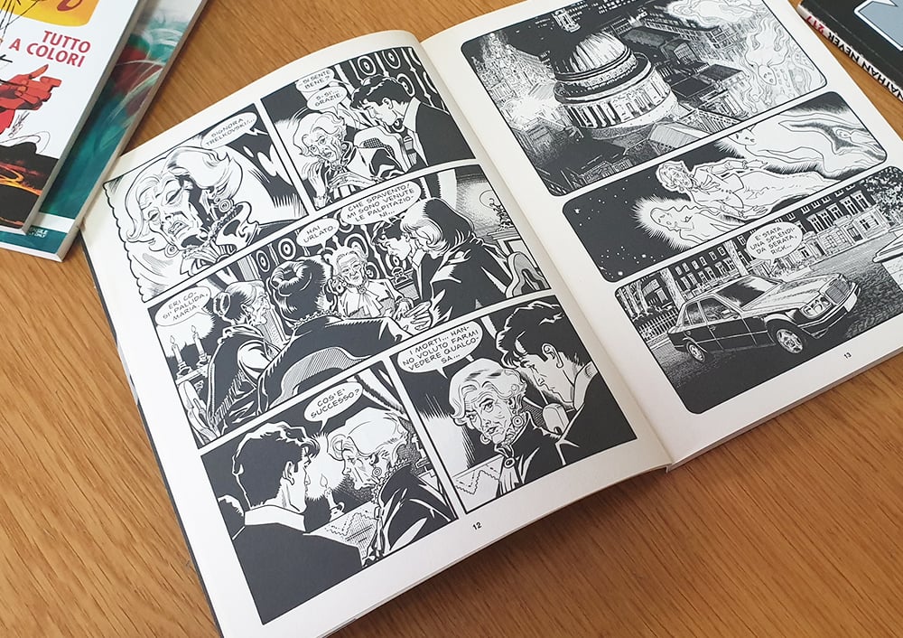
“What has always characterised the ‘bonellide’ format is undoubtedly its rigidity, which makes for easy narrative understanding and explains its popularity with the public. The classic Italian comic page has always been structured in a very square manner; indeed, it’s rare to see bleeds or splash pages (a page containing a single striking image) that aren’t contained within a frame and don’t reach the edges of the page, as is often the case in American comics. The reading direction is from left to right, like all the main markets, apart from Japan, where you read from right to left.”
As the audience has evolved, so has the bonellide page. As Lamberti explains:
“The bonellide page has become much freer and less ‘square’. It’s now not dissimilar from the American style that structures its page over four strips, with a much more vertical format, but without a structural limitation on the number of panels. For example, Bugs Comics has embraced this ‘revolution’: although it is published in a format that is recognisably Italian, illustrators are given total freedom over the structure of the page.”
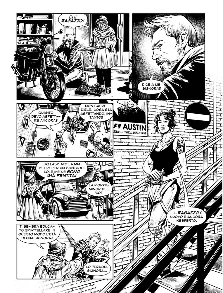
The bonellide page and the finished product
The bonellide page therefore has a very “rigid” base and is clearly structured. Here’s what you need to know:
- It has a 16 x 21 cm format and the page is divided into three horizontal strips, which can also be split in half vertically, thus creating a maximum of six panels.
- The space between one panel and another is usually around 5 mm.
- Albums comprise 96 pages, 94 of which carry the story. The other two are usually left for the frontispiece and the printer’s mark. Recently, there have been some experiments with colour, although normally albums are in black and white.
- The type of binding used is always perfect binding.
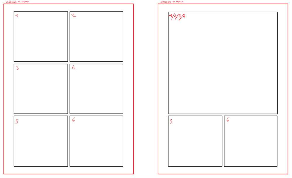
So, how is the page structured? Above and below are some examples of how the page is divided into panels. Here’s how you read those images:
- The black squares (or rectangles) form the edges of the panels, which together make up the grid.
- The white area between the black rectangles and the red border is the “bleed”. It’s rare to see bleeds in this format, although in more recent publications, more freedom is given to artists.
- The red line is the trim line, in other words, where the page will be cut after printing.

The finished product printed in bonellide format is a comic measuring 16 x 21 cm that is perfect bound and usually in black and white. With Pixartprinting, you can choose perfect binding.
That wraps up our exploration of Italian comics, a rich world of authors and stories to discover.

