Before reading a newspaper article, webpage, blog post, newsletter or infographic, we all do the same thing: we look at the graphics and decide whether the content is compelling or not. If it isn’t, we’re unlikely to linger, unless the subject is something we’re really interested in.
Here we look at the benefits of good content design and the key things to remember when planning to produce some content. Along the way, we’ll look at some illuminating examples of content design by true masters of the art.
What is content design and why is it important?
Every day we wade through a tide of useful and informative content. So how do we decide which deserve our precious time? Usually, we go for those which, at first glance, appear most pleasant and inviting, those that promise the most enjoyable experience.
Thoughtful content design helps the reader because:
- It makes content clearer and more accessible.
- It aids readability. Think about how hard it is to read text on a smartphone screen. In this case, it’s vital to make the text as easy to read as possible, so that people will want to carry on reading.
Creating well-crafted content – both in form and substance – helps to:
- Ensure that people read it from start to finish.
- Convey professionalism.
- Make you stand out.
- Hold the attention of your audience during, say, a presentation.
The ABC of content design
How do you design content that grabs the reader’s attention and doesn’t let go? A few suggestions:
- Use a font large enough to read easily.
- Watch out for line spacing: too little will suffocate the text and make reading difficult.
- Divide the text into paragraphs and bulleted lists, and use bold type. Don’t skimp on images and text boxes. Used judiciously, these elements will impart the right visual rhythm.
- Set the right contrast between font colour and background colour. Too little contrast and the text will disappear (for example, the yellow font on a white background); too much and reading becomes uncomfortable (for example, the red font on a black background).
- Balance the amount of filled and empty space on the page.
Content design: Textbook examples
Now we’re going to browse through some magazines, newspapers and infographics to see how we can and should design content.
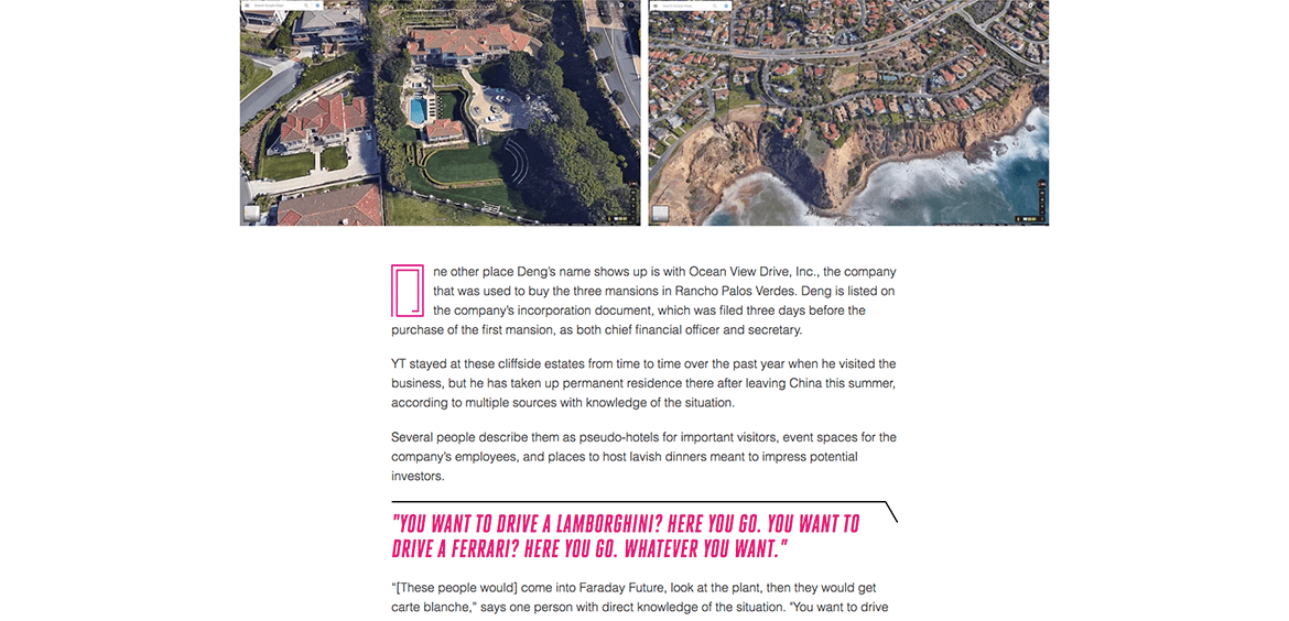
The Verge is an online magazine launched in 2011 in partnership with Vox Media. It features long-form writing at the intersection of technology, science, art and culture. We want to show you this example because, despite the long and challenging texts, The Verge manages to capture and hold the readers’ attention by using a design that’s fresh and light. See for yourself.
Let’s turn to Italy and look at IL – the lifestyle magazine from business newspaper Il Sole 24 ORE.
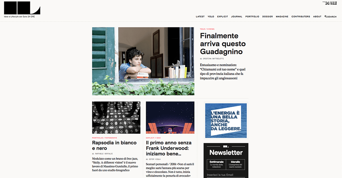
Order, lightness and elegance. That’s how the magazine presents its content. Margins are wide, as are the empty spaces that separate content. Line spacing lets the text breathe, while the balance between words and images is just right. Behind this design is Francesco Franchi, who, together with art director Angelo Rinaldi, also redesigned Italian national daily La Repubblica.
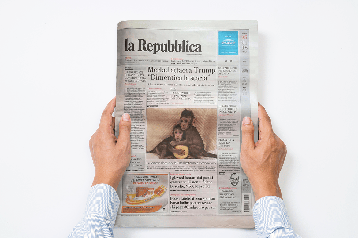
This is how La Repubblica explained its decision for the makeover:
In survey after survey, email after email, the main complaint from readers was not about content, but form: “The font is too small and hard to read”. That’s why we redesigned the font – called Eugenio, a tribute to founder Eugenio Scalfari – to be much bigger and easier to read. Some readers can now take off their glasses and feel like they’ve rolled back the years.
The page layout has changed too: margins are wider, while line spacing, captions, summaries and headlines have all been changed, as has the position of the sub-headlines (which are now ordered vertically). Small changes which make the paper easier to read and easier on the eye.
Our last example is the You Waste A Lot Of Time At Work infographic, which presents statistics on the amount of time people waste doing unproductive tasks at work. This beautiful and amusing infographic directs readers to the Atlassian website, which provides products and services to help you work more productively.
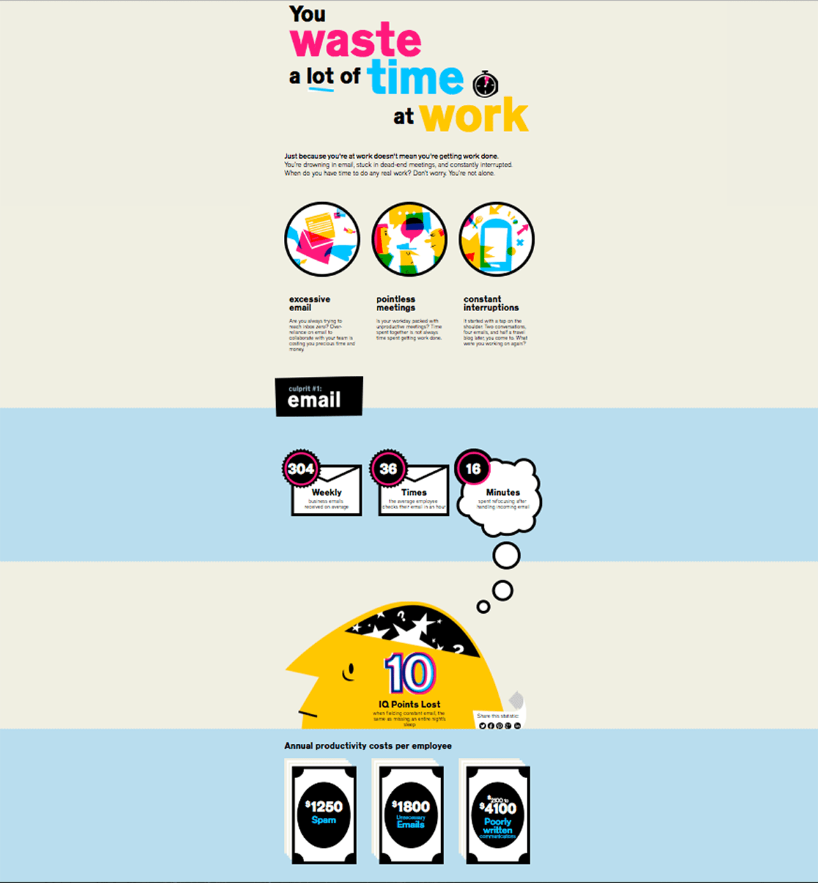
Atlassian has carefully designed the infographic to ensure readers scroll right to the end, where they’ll find a call to action. It’s done so well that scrolling to the end comes naturally.
That’s the goal of content design: to make the experience so enjoyable that readers almost forget they’re reading. No small feat!

