Table of Contents
Give this experiment a try: stare at a bright-green image for a few minutes, then shift your gaze to a white surface. What do you see? Perhaps a ‘ghost’ of the image, but in red? What you are seeing (for just a few seconds) is the afterimage in green’s complementary colour. After staring at a coloured image for a long time, the photoreceptors in your eye get tired, and their work is compensated by other photoreceptors, which produce the optical illusion of an image in the opposite (complementary) colour.

Sorry for throwing you in at the deep end, but we wanted to introduce you to one of the most fascinating aspects of how complementary colours work. Now let’s go right back to basics and explain what complementary colours are, which colours complement which others, and how to use them to enhance your images.
What are complementary colours?
Complementary colours are pairs of colours that interact with each other, causing special optical effects. If they’re placed next to each other they generate the greatest possible contrast between two colours, each one enhancing the other, which is why they are sometimes also called contrasting colours. If, however, complementary colours are combined, they cancel each other out, creating a dull greyscale colour (somewhere between white and black).
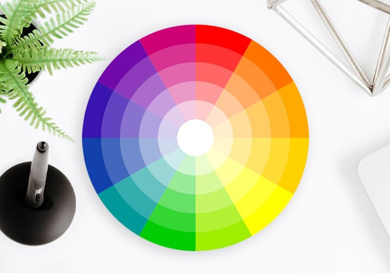
If you’re familiar with the colour circle or colour wheel, complementary colours are the pairs of colours found on opposite sides of the circle. If you’ve no idea what we’re talking about, read on for more details!
The complementary colour wheel
A colour wheel (shown in the cover image above) is a tool that illustrates the relationships between primary, secondary and tertiary colours, and so on. It allows you to identify, at a glance, the complementary colour of each shade just by looking at the opposite side of the wheel. In case you were wondering, all colours, including tertiary ones (generated by mixing a primary and secondary colour) have a complementary colour.

A quick Google search will show you that there are various colour wheels in a range of sizes, showing different hues. But the circle is always read in the same way: complementary colours are always at opposite sides of the wheel from each other.
Which colours are complementary?
A colour wheel can refer to one of two different models: the additive RGB or subtractive CMY model (here the primary colours are red, green and blue and the complementary colour pairs are red–cyan, green–magenta and blue–yellow); or the traditional RYB model. Here are the relationships between the colours in this model:
- Yellow’s complementary colour is purple;
- Blue’s complementary colour is orange;
- Red’s complementary colour is green.
You may have noticed that a pair of primary colours always contains one warm and one cold colour.
How to use complementary colours
If you work with images – whether in the design, art or marketing worlds – you need to know the complementary colours and how they interact if you want to ensure optimum colour results.
As we mentioned above, if you pair two complementary colours you get the highest possible level of contrast, known as simultaneous contrast. In optical perception terms, both colours will appear brighter and more intense and so will attract more attention from the observer (hence the relevance of marketing).

To give you a better idea, here’s an example: let’s say you want to design a logo or a poster, and you have a relatively dull, not too bright red as your starting colour. If you want to enhance it and make it brighter, you could match it with green: you’ll see a noticeable change in how the colour is perceived. Conversely, if you want to neutralise a colour, you can mix it with its complementary colour.
Basically, colours interact with each other a bit like particles. To handle them effectively, you need to pretend you are a chemist and work out the rules that govern their relationships. We’ve explained one of them in this article.

