Table of Contents
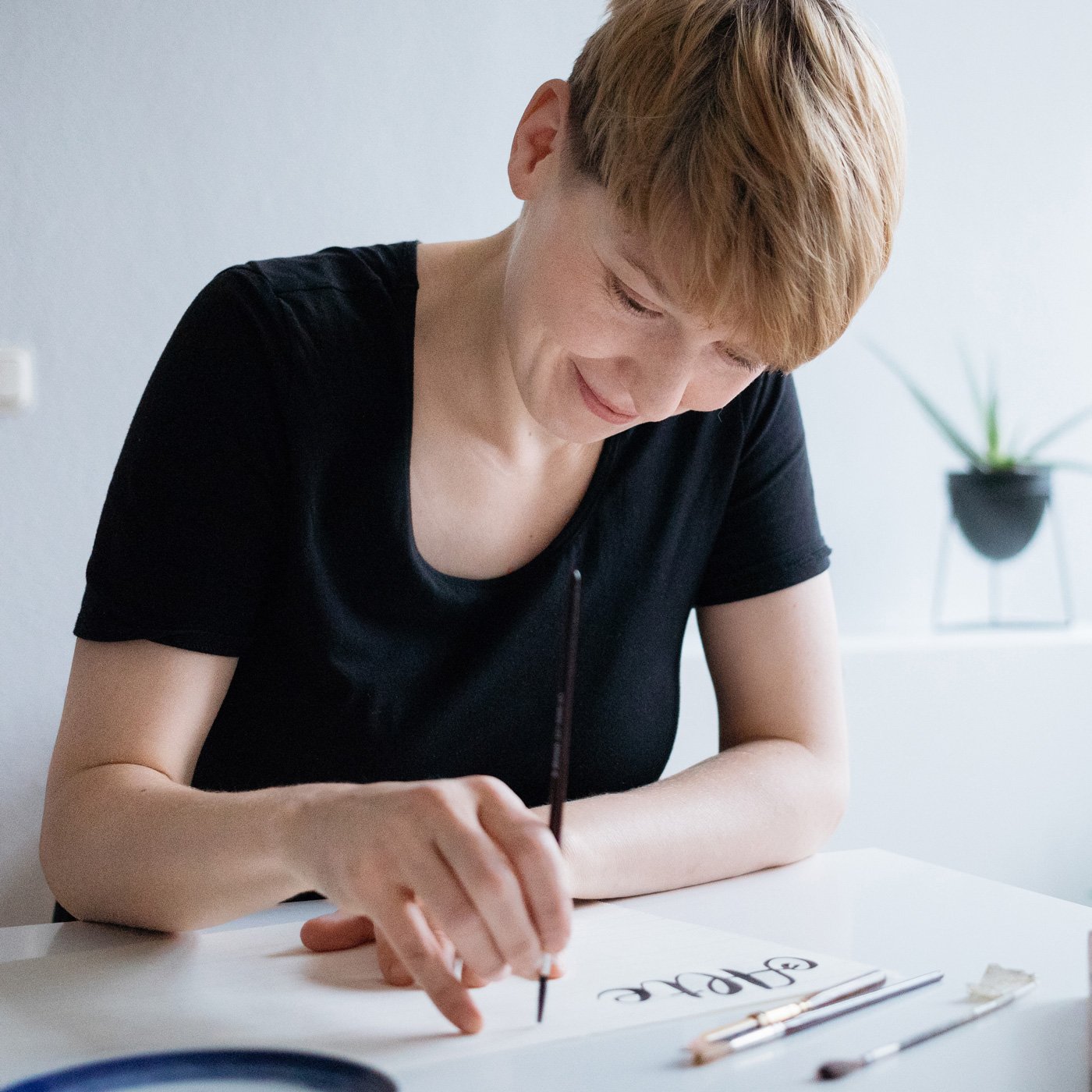
Chris Campe is a multifaceted person – she works as an author, designer, illustrator, teacher and speaker. All her creative output circles around mainly one topic – lettering! No matter if hand lettering, brush lettering or explaining how to create your own fonts, Chris has done it all!
She documents her process in her books, but also gives back through her lettering workshops, conference talks and very well-curated Instagram (which we totally recommend following!).
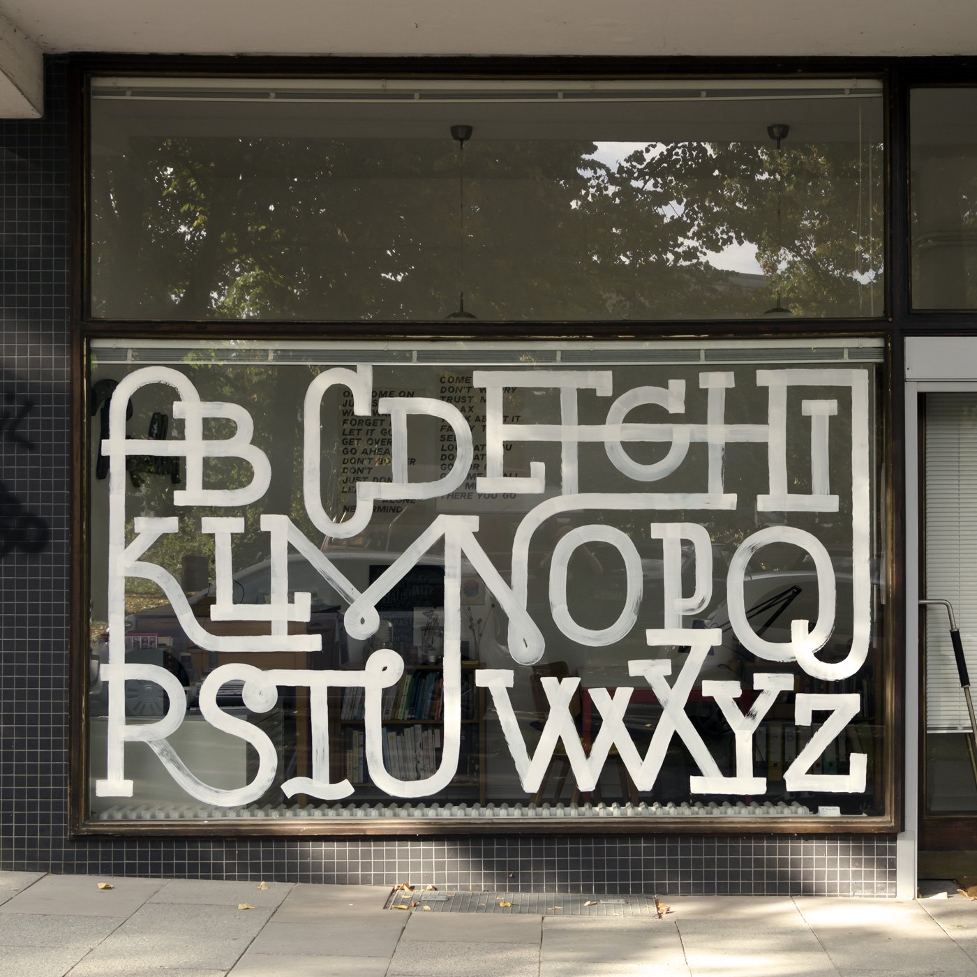
Her creative studio in Hamburg runs under the name “All Things Letters” and Chris uses the studio window to create amazing window art, like various alphabet compositions or her collaboration with other local lettering artists.
We had the chance to talk with Chris about her creative process for lettering creations, how she started as an author and how she manages to write published her own books from start to finish.
You started out as a bookseller – how does it feel to create your own books now? Was writing books always a goal for you?
I did an apprenticeship as a bookseller after high school and while I was working in the bookshop I dreamt of publishing a book with my own name on it one day. When I was finally ready to put out my first book “Hamburg Alphabet” ten years later, it was really helpful to know the book publishing industry so well.
I always wanted to write, but my first book was a photo book: “Hamburg Alphabet” is a portrait of Hamburg rendered in shop signs. To take the photos for the book, I went around Hamburg on my bike for half a year and took photos of more than 1000 different signs. 220 are in the book, in alphabetical order. The book tells city history through its signage and it becomes more valuable every day because so many of the old signs are gone.
Does writing books come naturally to you, or is the process challenging? Which parts do you enjoy most, which parts are less exciting?
After the apprenticeship I went to art school to study illustration and communication design. Because I am trained as a designer, writing feels as if it is something I just do on the side, like a hobby, and that’s what makes it easy for me, sometimes even easier than designing.
I work on all aspects of my books myself – the concept, the writing, the book design and layout and the illustrations. The process involves countless decisions, big and small, and it is mind-boggling to keep an overview of the whole project. The most challenging part is to keep going with a book project that takes at least a year to finish, while having to work on commissions in parallel to make a living. And doing a 200-page how to book for designers in just one year is very fast.
The most fun part of writing and designing a book is to develop an idea and seeing how it evolves over the course of the time that I am working on it. Usually, the book turns into something very different from what I had in mind in the beginning.
I also enjoy the actual writing of the texts in the book. My goal was to write how-to books that treat their subject very seriously but are also really fun to read. I think many specialized books are written by people who know their subject extremely well – but they don’t enjoy writing. That’s different for me: Coming up with a good way of putting something into words makes me happy every time.
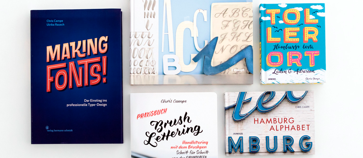
How was writing each of your three lettering books?
When I started to work on my first lettering book “Handbuch Handlettering”, I had already published two books about Hamburg, so I had an idea of the amount of work publishing a book involves. One of my ex-girlfriends said: “I am so glad we broke up!” We were together when I worked on “Hamburg Alphabet” and she remembered well how much I was like in a tunnel, unable to talk about anything but the book process.
The first thing I realized when I started “Handbuch Handlettering” was that I knew a lot less about lettering than I thought. I figured I’d have to do research – only to realize that there was lots of conflicting information on pretty much every aspect of typography and type-design and that I would have to decide on my own which information was relevant and which wasn’t. This really stressed me out. I was tense the whole time while working on the book and very afraid to make mistakes that the real pros of type-design and lettering would laugh at. Of course, that never happened.
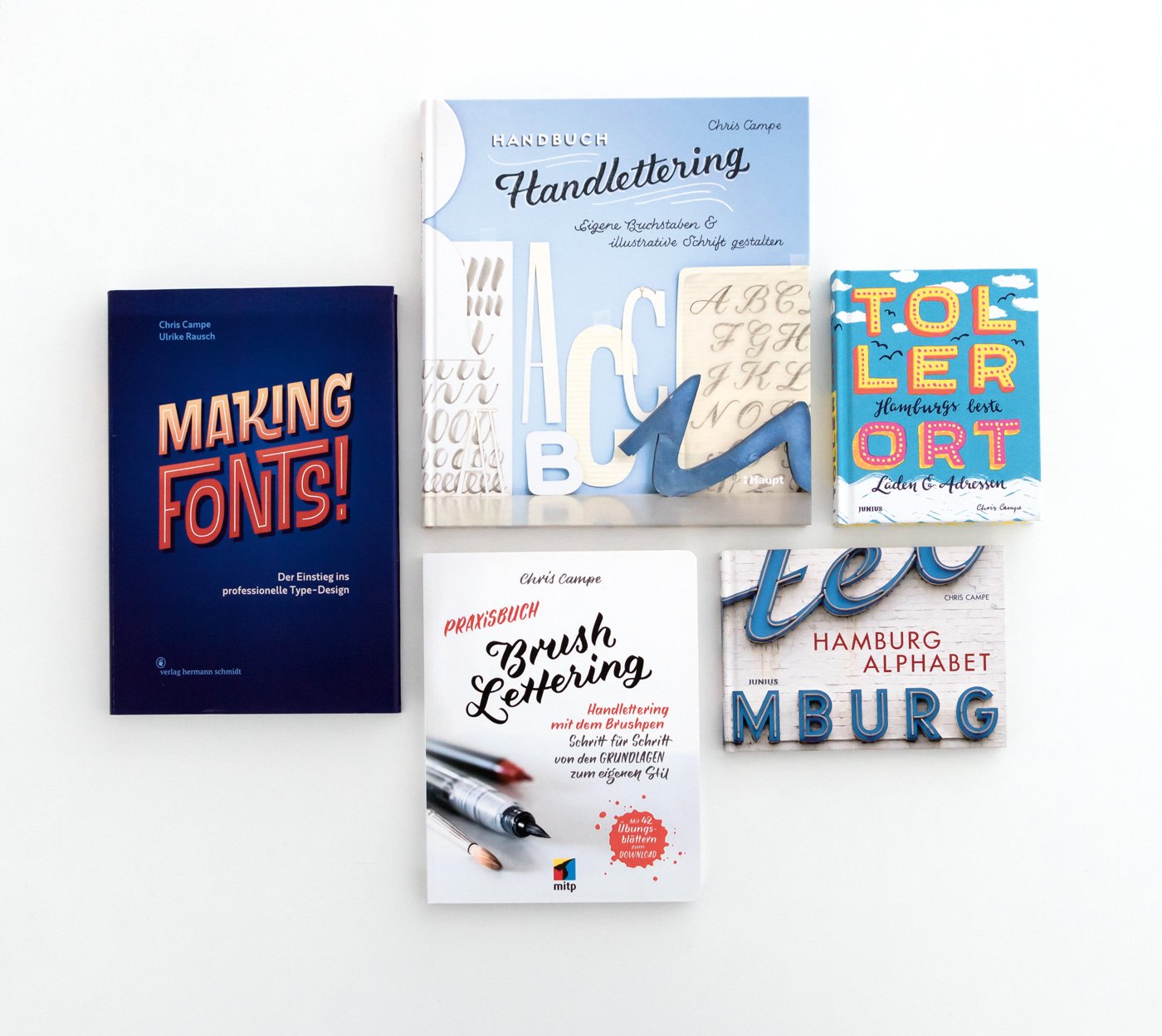
My second lettering book “Praxisbuch Brush Lettering” benefitted from the experience I had gained with “Handbuch Handlettering”. The book is structured better and the design is more straightforward. But “Praxisbuch Brush Lettering” is a less personal, too. In “Handbuch Handlettering” I gave a glimpse at how I work and what my studio looks like. “Praxisbuch Brush Lettering” is somewhat more distant and professional – but it keeps the approachable tone of voice in the writing.
The most recent book I published, “Making Fonts!”, was a different experience altogether because I wrote it together with my colleague and friend Ulrike Rausch, who runs the type foundry LiebeFonts. I always wanted to learn how to make fonts, so I thought if Ulrike explained to me what she does as a type-designer and I took notes, we could turn the notes into a book.
Writing “Making Fonts!” was also special because I did not master the subject I was writing about. I learned type-design as we went along and I was at the same time author and a typical member of the target audience: designers and illustrators who dream of making their own fonts. The collaboration with Ulrike went very well, not because we always agreed – on the contrary! – but because we let go and trusted the other in all the right places. Ulrike has the technical skills, I know how to write – the combination lead to a book neither of us could have created on her own.
How do you go about designing a lettering piece, for example for the window alphabets you paint on the window in your storefront studio? From idea to finish, what is the process like?
The way I work seems to be a kind of universal lettering process. At least I know of many other lettering artists who work this way and in one of my workshops someone said: “My grandfather designed logos and he used this technique, too!” So apparently this way of developing an idea from initial sketch to final design is long established.
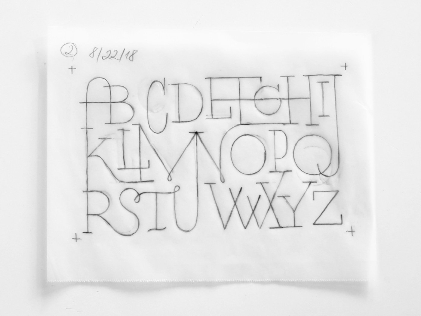
When I have an idea and play around with it in some sketches. Once I found a way to make the idea work, I redraw one of the sketches at a larger scale on transparent paper. Then I place another sheet of transparent paper on top of the initial drawing, copy the parts of the drawing that already work and correct the ones that don’t. This way, I develop the sketch into a more refined design that will work on the large scale of the storefront window. Finally, I transfer the sketch with the help of a grid of guidelines and then I paint it with regular acrylic paint. The advantage of acrylic is that I can just scrape it off, when I want to repaint the window.
How is teaching lettering different from creating lettering?
It is true that there is a big difference between applying techniques and creative approaches in your daily work and teaching them. Mastering a skill does not necessarily mean you manage to convey it to others. In order to break down your way of working into simple steps to explain it to students, you have to step back make your process unfamiliar to yourself – even though you know so well that you don’t have to even think about it anymore.
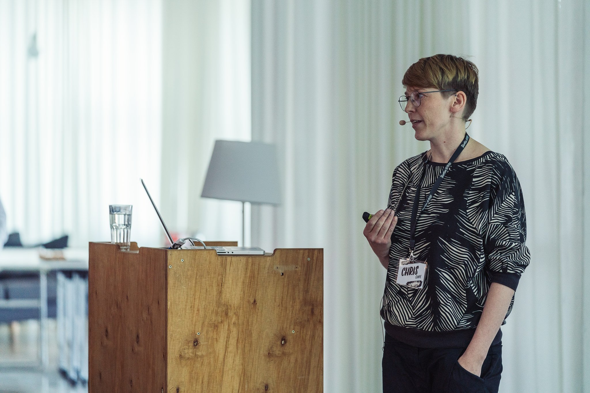
Teaching requires knowing your own process well, being able to put into words why you do things the way you do and packaging your knowledge into exercise that allow students to learn step by step. When you are really good at what you do, it’s sometimes hard to keep in mind which aspects beginners struggle with. Usually, the skill levels vary within a group and it’s essential to pay attention to the individual skills of each person and figure out what kind of help they need to be able to do the next step of their path. I think teaching really only works when you manage to connect with each person individually.
What are your favourite books around lettering and illustration currently?
One of my favourite books at the moment is Stefanie Weigele’s “Spitzfederkalligrafie”. Stefanie explains pointed pen calligraphy in great depth, the book design is exceptionally beautiful, and it made me want to pull out my pointed pen for the first time in years. It’s the new definite book on the subject.

