Table of Contents
It’s said that an image is worth 1000 words. Whether or not this is literally true, in the world of marketing, the use of carefully chosen images undoubtedly pays off. And the visual component of any brand strategy has become even more important since social media became the main form of communication with consumers. Images rule supreme on social networks – a tweet accompanied by a photo receives more retweets, and a Facebook post featuring an attractive image achieves more likes.
In this article we’d like to discuss the power of visual tools in marketing by showcasing various examples of brands that have chosen illustrations and cartoons to forge an immediate connection with their audience.
Visual communication in marketing
The first communication we do, from very early age, involves images – babies learn to understand images even before they learn to read or speak. Our brain also uses much less energy and requires much less time to process visual content than it does text. To be precise, the brain takes a tenth of a second to understand an image and a minute to read 200-250 words. An image therefore has an immediate impact on the observer, and remains in our memory much longer than information we read or listen to.
That said, there are images and then there are images. Here we’re not talking about stock photos; we’re discussing content tailor-made for brands.
High quality visual content must:
- Reflect the brand’s identity.
- Be relevant to the world inhabited by the target audience, so it establishes a connection with them.
- Be recognisable. Original visual content should recall the brand without even needing to include the logo.
- Play on people’s emotions. Images can move people, reassure them or make them smile. Brands that know their target audience well know which emotions to aim for.
- Be aesthetically pleasing. It may seem obvious, but no one pays attention to visual contents that don’t immediately jump out at them.
- Be brief. Images have the incredible power of being able to ‘explain’ even rather complex concepts. So avoid creating overly descriptive images, which risk being difficult to read and therefore not as immediate.
Given that words can only say so much, let’s have a look at three examples of what can undoubtedly be described as ‘high-quality visual contents’.
Dumb Ways to Die
Let’s start with a campaign that travelled around the world and went viral on social media. Dumb Ways to Die was an advertising campaign launched by Metro Trains, the company responsible for Melbourne’s railways. Here you can see some extracts from it and, most importantly, see how it was received.
The campaign dealt with the sensitive and challenging topic of safety, aiming to reduce railway accidents, which had been going up in recent years. Choosing to use fun, witty animations was therefore undoubtedly a brave and unusual choice. However, the campaign was a success – it attracted the desired attention, clearly conveyed its message, stuck in people’s minds and, after its launch, railway accidents fell by 21%. What more could you ask?
Marketoonist
If you want to take a punt on high-quality images, you need someone who knows what a high-quality image is Marketoonist, for example.

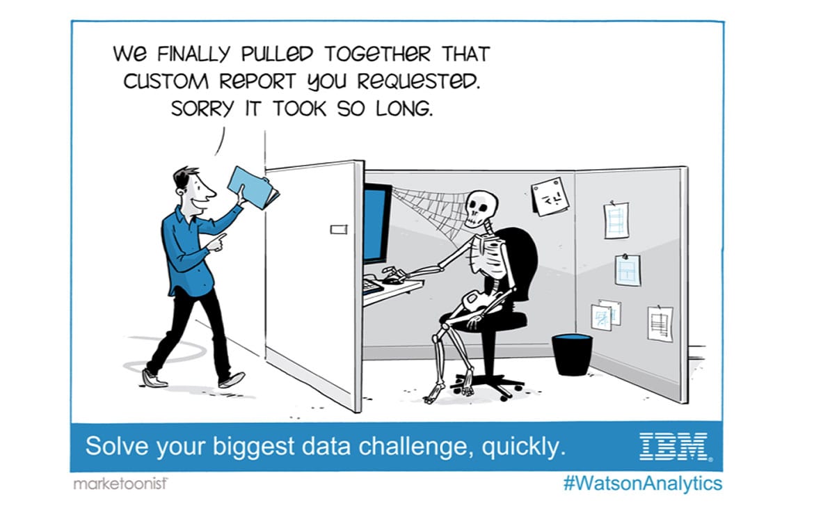
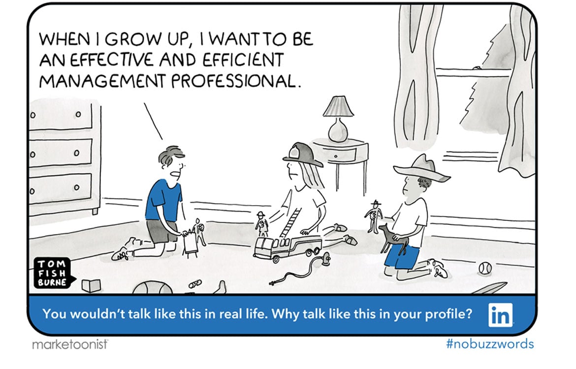
Tom Fishburne is the founder of Marketoonist, a company that specialises in creating cartoons for marketing purposes. Tom has been drawing for 20 years, and his illustrations have become famous all over the world, appearing in the Wall Street Journal, Fast Company and the New York Times, on a billboard in Times Square, and even popping up in a top-secret presentation given by the NSA (the National Security Agency, a US government body) that was then published by Edward Snowden.

Marketoonist’s clients include names like Google, IBM and LinkedIn. Before enjoying Marketoonist’s witty cartoons, it’s worth spending a few minutes listening to Tom Fishburne’s interesting TED talk, ‘The Power of Laughing at Ourselves’.
The Marketoonist website features a revised version of the motto with which we began this article: ‘If a picture tells a thousand words, a marketoon tells a thousand boring Powerpoint slides’. Judge for yourself.
https://www.youtube.com/watch?v=vQ2VS5iA-Yo
Estetista Cinica
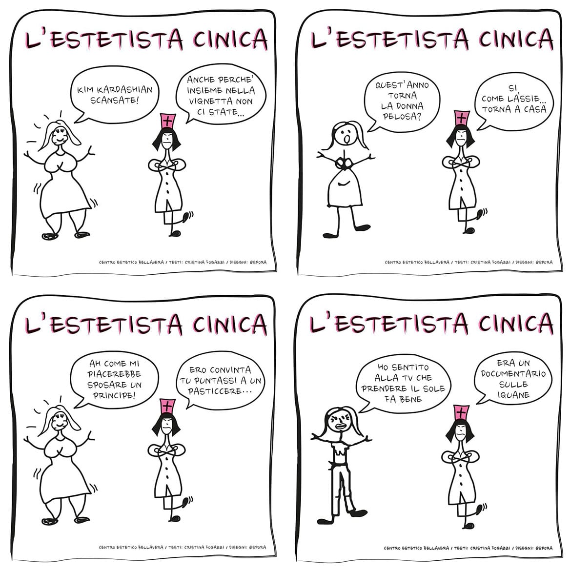
Now let’s look at an Italian example – Estetista Cinica‘s cartoons. If you haven’t heard of her, Cristina Fogazzi is a ‘cynical’ beautician who has become popular for her stinging irony and her frank approach. She has an extremely popular blog, a passionate group of followers on Instagram and a range of beauty products that sell like hot cakes. And she is also known for her witty cartoons. Her blog describes how she came up with the idea of using illustrations as a communication tool.

“… I wanted to create cartoons featuring a terrible beautician (me) saying naughty but frank things to her patients, both to stimulate them and to make them laugh. Since as beauticians we talk about cellulite and wrinkles, and fortunately not about illnesses, you need to be a bit silly as well as competent and well-trained – luckily no one dies of cellulite, wrinkles or hair, and our lives are already so stuffed full of serious issues I hope we can at least allow ourselves to joke about beauty.”
These are some of the most recent cartoons she has published on her Facebook page. The extremely simple, fun and highly original illustrations are not the work of an illustrator; they were drawn by Spora, an influencer and a friend of Cristina’s.
We wanted to show them to you because they prove that sometimes to leave your mark and be remembered you have to be courageous and stake everything on your personality. Take a risk!

