Table of Contents
As in any sector, branding is essential for restaurants to achieve recognition and success. Unlike other industries however, a key aspect to consider when crafting the corporate image of a bar, restaurant or cafe is the customer experience, which must be attractive and consistent with its offering.
For best results, you need to think carefully about the food served, the service provided, and what makes the establishment stand out from the competition: the visual language must always reflect but never shape or dictate these aspects.
Once you’ve developed a concept, it should be applied consistently, with the appropriate tweaks, to all communication (signage, menus and wine lists, flyers, website, social media etc.), as well as to the interior design of the premises.
Below are some examples of restaurants, both independent establishments and chains, whose identity fully reflects the spirit of the place, is extremely recognisable and, thanks to their originality, catches the eye.
Wahaca by Without, London
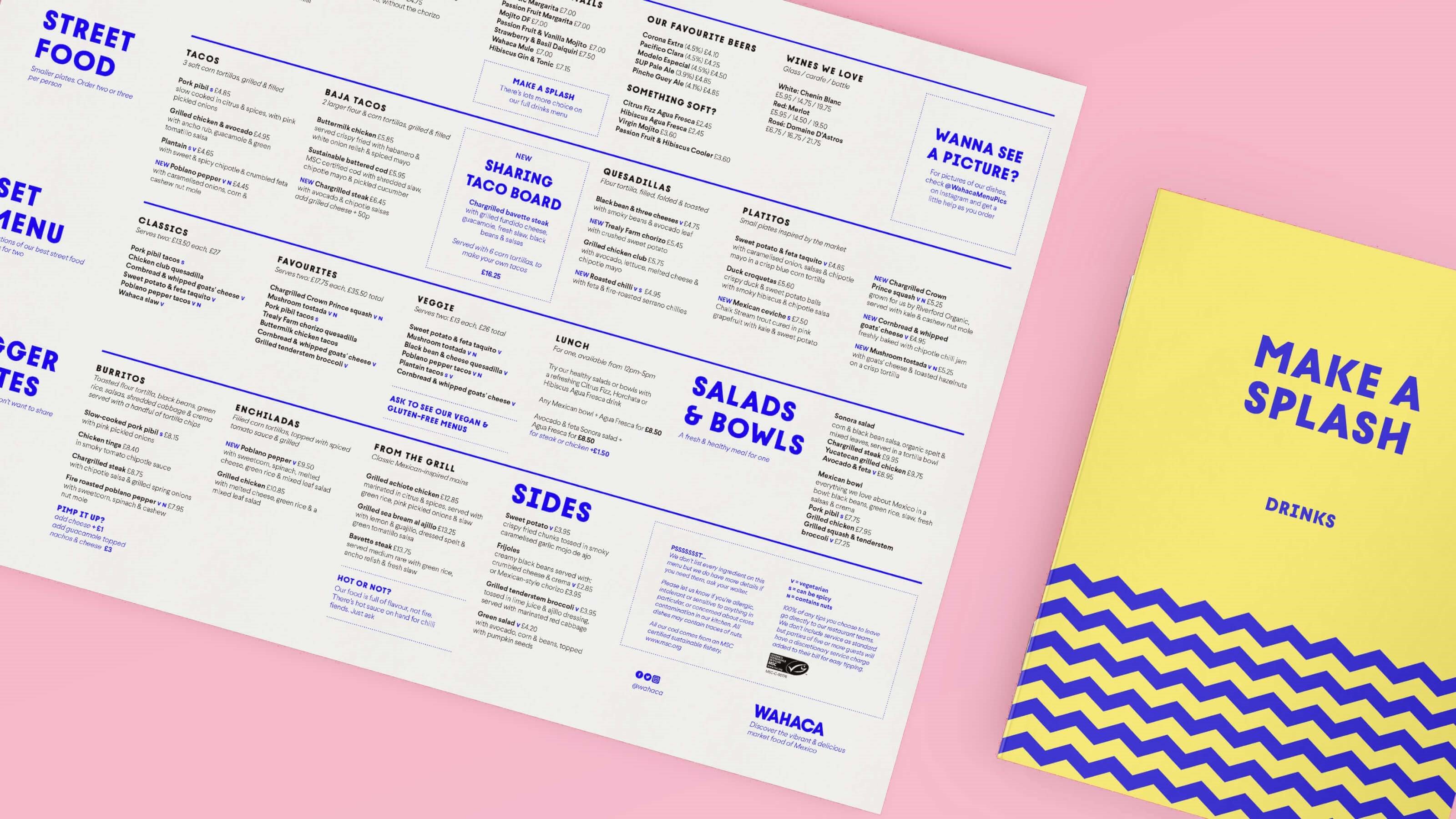
Wahaca is a London-based chain that serves authentic Mexican food at affordable prices. After 10 years in business, the need to stand out from the increasing number of Mexican street-food restaurants and grow the brand made rebranding necessary. It was handled by London design agency Without, the firm that also created the chain’s initial visual identity.
The main goal was to simplify the brand, taking inspiration from the colours, flavours and spirit of Oaxaca’s food markets, but interpreting rather than copying them.
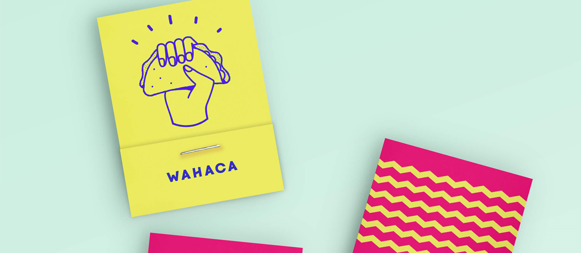
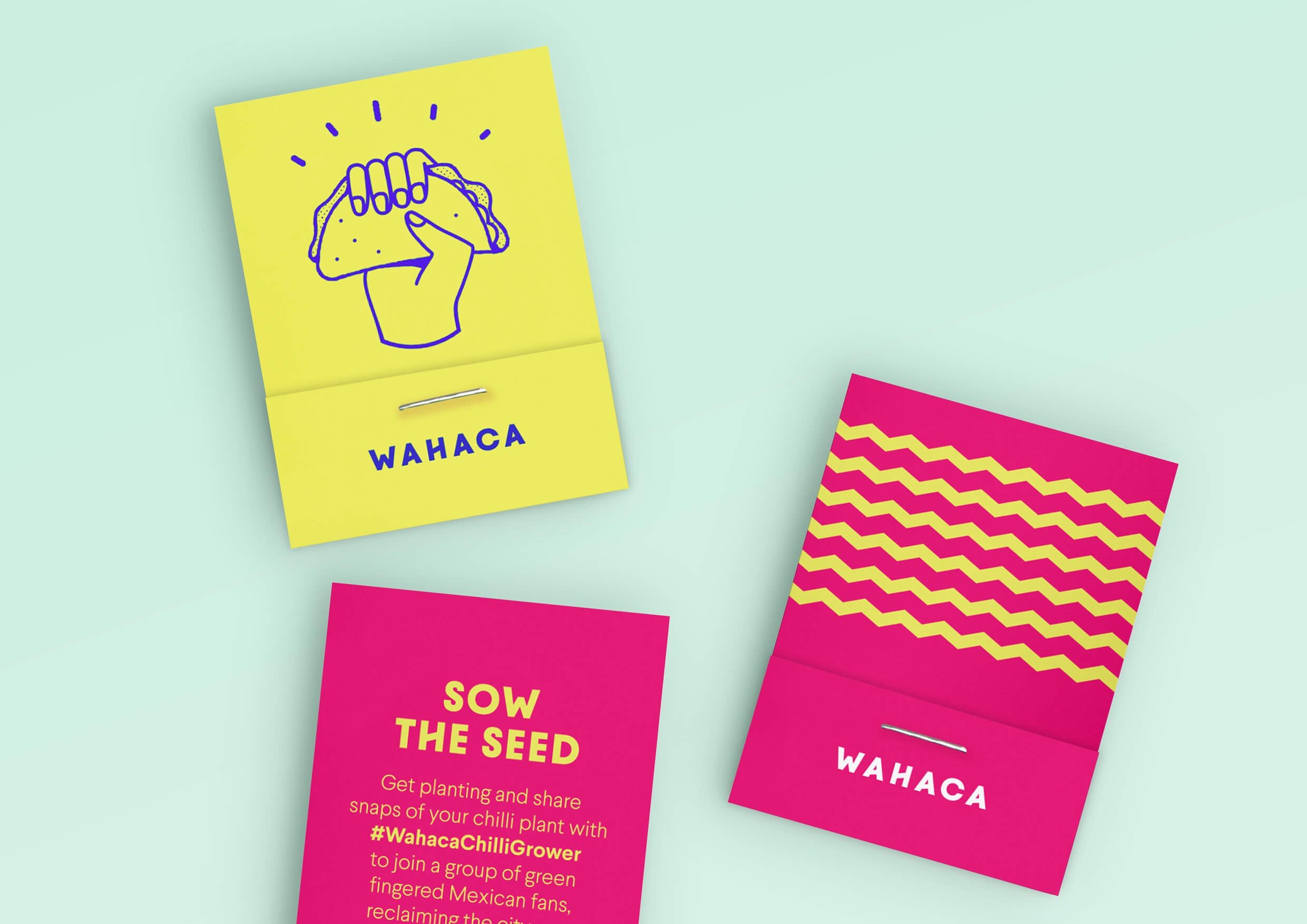
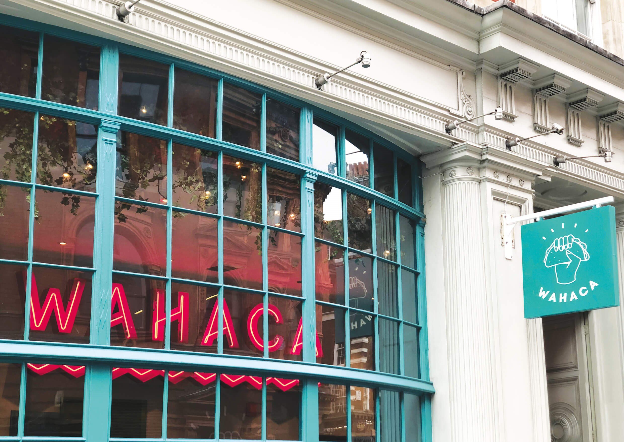
The chain’s slogan, “Sunshine and Tacos”, in other words vibrancy, informality and authenticity, is perfectly encapsulated by the logo: an illustration of a hand clenching a taco accompanied by the restaurant’s name in a custom font, which features diagonal strokes that are mirrored in the brand’s zigzag motifs.Combinations of vivid contrasting colours like yellow and turquoise, dark blue and red, brighten up the visual language.
The menu was also overhauled: 2Forks, specialists in restaurant communication, made it simpler and clearer, while Without redesigned the graphics. Following this redesign, Wahaca recorded their biggest ever month-on-month increase in sales.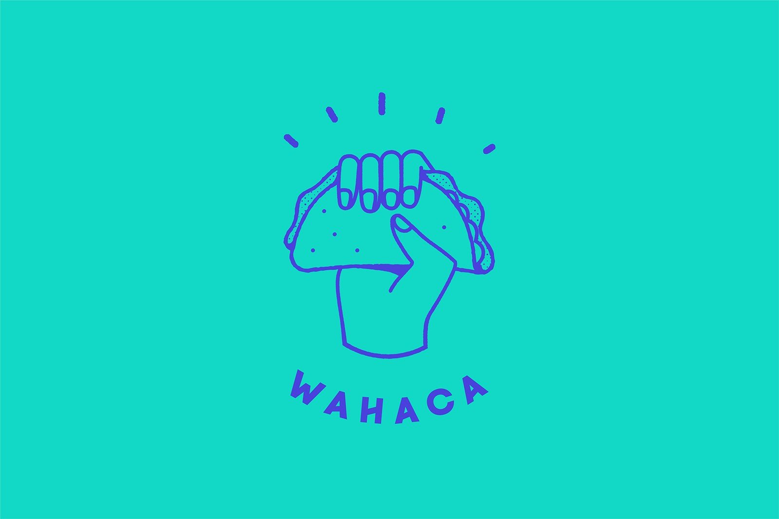
Bottura by Foreign Policy, Singapore
Bottura is an Italian restaurant and grocers run by Luca Bottura in Singapore.
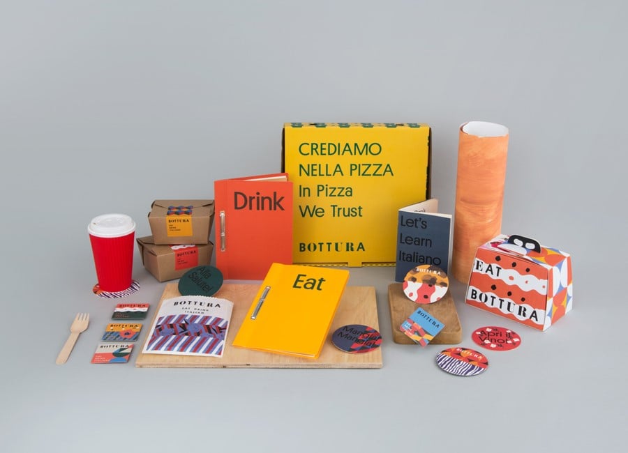
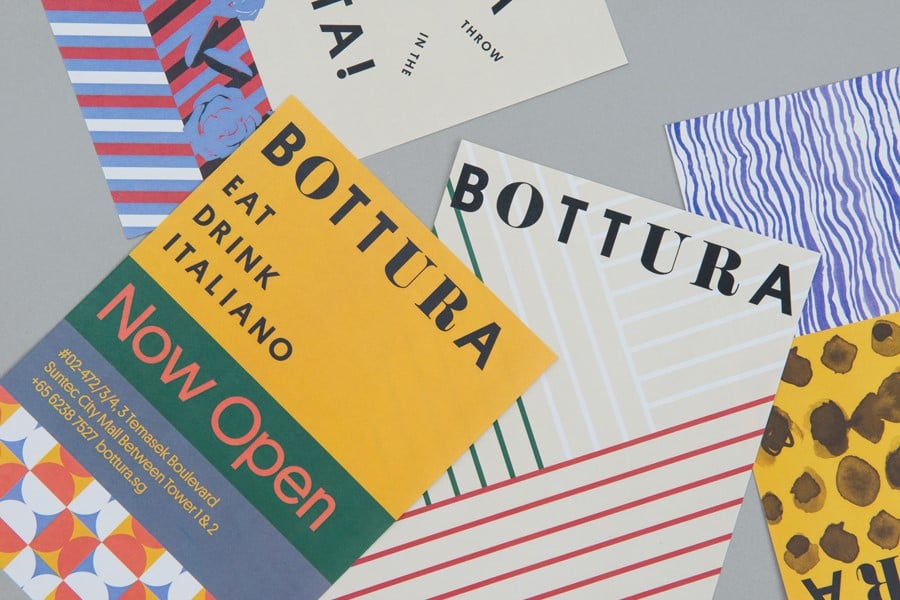
The restaurant serves traditional dishes from Italy’s Emilia-Romagna region that are reinterpreted and presented in a modern setting. The same approach applies to the brand identity created by Foreign Policy, marrying tradition and modernity.
This is immediately apparent in the logo, which boldly juxtaposes serif and sans serif characters. Then there are the warm colours, typical of Emilia-Romagna’s cuisine and architecture, and the patterns inspired by Italian grandmothers’ dresses alongside more geometric and contemporary motifs.
Kimski by Franklyn, Chicago
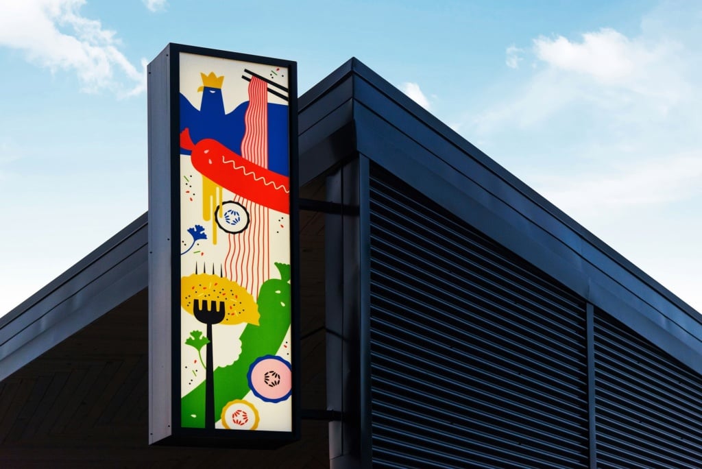
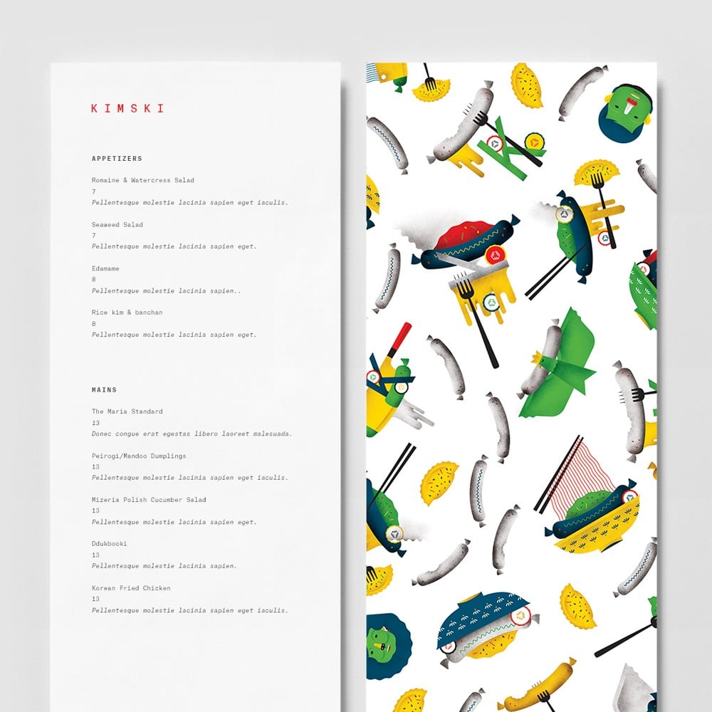
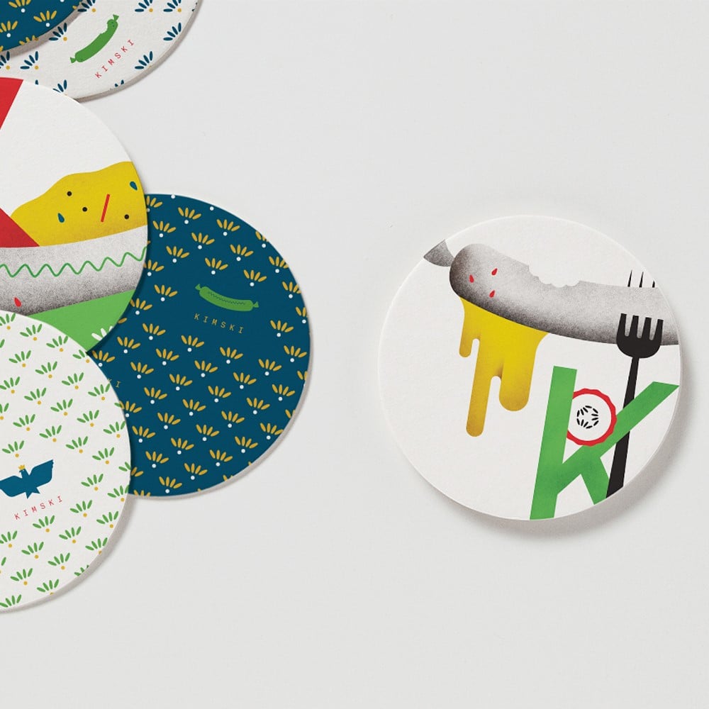
Kimski is a fusion street food restaurant in Chicago, born out of a collaboration between Korean chef Won Kim and Polish-American Chicagoan Ed Marzewski. Developed by New York agency Franklyn, its visual identity is inspired by this blend of cultures and is a riot of bright colours and bold illustrations that collide and intersect.
Polish sausages covered with kimchi, ravioli that could be pierogi or mandu, as well as forks and chopsticks all feature prominently in the restaurant’s graphics. The illustrations aren’t only vibrant, they’re also extremely sophisticated: they use stylised geometric shapes that stay the right side of abstract, employ a strict colour palette and make judicious use of overlaps.
The monospace font used for the logo and menu contrasts with the illustrations in its simplicity and minimalism; yet this doesn’t prevent it from being coherently integrated with the system of illustrations.
Sardine by Here Design, London
Sardine is London restaurant that serves dishes from the south of France and the Mediterranean. Founders Alex Jackson and Stevie Parle turned to Here Design, also based in the UK’s capital, to create a visual language in-keeping with their food.
The brief was to create an identity with an informal flavour that also took into account the restaurant’s sophisticated venue. Inspired by traditional Mediterranean typography and hand-drawn signs, they created a logo whose elongated and undulating letter ‘R’ evokes the sea.
The brand identity also features overlapping paper cut-outs inspired by the work of Henri Matisse which, with their warm pastel colours, bring to mind sun-drenched beaches. This recurring motif can be seen in the menu, business cards and website. The colour palette is also reprised in the tiles that cover the bar. Just a few simple elements – typography, colour and the cut-out motif – are all it takes to transport diners in this London restaurant to the shores of the Mediterranean.

