Table of Contents
2019 marks the centenary of the opening of one of the most important institutions in the field of design, architecture and art: the Bauhaus. The school was founded in 1919 by architect Walter Gropius in the German city of Weimar, amid the gloomy climate of resentment and unrest that followed the First World War. The Bauhaus, focused on the values of internationalism and experimentation, often felt the effect of this political climate, and indeed it was forced to move its headquarters twice: to Dessau in 1925, and then to Berlin in 1932, a year before it was closed definitively by director Ludwig Mies van der Rohe, following pressure from the Nazi government.

The school aimed to bring together art, design and technology to improve the functional and aesthetic qualities of mass-produced objects, and particularly low-cost items. The idealistic concept that gave rise to the Bauhaus was that design should permeate every aspect of people’s daily lives, and that this should apply to everyone, not just a privileged few.
The Bauhaus offered a multidisciplinary curriculum, with each subject treated on an equal footing and all of them underpinned by one of the school’s founding principles – the idea that form follows function.
In just 14 years, the Bauhaus played a key role in establishing industrial design as a discipline, and its influence on modernist art and architecture is clearly visible. In the field of graphic design, meanwhile, it opened the way to Jan Tschichold’s ‘new Typography’, upon which modern typography is still to some extent based.
Bauhaus: the centenary rekindles interest
Currently, thanks in part to the school’s centenary, the Bauhaus’ achievements are being rediscovered and garnering a growing amount of interest.
The Bayer Next font
One interesting project from this viewpoint is the new visual identity of the Bauhaus-Archiv Museum für Gestaltung in Berlin, created by graphic designer Sascha Lobe and his team at his former studio, L2M3. The museum was founded in 1960 with the aim of studying and preserving the history and influence of the Bauhaus.

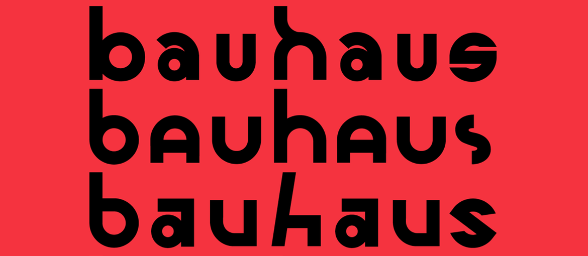
Following research involving a large quantity of archive material, Lobe created a new font for the museum, directly inspired by the Universal font designed by Herbert Bayer in 1925. The font, appropriately named Bayer Next, aims to revive not only the aesthetic style of the Bauhaus, but also its spirit and values.


The font design process was based on experimentation, refining and iteration; as of today, the font has 555 glyphs, and the number is constantly rising. To promote the centre and its graphic design work, a series of posters, animations and layouts have also been designed which, while undoubtedly drawing on key motifs for which the school is renowned, such as geometric forms, primary colours and halftone screens, are also clearly a contemporary reinterpretation, in which the variety of the glyphs offered by the font plays a fundamental role.
Adobe Hidden Treasures Bauhaus Dessau: reassembling unfinished fonts
Remaining in the world of typography, the importance of the Bauhaus’ typography course and its results are shown in the work carried out by renowned type designer Erik Spiekermann who, in collaboration with Adobe, recovered sketches and fragments of letters designed by students that were never finished due to the school’s sudden closure. Five alphabets have been painstakingly completed, in line with the drawings available and the intentions underpinning the sketches, and then digitalised by an international team of students led by Spiekermann himself. The fonts, part of the Adobe Hidden Treasures Bauhaus Dessau project, can be downloaded at the website adobehiddentreasures.com

Bauhaus and textiles: the magic lives on in Hannah Waldron’s tapestries
Another noteworthy contemporary reinterpretation of the Bauhaus’ achievements, this time in the field of textiles, is the work of Hannah Waldron, an artist and designer who explores the expressive potential of fabric through exhibitions, research projects and teaching. Waldron claims to have started weaving in 2010 after admiring the wonderful woven works in the Bauhaus archive (the textiles created by Anni Albers, recently exhibited in the Tate Modern, are particularly well known). However, Waldron was also inspired by the school’s philosophy and founding principles, and draws on them in her practice, creating extraordinary tapestries that work on their own or in dialogue both with one another and with wooden structures in her exhibitions.


Bauhaus iconography: 99design’s revisiting of famous logos
Sometimes rediscovering the Bauhaus involves returning to the most recognisable stylistic features of the school’s graphic design language, such as simple geometric shapes, primary colours and diagonal lines. To mark the centenary, 99design invited international designers to reimagine famous logos in a Bauhaus style. The result is a rather simplistic vision of the typographical and graphical maxims of the Bauhaus, but it is certainly a fun reinterpretation that brings together the aspects of graphic design that the public most associate with the school.
While some interesting similarities can be found in formal aspects of contemporary projects, the current revisiting of the Bauhaus above all invokes its values and its spirit. The aim to use design as a tool to improve people’s daily lives, the amalgamation of art and technology and the idea of functionality as the most important guide when defining the form are all Bauhaus teachings that are still equally valid and important today.

